CP

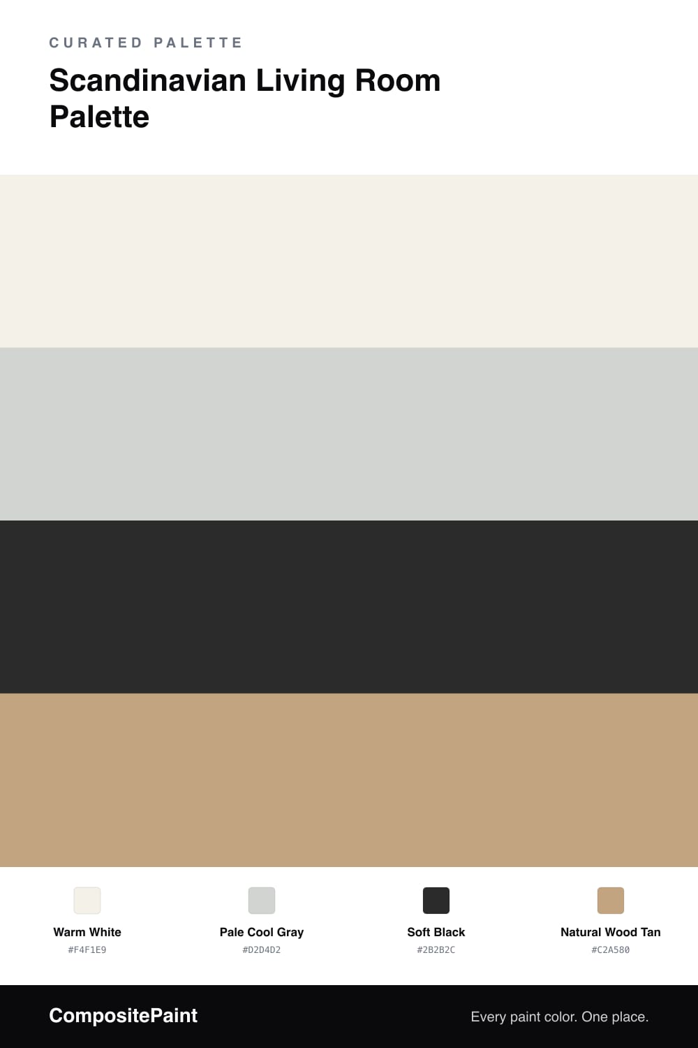
Scandinavian Living Room Palette — Warm White & Pale Gray

A bright, airy 4-color living room scheme pairing warm white walls with cool pale gray, a soft black accent, and natural wood tan for clean Nordic calm. Every color matched to real paint you can buy.

By Jessica Williams · Color Stylist & Interior Editor

This is a clean, restful palette built on the Nordic idea that less really is more. Paint your main walls the warm white so the whole room feels bright and open, especially in low winter light. Use the pale cool gray on a secondary wall or in an alcove to add the faintest bit of depth, keeping things calm rather than flat. The soft black is your contrast color, but use it sparingly. A black window frame, a slim floor lamp, or the legs of a chair give the room just enough definition to feel modern and intentional. The natural wood tan ties it all together, whether it comes from oak floors, a light wood table, or shelving. Together these four tones create a space that feels uncluttered, airy, and warm at the same time, which is exactly what Scandinavian style is all about.

View palette in
Warm White
Walls
Dutch Boy Birched White · 004W
#F5F2EA
LRV 89
Pale Cool Gray
Secondary Wall
Sherwin-Williams Reflection · SW 7661
#D3D5D3
LRV 66
Soft Black
Accent
Kompozit Silent Sea · 0515
#2A2B2C
LRV 2
Natural Wood Tan
Wood Tones
Dunn-Edwards Graham Cracker · DE6144
#C0A480
LRV 37

Buy These Colors

Each color matched to the closest real paint in every brand, by ΔE2000. Tap a swatch for its full guide or + to save it — take any SKU to the store, they mix on demand.

Warm White
#F4F1E9 · LRV 88 · Walls
Sherwin-Williams · SW 9503 · ΔE 0.92
Behr · T16-17 · ΔE 1.15
Benjamin Moore · AF-10 · ΔE 0.51
Valspar · 7007-4 · ΔE 1.05
PPG / Glidden · PPG0998-1 · ΔE 1.04
Glidden · 61YY 89/040 · ΔE 1
Dutch Boy · 004W · ΔE 0.21
HGTV Home by Sherwin-Williams · HGSW 4002 · ΔE 0.5
Dunn-Edwards · DE6260 · ΔE 0.46
Magnolia Home · JG-107 · ΔE 0.73
Farrow & Ball · NO. 239 · ΔE 1.56
Diamond Vogel · 0411 · ΔE 1.04
Hirshfield's · 0411 · ΔE 1.48
Rodda · CA002 · ΔE 2.19
C2 Paint · C2-820 · ΔE 0.53
Clare · PNT100-LT-24 · ΔE 2.68
Portola Paints · ORIGAMI · ΔE 1.56
Annie Sloan · OLD OCHRE · ΔE 13.19
Backdrop · BD-TR · ΔE 1.56
Rust-Oleum · 329598 · ΔE 5.53
Kompozit · 0411 · ΔE 1.48
Pale Cool Gray
#D2D4D2 · LRV 65 · Secondary Wall
Sherwin-Williams · SW 7661 · ΔE 0.24
Behr · PPU26-11 · ΔE 0.79
Benjamin Moore · 1604 · ΔE 1.64
Valspar · 7004-21 · ΔE 0.24
PPG / Glidden · FLLW961 · ΔE 0.52
Glidden · PPG1011-2 · ΔE 1.11
Dutch Boy · 434-1DB · ΔE 1.97
HGTV Home by Sherwin-Williams · HGSW 1456 · ΔE 0.24
Dunn-Edwards · DE6366 · ΔE 1.27
Magnolia Home · JG-74 · ΔE 1.43
Farrow & Ball · NO. 277 · ΔE 1.02
Diamond Vogel · 0538 · ΔE 2.62
Hirshfield's · 0530 · ΔE 1.52
Rodda · CA030 · ΔE 3.18
C2 Paint · C2-979 · ΔE 2.2
Clare · PNT100-LT-18 · ΔE 3.59
Portola Paints · SAN FERNANDO · ΔE 3.83
Annie Sloan · OLD OCHRE · ΔE 13.53
Backdrop · BD-RR · ΔE 7.17
Rust-Oleum · 285142 · ΔE 10.67
Kompozit · 0530 · ΔE 1.52
Soft Black
#2B2B2C · LRV 2 · Accent
Sherwin-Williams · SW 6258 · ΔE 1.27
Behr · 770F-7 · ΔE 5.33
Benjamin Moore · PM-9 · ΔE 0.72
Valspar · 4011-2 · ΔE 1.42
PPG / Glidden · PPG0995-7 · ΔE 5.81
Glidden · 00NN 05/000 · ΔE 5.25
Dutch Boy · 438-7DB · ΔE 1.27
HGTV Home by Sherwin-Williams · HGSW 1441 · ΔE 1.27
Dunn-Edwards · DEA002 · ΔE 4.93
Magnolia Home · JG-05 · ΔE 4.27
Farrow & Ball · NO. G18 · ΔE 5.49
Diamond Vogel · H101 · ΔE 4.79
Hirshfield's · 0515 · ΔE 0.68
Rodda · CA210 · ΔE 7.57
C2 Paint · BD49 · ΔE 7.8
Clare · PNT100-DP-54 · ΔE 9.32
Portola Paints · FACTORY BLACK · ΔE 2.2
Annie Sloan · NAPOLEONIC BLUE · ΔE 15.98
Backdrop · BD-HP · ΔE 4.4
Rust-Oleum · 285144 · ΔE 5.65
Kompozit · 0515 · ΔE 0.68
Natural Wood Tan
#C2A580 · LRV 40 · Wood Tones
Sherwin-Williams · SW 9103 · ΔE 2.04
Behr · S280-4 · ΔE 1.74
Benjamin Moore · 1061 · ΔE 0.62
Valspar · T578 · ΔE 1.73
PPG / Glidden · PPG1080-4 · ΔE 2.34
Glidden · 00YY 37/221 · ΔE 3.06
Dutch Boy · 217-4DB · ΔE 1.2
HGTV Home by Sherwin-Williams · HGSW 2185 · ΔE 1.52
Dunn-Edwards · DE6144 · ΔE 0.5
Magnolia Home · JG-166 · ΔE 7.53
Farrow & Ball · NO. 38 · ΔE 3.02
Diamond Vogel · 0267 · ΔE 1.55
Hirshfield's · H0112 · ΔE 2.9
Rodda · CA107 · ΔE 2.29
C2 Paint · BD32 · ΔE 2.71
Clare · PNT100-DP-59 · ΔE 4.87
Portola Paints · CODA · ΔE 4.91
Annie Sloan · VERSAILLES · ΔE 7.21
Backdrop · BD-RO · ΔE 14.73
Rust-Oleum · 371674 · ΔE 13.19
Kompozit · 0275 · ΔE 2.52

Questions

Why use a warm white instead of a pure bright white?

A warm white keeps the room feeling soft and welcoming rather than cold or clinical. It still reads as white but works with the natural wood and gray to give the room that gentle Nordic glow.

How much of the soft black should I use?

Keep it minimal. Scandinavian rooms use black in thin doses, like a window frame, a light fixture, or a few legs on furniture. It adds contrast and structure without breaking the calm, pared-back feel.

KEEP EXPLORING

Similar Palettes

Closest schemes by color — not by label.