CP

Red Pastel Color Palette — Strawberry Sorbet

A soft five-color scheme built on rosewater, coral blush, and strawberry cream, grounded by warm white and a muted rose — every color matched to real paint you can buy.

By David Chen · Formulation Lead & Resident Chemist

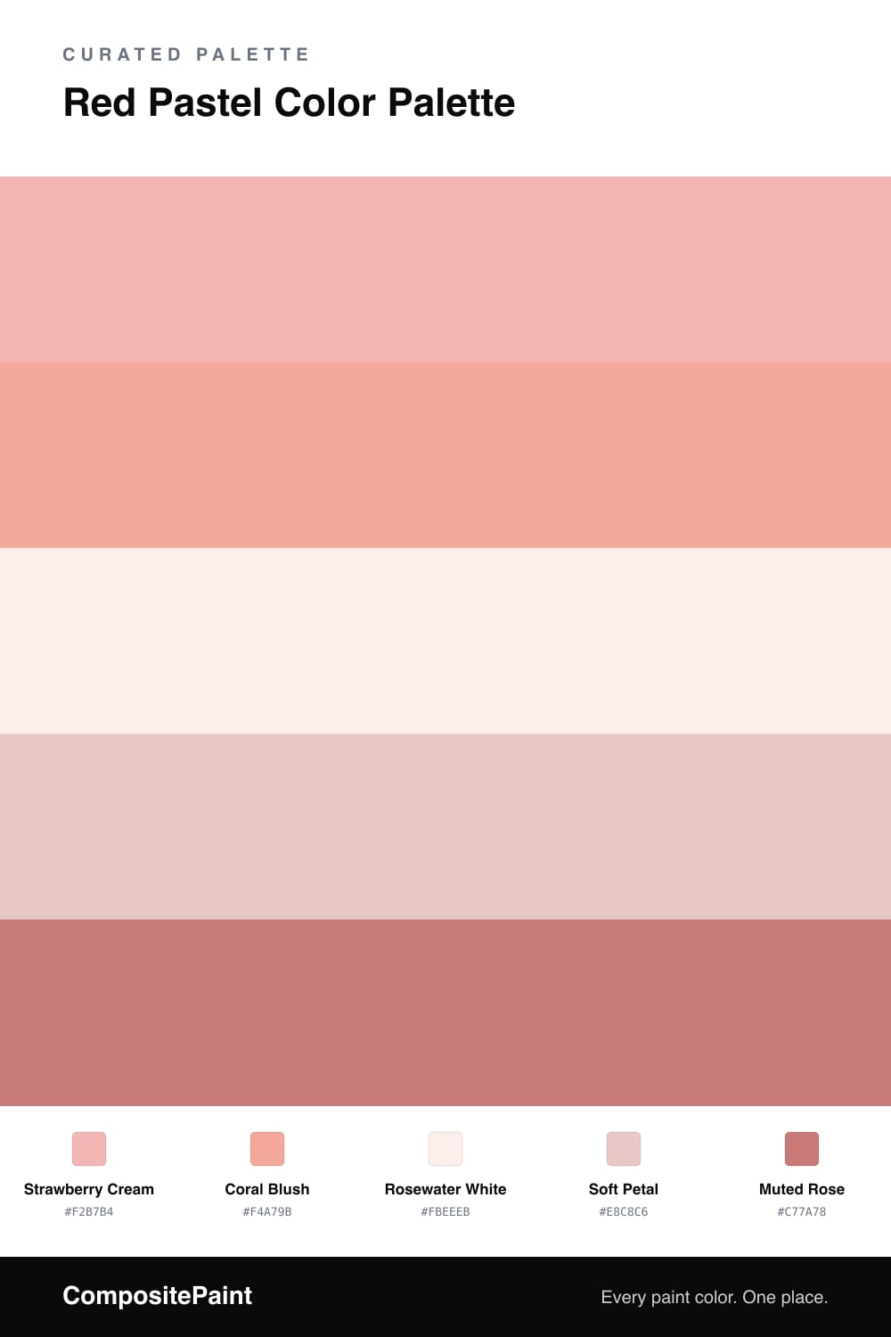
Soft reds are having a quiet moment, and this scheme leans into the gentlest end of the family. Strawberry Cream leads as the dominant tone, warm and barely saturated, with Coral Blush stepping in as a slightly punchier partner that keeps things from going flat.

The trick with a palette this tender is restraint. Rosewater White is the calm base that lets the pinks feel intentional instead of overwhelming, and Soft Petal bridges the gap so nothing jumps too far between neighbors. Think of it like diluting a bright pigment with white glaze — the color stays, but the edge softens.

To keep it contemporary rather than precious, let Muted Rose do the grounding. A few touches of that deeper, grayed tone give the eye somewhere to rest and pull the whole sorbet palette toward something calm and modern.

View palette in
Strawberry Cream
Dominant
Behr Veronese Peach · BIC-03
#F1B9B5
LRV 57
Coral Blush
Secondary
Glidden Bay Coral · 22YR 50/316
#F5A69B
LRV 50
Rosewater White
Base
Behr Bella Pink · 210E-1
#FAEEEB
LRV 87
Soft Petal
Support
Diamond Vogel Empire Rose · 0069
#E6C7C4
LRV 62
Muted Rose
Accent
Glidden Emberglo · PPG18-29
#C67976
LRV 27

Buy These Colors

Each color matched to the closest real paint in every brand, by ΔE2000. Tap a swatch for its full guide or + to save it — take any SKU to the store, they mix on demand.

Strawberry Cream
#F2B7B4 · LRV 56 · Dominant
Sherwin-Williams · SW 6597 · ΔE 1.21
Behr · BIC-03 · ΔE 0.84
Benjamin Moore · 1296 · ΔE 1.41
Valspar · 2002-4B · ΔE 1.46
PPG / Glidden · PPG1185-3 · ΔE 1.92
Glidden · 50RR 67/085 · ΔE 1.92
Dutch Boy · 303-3DB · ΔE 4.12
HGTV Home by Sherwin-Williams · HGSW 1066 · ΔE 1.21
Dunn-Edwards · DE5114 · ΔE 1.44
Magnolia Home · JG-26 · ΔE 7.15
Farrow & Ball · NO. 278 · ΔE 3.68
Diamond Vogel · 1072 · ΔE 2.35
Hirshfield's · 0061 · ΔE 1.92
Rodda · CA061 · ΔE 15.44
C2 Paint · C2-544 · ΔE 5.71
Clare · PNT100-LT-27 · ΔE 3.1
Portola Paints · ANGEL'S LANDING · ΔE 11.93
Annie Sloan · OLD OCHRE · ΔE 19.12
Backdrop · BD-BG · ΔE 7.42
Rust-Oleum · 285142 · ΔE 11.02
Kompozit · 0061 · ΔE 1.92
Coral Blush
#F4A79B · LRV 49 · Secondary
Sherwin-Williams · SW 9699 · ΔE 3.79
Behr · HDC-MD-18 · ΔE 3.12
Benjamin Moore · 011 · ΔE 2.1
Valspar · V006-2 · ΔE 1.46
PPG / Glidden · PPG1193-5 · ΔE 3.93
Glidden · 22YR 50/316 · ΔE 0.53
Dutch Boy · 206-4DB · ΔE 2.76
HGTV Home by Sherwin-Williams · HGSW 1076 · ΔE 3.2
Dunn-Edwards · DE5122 · ΔE 2.58
Magnolia Home · JG-154 · ΔE 12.36
Farrow & Ball · NO. 9806 · ΔE 2.87
Diamond Vogel · 1086 · ΔE 3.71
Hirshfield's · 1086 · ΔE 4.2
Rodda · CA126 · ΔE 16.92
C2 Paint · C2-528 · ΔE 7.62
Clare · PNT100-LT-27 · ΔE 5.95
Portola Paints · ANGEL'S LANDING · ΔE 12.81
Annie Sloan · PALOMA · ΔE 17.62
Backdrop · BD-BG · ΔE 9.44
Rust-Oleum · 285142 · ΔE 15.29
Kompozit · 1086 · ΔE 4.2
Rosewater White
#FBEEEB · LRV 88 · Base
Sherwin-Williams · SW 7100 · ΔE 4.79
Behr · 210E-1 · ΔE 0.42
Benjamin Moore · 2089-70 · ΔE 1.1
Valspar · 7001-21 · ΔE 1.95
PPG / Glidden · PPG1191-1 · ΔE 2.53
Glidden · 61YY 89/040 · ΔE 5.16
Dutch Boy · 004W · ΔE 6.07
HGTV Home by Sherwin-Williams · HGSW 4054 · ΔE 5.72
Dunn-Edwards · DEW302 · ΔE 1.44
Magnolia Home · JG-107 · ΔE 6.2
Farrow & Ball · NO. 239 · ΔE 7.61
Diamond Vogel · 1076 · ΔE 1.78
Hirshfield's · 1076 · ΔE 1.97
Rodda · CA002 · ΔE 6.05
C2 Paint · C2-852 · ΔE 3.3
Clare · PNT100-LT-24 · ΔE 3.49
Portola Paints · ORIGAMI · ΔE 5.07
Annie Sloan · OLD OCHRE · ΔE 14.27
Backdrop · BD-TR · ΔE 7.61
Rust-Oleum · 285140 · ΔE 6.4
Kompozit · 1076 · ΔE 1.97
Soft Petal
#E8C8C6 · LRV 63 · Support
Sherwin-Williams · SW 6596 · ΔE 3.17
Behr · 210E-3 · ΔE 1.81
Benjamin Moore · 1276 · ΔE 2.18
Valspar · V078-2 · ΔE 2.01
PPG / Glidden · PPG1051-2 · ΔE 1.67
Glidden · PPG1058-3 · ΔE 2.66
Dutch Boy · 303-2DB · ΔE 0.96
HGTV Home by Sherwin-Williams · HGSW 1067 · ΔE 3.17
Dunn-Edwards · DE6051 · ΔE 3.95
Magnolia Home · JG-24 · ΔE 6.81
Farrow & Ball · NO. 230 · ΔE 5.79
Diamond Vogel · 0069 · ΔE 0.66
Hirshfield's · 0076 · ΔE 1.37
Rodda · R121 · ΔE 7.23
C2 Paint · BD51 · ΔE 3.19
Clare · PNT100-LT-60 · ΔE 5.73
Portola Paints · GYPSY · ΔE 8.08
Annie Sloan · OLD OCHRE · ΔE 15.07
Backdrop · BD-AU · ΔE 7.24
Rust-Oleum · 285142 · ΔE 3.71
Kompozit · 0076 · ΔE 1.37
Muted Rose
#C77A78 · LRV 27 · Accent
Sherwin-Williams · SW 9004 · ΔE 2.05
Behr · 210D-5 · ΔE 2.38
Benjamin Moore · 2005-40 · ΔE 3.83
Valspar · 1008-3C · ΔE 4.29
PPG / Glidden · PPG18-29 · ΔE 0.54
Glidden · PPG18-29 · ΔE 0.53
Dutch Boy · 204-5DB · ΔE 1.75
HGTV Home by Sherwin-Williams · HGSW 2054 · ΔE 2.05
Dunn-Edwards · DE5116 · ΔE 2.91
Magnolia Home · JG-35 · ΔE 12.28
Farrow & Ball · NO. 9911 · ΔE 2.78
Diamond Vogel · 1074 · ΔE 5.01
Hirshfield's · 0063 · ΔE 1.33
Rodda · CA223 · ΔE 13.75
C2 Paint · C2-543 · ΔE 4.42
Clare · PNT100-MD-28 · ΔE 4.18
Portola Paints · MESA · ΔE 10.12
Annie Sloan · SCANDINAVIAN PINK · ΔE 5.31
Backdrop · BD-AN · ΔE 20.01
Rust-Oleum · 398640 · ΔE 17.73
Kompozit · 0063 · ΔE 1.33

Questions

Will these soft reds read as too sweet or babyish?

Not if you keep the warm white doing most of the work. Let Rosewater White carry the big surfaces and use Strawberry Cream and Coral Blush in smaller, deliberate moments. The slightly grayed Muted Rose pulls the whole thing toward grown-up rather than candy.

How do I keep four soft pinks from blending into one blur?

Lean on the value gap. Rosewater White is nearly white, Muted Rose is clearly the deepest, and the two mid-tones sit between them. That spread of light to dark gives the eye edges to land on, so the colors stay distinct instead of melting together.

KEEP EXPLORING

Similar Palettes

Closest schemes by color — not by label.