Red Pastel Color Palette — Rosewater Blush
A soft four-color scheme of rosewater, coral blush, and strawberry cream warmed with a clay accent — every color matched to real paint you can buy.
By Emily Roberts · DIY Editor & First-Timer's Guide
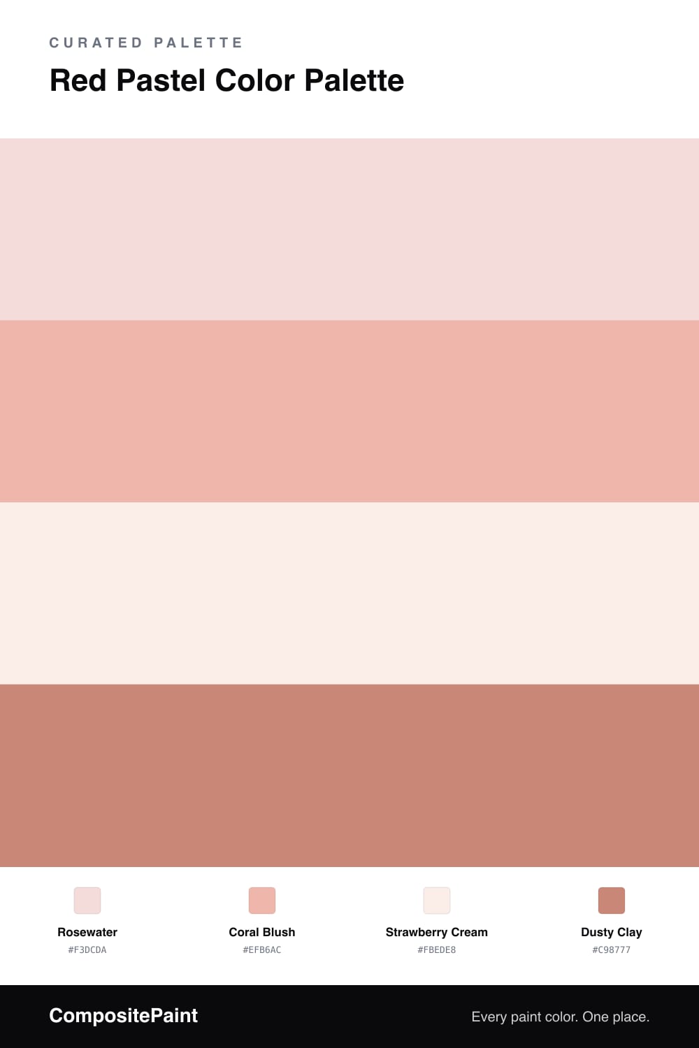
Soft pastel reds are having a real moment in 2026 — they give you the warmth of a true red without any of the drama, which makes them so easy to live with. This scheme starts with Rosewater as the dominant shade, a pale petal pink with just enough red in it to feel like a color and not a whisper.
From there, Coral Blush steps up the pigment a notch, while Strawberry Cream works as the calm base that lets the pinks breathe. Think of these three as one gentle family, slightly different versions of the same soft idea.
The one that does the real work is Dusty Clay — a deeper, earthier rose that grounds everything and keeps the palette from floating away into sweetness. Use it in small doses, and your pastels suddenly look intentional and grown-up.
Buy These Colors
Each color matched to the closest real paint in every brand, by ΔE2000. Tap a swatch for its full guide or + to save it — take any SKU to the store, they mix on demand.
Questions
Not at all. The trick is the warmth — each of these shades has a touch of clay or coral in it, so they read as gentle reds rather than washed-out pink. Rosewater leads, Coral Blush adds a little blush of pigment, and Dusty Clay gives you a deeper note so the whole thing has somewhere to land.
Reach for a warm off-white rather than a cool bright white. Strawberry Cream already acts as your soft neutral here, so for trim or a ceiling pick something with the same pink-cream undertone. A stark blue-white would make these pastels look chalky next to it.
Similar Palettes
Closest schemes by color — not by label.