Red Pastel Color Palette — Coral Blush Morning
A soft four-color scheme layering rosewater, coral blush, and strawberry cream with a warm putty base — every color matched to real paint you can buy.
By Jessica Williams · Color Stylist & Interior Editor
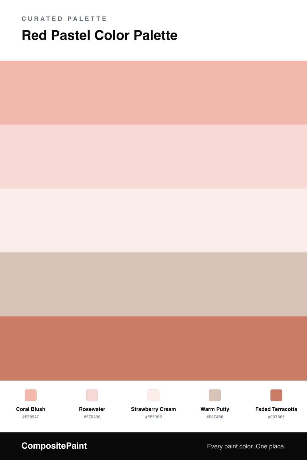
There is something gentle and unhurried about a room built on pastel reds. This scheme opens with Coral Blush, a warm, peachy pink that feels like early light on a plaster wall, then softens into Rosewater and a barely-there Strawberry Cream so the whole palette breathes rather than shouts.
To keep all that sweetness honest, Warm Putty steps in as a grounding support — a dusty greige that reads almost neutral next to the pinks and stops the scheme from tipping into nursery territory. It is the quiet hand that makes the pastels feel current and lived-in.
Then comes Faded Terracotta, the one note with some depth. Used sparingly on a door, a chair, or a single shelf, it gives your eye somewhere to land and pulls the soft reds together. Let the blush lead, let the creams fill, and save the terracotta for the spark.
Buy These Colors
Each color matched to the closest real paint in every brand, by ΔE2000. Tap a swatch for its full guide or + to save it — take any SKU to the store, they mix on demand.
Questions
They can if you skip the grounding tones. Let Coral Blush lead on the largest surface, keep Rosewater and Strawberry Cream as quiet fill, and lean on Warm Putty to take the edge off the sugar so the room reads calm and grown-up.
A flat or matte finish keeps these tints soft and chalky, which is where pastels look their best. Save a low-sheen eggshell for the Faded Terracotta accent, where a little light play makes the warmth glow.
Similar Palettes
Closest schemes by color — not by label.