CP

Red Pastel Color Palette — Soft Petal

A gentle five-color scheme of rosewater, coral blush, and strawberry cream, warmed with sand and a soft clay accent — every color matched to real paint you can buy.

By Emily Roberts · DIY Editor & First-Timer's Guide

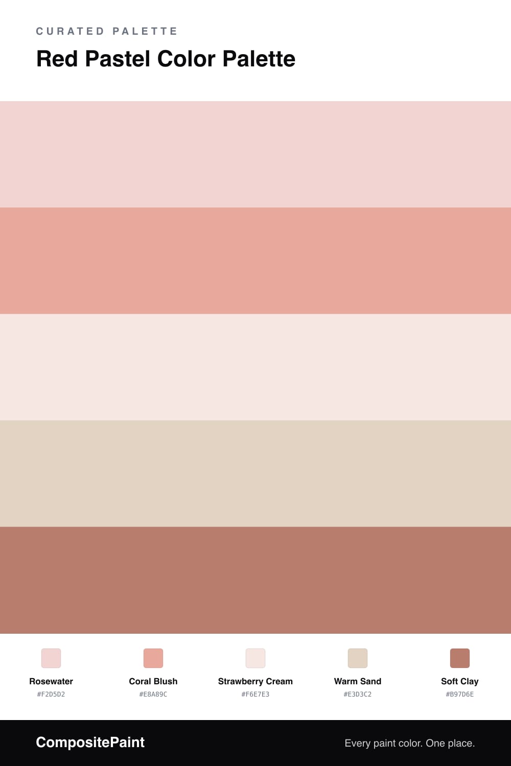
Soft reds are having a real moment, and this scheme leans into the gentlest end of that range. Rosewater is the dominant shade — a barely-there pink that feels more like warm light than a bold color — with Coral Blush stepping in as the secondary to add a little glow.

Underneath those two sits Strawberry Cream, a near-white base that keeps everything fresh and breathable, and Warm Sand as quiet support so the pinks have something grounded to lean on. If it were all petals it might float away, so a touch of Soft Clay anchors the palette and gives it a modern, lived-in warmth.

The easy way to use this is to let the pale shades cover the big areas and save the soft clay for small, deliberate spots. That little bit of depth is what turns a sweet idea into a palette you’ll still love next year.

View palette in
Rosewater
Dominant
Benjamin Moore Tippy Toes · 1282
#F3D3D1
LRV 70
Coral Blush
Secondary
Farrow & Ball Blooth Pink · No. 9806
#E6A79B
LRV 47
Strawberry Cream
Base
Sherwin-Williams Cosmetic Blush · SW 7110
#F6E7E2
LRV 83
Warm Sand
Support
Dunn-Edwards Sand Dune · DE6128
#E3D2C0
LRV 62
Soft Clay
Accent
C2 Paint Flower Pot · C2-540
#B57E6E
LRV 26

Buy These Colors

Each color matched to the closest real paint in every brand, by ΔE2000. Tap a swatch for its full guide or + to save it — take any SKU to the store, they mix on demand.

Rosewater
#F2D5D2 · LRV 71 · Dominant
Sherwin-Williams · SW 6589 · ΔE 2.19
Behr · M180-2 · ΔE 1.87
Benjamin Moore · 1282 · ΔE 1.16
Valspar · V080-1 · ΔE 1.67
PPG / Glidden · 1187-2 · ΔE 1.36
Glidden · 90RR 69/101 · ΔE 1.97
Dutch Boy · 204-1DB · ΔE 2.28
HGTV Home by Sherwin-Williams · HGSW 1057 · ΔE 2.19
Dunn-Edwards · DE6086 · ΔE 3.21
Magnolia Home · JG-34 · ΔE 9.67
Farrow & Ball · NO. 202 · ΔE 6.51
Diamond Vogel · 0082 · ΔE 1.76
Hirshfield's · 0117 · ΔE 1.91
Rodda · R121 · ΔE 6.18
C2 Paint · BD4 · ΔE 9.82
Clare · PNT100-LT-25 · ΔE 4.23
Portola Paints · GEM · ΔE 12.76
Annie Sloan · OLD OCHRE · ΔE 14.47
Backdrop · BD-CC · ΔE 15.12
Rust-Oleum · 285142 · ΔE 3.48
Kompozit · 0117 · ΔE 1.91
Coral Blush
#E8A89C · LRV 48 · Secondary
Sherwin-Williams · SW 9699 · ΔE 4.42
Behr · M200-4 · ΔE 1.64
Benjamin Moore · 031 · ΔE 1.17
Valspar · V080-3 · ΔE 1.84
PPG / Glidden · PPG1190-4 · ΔE 1.67
Glidden · 49BB 51/186 · ΔE 1.67
Dutch Boy · 206-4DB · ΔE 2.4
HGTV Home by Sherwin-Williams · HGSW 1076 · ΔE 2.81
Dunn-Edwards · DE5178 · ΔE 4.96
Magnolia Home · JG-154 · ΔE 10.18
Farrow & Ball · NO. 9806 · ΔE 0.39
Diamond Vogel · 1058 · ΔE 3.66
Hirshfield's · 1058 · ΔE 3.07
Rodda · R122 · ΔE 10.61
C2 Paint · C2-528 · ΔE 5.86
Clare · PNT100-MD-76 · ΔE 5.13
Portola Paints · ANGEL'S LANDING · ΔE 11.05
Annie Sloan · PALOMA · ΔE 15.64
Backdrop · BD-RO · ΔE 4.52
Rust-Oleum · 285143 · ΔE 21.54
Kompozit · 1058 · ΔE 3.07
Strawberry Cream
#F6E7E3 · LRV 82 · Base
Sherwin-Williams · SW 7110 · ΔE 0.5
Behr · W-D-120 · ΔE 1.05
Benjamin Moore · 2094-70 · ΔE 1.21
Valspar · P077 · ΔE 0.97
PPG / Glidden · PPG1194-1 · ΔE 1.86
Glidden · 51YR 83/054 · ΔE 0.59
Dutch Boy · 103-1DB · ΔE 2.31
HGTV Home by Sherwin-Williams · HGSW 4069 · ΔE 4.52
Dunn-Edwards · DE6092 · ΔE 2.02
Magnolia Home · JG-111 · ΔE 7.3
Farrow & Ball · NO. 245 · ΔE 2.54
Diamond Vogel · 0075 · ΔE 0.55
Hirshfield's · 0075 · ΔE 1.05
Rodda · CA043 · ΔE 5.77
C2 Paint · C2-531 · ΔE 2.45
Clare · PNT100-LT-12 · ΔE 6.71
Portola Paints · KASHMIR · ΔE 5.1
Annie Sloan · OLD OCHRE · ΔE 13.21
Backdrop · BD-JA · ΔE 7.77
Rust-Oleum · 329598 · ΔE 11.12
Kompozit · 0075 · ΔE 1.05
Warm Sand
#E3D3C2 · LRV 67 · Support
Sherwin-Williams · SW 7596 · ΔE 0.79
Behr · QE-10 · ΔE 1.19
Benjamin Moore · 1030 · ΔE 1.2
Valspar · 8007-10G · ΔE 1.15
PPG / Glidden · PPG14-21 · ΔE 2.7
Glidden · 10YY 67/089 · ΔE 1.25
Dutch Boy · 311-1DB · ΔE 1.36
HGTV Home by Sherwin-Williams · HGSW 4049 · ΔE 1.55
Dunn-Edwards · DE6128 · ΔE 0.51
Magnolia Home · JG-24 · ΔE 4.3
Farrow & Ball · NO. 2013 · ΔE 4.06
Diamond Vogel · 0181 · ΔE 1.27
Hirshfield's · 0181 · ΔE 0.88
Rodda · CA011 · ΔE 1.95
C2 Paint · C2-833 · ΔE 3.51
Clare · PNT100-LT-21 · ΔE 2.61
Portola Paints · FIGUEROA · ΔE 5.02
Annie Sloan · OLD OCHRE · ΔE 5.67
Backdrop · BD-RR · ΔE 4.58
Rust-Oleum · 285142 · ΔE 8.79
Kompozit · 0181 · ΔE 0.88
Soft Clay
#B97D6E · LRV 26 · Accent
Sherwin-Williams · SW 9005 · ΔE 2.74
Behr · ICC-102 · ΔE 1.94
Benjamin Moore · 1201 · ΔE 2.49
Valspar · 1008-7C · ΔE 3.32
PPG / Glidden · PPG1056-5 · ΔE 4.02
Glidden · PPG1056-5 · ΔE 3.68
Dutch Boy · 304-4DB · ΔE 4.53
HGTV Home by Sherwin-Williams · HGSW 2064 · ΔE 2.74
Dunn-Edwards · DE6089 · ΔE 2.28
Magnolia Home · JG-152 · ΔE 14.04
Farrow & Ball · NO. 64 · ΔE 1.9
Diamond Vogel · 0038 · ΔE 3.64
Hirshfield's · 0038 · ΔE 3.81
Rodda · CA102 · ΔE 11.28
C2 Paint · C2-540 · ΔE 1.31
Clare · PNT100-MD-28 · ΔE 5.94
Portola Paints · TIERRE · ΔE 5.01
Annie Sloan · SCANDINAVIAN PINK · ΔE 3.42
Backdrop · BD-AN · ΔE 15.95
Rust-Oleum · 398640 · ΔE 12.4
Kompozit · 0038 · ΔE 3.81

Questions

Will all these soft reds and pinks look too sweet together?

Not if you let one lead. Rosewater is the quiet dominant here, and the warm sand and soft clay pull everything toward a grown-up, earthy feel. The trick is balance — lots of the pale shades, just a touch of the deeper clay so it reads calm instead of candy.

How do I keep a pastel red room from feeling washed out?

Add contrast with the soft clay accent on a door, a frame, or a single piece of trim. That one deeper note gives your eye somewhere to land and makes all the pale petals around it look intentional rather than faded.

KEEP EXPLORING

Similar Palettes

Closest schemes by color — not by label.