Periwinkle Bedroom Palette — Soft Blue-Violet & Cool White
A dreamy pastel bedroom in periwinkle, crisp white, soft gray, and a deep indigo accent — calm, a little romantic, and restful to sleep in. Every color matched to real paint you can buy.
By Jessica Williams · Color Stylist & Interior Editor
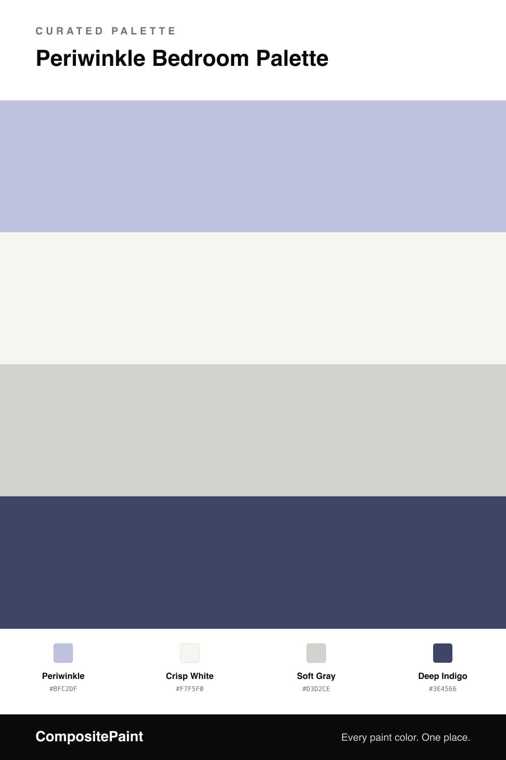
Periwinkle is one of those colors that’s hard to pin down, and that’s exactly why it’s so restful. It floats between soft blue and gentle violet, shifting with the light through the day. On bedroom walls it feels calm and a little dreamy — never cold, never loud.
A crisp white on the trim keeps it fresh, and a soft gray through furniture or a rug steadies the room so the periwinkle can stay light. Those quiet neutrals are what keep the whole thing from drifting too sweet.
The deep indigo is your anchor. Bring it in on bedding, a headboard, or one painted wall, and it gives the pastels real depth. Use it sparingly and the room feels grown-up and romantic — soft color leading, gray supporting, and that one deep blue-violet holding it all in place.
Buy These Colors
Each color matched to the closest real paint in every brand, by ΔE2000. Tap a swatch for its full guide or + to save it — take any SKU to the store, they mix on demand.
Questions
It sits right between the two, which is part of its charm. In warm light it leans soft violet; in cool daylight it reads more blue. That gentle shift is what makes it feel calm and a little romantic on bedroom walls.
Lean into the deeper notes. The indigo accent, soft gray furniture, and crisp white trim give the room structure and weight, so the periwinkle reads as a soft, grown-up color rather than a sweet pastel.
Similar Palettes
Closest schemes by color — not by label.