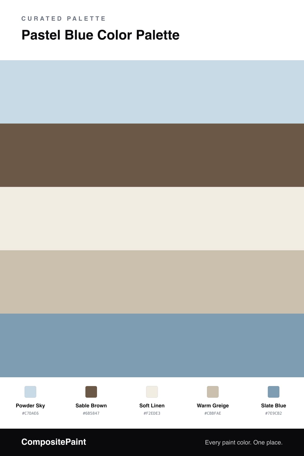
Pastel Blue Color Palette — Sable Morning
A soft four-color scheme pairing airy pastel blue with a grounding sable brown and quiet warm neutrals, with every color matched to real paint you can buy.
By Maya Patel · Reviews Editor & Product Tester
Pastel blue can drift into baby-nursery territory fast, so the trick is giving it a grown-up partner. Here Powder Sky carries the room with that soft, airy blue everyone wants right now, and Sable Brown steps in as the anchor that keeps it from feeling flimsy.
Soft Linen and Warm Greige fill the space between them, doing the quiet work so nothing competes. They are the neutrals you barely notice, which is exactly the point — they let the blue stay the star.
For the spark, Slate Blue bridges the two extremes: it echoes the pastel but with more depth, so it reads as a deliberate accent rather than a third unrelated color. This is a calm, current scheme that leans warm-minimal without going cold. Powder Sky leads, sable grounds, and the rest stay out of the way.
Buy These Colors
Each color matched to the closest real paint in every brand, by ΔE2000. Tap a swatch for its full guide or + to save it — take any SKU to the store, they mix on demand.
Questions
Cool and warm balance each other. The pastel blue keeps the room light and fresh, while the sable brown adds weight so the space does not feel washed out or chilly.
Lead with the pastel blue on the largest surfaces, keep the linen and greige as quiet backups, and save sable and slate blue for trim, furniture, or one accent wall.
Similar Palettes
Closest schemes by color — not by label.