CP

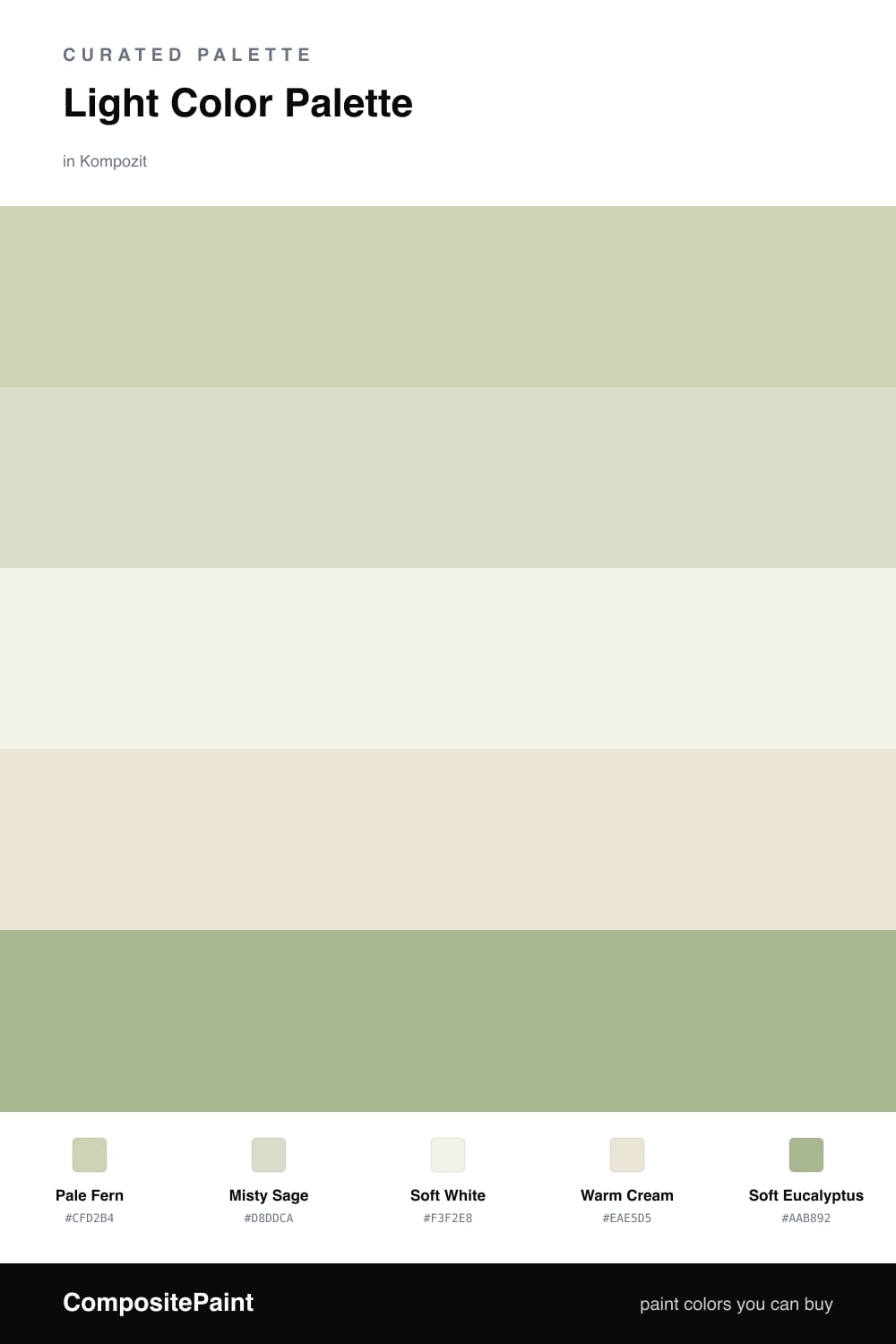
Light Color Palette — Fern & Mist

A soft, high-key five-color scheme of pale fern green, misty sage, and warm cream that stays bright and low-contrast — every color matched to real paint you can buy.

By Maya Patel · Reviews Editor & Product Tester

Pale Fern
Dominant
Kompozit Home Body · 0406
#CFD2B4
LRV 63
Misty Sage
Secondary
Kompozit Grassy Glade · 0433
#D8DDCA
LRV 71
Soft White
Base
Kompozit Twinkle Twinkle · 0355
#F3F2E8
LRV 88
Warm Cream
Support
Kompozit Bleached Meadow · 0376
#EAE5D5
LRV 78
Soft Eucalyptus
Accent
Kompozit Green Glass · 0751
#AAB892
LRV 45
View palette in

This is the kind of scheme I reach for when a room needs to feel open and easy. Pale Fern leads as a barely-there green, and Misty Sage sits right beside it as a softer echo, so the two greens blur together instead of competing.

Soft White and Warm Cream do the quiet work as the base, keeping everything light and reflective. They lean a touch warm, which stops the greens from going cold or clinical the way pale paints sometimes do.

The one move that earns its place is Soft Eucalyptus as the accent — a deeper, grayed green for a door, a bench, or trim. It gives the eye somewhere to land and keeps this airy, contemporary palette from drifting into nothing.

Buy These Colors

Each color matched to the closest real paint in every brand, by ΔE2000. Kompozit first; take any SKU to the store — these mix on demand.

Pale Fern
#CBD6BA · LRV 64 · Dominant
Kompozit Home Body · 0406 ΔE 3.11
Backdrop Real Real · BD-RR ΔE 9.19
Behr Unmarked Trail · N330-3 ΔE 2.88
Benjamin Moore Van Alen Green · HC-120 ΔE 1.81
Clare All The Sage · PNT100-LT-70 ΔE 4.25
Dunn-Edwards Green Lane · DE5653 ΔE 3.45
Farrow & Ball Shaded White · No. 201 ΔE 9.18
Magnolia Home Mineral Green · JG-67 ΔE 4
PPG / Glidden Pickling Spice · 1122-3 ΔE 3.08
Sherwin-Williams Topiary Tint · SW 6449 ΔE 3.23
Valspar Sunlit Sea · M323 ΔE 3.91
Misty Sage
#D7DDCC · LRV 71 · Secondary
Kompozit Grassy Glade · 0433 ΔE 0.82
Backdrop Cookies & Cream · BD-CC ΔE 6.75
Behr Desert Springs · PPU10-15 ΔE 2.18
Benjamin Moore Hint of Mint · 505 ΔE 1.38
Clare Greenish · PNT100-LT-68 ΔE 3.52
Dunn-Edwards Limestone · DE6233 ΔE 4.57
Farrow & Ball Pale Powder · No. 204 ΔE 3.3
Magnolia Home Locally Sown · JG-112 ΔE 5.38
PPG / Glidden Liberated Lime · 1127-2 ΔE 0.42
Sherwin-Williams Nonchalant White · SW 6161 ΔE 4.02
Valspar Glowing Green · 5007-3A ΔE 1.38
Soft White
#F4F2E9 · LRV 89 · Base
Kompozit Twinkle Twinkle · 0355 ΔE 0.74
Backdrop Tabula Rasa · BD-TR ΔE 0.89
Behr White Flour · OR-W10 ΔE 1.42
Benjamin Moore Cloud White · 967 ΔE 1.15
Clare Wing It · PNT100-LT-24 ΔE 3.42
Dunn-Edwards Dove's Wing · DE6267 ΔE 0.46
Farrow & Ball Wimborne White · No. 239 ΔE 1.15
Magnolia Home Silos White · JG-107 ΔE 1.09
PPG / Glidden Clear Yellow · 1215-1 ΔE 1.5
Sherwin-Williams White Flour · SW 7102 ΔE 1.51
Valspar Sunbeam · 8007-5D ΔE 2.06
Warm Cream
#ECE6D6 · LRV 79 · Support
Kompozit Bleached Meadow · 0376 ΔE 0.55
Backdrop Don't Eat the Yellow Snow · BD-DS ΔE 2.97
Behr Natural Linen · W-F-120 ΔE 1.89
Benjamin Moore White Down · 970 ΔE 0.53
Clare Like Buttah · PNT100-LT-62 ΔE 2.26
Dunn-Edwards Antique White · DEW351 ΔE 0.4
Farrow & Ball Dimity · No. 2008 ΔE 2.48
Magnolia Home Carter Crème · JG-16 ΔE 0.81
PPG / Glidden Little Lamb · 1112-1 ΔE 0.94
Sherwin-Williams Ivory Lace · SW 7013 ΔE 1.52
Valspar Shania's Lace · 3006-10C ΔE 0.76
Soft Eucalyptus
#A9B89A · LRV 45 · Accent
Kompozit Green Glass · 0751 ΔE 2.43
Backdrop Le Freak · BD-LF ΔE 4.97
Behr Spartan Stone · 780D-5 ΔE 1.46
Benjamin Moore Palisades Park · 439 ΔE 1.41
Clare Avocado Toast · PNT100-MD-49 ΔE 1.54
Dunn-Edwards Reeds · DE5647 ΔE 5.18
Farrow & Ball French Gray · No. 18 ΔE 8.17
Magnolia Home Seasonal · JG-51 ΔE 5.12
PPG / Glidden Mellow Mood · 1030-3 ΔE 4.31
Sherwin-Williams Haven · SW 6437 ΔE 3.3
Valspar Green Trellis · 5006-3C ΔE 3.17

Questions

Why do these light colors work together?

They all sit at a high tint level with low contrast, so the green and cream read as one calm wash rather than separate blocks. The eucalyptus accent gives just enough edge to keep the scheme from feeling washed out.

How do I keep a light scheme from looking flat?

Vary the finish, not the color. Pair a matte fern on the walls with an eggshell cream on the trim, and let the soft eucalyptus carry the slight depth so the room stays bright but still has shadow.

Similar Palettes

Closest schemes by color — not by label.