CP

Autumn Color Palette — Willow & Ember

A warm five-color autumn scheme blending burnt orange, maple red, and ochre with olive and deep brown — every color matched to real paint you can buy.

By Emily Roberts · DIY Editor & First-Timer's Guide

Olive Willow
Dominant
Kompozit Austere · 0354
#726848
LRV 14
Burnt Ember
Secondary
Kompozit Pretty Parasol · 1039
#AC5D3E
LRV 17
Warm Ochre
Base
Kompozit Angel Food Cake · 0913
#D7A14F
LRV 41
Maple Red
Support
Kompozit April Love · 1061
#8B3D2F
LRV 9
Deep Walnut
Accent
Kompozit Silent Sea · 0515
#2A2B2C
LRV 2
View palette in

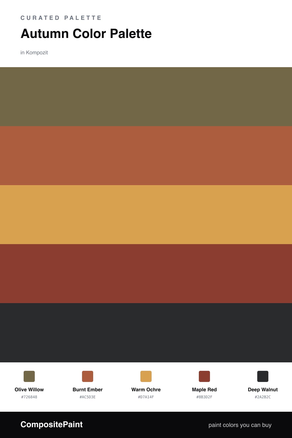
This is the palette I reach for when I want a room to feel like a crisp October walk. Olive Willow sets a soft, slightly muted tone, the kind of grounded green that has quietly become a favorite again in 2026, and Warm Ochre keeps everything sunny without going gold-heavy.

The fun comes from Burnt Ember and Maple Red. These are your spark colors, so use them in smaller amounts — a throw, a few books, one painted door — and they will read rich instead of busy. Think of them as the leaves, not the whole tree.

To tie it all together, Deep Walnut acts like the trunk: a near-brown that anchors the lighter tones and makes the warm shades pop. Lean on the olive and ochre for most of the space, and let the reds and oranges do the small, glowing work.

Buy These Colors

Each color matched to the closest real paint in every brand, by ΔE2000. Kompozit first; take any SKU to the store — these mix on demand.

Olive Willow
#6E6B47 · LRV 14 · Dominant
Kompozit Austere · 0354 ΔE 3.73
Backdrop Buenos Aires · BD-BA ΔE 14.46
Behr Butternut Wood · 710D-6 ΔE 1.25
Benjamin Moore Sage · 2143-10 ΔE 3.66
Clare Daily Greens · PNT100-DP-61 ΔE 8.74
Dunn-Edwards Spruce Woods · DE6238 ΔE 4.17
Farrow & Ball Bancha · No. 298 ΔE 2.33
Magnolia Home Landscape · JG-49 ΔE 1.58
PPG / Glidden Olive Orchard · 11-08 ΔE 1.96
Sherwin-Williams Oakmoss · SW 6180 ΔE 3.93
Valspar Vineyard View · 8003-27F ΔE 2.06
Burnt Ember
#B5602F · LRV 18 · Secondary
Kompozit Pretty Parasol · 1039 ΔE 5.07
Backdrop Buenos Aires · BD-BA ΔE 14.97
Behr Acorn Spice · S-H-280 ΔE 5.46
Benjamin Moore Gold Rush · 2166-10 ΔE 1.9
Clare Sriracha · PNT100-DP-29 ΔE 13.17
Dunn-Edwards Georgia Clay · DE5181 ΔE 5.46
Farrow & Ball Blazer · No. 212 ΔE 13.53
Magnolia Home Work Worn Wood · JG-35 ΔE 6.09
PPG / Glidden Fragrant Cloves · 1199-7 ΔE 3.63
Sherwin-Williams Husky Orange · SW 6636 ΔE 4.36
Valspar Ripe Peach · P045 ΔE 2.47
Warm Ochre
#D2A24C · LRV 40 · Base
Kompozit Angel Food Cake · 0913 ΔE 2.09
Backdrop Rosita · BD-RO ΔE 22.2
Behr Campground · 330D-5 ΔE 2.73
Benjamin Moore Buttercup · 2154-30 ΔE 1.15
Clare Good as Gold · PNT100-DP-59 ΔE 6.11
Dunn-Edwards Chipmunk · DE5376 ΔE 0.77
Farrow & Ball India Yellow · No. 66 ΔE 3.15
Magnolia Home Bright Days · JG-45 ΔE 7.05
PPG / Glidden Glorious Gold · 1107-6 ΔE 4.23
Sherwin-Williams Kingdom Gold · SW 6698 ΔE 3.75
Valspar Ripe Pear · P091 ΔE 2.36
Maple Red
#923327 · LRV 9 · Support
Kompozit April Love · 1061 ΔE 2.9
Backdrop Punk Rock · BD-PR ΔE 5
Behr Firebrick · 210D-7 ΔE 3.41
Benjamin Moore Raspberry Truffle · 2080-10 ΔE 5.64
Clare Vintage · PNT100-DP-67 ΔE 11.74
Dunn-Edwards Deep Crimson · DEA152 ΔE 5.48
Farrow & Ball Incarnadine · No. 248 ΔE 7.48
Magnolia Home Create · JG-28 ΔE 8.9
PPG / Glidden Apple-a-day · 1051-7 ΔE 8.63
Sherwin-Williams Bolero · SW 7600 ΔE 3.47
Valspar Dante's Cardigan · M251 ΔE 1.47
Deep Walnut
#352A22 · LRV 3 · Accent
Kompozit Silent Sea · 0515 ΔE 8.33
Backdrop Hocus Pocus · BD-HP ΔE 10.53
Behr Beluga · 770F-7 ΔE 12.34
Benjamin Moore Bucktrout Brown · CW-180 ΔE 3.88
Clare Blackish · PNT100-DP-54 ΔE 10.96
Dunn-Edwards Black · DEA187 ΔE 8.34
Farrow & Ball Pitch Black · No. 256 ΔE 7.53
Magnolia Home Blackboard · JG-05 ΔE 10.99
PPG / Glidden Black Magic · 1001-7 ΔE 9.56
Sherwin-Williams Raisin · SW 7630 ΔE 6.88
Valspar Tomcat · 8006-12G ΔE 7.52

Questions

Why do these autumn colors work together?

They all share a warm, earthy base, so they feel like they came from the same fall afternoon. The olive cools things down just enough to keep the oranges and reds from feeling heavy.

How do I use them in a room?

Let the olive lead and the warm ochre carry the walls, then add the burnt orange and maple red in smaller doses — pillows, a chair, a piece of art — with deep walnut for grounding.

Similar Palettes

Closest schemes by color — not by label.