CP

Aqua Living Room Palette — Coastal Aqua & Warm Walnut

A calm five-color living room scheme led by soft aqua walls, balanced with greige, crisp white, warm walnut, and a deep teal accent — every color matched to real paint you can buy.

By David Chen · Formulation Lead & Resident Chemist

Coastal Aqua
Walls
Kompozit Shimmering Glade · 0707
#A3D6C5
LRV 60
Soft Greige
Trim & Ceiling
Kompozit Mossy Shade · 0195
#DBD2C7
LRV 65
Cloud White
Cabinets or Vanity
Kompozit Cyprus Spring · 0411
#F2F2EA
LRV 88
Warm Walnut
Wood & Floors
Kompozit Evolution · 0130
#704A3D
LRV 9
Deep Teal
Accent
Kompozit Blue Period · 0690
#075158
LRV 7
View palette in

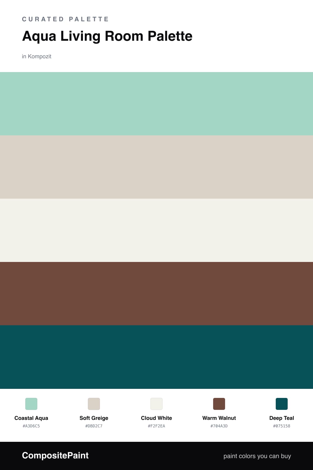
Think of aqua as the temperature dial of this room. Coastal Aqua on the walls is soft enough to live with all day, like sea glass held up to morning light. It leans contemporary for 2026 — quieter and grayer than the bright turquoise of a decade ago.

To keep that aqua from feeling like a pool tile, I warm it from both sides. Soft Greige on the trim and ceiling is the neutral bridge, and Cloud White on any built-ins or cabinetry keeps the brightest notes clean. Warm Walnut floors do the real heavy lifting here, grounding the cool walls with honest brown weight.

The last move is contrast. A single Deep Teal accent — a sofa, a painted niche, a band of cabinet fronts — pulls the whole scheme into focus. Use it sparingly, roughly one-fifth of the room, and let the aqua and the wood carry the rest.

Buy These Colors

Each color matched to the closest real paint in every brand, by ΔE2000. Kompozit first; take any SKU to the store — these mix on demand.

Coastal Aqua
#9ECFCB · LRV 56 · Walls
Kompozit Shimmering Glade · 0707 ΔE 5.25
Backdrop Lost in the 80s · BD-LO ΔE 11.48
Behr Hopeful Blue · BIC-23 ΔE 0.84
Benjamin Moore Lake Victoria · 668 ΔE 0.87
Clare Summer Friday · PNT100-LT-37 ΔE 9.05
Dunn-Edwards Fountain City · DE5723 ΔE 1.74
Farrow & Ball Blue Ground · No. 210 ΔE 5.09
Magnolia Home Vibrant Horizon · JG-88 ΔE 6.95
PPG / Glidden Tarreyton · 1140-3 ΔE 4.12
Sherwin-Williams Bora Bora Shore · SW 9045 ΔE 2.7
Valspar Lake Breeze · 5007-7B ΔE 2.15
Soft Greige
#DAD3C7 · LRV 66 · Trim & Ceiling
Kompozit Mossy Shade · 0195 ΔE 1.26
Backdrop Real Real · BD-RR ΔE 2.4
Behr Windrush · HDC-CT-19 ΔE 0.86
Benjamin Moore Alaskan Skies · 972 ΔE 1.56
Clare Beigeing · PNT100-LT-18 ΔE 2.68
Dunn-Edwards Shady · DEC774 ΔE 1.14
Farrow & Ball Shaded White · No. 201 ΔE 2.17
Magnolia Home Stoneware Pieces · JG-55 ΔE 3.61
PPG / Glidden Gray Beige · 14-30 ΔE 1.3
Sherwin-Williams Natural Tan · SW 7567 ΔE 1.57
Valspar Warm Putty · 6006-1A ΔE 0.57
Cloud White
#F4F1EA · LRV 88 · Cabinets or Vanity
Kompozit Cyprus Spring · 0411 ΔE 1.67
Backdrop Tabula Rasa · BD-TR ΔE 2.02
Behr Nano White · HDC-MD-06 ΔE 1.4
Benjamin Moore Gardenia · AF-10 ΔE 0.21
Clare Wing It · PNT100-LT-24 ΔE 2.46
Dunn-Edwards Fossil · DE6225 ΔE 0.48
Farrow & Ball Wimborne White · No. 239 ΔE 1.78
Magnolia Home Silos White · JG-107 ΔE 0.68
PPG / Glidden Delicate White · 1001-1 ΔE 2.13
Sherwin-Williams White Flour · SW 7102 ΔE 1.48
Valspar Santa's Beard · 8007-6E ΔE 1.18
Warm Walnut
#6B4E37 · LRV 9 · Wood & Floors
Kompozit Evolution · 0130 ΔE 6.46
Backdrop It's a Date · BD-IT ΔE 4.93
Behr Outback Brown · BXC-65 ΔE 0.58
Benjamin Moore Seed Brown · 2096-10 ΔE 3.39
Clare Vintage · PNT100-DP-67 ΔE 12.87
Dunn-Edwards Chaps · DE6049 ΔE 5.84
Farrow & Ball Preference Red · No. 297 ΔE 14.9
Magnolia Home Mountain Currant · JG-171 ΔE 7.46
PPG / Glidden Pumpernickel · 15-22 ΔE 5.19
Sherwin-Williams Cowboy Boots · SW 9115 ΔE 3.26
Valspar Cowboy Hat · 3010-8 ΔE 3.33
Deep Teal
#1F4A4E · LRV 6 · Accent
Kompozit Blue Period · 0690 ΔE 3.68
Backdrop After Hours · BD-AH ΔE 11.92
Behr Thermal · S440-7 ΔE 2.33
Benjamin Moore River Blue · 2057-10 ΔE 3.74
Clare Blackish · PNT100-DP-54 ΔE 14.98
Dunn-Edwards Deep Pine · DEA180 ΔE 3.61
Farrow & Ball Hague Blue · No. 30 ΔE 9.22
Magnolia Home Arches · JG-97 ΔE 12.19
PPG / Glidden Sailor's Coat · 1153-7 ΔE 8.5
Sherwin-Williams Moscow Midnight · SW 9142 ΔE 5.2
Valspar Deep Galaxy · 8003-41G ΔE 6.28

Questions

Why does aqua work so well in a living room?

Aqua sits between blue and green, so it reads as fresh and restful at the same time. In a room where people sit and talk for hours, that gentle cooling effect keeps the space feeling open without going cold, especially when warm wood is nearby.

How do I keep an aqua room from feeling too cool?

Anchor it with warmth. Here the walnut floors and greige trim add weight and a touch of brown, while the deep teal accent gives the eye somewhere to land — together they stop the aqua from drifting into a chilly, washed-out look.

Similar Palettes

Closest schemes by color — not by label.