CP

Aqua Dining Room Palette — Lagoon Mist & Walnut Smoke

A calm five-color dining room scheme led by soft aqua walls, grounded by warm walnut and a deep slate accent — every color matched to real paint you can buy.

By David Chen · Formulation Lead & Resident Chemist

Lagoon Mist
Walls
Kompozit Restful Retreat · 0497
#B1C7C9
LRV 54
Quiet Linen
Trim & Ceiling
Kompozit Hint of Vanilla · 0001
#EEE8DC
LRV 81
Soft Chalk
Cabinets or Vanity
Kompozit Cyprus Spring · 0411
#F2F2EA
LRV 88
Walnut Smoke
Wood & Floors
Kompozit Coffee Shop · 0151
#725042
LRV 10
Deep Teal Slate
Accent
Kompozit Blue Period · 0690
#075158
LRV 7
View palette in

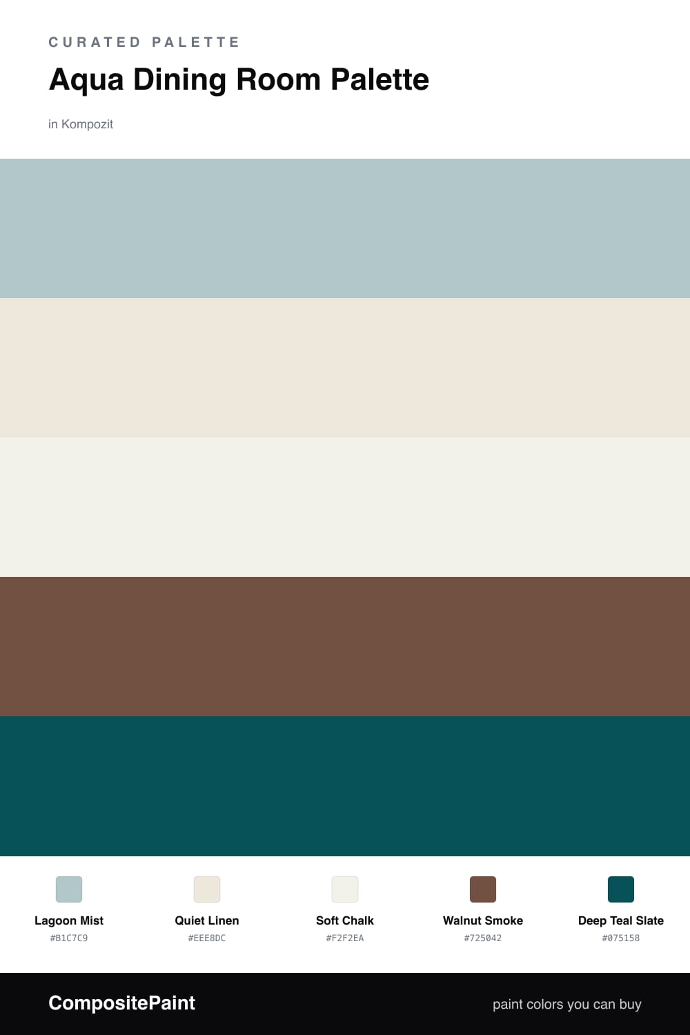
Aqua is one of those colors that behaves differently depending on what you stand it next to. On its own it can drift cold, but give it a warm partner and it settles into something soft and welcoming. That is exactly the trick here — Lagoon Mist carries the walls with a gentle, watery calm, while Walnut Smoke on the floors and table wood pulls the whole room back toward warmth.

The two whites do quiet but important work. Quiet Linen on the trim and ceiling has just enough cream in it to flatter the aqua, and Soft Chalk keeps cabinets and built-ins bright without going stark. Think of them as the cushion that lets the aqua breathe.

For the finishing note, Deep Teal Slate is the aqua turned all the way up and dimmed down — same family, far more depth. Use it sparingly on a sideboard, a single accent wall, or chair frames. A little of that darker tone makes the lighter aqua look intentional and current, which is right where 2026 dining rooms are headed.

Buy These Colors

Each color matched to the closest real paint in every brand, by ΔE2000. Kompozit first; take any SKU to the store — these mix on demand.

Lagoon Mist
#A7CBC6 · LRV 55 · Walls
Kompozit Restful Retreat · 0497 ΔE 5.74
Backdrop Lost in the 80s · BD-LO ΔE 10.36
Behr Half Sea Fog · N470-3 ΔE 1.33
Benjamin Moore Thunderbird · 675 ΔE 1.3
Clare Summer Friday · PNT100-LT-37 ΔE 6.81
Dunn-Edwards Seaport · DE5744 ΔE 2.77
Farrow & Ball Blue Ground · No. 210 ΔE 3.85
Magnolia Home It Is Well · JG-76 ΔE 4.71
PPG / Glidden Copenhagen · 1137-4 ΔE 2.71
Sherwin-Williams Aloe · SW 6464 ΔE 3.98
Valspar New-Age Green · M315 ΔE 0.84
Quiet Linen
#EDE7DA · LRV 80 · Trim & Ceiling
Kompozit Hint of Vanilla · 0001 ΔE 0.5
Backdrop Don't Eat the Yellow Snow · BD-DS ΔE 4.1
Behr Exclusive Ivory · HDC-MD-11 ΔE 1.57
Benjamin Moore White Down · 970 ΔE 1.15
Clare Like Buttah · PNT100-LT-62 ΔE 2.53
Dunn-Edwards Ball of String · DE6190 ΔE 1.07
Farrow & Ball James White · No. 2010 ΔE 2.18
Magnolia Home Antique Rose · JG-23 ΔE 0.22
PPG / Glidden Enduring Ice · 1102-1 ΔE 1.48
Sherwin-Williams Futon · SW 7101 ΔE 1.17
Valspar Dover White · 7007-1 ΔE 0.53
Soft Chalk
#F6F3EC · LRV 90 · Cabinets or Vanity
Kompozit Cyprus Spring · 0411 ΔE 1.71
Backdrop Tabula Rasa · BD-TR ΔE 2.04
Behr Whisper White · HDC-MD-08 ΔE 0.58
Benjamin Moore Opulence · 879 ΔE 0.99
Clare Timeless · PNT100-LT-04 ΔE 1.25
Dunn-Edwards Droplets · DEW381 ΔE 0.97
Farrow & Ball Wimborne White · No. 239 ΔE 1.74
Magnolia Home True White · JG-21 ΔE 2.01
PPG / Glidden Delicate White · 1001-1 ΔE 2.15
Sherwin-Williams High Reflective White · SW 7757 ΔE 1.6
Valspar Ivory Keys · 8007-4A ΔE 0.95
Walnut Smoke
#6E513C · LRV 10 · Wood & Floors
Kompozit Coffee Shop · 0151 ΔE 4.31
Backdrop Buenos Aires · BD-BA ΔE 5.14
Behr Outback Brown · BXC-65 ΔE 1.03
Benjamin Moore Brown Tar · 2110-20 ΔE 1.46
Clare Vintage · PNT100-DP-67 ΔE 11.96
Dunn-Edwards Rich Mocha · DEA159 ΔE 3.01
Farrow & Ball Preference Red · No. 297 ΔE 14.23
Magnolia Home Mountain Currant · JG-171 ΔE 6.97
PPG / Glidden Bigfoot · 1061-7 ΔE 4.78
Sherwin-Williams Rookwood Medium Brown · SW 2807 ΔE 1.73
Valspar Leather & Lace · V088-6 ΔE 2.69
Deep Teal Slate
#284B4A · LRV 6 · Accent
Kompozit Blue Period · 0690 ΔE 5.45
Backdrop North End · BD-NE ΔE 8.32
Behr Thermal · S440-7 ΔE 1.52
Benjamin Moore Mallard Green · 2053-10 ΔE 1.43
Clare Blackish · PNT100-DP-54 ΔE 13.98
Dunn-Edwards Deep Pine · DEA180 ΔE 1.36
Farrow & Ball Hague Blue · No. 30 ΔE 9.67
Magnolia Home Arches · JG-97 ΔE 11.99
PPG / Glidden Midnight Hour · 1038-7 ΔE 9.88
Sherwin-Williams Hunt Club · SW 6468 ΔE 5.65
Valspar Peacock House · 5010-4 ΔE 3.44

Questions

Why does aqua work so well in a dining room?

Aqua sits between blue and green, so it reads fresh and calm without feeling cold. In a room built around gathering and food, that softness keeps the space relaxed and easy to linger in.

How do I keep an aqua room from feeling too cool?

Pair it with a warm wood tone and a creamy white. Here the walnut floor and linen trim add warmth, so the aqua stays crisp instead of chilly.

Similar Palettes

Closest schemes by color — not by label.