Seafoam Study Palette — Seafoam Mist & Spiced Walnut
A calm five-color study scheme led by soft seafoam, balanced with warm walnut, a clean white, and a deep teal accent — every color matched to real paint you can buy.
By Emily Roberts · DIY Editor & First-Timer's Guide
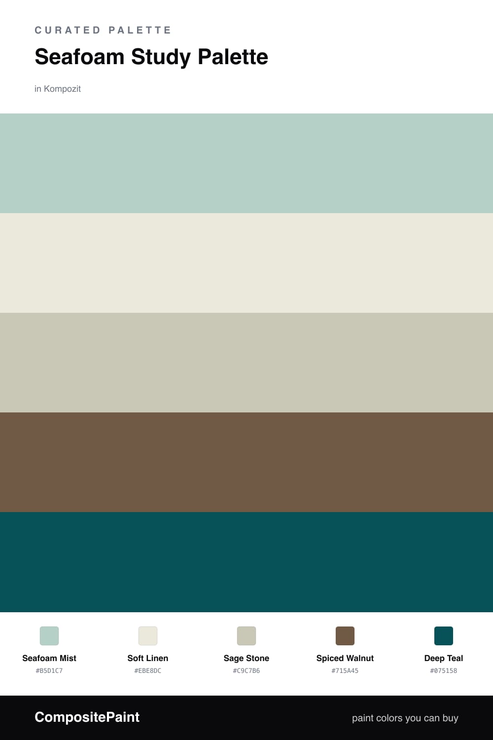
A study should feel calm enough to focus in, and seafoam is one of the easiest colors to live with all day. Here Seafoam Mist wraps the walls in a soft, watery green that reads contemporary without trying too hard, while Soft Linen on the trim and ceiling keeps everything bright and clean.
For the built-ins or a vanity, Sage Stone sits a half-step grayer than the walls, so your shelves feel grounded instead of disappearing. Down low, Spiced Walnut brings in real warmth through wood floors or a desk — that touch of brown is what stops a seafoam room from feeling chilly.
The spark is Deep Teal. Use it in small, confident doses — a bookshelf back, a chair, a painted door — and it pulls the whole palette together. It is the same family as the seafoam, just turned way up, which is why it feels intentional rather than loud.
Buy These Colors
Each color matched to the closest real paint in every brand, by ΔE2000. Kompozit first; take any SKU to the store — these mix on demand.
Questions
Seafoam is a quiet, low-energy green that helps your eyes relax — perfect for a room where you read, think, or work. It keeps the space feeling fresh without ever feeling cold.
Keep it small. Use Deep Teal on one bookshelf back, a desk, or a single feature wall, and let the soft seafoam carry the rest of the room. Roughly one-fifth teal to four-fifths the lighter tones.
Similar Palettes
Closest schemes by color — not by label.