Beetroot
The deep burgundy from Sherwin-Williams' expert picks, reviewed honestly: the light that keeps it wine-red, the light that turns it black, and where it actually belongs.

Jessica has spec'd whites and neutrals for more than 300 rooms and keeps a sample wall of painted drawdowns in her studio. Every color review is checked against real reader rooms in the comments and re-tested when a formula changes. About the testing process →
- 1Redwood0
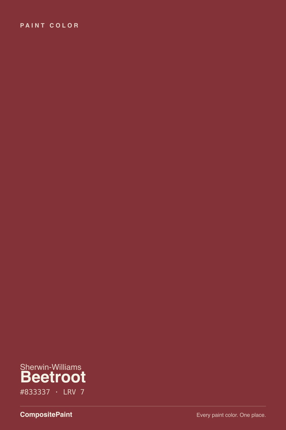
- 2Beetroot7
- 3Million Dollar Red13
- 4Cinnamon Slate19
The Fast Verdict
Beetroot is a true burgundy dialed down to LRV 7 — deep enough to sit next to black on a fan deck, warm enough that it never quite gets there. In lamplight the wine-red comes forward and it looks rich and deliberate, like a color someone chose on purpose. In flat, cool daylight it can collapse toward a plain black-brown and lose the point entirely. It is not a whole-house color and was never meant to be — it is a dining room, a powder room, an island, a front door.
Dining rooms with warm lamplight · powder rooms and small baths · kitchen islands and cabinetry · front doors that want ruby depth, not fire-engine red · dens, libraries and built-ins
You want a true bright red, not a burgundy · your room is small, windowless and lit by cool white LEDs · you are painting an open-plan great room floor-to-ceiling · you already have another warm red or terracotta nearby
- Genuine burgundy depth — reads wine-red, not flat brown, under warm light
- Deep enough (LRV 7) to hide scuffs and hold its color in daylight
- Small rooms take the whole-wall commitment beautifully — powder rooms, dining rooms
- Flatters brass, walnut and other dark warm woods
- A confident front-door color that stops short of fire-engine red
- Cool LEDs and dim rooms flatten it toward plain black-brown, losing the red
- Too dark and enclosing for an open-plan great room floor-to-ceiling
- Needs a gray-tinted primer and real coverage effort — deep reds are notoriously hard to lay down evenly
- Competes rather than coordinates with another warm red or terracotta nearby
What Color Is Beetroot, Really?
Beetroot is a dark, muted red with a brown-plum cast — a genuine burgundy, not a maroon-tinted brown. Owners who have sampled it describe exactly this line: enough purple in the mix to keep it reading as wine rather than mud, but not so much that it drifts toward eggplant. Sherwin-Williams puts it in the red family for a reason — under warm light it is unmistakably red, just a red that has been aged down several shades from anything you'd call bright.
At LRV 7 it sits in the same depth bracket as the deck's near-black neutrals, and it behaves like them: it reflects almost no light, holds its color densely on a wall, and hides scuffs and handprints the way a pale color never could. That same depth is the whole risk profile of the color — a hair less light in the room and the red pigment stops registering, leaving something closer to a flat brown-black. Sample it big, and sample it in the actual room, not the store aisle.
Undertone in one line: warm red first, a whisper of plum-purple second — never orange, never a true chocolate brown. If your sample reads as plain dark brown, the room is starved for warm light; if it reads black, the room is even dimmer than that.
Where It Shines
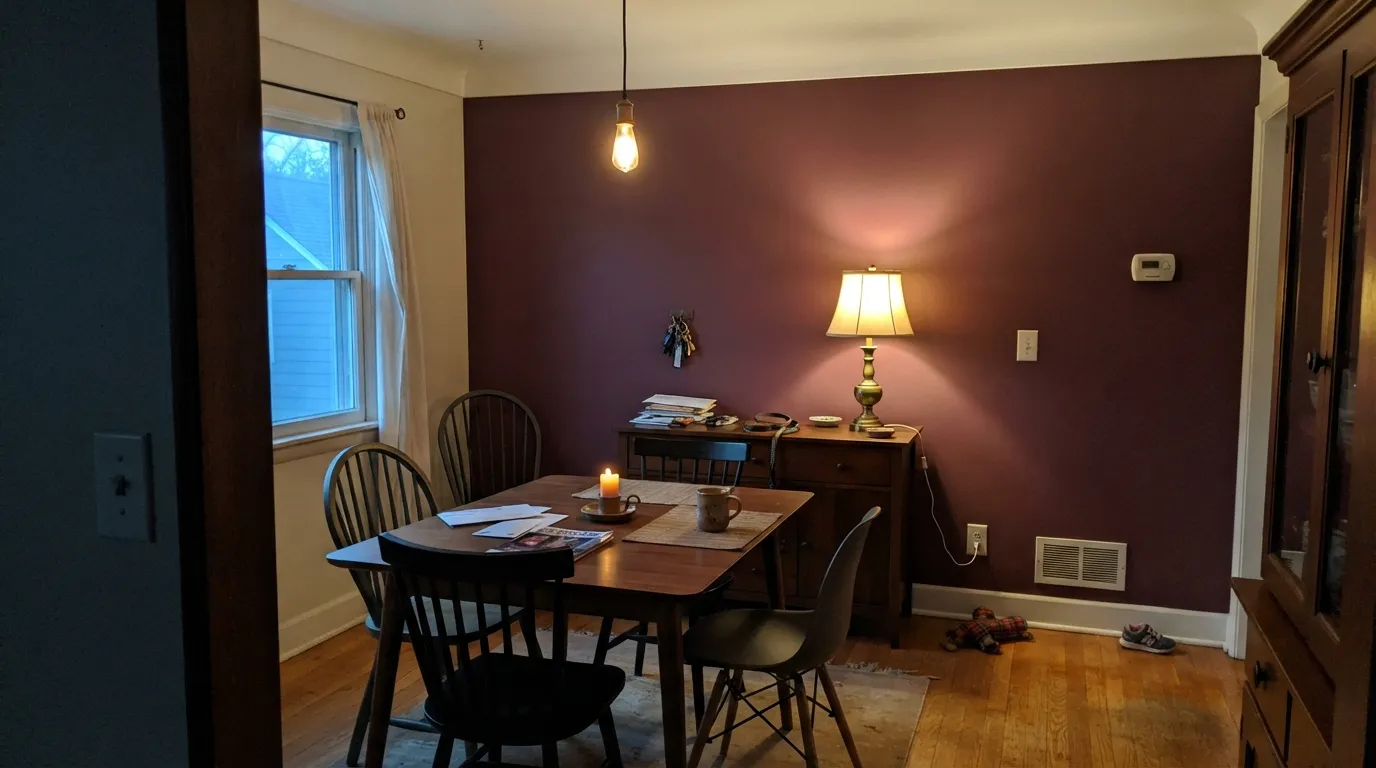
Give it lamplight, brass, dark wood and a room small enough to wrap around, and Beetroot is one of the more satisfying deep colors in the deck to live with. It is built for the rooms people use after the sun goes down — dining rooms, powder rooms, snug dens — where the depth reads as intentional and expensive rather than as a mistake. In doses, on an island or a front door, it does the same job without the commitment: a shot of genuine color that still coordinates with almost anything warm and neutral around it.
Where It Fails
Nearly every disappointed review of a very dark red like Beetroot traces back to one of three predictable setups. None of them are the paint failing — they are the paint being asked to do a job it was never suited for.
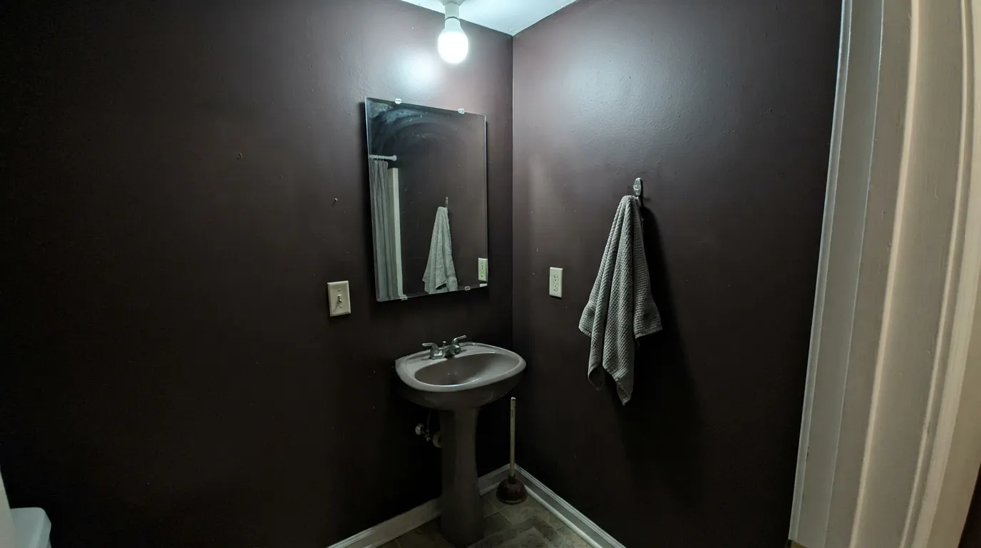
At LRV 7 the color needs help from the room to read as red at all. A windowless powder room lit only by a cool white overhead can flatten Beetroot into a plain near-black — no wine, no warmth, just dark. Swap in a warm 2700K bulb, or add a lamp, before blaming the paint.
This color was built for enclosed rooms you can close a door on. Run it across an open-plan living-kitchen-dining space and it stops feeling rich and starts feeling like a cave, especially once evening light fades and there is no natural contrast left in the room. Keep it to one closed room, or one surface — an island, a door, an accent wall — inside an open plan.
Two different reds in sight of each other compete instead of coordinating — the eye keeps trying to reconcile them and neither wins. If a room already has a rusty terracotta tile, a brick fireplace, or another red accent, do not add Beetroot to the same sightline; pair it with neutrals, dark wood or green instead.
Room by Room
Evening use, lamplight, a table full of warm wood: this is exactly the brief Beetroot was written for. Eggshell on the walls, White Dove or Alabaster on the trim to keep the room from feeling sealed shut.
Small rooms take deep color well, and a powder room is used in short bursts under whatever light you install — so you control the variable that makes or breaks this color. Add a warm sconce and it looks custom, not cave-like.
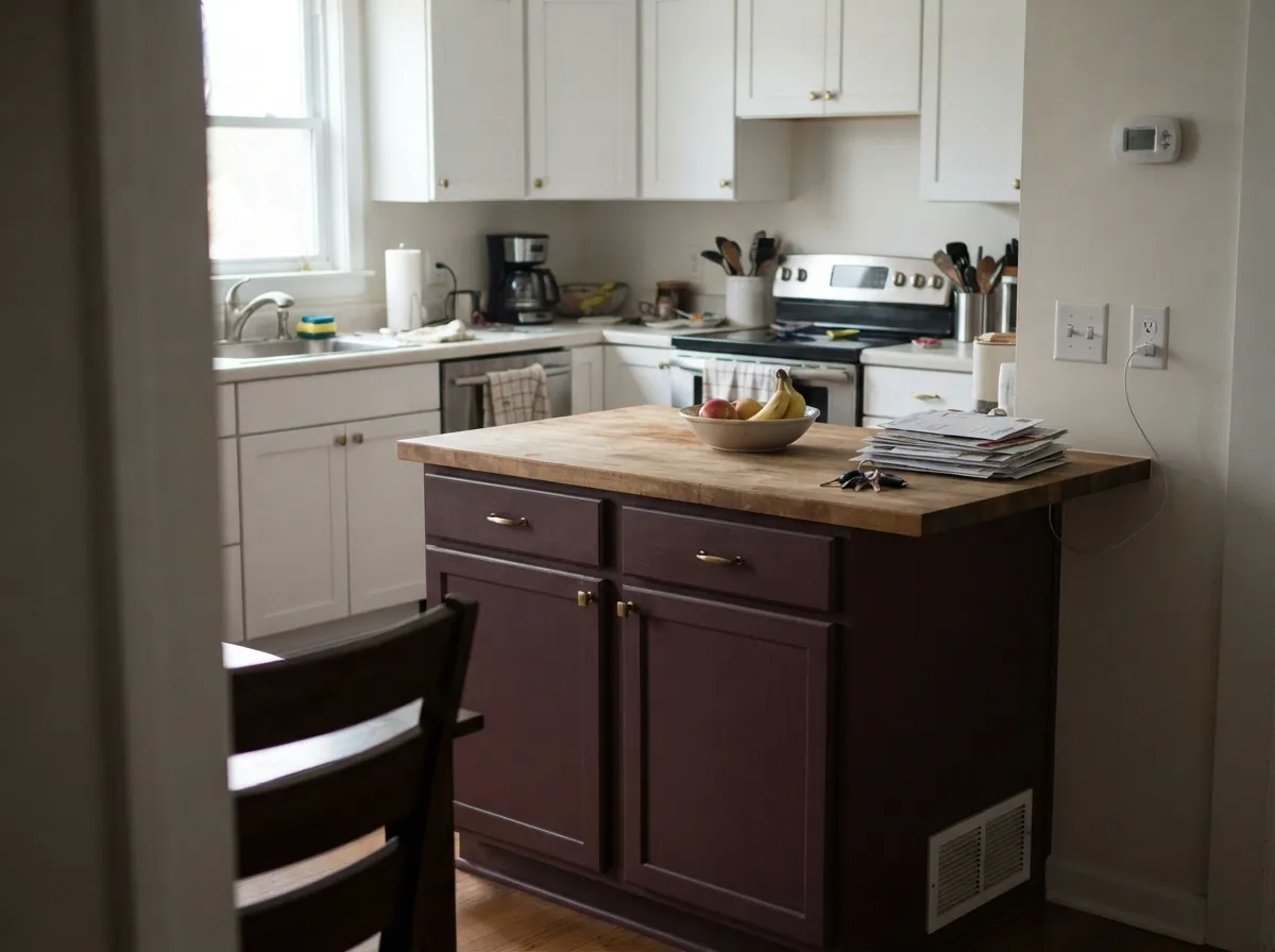
On an island under white perimeter cabinets, Beetroot reads as a deliberate design choice against brass hardware and butcher block. A full kitchen of it fights the room's daytime task lighting; keep it to one piece of furniture-grade cabinetry.
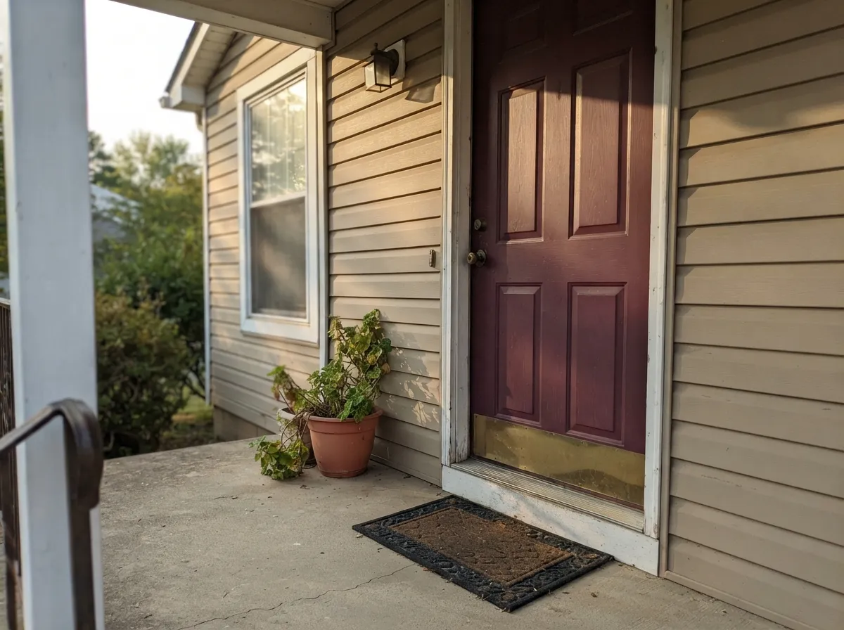
Against a sandy, tan or warm white exterior, a Beetroot door reads as a moody, confident entrance rather than a bright red one. Semi-gloss holds up outdoors and lets the ruby undertone show in direct sun.
Built-ins, leather, brass reading lamps: the color disappears into the shadows during the day and comes alive at night, which is exactly how these rooms get used. Satin on trim and shelving.
In a closed, lamplit living room it can work the same way the dining room does. In an open floor plan connected to a kitchen and entry, it is too dark and too committed — pick a lighter warm neutral for the shared walls and save Beetroot for a door or an accent.
Your Light Is the Risk
2700K lamps pull the wine-red forward and the color looks rich and deliberate. This is the light the color was bought for.
Cool, flat light drains the red pigment out and leaves something close to plain black-brown. Test in the actual room before committing.
Golden-hour sun flushes it distinctly ruby for an hour; midday light flattens it back toward neutral dark.
2700K bulbs keep the wine tone alive at night. Cool white LEDs push it toward a flat, slightly muddy near-black — swap the bulb before you swap the paint.
Most complaints about Beetroot are a light mismatch. Upload a photo of your actual room and see it on your walls — then ask for the same wall in north light or evening lamps before you buy a single sample.
Need It From Another Brand?
Any paint counter can custom-tint Sherwin-Williams SW 9695 directly. If you would rather stay in one brand's own deck, these are the closest stock matches, measured as ΔE2000. Under 2 is a difference you will not see on the wall.
| Brand | Closest color | ΔE | LRV | |
|---|---|---|---|---|
| Behr | Roasted Pepper180D-7 · Behr | 2.7 | 7 | Color page → |
| Benjamin Moore | PomegranateAF-295 · Benjamin Moore | 2.2 | 9 | Color page → |
| Valspar | Wine CaskT513 · Valspar | 1.9 | 7.3 | Color page → |
| PPG / Glidden | Ruby LipsPPG1052-7 · PPG / Glidden | 4.1 | 8 | Color page → |
| Glidden | Oriental Berry96RR 08/311 · Glidden | 3.0 | 8 | Color page → |
| Dutch Boy | Holden' My Heart303-6DB · Dutch Boy | 2.7 | 8 | Color page → |
Similar Sherwin-Williams Colors
The nearest shades to Beetroot within Sherwin-Williams's own range, ranked by perceptual color distance — useful when you want the same look a touch lighter, darker, or warmer.
WCAG 2.1: AA is 4.5 : 1 for normal text, 3 : 1 for large text, AAA is 7 : 1.
Beetroot vs the Colors You're Also Considering
Every Beetroot sample board has the same rivals on it. The numbers show the real lightness gap — then it comes down to which risk you would rather live with.
Pick this for the deeper, more burgundy, more forgiving-on-four-walls version of a dark red.
Benjamin Moore AF-290 · LRV 8CalientePick this if you want a true, brighter red for a door or one bold room — Caliente is louder and has none of the purple.
Pick this for a color that stays calm and usable in ordinary daylight, not just at night.
Benjamin Moore 2003-10 · LRV 8Million Dollar RedPick this for a lacquer-bright red built to live under lamplight in one statement room.
Beetroot Coordinating Colors
The rule for coordinating with Beetroot: warm whites to give it breathing room, one near-black to anchor it instead of compete with it, and dark, muted greens if you want a second color at all. Avoid other warm reds and terracottas in the same sightline — two different reds fight rather than coordinate. These are the partners that keep it looking deliberate:
Beetroot's Story: Reds With Real Depth
Beetroot sits in Sherwin-Williams' own curated expert picks rather than being a fringe deck color, and its use case is consistent across the sources that cover it: a front door or interior room that wants a red with genuine depth rather than a bright, primary red. Sherwin-Williams itself groups reds like this — deep, ruby-leaning — as a front-door option specifically for houses in warm, sandy or tan exteriors, where the door reads as a rich, grounded accent instead of a loud one.
The broader trend it rides is the return of saturated, enclosed-room color after a decade of all-white interiors — dining rooms, powder rooms and libraries painted in deep reds, greens and blues rather than left neutral. Beetroot's brown-plum cast is what keeps it from reading as a costume-y, primary Christmas red; it is closer to the burgundy you'd find in an old velvet chair than the red of a stop sign.
Beetroot With Wood Tones and Metals
Dark, warm woods are this color's best company: walnut, espresso stain and butcher block all sit at a similar depth, so the room reads cohesive instead of stark. Unlacquered or antique brass is the metal to reach for — it warms up next to Beetroot the same way it does next to any deep red or burgundy, while polished chrome and nickel read cold and slightly out of place beside it.
Very light or pale wood — blonde oak, whitewashed floors — creates the starkest possible contrast against a color this dark. That can genuinely work in a modern dining room built around the contrast on purpose, but in a small room it tends to make the paint feel heavier than intended. If the floor is pale, lean on a warm rug or warm-toned furniture in the same room to bridge the gap.
Three Ready Palettes Built on Beetroot
A color is never alone on the wall. These are complete combinations in the 60-30-10 pattern, with the reason each one holds together. Every one opens in the visualizer.
White Dove trim and ceiling keep the room from sealing itself shut, while Iron Ore on one built-in surface gives the wine-red a near-black anchor instead of competing with it. All three read as one confident, lamplit palette after dark.
Try this palette in your roomA warm white body lets the ruby undertone in the door show up instead of fighting for attention, and black shutters give the facade one more dark note so the door doesn't read as the only dark thing on the house.
Try this palette in your roomA crisp white kitchen keeps the daytime task lighting working for you while the island alone carries all the color; near-black window trim ties the two dark notes together without adding a third competing hue.
Try this palette in your roomBeetroot FAQ
Is Beetroot more red or more brown?
Red — a genuine burgundy with a plum-purple whisper, not a red-tinted brown. In warm lamplight the wine color is unmistakable. It only reads brown, or even black, when the room is short on warm light — that is the room's fault, not the paint's undertone.
What trim color goes with Beetroot walls?
A warm white — White Dove or Alabaster — softens the edge and keeps the room from feeling sealed shut. A stark bright white like Extra White will make the red look even darker and heavier by contrast; use it sparingly, if at all, next to this color.
Does Beetroot work in a small windowless powder room?
Yes, and it is one of the color's best jobs — but only with a warm light source installed. A windowless room lit by a plain cool-white overhead will flatten it toward black; add a warm sconce or a 2700K bulb and it turns rich and deliberate instead.
Can I use Beetroot on kitchen cabinets or a kitchen island?
Yes, especially on an island under lighter perimeter cabinets. It pairs well with brass hardware, butcher block and white uppers. A full kitchen of it is a much bigger commitment and fights daytime task lighting; keep it to one piece of cabinetry unless you are certain.
Is Beetroot a good front door color?
Yes, particularly against a sandy, tan or warm white exterior, where the ruby undertone reads as a moody, confident entrance rather than a bright fire-engine red. Use semi-gloss outdoors for durability and to let the undertone catch direct sun.
How many coats does Beetroot need?
Plan on a gray-tinted primer and at least two finish coats over any lighter existing color — deep, saturated reds are among the hardest colors to cover evenly, and skipping the tinted primer is the most common reason people end up needing a third coat.
Have you painted with Beetroot?
Rate it — one tap helps the next reader decide.
Ask a Question