Forest
Pratt & Lambert's deep blue-green, reviewed honestly: the libraries where it feels like shade, the rooms where it goes black, and what to pick instead.

Jessica has spec'd whites and neutrals for more than 300 rooms and keeps a sample wall of painted drawdowns in her studio. Every color review is checked against real reader rooms in the comments and re-tested when a formula changes. About the testing process →
- 1English Ivy2
- 2Forest7
- 3Sage Green22
- 4Evergreen Fog30
The Fast Verdict
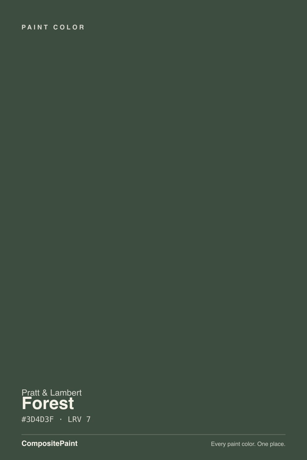
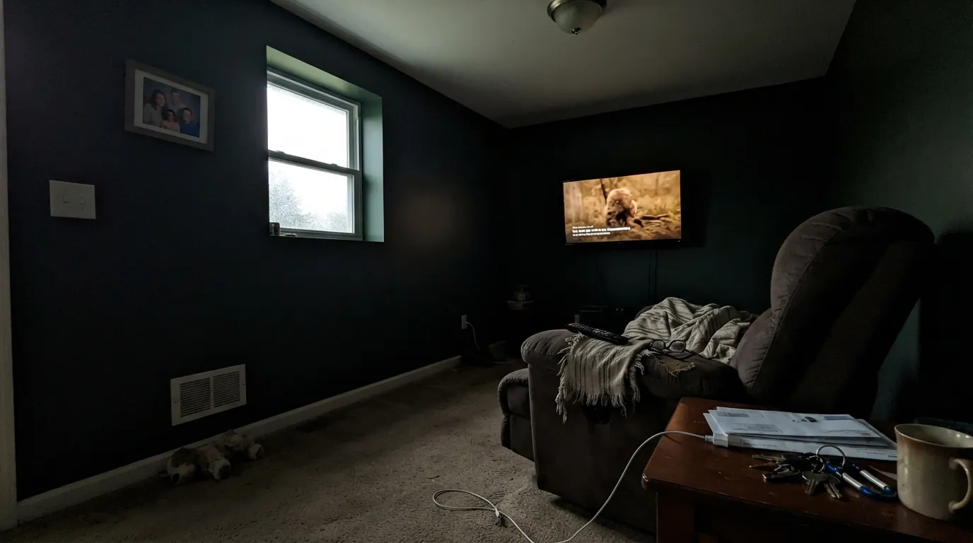
Forest is a true deep blue-green at LRV 7 — pine-shade, not olive, not hunter-catalog bright. In a lamplit library or dining room it reads expensive and enclosed on purpose. Starve it of light and the green disappears: four walls go near-black, and you will swear you bought a charcoal. Sample it on the actual wall at night before you commit.
Libraries, dens, and dining rooms · powder rooms and vanities · a front door on a light house · anyone who wants blue-green depth, not olive
The room is dim and you refuse lamps · you actually wanted black or olive · honey-oak floors stay exposed · you need the walls to bounce light
- True blue-green, not the olive most "forest" chips hide
- Library, dining room, and powder room feel finished with one decision
- Deep enough (LRV 7) to drench a small room without looking trendy
- Excellent on a front door, island, or interior door where dark is the point
- Pairs cleanly with walnut, brass, leather, and a soft white trim
- Reads black, not green, the moment the light drops
- Four walls in an open or lamp-poor room feel like a basement
- Fights honey oak, golden beige, and anything yellow-warm
- Cool LEDs push it toward inky teal-black — bulbs are part of the paint job
What Color Is Forest, Really?
A dark blue-green with the yellow stripped out — that is the whole personality. Most "forest" chips in big-box decks lean olive because they carry a yellow oxide that turns khaki the moment a warm bulb hits them. Pratt & Lambert Forest sits cooler: green first, a drop of blue second, almost no gold. On a well-lit wall it looks like the shaded side of a pine, not a military jacket. It has lived in P&L's Calibrated deck as 27-9 for years as a workhorse library color, not a trend chip — Pratt & Lambert does not run a Color of the Year, and this one has never needed the help.
At LRV 7 it soaks up roughly ninety-three percent of the light that hits it. That is Hale Navy (LRV 8) territory, a hair lighter than Ripe Olive (LRV 6) and Hunter Green (LRV 5), and it behaves like every other color this dark: the chip looks greener than the wall, and the wall looks a full step blacker than you expected. Plan for that. In mixed daylight plus lamps the blue-green still shows. After dark, or in a north room with no lamps, it collapses into a soft black-green and the name stops making sense.
Undertone in one line: cool blue-green — never yellow, never true teal until a cool LED forces it. If your sample reads olive, that is bounce from a golden floor or a 2200K bulb, not the paint. If it reads black, you do not have enough light, and no extra coat will invent some.
Where It Shines
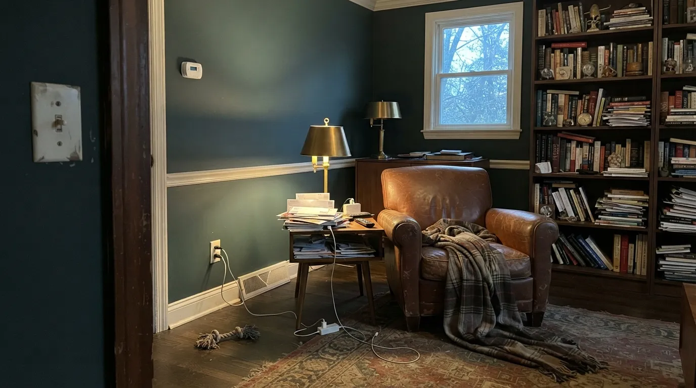
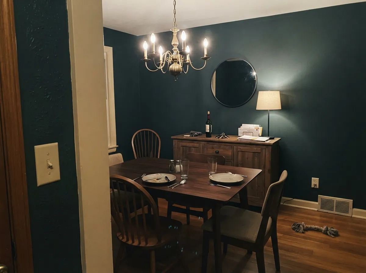
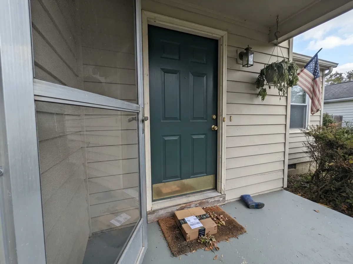
This color is built for rooms that are allowed to feel enclosed. A library, a dining room you use at night, a powder room you drench on purpose — anywhere lamps are part of the architecture, not an afterthought. Give it walnut, leather, brass, and a cream or warm-white trim and it looks like it has been on the wall since the bookshelves went in. Its other natural job is the small, high-impact surface: an island, a front door, an interior door, where LRV 7 reads as a decision instead of a cave.
Where It Fails
Almost every regret story about a green this dark follows one of three scripts, and all three are visible before the first gallon. None of them are the paint's fault — but if your room matches one, Forest is not your color, and a bigger sample will only confirm it.
LRV 7 is the trap. On the chip you see forest. On four walls in ordinary house light the green recedes and you are left with a charcoal that happens to flash pine next to a lamp. If you wanted a green you can name from the hallway, this is too dark — Pewter Green (LRV 12) still reads green on a wall; Forest often does not.
A dark dining room with a chandelier can carry this. A dim living room that shares light with a kitchen cannot. The color eats the perimeter, adjacent rooms look washed-out by comparison, and guests describe it as a basement. Keep it in a closed room or put it on one surface.
Yellow-orange sits across the wheel from blue-green, so honey oak floors, orange-stained trim, and builder-beige carpet all push Forest toward teal while the walls make the floor look cheaper and more orange. Walnut, mahogany, cherry, and dark-stained oak are the company it was mixed for. Pale white oak is tolerable with a large rug; wall-to-wall gold is not.
Room by Room
This is the room the chip was named for. Low, warm light, books, leather, a lamp on every table: the blue-green holds and the walls recede into shade instead of gloom. Matte hides texture; eggshell if chairs scuff. White Dove trim keeps the edges soft instead of cutting a black outline.
Candlelight and a 2700K chandelier are this color's second home. It makes a closed dining room feel like a reservation. Skip it if the dining area is a corner of a bright open plan with no separate lighting — the green will read as a dark hole next to the kitchen.
Four walls of Forest in a powder room is a weekend that looks custom. Satin on a vanity under stone and brass pulls is the lower-risk version of the same idea. Keep the bulbs warm; cool LEDs turn the little room inky and a little aquatic.
Moody and restful if you already live with bedside lamps and a dimmer. In a north-facing bedroom with one overhead fixture it will feel like a cave by 7am. Matte, cream bedding, no beige (beige goes yellow against the blue). If you want green you can still see in the morning, go lighter.
Satin Forest on an island under cream or Alabaster walls is the designer move: one dark green note, wipeable, and it still reads as color next to the counters. A full kitchen of LRV 7 cabinets in a galley with one window is a bet most people lose. Urethane-fortified enamel either way.
On a front door against White Dove, Pale Oak, or another light body color, Forest is a classic deep-green door that still looks green in daylight. Full-sun siding is a different paint: this dark, the facade goes near-black from the street and every scuff shows as a gray scab. Shutters on a light house are the other exterior yes.
Your Light Is the Risk
Direct daylight is when the green actually shows — a clear blue-green, not black. Keep a warm lamp in the mix so it does not flatten when the sun moves. This is the light that justifies the name.
Cool, weak daylight strips the green and leaves a flat charcoal. Readers who sampled it in a sunny store and painted a north den are the ones who say it went black overnight.
Morning light runs cooler and a little bluer; west sun and golden hour warm it toward pine. The shift is real but it never becomes olive. Sample at 8am and at 6pm on the same wall.
2700K incandescent or warm LED keeps a brown-green warmth in the dark — still deep, still Forest. Cool white LEDs (4000K and up) kill the green and leave an inky blue-black. Swap the bulbs before you repaint.
Most complaints about Forest are a light mismatch. Upload a photo of your actual room and see it on your walls — then ask for the same wall in north light or evening lamps before you buy a single sample.
Need It From Another Brand?
Any paint counter can custom-tint Pratt & Lambert 27-9 directly. If you would rather stay in one brand's own deck, these are the closest stock matches, measured as ΔE2000. Under 2 is a difference you will not see on the wall.
| Brand | Closest color | ΔE | LRV | |
|---|---|---|---|---|
| Sherwin-Williams | Dard Hunter GreenSW 41 · Sherwin-Williams | 1.6 | 6 | Color page → |
| Behr | Black Bean790D-7 · Behr | 3.3 | 6 | Color page → |
| Valspar | Devon GreenT607 · Valspar | 4.0 | 7.1 | Color page → |
| PPG / Glidden | Pine ForestPPG1134-7 · PPG / Glidden | 2.3 | 7 | Color page → |
| Glidden | Dark Hunter Green30GG 06/113 · Glidden | 4.5 | 6 | Color page → |
| Dutch Boy | Baked Spinach327-7DB · Dutch Boy | 1.6 | 6 | Color page → |
Contrast and Legibility
WCAG 2.1: AA is 4.5 : 1 for normal text, 3 : 1 for large text, AAA is 7 : 1.
Forest vs the Colors You're Also Considering
Every Forest sample board has the same rivals on it. The numbers show the real lightness gap — then it comes down to which risk you would rather live with.
Pick this when you still want it to read as blue-green, not as a black with a yellow-green flash.
Sherwin-Williams SW 6209 · LRV 6Ripe OlivePick this if you want a near-black with an olive pulse — Ripe Olive is the green people don't ask for by name, and it sits even closer to charcoal.
Pick this for a cooler, slightly softer blue-green that is less costume-hunt-club.
Benjamin Moore 2041-10 · LRV 5Hunter GreenPick this for the classic saturated hunter — glossier on a door, bolder on an island, a step darker and more traditional.
Forest has no near twins within the Pratt & Lambert deck, so the useful comparisons come from other brands' green-blacks in the same band. Sherwin-Williams Dard Hunter Green (SW 41), at LRV 6, is a hair darker and reads a touch more classic hunter green; it is the closest in feel, so choose Forest when you want a slightly cleaner, cooler green and Dard Hunter when you want a fraction more depth.
Farrow & Ball Duck Green (No. W55), LRV 8, is a shade lighter and shows its green more readily, making it the better option if you want the green to be obvious rather than nearly black. Behr Black Bean (790D-7), LRV 6, tips further toward a warm green-black and can look more like a soft charcoal than a green. If your goal is a color that clearly reads as forest green in good light, Forest and Duck Green win; if you want something that mostly behaves as a near-black, Black Bean leans that way.
Forest Coordinating Colors
The rule for coordinating with Forest: warm whites, other darks that are not quite the same green, and keep yellow at arm's length. It wants cream more than beige, walnut more than honey oak, brass more than chrome. These are the partners that keep a room this dark from looking accidental:
An Old Deck Color, Not a Trend Chip
Forest is not a Color of the Year, a viral cabinet color, or a show-house moment anyone can point to. Pratt & Lambert has never run that kind of campaign, and 27-9 has sat in the Calibrated numbering as a quiet, dark blue-green for rooms that are supposed to feel enclosed: libraries, dining rooms, dens. That obscurity is useful. You are not buying last year's green, and you are not buying a hunter that photographs like a hunting lodge.
What you are buying is depth with a cool lean. Compare it to the dark greens people actually search — Ripe Olive, Hunter Green, Pewter Green — and Forest lands in the gap: greener than a near-black, cooler than an olive, darker than the cabinet sage everyone already has. If you cannot sample the real chip in your light, you should not guess from the name. Every dark green lies on a phone screen.
Forest With Wood Tones and Floors
This decision gets made at the floor. Walnut, mahogany, cherry, and espresso-stained oak are the color's natural company — the red-brown depth makes the blue-green read like a library, not a gym. Dark-stained existing oak is a renovation-friendly yes. Pale white oak and gray-washed floors are quieter and a little more current; they work if you add a rug so the green is not sitting on a blond field.
The honest no is golden: honey oak, orange builder stain, yellow-beige carpet. Blue-green and yellow-orange exaggerate each other — the floor goes louder, the walls go more teal, and no extra coat fixes complementary colors. If that floor is staying, put a large rug down or pick a greener-gray like Pewter Green and keep the fight smaller.
Metals are easy: unlacquered brass, antique bronze, and matte black all sit well; polished chrome is the one that leans cold and a little office-like against it.
Three Ready Palettes Built on Forest
A color is never alone on the wall. These are complete combinations in the 60-30-10 pattern, with the reason each one holds together. Every one opens in the visualizer.
A soft near-black next to a blue-green this dark keeps the scheme from looking like one inky blob, and White Dove is the trim that does not turn Forest dingy. Walnut shelves, leather, and 2700K lamps do the rest — this is the room the color was mixed for.
Try this palette in your roomThe island carries the dark green so the kitchen still bounces light. Swiss Coffee on the walls and Alabaster on the uppers stay on the warm-white side of Forest; a stark gallery white would make the island look like a hole. Brass hardware and a walnut or butcher-block top finish it.
Try this palette in your roomPale Oak gives the facade a warm, light body so the door can go this dark without the house reading gothic. Forest stays green in daylight on a single door; Hale Navy shutters are optional and only if the house has enough light that two darks will not collapse into one.
Try this palette in your roomForest FAQ
Is Forest green or black on the wall?
Green only when there is real light on it. At LRV 7 it is a blue-green in south daylight and next to a lamp, and a soft black-green everywhere else. If you need to name the color from a dim hallway, it will read as charcoal. That mismatch is behind most of the bad outcomes with this depth.
What trim white goes with Forest?
A warm, soft white — White Dove is the default. Swiss Coffee if you want a creamier, more traditional library look. A stark bright white (Chantilly Lace territory) cuts a harsh edge and makes the walls look sooty. Semi-gloss on the trim, matte or eggshell on the walls.
Is it good for a dining room?
Yes, if the dining room is its own room with a chandelier you actually use. Night is when Forest earns the wall. If dining is an open alcove off a bright kitchen with no separate lighting, the green will look like a dark patch, not a dining room — keep it on a buffet, a door, or skip it.
Does Forest work with oak floors?
Depends on the oak. Walnut, mahogany, cherry, and dark-stained oak are excellent. Pale white oak is fine with a large rug. Golden honey oak is the genuine clash: yellow-orange against blue-green makes the floor louder and the walls more teal. If the honey floor is staying, Pewter Green or a warmer olive is the less painful green.
Can I use it on kitchen cabinets or an island?
The island is the smart use — satin Forest under cream walls, brass hardware, a wood or stone top. A whole kitchen of LRV 7 cabinets only works in a bright room with other light surfaces. In a dark galley it will feel like cooking inside a bottle. Cabinet enamel, not wall paint.
Forest or Pewter Green for four walls?
Pewter Green if the room has to function in daylight without a lamp on every table — at LRV 12 it still reads as green on cabinets and walls, though it is risky on four dim walls too. Forest if the room is closed, used at night, and you want the library depth Pewter Green cannot give you. They are not substitutes; they are two different commitments.
Have you painted with Forest?
Rate it — one tap helps the next reader decide.
Ask a Question