Antique Silver
The warm gray-green taupe that shows up under six different names across six different brands, reviewed honestly: where it earns its keep, the light that flattens it, and what to pick instead.

Jessica has spec'd whites and neutrals for more than 300 rooms and keeps a sample wall of painted drawdowns in her studio. Every color review is checked against real reader rooms in the comments and re-tested when a formula changes. About the testing process →
- 1Black Fox7
- 2Pewter Green12
- 3Antique Silver27
- 4Stardew43
- 5Upward57
The Fast Verdict
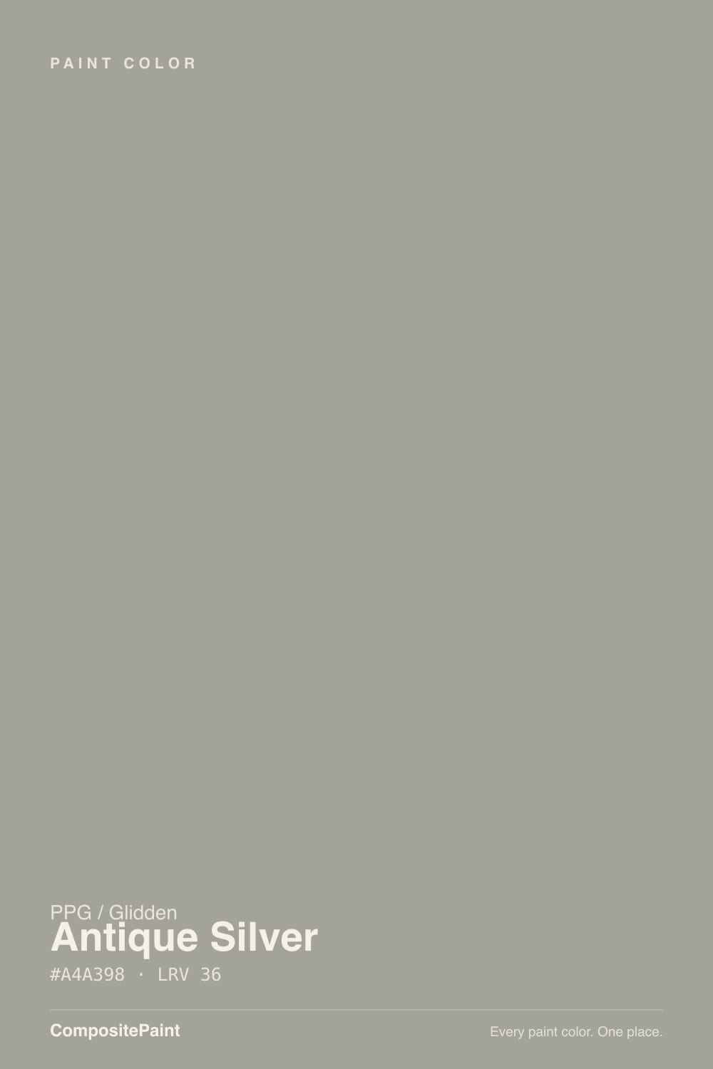
Antique Silver is a warm, cloudy gray with a slate-green undertone — a taupe that leans just green enough to feel considered instead of builder-basic. At LRV 27 it sits in the useful middle: deep enough to hide scuffs and hold its color, light enough to still read as a neutral. It is not a star performer and it is not trying to be one. It is the dependable greige-green that a dozen brands sell some near-copy of, and PPG's version does the job as well as any of them.
Exterior siding · a quiet home office or den · living rooms with real daylight and warm wood · kitchen islands and cabinets against white counters · anyone who wants "gray" with a little more personality than beige-gray
Your room is dim, cool, and north-facing · your floors are honey oak or golden pine · you want a true, green-free gray · you were hoping for a crisp, bright trim white
- A gray-green taupe with real personality, not flat builder-gray
- LRV 27 holds its color and hides scuffs better than lighter greiges
- One of the more convincing exterior siding colors in this depth range
- Flatters warm wood, leather, and brass indoors
- A near-identical formula to well-liked colors in other brands' decks, at PPG/Glidden pricing
- Goes flat and institutional in dim, north-facing rooms
- Reads more green than buyers expect once it's on four walls
- Fights honey oak floors and golden-beige trim
- Not a crisp, true gray — sample big if that's what you actually want
What Color Is Antique Silver, Really?
PPG files Antique Silver in the Neutral Gray Green family and describes it as a midtone, warm, cloudy gray with a slate undertone — and that is an accurate read of the hex. It is not a designed-to-be-distinctive color; it is closer to a formula. Almost every major brand sells a near-identical warm gray-green taupe at roughly this same LRV: Behr's Rustic Taupe and Chic Gray land within a few points of it, Sherwin-Williams has Dorian Gray and Frosted Fern in the same neighborhood, Benjamin Moore has October Mist one step lighter. Antique Silver is not a copy of any one of them — it is evidence that every deck eventually needs exactly this color, because it is the greige that reads as "considered gray" instead of "cheap gray."
At LRV 27 it holds real depth. It will not wash out in bright rooms the way a pale greige does, and it hides handprints and scuffs better than anything above LRV 50. The tradeoff is the usual one for mid-depth neutrals: it needs actual light to stay looking intentional. In a dim room it stops reading as "sophisticated taupe" and starts reading as flat, cool concrete — the same failure mode as every color in this family, from Agreeable Gray on down.
Undertone in one line: warm gray with a slate-green cast, never blue, never pink. On the chip it can pass for a plain gray. On four walls in daylight the green comes forward more than most buyers expect — which is the single most common surprise with this whole color family, not just this one paint.
Where It Shines
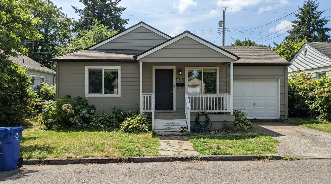
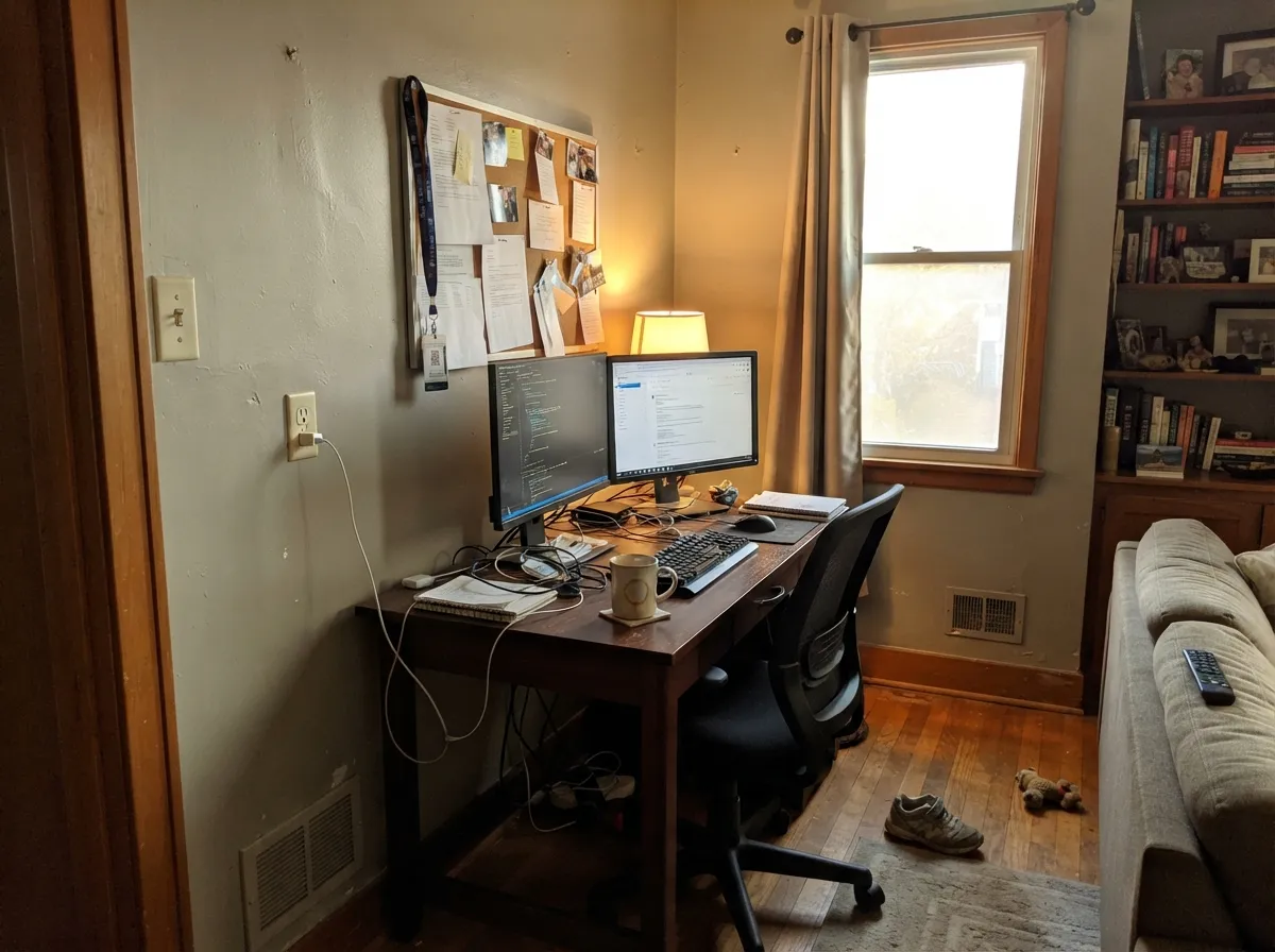
Give it real light and it earns the word "taupe" instead of "gray." Its best job by far is outside: as an exterior siding color it reads as a modern, quietly upscale gray-green that photographs well against white trim and a dark door, and full sun keeps the green from ever going drab. Indoors, it is at its best in rooms people actually use during the day — a home office, a den, a living room with west or south windows — where warm wood furniture, leather, and brass keep it grounded instead of institutional.
Where It Fails
Almost every disappointed review of a color in this family follows one of the same three scripts, and Antique Silver is no exception. None of them are really about this specific paint — they are about what warm gray-green taupes do in the wrong room.
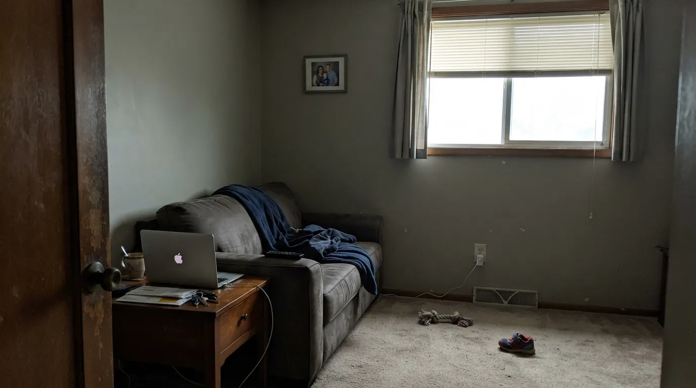
Without real daylight, the warm slate undertone disappears and what is left reads flat, cool, and a little institutional — closer to a hallway at a doctor's office than a considered taupe. This is the single most common complaint about every color in this family. Fix it with warm lamps and 2700K bulbs, or step up to a lighter, warmer greige like Smoked Tan.
On the paint chip it can pass for a plain warm gray. Painted across four walls in daylight, the slate-green undertone shows up more than most people expect — it is a gray-green, not a gray. If the goal is genuinely neutral, sample it big before committing; a color like Behr Chic Gray sits closer to true gray at the same depth.
Warm gray-greens and golden-orange wood tones fight each other: the wood looks more orange next to the green wall, and the wall looks murkier next to the orange floor. Walnut, white oak, and darker stains are safe; honey oak and butter-yellow trim are not.
Room by Room
With real south or west light it reads as a grounded, grown-up neutral that flatters leather and dark wood furniture. In a dim or north-facing room, step up to a lighter warm greige instead.
A quiet, unfussy backdrop for video calls and bookshelves. It reads calm rather than cold on camera, which most true grays do not. Eggshell for a soft, low-glare finish.
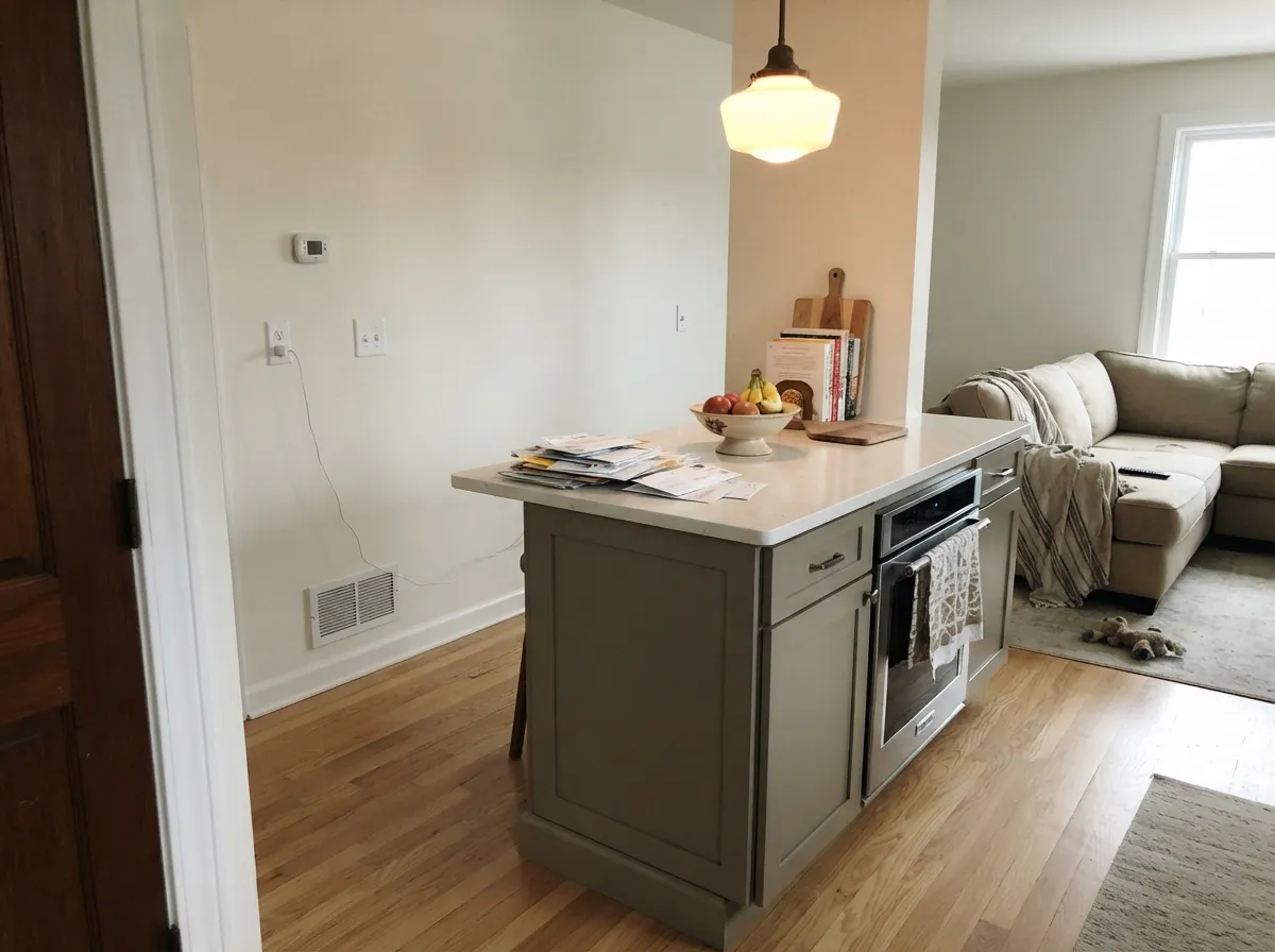
Against white or light quartz counters, a satin Antique Silver island or lower-cabinet run looks custom and current. A full kitchen of it over honey-oak floors is the one combination to avoid.
Under 2700K lamps it goes soft and restful. In a bedroom that runs dim and north-facing with cool LEDs, it will read flat and a little cheerless — this is not the room to skip a sample.
With warm-veined marble, wood vanities, and brass it is handsome. Against cool blue-grey tile or chrome fixtures the two temperatures argue; test a sample against your actual tile first.
This is where the color does its most convincing work: full sun keeps the slate-green rich rather than muddy, and it reads as a modern, upscale siding gray-green next to white trim and a dark door. See the exterior section below for pairings.
Your Light Is the Risk
Direct sun keeps the slate-green rich and considered rather than muddy. This is the light the color was practically made for — exteriors, sunrooms, bright west rooms.
Without warmth to react against, it flattens into a cool, institutional gray. Sample it on the actual wall before trusting the chip.
Warmer and greener at the sun hours, quieter and grayer once direct light passes. Most owners describe the shift as pleasant, not distracting.
2700K lamps pull it warmer and softer. Cool white LEDs flatten the taupe back toward plain gray — swap the bulbs before you swap the paint.
Most complaints about Antique Silver are a light mismatch. Upload a photo of your actual room and see it on your walls — then ask for the same wall in north light or evening lamps before you buy a single sample.
Need It From Another Brand?
Any paint counter can custom-tint PPG / Glidden PPG1002-5 directly. If you would rather stay in one brand's own deck, these are the closest stock matches, measured as ΔE2000. Under 2 is a difference you will not see on the wall.
| Brand | Closest color | ΔE | LRV | |
|---|---|---|---|---|
| Sherwin-Williams | Moonlit OrchidSW 9153 · Sherwin-Williams | 2.5 | 29 | Color page → |
| Behr | Plum SmokePPU16-14 · Behr | 2.2 | 27 | Color page → |
| Benjamin Moore | StonehedgeES-76 · Benjamin Moore | 3.8 | 28 | Color page → |
| Valspar | Four-Wheel GrayV119-2 · Valspar | 2.9 | 26.5 | Color page → |
| Glidden | Antique SilverPPG1002-5 · Glidden | 0.6 | 27 | Color page → |
| Dutch Boy | Castle Wood445-4DB · Dutch Boy | 4.5 | 27 | Color page → |
Similar PPG / Glidden Colors
The nearest shades to Antique Silver within PPG / Glidden's own range, ranked by perceptual color distance — useful when you want the same look a touch lighter, darker, or warmer.
WCAG 2.1: AA is 4.5 : 1 for normal text, 3 : 1 for large text, AAA is 7 : 1.
Antique Silver vs the Colors You're Also Considering
Every Antique Silver sample board has the same rivals on it. The numbers show the real lightness gap — then it comes down to which risk you would rather live with.
Pick this if you're already matched into the PPG/Glidden deck, or want the same look from a different retailer.
Behr N200-4 · LRV 36Rustic TaupePick this if your painter stocks Behr — this is close enough to be the same color, and it is easier to find on short notice.
Pick this for more of the slate-green character — Dorian Gray reads plainer and grayer.
Sherwin-Williams SW 7017 · LRV 39Dorian GrayPick this for a slightly lighter, warmer greige with less visible green in the mix.
Antique Silver's closest PPG neighbors share its mid depth but split on undertone. Smoky Slate (PPG1028-4, LRV 36) sits at the same lightness but has a stronger green-yellow pull; put them together and Smoky Slate looks earthier and more sage, while Antique Silver stays a cleaner warm gray. Choose Smoky Slate if you want a hint of green, Antique Silver if you want the undertone to stay quiet.
Simmering Smoke (PPG1019-4, LRV 35) is a touch darker and reads warmer and more taupe, with a soft pink-brown base rather than yellow. It feels cozier and more traditional. Antique Silver stays grayer and more flexible next to cool finishes.
Aldabra (PPG14-28, LRV 38) is slightly lighter and yellower again, closer to a greige. If a room eats warmth and you want more of it, Aldabra delivers; if you want restraint, stay with Antique Silver.
Antique Silver Coordinating Colors
The rule for coordinating with Antique Silver is the same as for any warm gray-green: crisp or soft whites for trim, warm woods and near-blacks for contrast, and other members of the same taupe family for depth without a color change. Keep it away from cool blue-grays and anything with a pink undertone. These are the partners that keep showing up in rooms that work:
The Color Every Brand's Deck Already Has
Antique Silver is not chasing a trend and it has no famous celebrity room behind it — its real story is how common this exact formula is. Warm, mid-depth, slightly green gray taupes sit in nearly every major brand's core deck: Behr sells two versions within a few LRV points of this one, Sherwin-Williams has at least three, Benjamin Moore has its lighter sage cousin October Mist. None of these are copies of each other in any legal sense — they are independent answers to the same demand: buyers who ask a paint counter for "a gray that isn't boring" consistently get shown a color in this exact family.
That makes Antique Silver a reasonable, unglamorous pick rather than an exciting one. If your contractor already stocks PPG or Glidden, there is no real reason to shop around for a Sherwin-Williams or Behr equivalent — you would be buying essentially the same color at a different counter.
Antique Silver With Wood Tones and Floors
Dark and mid-tone woods are this color's best company: walnut, dark-stained oak, and weathered gray-brown floors all sit comfortably against the slate-green undertone, and black or bronze hardware reads modern rather than harsh next to it. Light, cool floors like white oak or gray-washed LVP are also safe — they simply let the wall carry more of the room's color.
The one wood tone to test carefully is honey or golden oak. Yellow-orange sits in visual conflict with warm gray-green, and the pairing tends to make both surfaces look worse: the floor reads more orange, the wall reads murkier. A large area rug helps bridge the two if the floor isn't changing; otherwise, a warmer, less-green greige like Smoked Tan will get along with golden wood better.
Three Ready Palettes Built on Antique Silver
A color is never alone on the wall. These are complete combinations in the 60-30-10 pattern, with the reason each one holds together. Every one opens in the visualizer.
White Dove trim keeps the taupe from tipping cold, and one near-black on the built-ins gives the eye a resting point without turning the room into a design statement — a genuinely calm backdrop for a room used all day.
Try this palette in your roomThis is where Antique Silver does its best work — full sun keeps the slate-green rich, crisp white trim outlines the roofline, and the near-black door supplies the one dark note the facade needs to read as intentional rather than dated.
Try this palette in your roomFawn Brindle's warm brown-greige sits right next to Antique Silver on the same taupe family tree, so the accent wall reads as depth, not a color change; Swiss Coffee keeps the whole room from tipping cool.
Try this palette in your roomAntique Silver FAQ
Is Antique Silver gray or green?
Both — it is a warm gray with a genuine slate-green undertone, which PPG itself files under "Neutral Gray Green." On the small chip it can pass for a plain gray; painted across a whole room in daylight, the green becomes clearly visible. If you want a true, green-free gray, sample it big before committing.
What's the closest color from another brand?
Behr's Rustic Taupe is close enough to be effectively the same color at the same LRV. Sherwin-Williams' Dorian Gray and Frosted Fern, and Benjamin Moore's October Mist, all sit in the same family a few points lighter or greener. This is one of those shades nearly every major brand's deck carries some close version of.
Is it good for exterior siding?
Yes — it's arguably the color's best use. Full sun keeps the slate-green undertone rich instead of muddy, and it reads as a modern, upscale gray-green next to white trim and a dark front door.
What trim white goes with it?
A clean, slightly cool white like Pure White or a warm soft white like White Dove both work — Pure White for a crisper exterior contrast, White Dove for a softer interior handoff. Avoid a stark blue-white trim, which will make the taupe look muddy by comparison.
Does it work with honey oak floors?
Not well. Golden-orange wood and warm gray-green paint amplify each other's worst qualities — the floor looks more orange, the wall looks murkier. It pairs far better with walnut, white oak, or darker stained floors.
Is it too dark or too gray for a small room?
At LRV 27 it's a genuine mid-depth color, not a light neutral, so a small room with limited daylight will feel cozier and a little dimmer, not brighter. That can work beautifully in a den or powder room; in a small room that's already short on natural light, a lighter greige will serve you better.
Have you painted with Antique Silver?
Rate it — one tap helps the next reader decide.
Ask a Question