Metal Fringe
Dunn-Edwards' mid-tone bronze-gray, reviewed honestly: the daylit rooms where it reads like leather and stone, the north light that turns it olive-mud, and what to pick instead.

Jessica has spec'd whites and neutrals for more than 300 rooms and keeps a sample wall of painted drawdowns in her studio. Every color review is checked against real reader rooms in the comments and re-tested when a formula changes. About the testing process →
- 1Nocturne8
- 2Roycroft Brass15
- 3Metal Fringe21
- 4Dorian Gray39
- 5Mindful Gray48
The Fast Verdict
Metal Fringe is a mid-tone warm gray with bronze in it — earthy, quiet, and a step darker on the wall than the chip suggests. At LRV 21 it is a genuine dark-neutral: cabinets, built-ins, and rooms with real daylight are the jobs it earns. Dunn-Edwards painters already treat it as the warmer Chelsea Gray crossover. It has sat in the deck since 1996. It has never been a Color of the Year, because Dunn-Edwards does not run one.
Daylit living rooms and dens · kitchen islands and built-ins · satin cabinets · Western exteriors with cream trim · anyone whose painter works in Dunn-Edwards and asked for Chelsea Gray
The room faces north and stays dim · you wanted a cool true gray · floors are cool gray LVP or blue-gray stone · trim stays a bright cool white
- The Chelsea Gray crossover Dunn-Edwards counters already mix
- Bronze-warm gray that does not go icy in an all-neutral room
- Deep enough (LRV 21) to look expensive on cabinets and built-ins
- Sits in the 1996 Then, Now & Forever stack — not a trend launch
- Flatters leather, walnut, brass, and cream stucco
- Too dark for four walls of a dim or north-facing room
- Not a cool gray — bronze and olive show up once it is on the wall
- Cool floors, cool stone, and cool white trim make it look dirty
- Thin national photo record compared with Chelsea Gray or Anonymous
What Color Is Metal Fringe, Really?
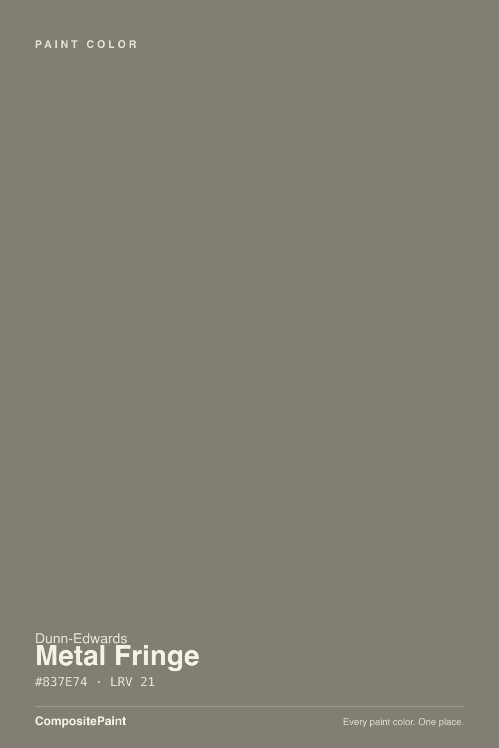
A mid-tone warm gray with bronze in the mix, and a green-brown whisper that only names itself in the wrong light. Dunn-Edwards files DET626 in the Then, Now & Forever collection — the Western-history stack — and still lists it under Trending Today, which tells you the job: not a launch color, a counter color that has been mixed since 1996. Sara McLean, then a Dunn-Edwards color expert, put it on Bob Vila's 2015 gray roundup because the green and brown undertones keep an all-gray room from going cold. On Houzz, the store's own crossover note for Benjamin Moore Chelsea Gray is this can, slightly warmer. That is the whole personality: charcoal-greige with a bronze bias, not a cool gray pretending to be one.
At LRV 21 it lives in the same dark-neutral band as Chelsea Gray (LRV 23) and Sherwin-Williams Anonymous (LRV 20). The number is the useful part and the trap. On a chip it can pass for a polite mid-gray. On four walls it drops a step deeper and starts behaving like a shadow the moment the light thins. Munsell 4.1Y at chroma 0.9 is the technical version of the same fact: a yellow hue with almost no saturation, so the color reads earthy and quiet rather than clean. Plan for the field to look heavier than the card. Every color at this depth does that, and it is the number-one surprise when people sample a two-inch square and then paint a room.
Undertone in one line: bronze first, olive-beige second — never blue. If your sample looks green, the light is cold or the neighbor is a cool white. If it looks brown, you are seeing bounce from oak, terracotta, or late west sun. If it looks like a cave, you do not have enough light. The paint itself is a warm gray.
Where It Shines
Give it real daylight, leather, aged metal, and stone, and it does the backdrop job it was mixed for. Its second home is the hard surface: a kitchen island, a run of built-ins, satin cabinet doors — HomeBunch photographed it on gray built-ins, and Western painters keep putting it there because at LRV 21 a box still reads as color instead of a hole. Outdoors, on a Craftsman body or a stucco elevation with cream trim, Western sun keeps the bronze honest. This is a dose color that can carry four walls in a bright room. It is not a whole-house airy gray.
Where It Fails
Almost every regret about Metal Fringe is a lighting or identity problem, not a bad batch. The chip is a warm bronze-gray. Shade, cool neighbors, and a head full of true gray will all make you think you bought the wrong can.
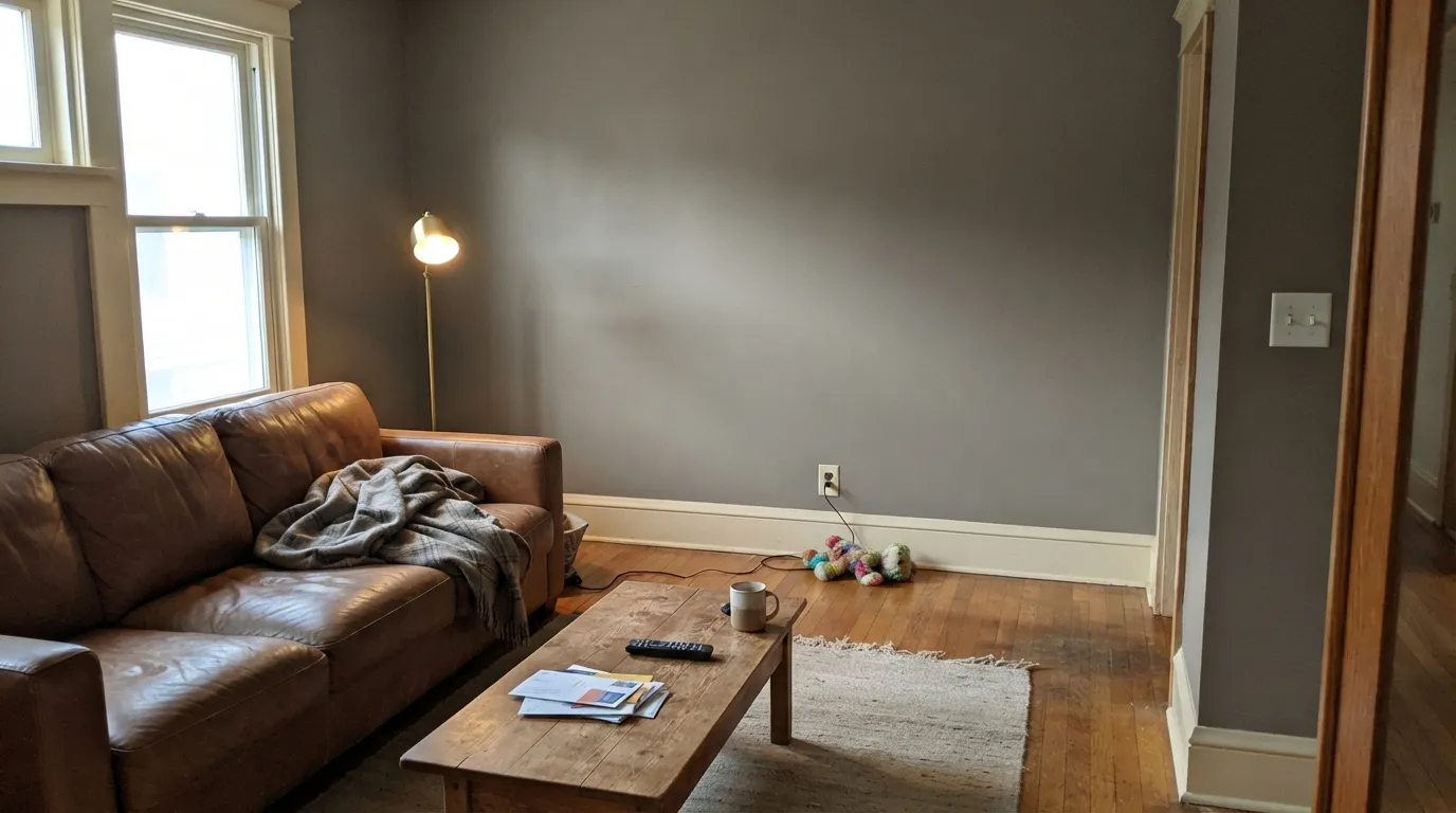
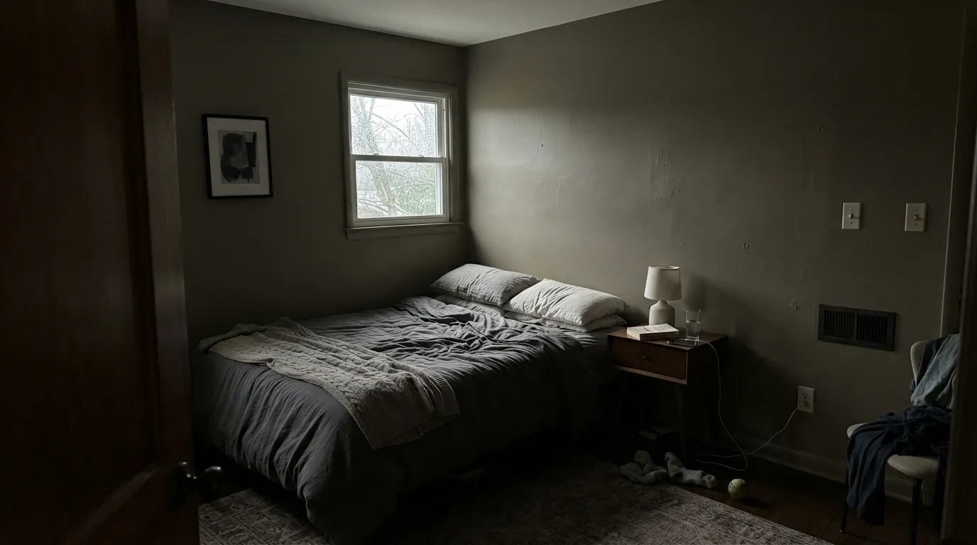
LRV 21 without bounce light stops being a color and starts being mud. North bedrooms, windowless halls, and overcast dens pull the olive-beige and the walls go khaki-cave. Art disappears, corners go dead, and the bronze you liked on the chip is gone. Keep four walls for rooms that actually see a window, or pick a lighter greige and put this on the cabinets instead.
On the card it can pass. On four walls the bronze and the green-brown whisper are unmistakable — depth multiplies undertone. If the photo you saved was a steely charcoal, you wanted Kendall Charcoal. If you wanted gray with almost no hue, Charcoal Smudge is the cooler Dunn-Edwards can. Metal Fringe is the warm one. Sample it next to a true gray before you commit.
Cool gray LVP, blue-gray quartz, and a bright cool trim white — Classic White, Lighthouse, Chantilly Lace — all yank the olive-beige forward and make the walls look dirty by comparison. The company this color was mixed for is cream, walnut, leather, and 2700K lamps. Whisper or Dunn-Edwards Swiss Coffee on the millwork; a cooler white is the most common pairing mistake at this depth.
Room by Room
With south or west daylight, a leather sofa, and wood floors it is the quiet backdrop Sara McLean described: warm enough not to go cold, gray enough not to go beige. Eggshell on the walls; Whisper or White Dove on trim in semi-gloss. Open to a dim hall, it will close that hall down — keep the darker can in the room that has windows.
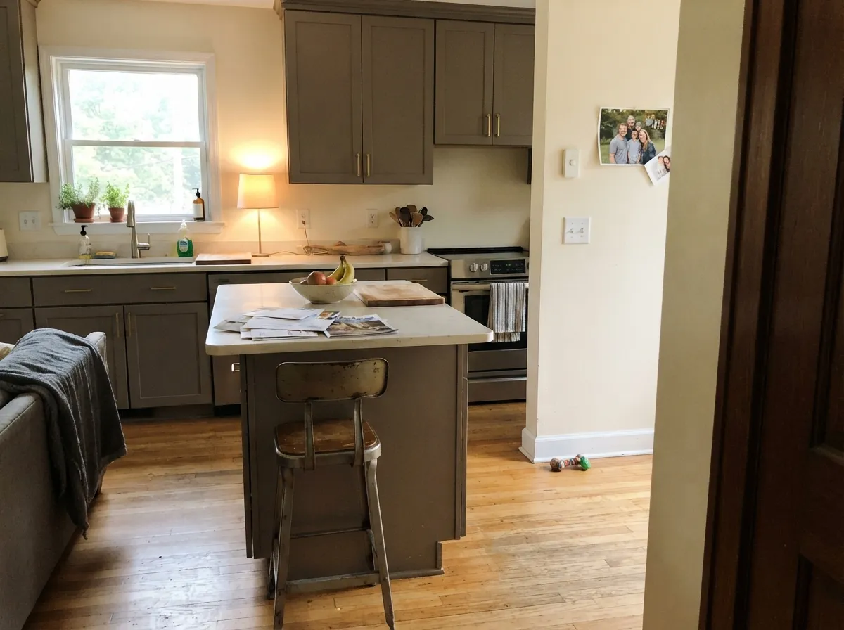
Satin Metal Fringe on an island or a run of built-ins under Swiss Coffee or Whisper walls is the move Western counters actually mix. At LRV 21 the box still shows as color in daylight, fingerprints wipe, and brass or aged-bronze pulls look like they belong. Perimeter boxes stay light so the dark reads designed instead of cave-like. Cabinet enamel, not wall paint.
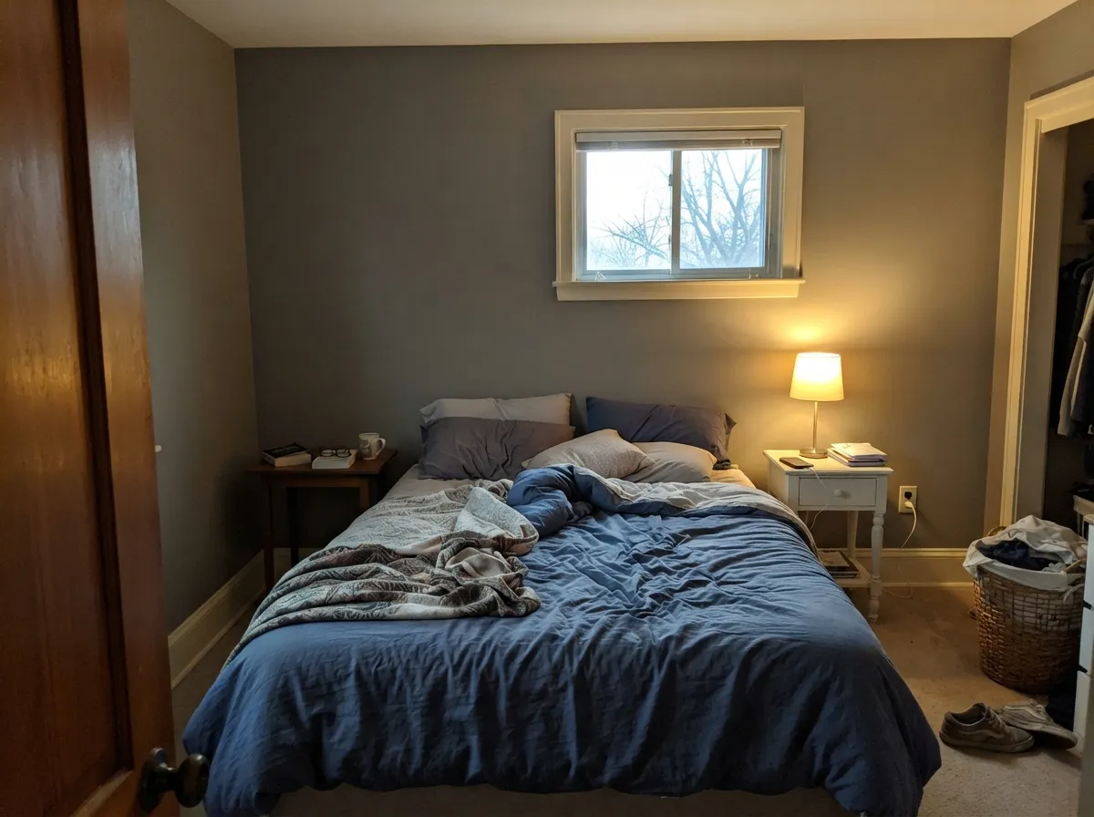
A documented Los Angeles bedroom ran it on all four walls with Historic White trim and it looked tailored, not cave-like — because the room had windows. Matte or eggshell; 2700K lamps are part of the paint job. A north bedroom with one overhead LED is the khaki-mud version of the same idea. Sample a large board for a full day before you drench it.
Low-to-medium light flatters a color this deep, as long as a real window is in the mix. Walnut shelves, leather, and a brass desk lamp are its natural company. Eggshell for chair-scuff durability. A windowless office in this paint is just a darker cubicle.
Then, Now & Forever is a Western-history collection, and this is a Western body color: Craftsman siding, stucco, Hardie, with Swiss Coffee or Whisper trim and a navy or charcoal door. Full sun keeps the bronze honest; the shaded north elevation will read a full step darker and a little more olive. Walk the house at noon and at 6 p.m. with a sample board. A closed ranch with small windows is the wrong building.
A powder with a window and warm sconces can take it as a vanity or a drench. A windowless hall, a north bath with cool tile, or any room that already feels small will shrink further. For those, put Metal Fringe on the cabinet or the door and keep the field in Whisper or Foggy Day.
Your Light Is the Risk
Hard daylight is the light this bronze-gray was mixed for. The warmth holds, the olive stays in the background, and the wall reads as a finished earthy gray instead of mud. Sample it on the sunny side first.
Cool gray daylight strips the bronze and leaves the olive-beige. Corners go khaki-cave and the color you liked on the chip is gone. Fine on a cabinet in that room; a losing bet on four walls.
Morning east light is the cooler, slightly greener read. Late west sun flushes the bronze for an hour and the wall goes more taupe. Both versions are the same paint being honest about the sky. Sample at 8 a.m. and at 6 p.m. on the same wall.
2700K bulbs keep the bronze and the walls go leather-warm after dark. Cool 4000K LEDs pull the olive-flat khaki that makes people think the can was wrong. If you use this inside, the bulbs are part of the paint job.
Most complaints about Metal Fringe are a light mismatch. Upload a photo of your actual room and see it on your walls — then ask for the same wall in north light or evening lamps before you buy a single sample.
Need It From Another Brand?
Any paint counter can custom-tint Dunn-Edwards DET626 directly. If you would rather stay in one brand's own deck, these are the closest stock matches, measured as ΔE2000. Under 2 is a difference you will not see on the wall.
| Brand | Closest color | ΔE | LRV | |
|---|---|---|---|---|
| Sherwin-Williams | Link GraySW 6200 · Sherwin-Williams | 2.7 | 21 | Color page → |
| Behr | Smoky TroutMQ2-53 · Behr | 0.6 | 21 | Color page → |
| Benjamin Moore | BarnwoodCSP-115 · Benjamin Moore | 2.0 | 21 | Color page → |
| Valspar | Lead Cast5007-2B · Valspar | 2.8 | 21 | Color page → |
| PPG / Glidden | Cool CharcoalPPG1007-6 · PPG / Glidden | 3.6 | 20 | Color page → |
| Glidden | Mansard Stone30YY 20/029 · Glidden | 3.0 | 20 | Color page → |
Similar Dunn-Edwards Colors
The nearest shades to Metal Fringe within Dunn-Edwards's own range, ranked by perceptual color distance — useful when you want the same look a touch lighter, darker, or warmer.
WCAG 2.1: AA is 4.5 : 1 for normal text, 3 : 1 for large text, AAA is 7 : 1.
Metal Fringe vs the Colors You're Also Considering
Every Metal Fringe sample board has the same rivals on it. The numbers show the real lightness gap — then it comes down to which risk you would rather live with.
Pick this when your painter is already in Dunn-Edwards and you want the warmer, slightly bronzer version of the same job.
Benjamin Moore HC-168 · LRV 23Chelsea GrayPick this if you want the famous BM charcoal-greige for islands, exteriors, and accent walls — a hair lighter and a hair cooler, with a thousand more photos.
Pick this for a touch more bronze and a touch less brown, especially on cabinets and Western interiors.
Sherwin-Williams SW 7046 · LRV 20AnonymousPick this if your painter works in Sherwin-Williams — the quietest earthy SW neutral, and one of its best exteriors, at almost the same depth.
Pick this when you still want to see warmth and a step of light, and a cool charcoal would go steely against your wood.
Benjamin Moore HC-166 · LRV 15Kendall CharcoalPick this if you want it darker and more truly gray — the best-behaved dark gray in the BM deck, as long as the room is not dim.
Pick this for the lighter, more gray-readable version of the same earthy mood, especially on four walls that actually have windows.
Sherwin-Williams SW 7047 · LRV 13PorpoisePick this if you want it deeper and browner — a warm dark that never went viral, and does not need to.
Metal Fringe Coordinating Colors
The rule for coordinating with Metal Fringe: stay warm. Cream millwork, tonal greiges from the same DET strip, and one darker gray or navy — and keep icy whites and blue-gray stone at arm's length. Dunn-Edwards already prints Pewter Patter as the accent next to it on the color page; Reclaimed Wood is the step-lighter neighbor on the same strip. These are the partners that keep showing up in rooms that work:
The Chelsea Gray Crossover: A 1996 Workhorse
Metal Fringe is not obscure because it failed. It is obscure because Dunn-Edwards is a Western brand, and this can never had to go viral to keep selling. It entered the deck in 1996, sits in Then, Now & Forever — 142 historically accurate colors plus 158 that still trend — and still shows up on the live color page under Trending Today. Dunn-Edwards does not name a Color of the Year, so there is no launch story to recycle. The honest story is a counter chip: painters who cannot leave the DE store with Chelsea Gray get handed DET626, and Bob Vila's 2015 gray roundup put it next to the national names because Sara McLean could defend the undertone.
That is also why the photo record is thin compared with Chelsea Gray or Anonymous. The rooms that work — a Los Angeles bedroom with Historic White trim, gray built-ins, a satin island under cream walls, a Craftsman body in Western sun — look like regular houses, not magazine sets. If you need a thousand saved photos before you buy, stay in Chelsea Gray. If you need the same job from a Dunn-Edwards can, this is it.
Metal Fringe With Wood Tones, Floors, and Metals
Leather, walnut, espresso, and pale white oak are the easy yes — the bronze in the paint meets the red-brown in the wood halfway, which is why Dunn-Edwards points it at leather and aged metals. Unlacquered brass, antique bronze, and matte black all sit comfortably; polished chrome is the one that leans cold against it. Textured stone with warm flecks is fine; blue-gray marble is the fight.
Floors decide more than the furniture. Medium oak, walnut, and terracotta tile keep the color earthy and deliberate. Cool gray LVP and gray-washed wood pull the olive-beige and the wall can read khaki-dirty — test a large board above the actual floor before you paint the room. Honey oak is not an automatic no, but it is a sample: yellow-orange plus a green-brown whisper can go muddy instead of warm. A large rug between the floor and this paint is cheaper than a repaint.
Metals on an exterior are the same rule as indoors. Aged bronze and black hardware against a Metal Fringe body look like they were specified; bright chrome and cool-gray stone veneer will name the olive from the sidewalk.
Three Ready Palettes Built on Metal Fringe
A color is never alone on the wall. These are complete combinations in the 60-30-10 pattern, with the reason each one holds together. Every one opens in the visualizer.
Whisper is Dunn-Edwards' White Dove analog, so the millwork stays soft instead of icy; a cooler trim white would make Metal Fringe look dirty. Kendall Charcoal supplies one darker gray note so the bronze-gray field does not have to do all the contrast itself.
Try this palette in your roomDunn-Edwards already lists Pewter Patter as the accent next to Metal Fringe on the color page, and Swiss Coffee is the Southwest's default cream — so the island reads as the dark note in a warm kitchen, not a cave. Satin enamel on the boxes; brass or aged-bronze pulls finish the argument.
Try this palette in your roomCream stucco-and-trim against a bronze-gray body is the Western elevation this collection was built for. Swiss Coffee stays warm next to the bronze; a cool high-hide white would push the body toward olive. Hale Navy is the one dark punctuation a sunny elevation can carry.
Try this palette in your roomMetal Fringe FAQ
Is Metal Fringe gray or brown?
Warm gray first, bronze second. On the chip it can pass for a polite mid-gray. On four walls the bronze and a green-brown whisper come forward, especially in cool light, so nobody will call it a true gray. If gray-without-hue is what you actually want, this is the wrong can; that mismatch is behind most of the bad days with this color.
Is it too dark for walls?
In a daylit living room, no — LRV 21 is the Chelsea Gray depth, and four walls can look tailored. In a north bedroom, a windowless hall, or any room that already feels small, yes. Sample a large board for a full day. If the corners already look cave-like on the sample, put it on cabinets instead.
What trim white goes with Metal Fringe?
A warm, soft white. Whisper is the Dunn-Edwards default; White Dove if the rest of the house is Benjamin Moore; Dunn-Edwards Swiss Coffee if you want the creamier Southwest read. A bright cool white — Classic White, Lighthouse, Chantilly Lace — makes the walls look dirty and olive. Semi-gloss on the trim, eggshell on the walls.
Is Metal Fringe the same as Chelsea Gray?
It is the Dunn-Edwards crossover, not a clone. Chelsea Gray is a hair lighter (LRV 23 vs 21) and a hair cooler; Metal Fringe is the warmer, bronzer version of the same charcoal-greige job. If your painter is already at a Dunn-Edwards counter, this is the can they will mix. If you need the famous BM photos, stay in Chelsea Gray.
Is it good for kitchen cabinets?
One of its best jobs. At this depth a satin box still reads as color in daylight, hides knuckle marks better than a pale greige, and loves brass and walnut. Keep the walls cream so the kitchen does not cave in. Use a urethane-fortified cabinet enamel, not wall paint.
Does Metal Fringe work on exteriors?
Yes — Then, Now & Forever is a Western-history collection, and this is a body color for Craftsman siding and stucco with cream trim. Expect the sunny side to read bronze-gray and the shaded north side a step darker and a little more olive. Pair it with Swiss Coffee or Whisper, not a cool bright white, and walk the house with a sample board before you commit.
Have you painted with Metal Fringe?
Rate it — one tap helps the next reader decide.
Ask a Question