Santa Rosa
The clay-brown with a pink secret, reviewed honestly: where its southwestern warmth glows, the light that turns it muddy, and what to pick instead.

Jessica has spec'd whites and neutrals for more than 300 rooms and keeps a sample wall of painted drawdowns in her studio. Every color review is checked against real reader rooms in the comments and re-tested when a formula changes. About the testing process →
- 1Turkish Coffee5
- 2Porpoise13
- 3Santa Rosa30
The Fast Verdict
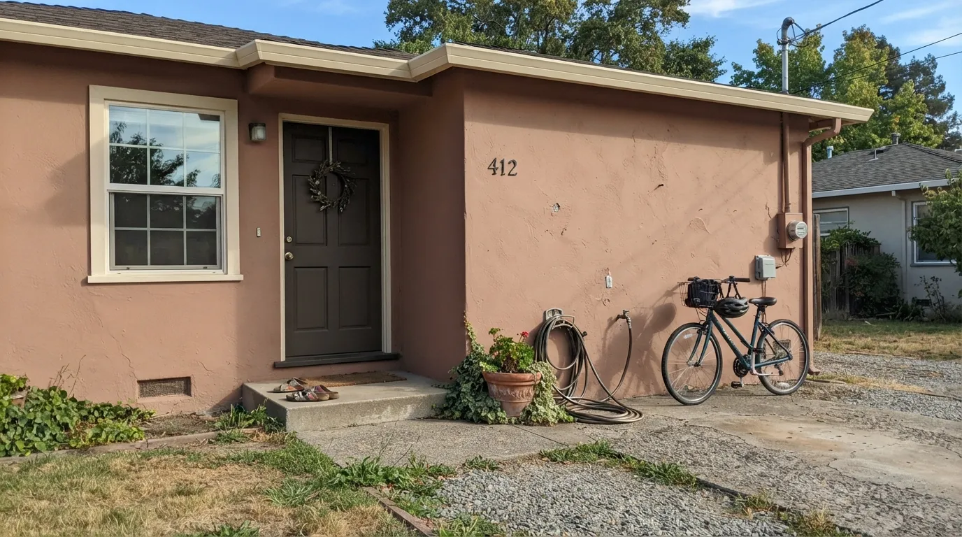
Santa Rosa is Benjamin Moore's quiet answer to the southwestern-adobe look — a mid-toned red-brown built on clay and copper, with a whisper of pink that Benjamin Moore itself flags as the color's defining trait. It isn't a true terracotta and it isn't a dusty mauve; it sits in between, warmer than a taupe and softer than a brick red. Give it real light and warm materials and it reads like sun-baked stucco. Give it a cold north window and it slumps toward a flat, muddy rose-brown.
Stucco or adobe-style exteriors · front doors and shutters on a light-bodied house · dens, libraries, and dining rooms with warm wood and brass · anyone chasing southwestern warmth without going full orange terracotta
Your room only gets cool north light · you wanted true orange terracotta, not pink · your fixed finishes are cool gray or blue-based stone · you want a safe, forgettable neutral, not a color with a point of view
- A genuine warm red-brown with real depth (LRV 30) that holds its color instead of washing out
- Reads like sun-baked adobe stucco on the right exterior
- A front door or shutter color that isn't the default black or navy
- Loves brass, walnut, and warm plaster — instant southwestern warmth
- Deep enough for a den or dining room without going full brick red
- The pink note surprises buyers expecting a straight orange terracotta
- Cool north light drains it to a flat, muddy rose-brown
- Clashes with cool gray or blue-based stone and neighbors
- A narrow, specific look — not a safe whole-house neutral
What Color Is Santa Rosa, Really?
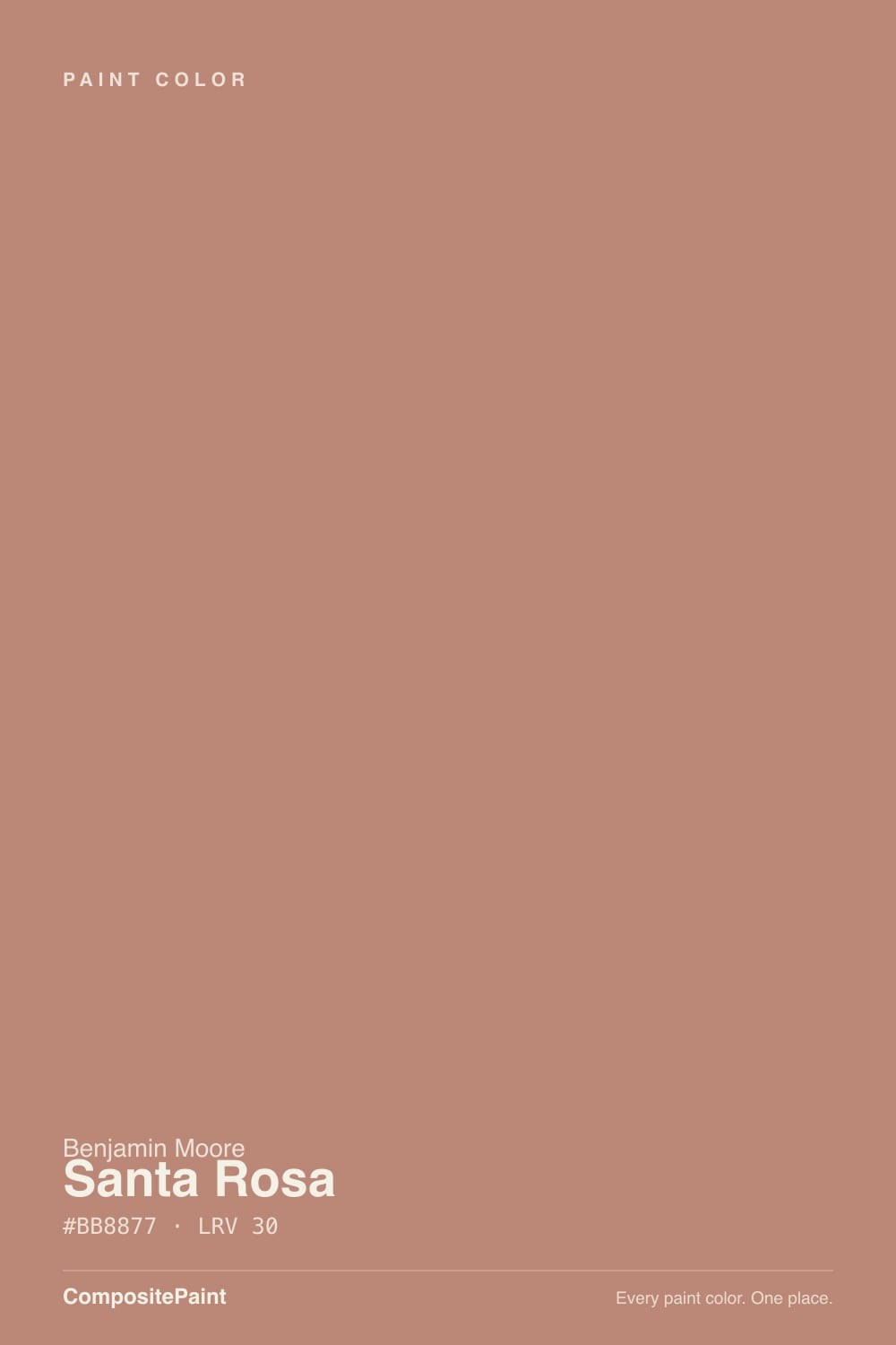
A warm, muted red-brown with a clay-and-copper cast — and a genuine pink note running through it. Benjamin Moore's own description calls out "subtle notes of pink" that bring an earthen quality to the hue, and that is the honest way to describe it: most adobe-style browns are built orange-forward, but Santa Rosa is built pink-forward, then grounded with enough brown depth that it never tips into blush or mauve. It sits in Benjamin Moore's Classic Color Collection, which is a fitting home — this is a color with decades of southwestern-architecture pedigree behind it, not a trend chase.
At LRV 30 it is a genuine mid-tone: darker than a greige, lighter than a true clay red. That depth is doing real work — some paint databases file it under "medium red" rather than brown or orange, and on the wall you can see why. It holds color under bright light instead of washing pale, and it has enough body to read as a deliberate accent color rather than a background neutral. Expect a wall-sized room to look a full step warmer and pinker than the paper chip; that shift is normal for a color built this way, not a defect.
Undertone in one line: red-brown with pink first, clay-copper second — never true orange, never gray. If a sample reads flatter and more mauve-gray than expected, that is cool daylight muting the warmth, not a different color underneath.
Where It Shines
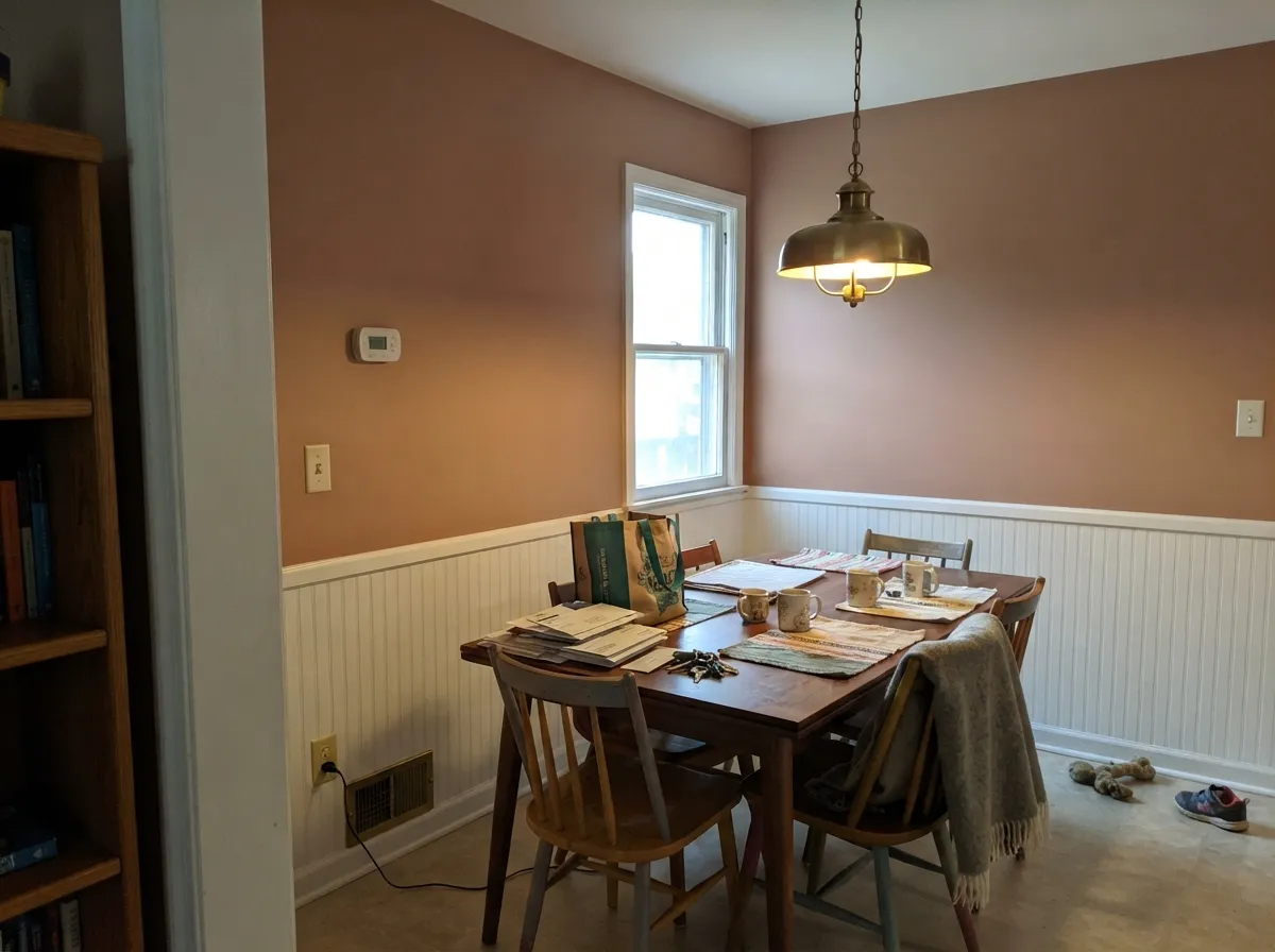
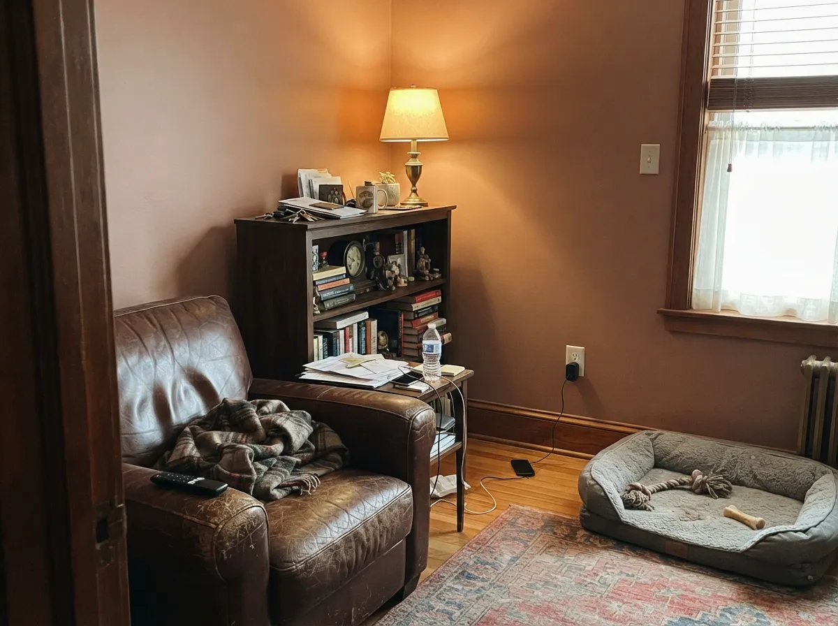
This color is built for sun. On stucco, adobe block, or any light-bodied southwestern exterior, full daylight brings the clay and copper forward and the pink recedes into something closer to sun-baked earth — the effect the name is going for. Indoors its best rooms are the ones that run warm and low-lit after dark: a den with leather and walnut, a dining room with brass fixtures, a front door on a cream or white house. Give it terracotta tile, plaster, wrought iron, and warm wood, and it looks like it belongs to the house rather than a coat of paint added later.
Where It Fails
Almost every disappointing outcome with Santa Rosa comes down to one of three predictable mismatches. None of them are the paint failing — they are the color being asked to do a job it was never built for.
Shoppers picture a straight orange-brown adobe color and get a red-brown with a real pink undercurrent instead. On a small chip the pink is easy to miss; at wall scale it is unmistakable. If straight orange clay is the goal, this is the wrong can — see the comparisons below.
Cool daylight strips the warmth out of any red-brown, and Santa Rosa is no exception: without direct sun or warm bulbs it reads flat and slightly muddy, more "dull rose-gray" than "sun-baked clay." Add 2700K lamps or point it at a room with real daylight instead.
Cool grays, blue-black stone, and icy whites fight the pink instead of grounding it, and the color starts to look like a mistake rather than a choice. Keep its neighbors warm — cream, walnut, brass, terracotta tile — and it stops arguing with the room.
Room by Room
On stucco, adobe block, or a light-bodied siding it reads as intentional southwestern warmth in full sun. As a front-door-only color on a cream or white house, it is a genuine alternative to the usual black or navy door — distinctive without being loud.
Low, warm evening light is this color's best friend, and a dining room gets exactly that. With a walnut table and brass fixtures it reads formal and grounded rather than rustic.
Rooms that run low-lit and lived-in flatter it the same way they flatter any deep, warm color. Leather, walnut shelving, and a warm reading lamp are its natural company.
Beautiful in a closed, warmly lit living room with cream and wood. In an open-plan layout it has to negotiate with whatever the kitchen and hallway are wearing, so sample it against those rooms before committing to the whole floor.
A Santa Rosa island under cream or white cabinetry is a strong, specific look with brass hardware and butcher block. A full kitchen of it is a much bigger commitment and needs warm counters, not cool quartz.
At LRV 30 it is too saturated and too specific for four full walls in most bedrooms, but a single headboard wall under warm lamps gets the cozy southwestern mood without overwhelming the room.
Your Light Is the Risk
Direct daylight brings the clay and copper forward and lets the pink settle into earthy warmth — the sun-baked adobe look the name promises.
Cool, indirect daylight mutes the warmth and leaves a flatter, slightly muddy rose-brown. Sample it in the actual room before trusting the chip.
Warmest and most clay-like at the sun hours, quieter and browner once direct light passes. The color visibly breathes through the day.
2700K lamps push it rosier and cozier. Cool LEDs flatten it toward gray-brown — swap the bulbs before you second-guess the paint.
Most complaints about Santa Rosa are a light mismatch. Upload a photo of your actual room and see it on your walls — then ask for the same wall in north light or evening lamps before you buy a single sample.
Need It From Another Brand?
Any paint counter can custom-tint Benjamin Moore 1189 directly. If you would rather stay in one brand's own deck, these are the closest stock matches, measured as ΔE2000. Under 2 is a difference you will not see on the wall.
| Brand | Closest color | ΔE | LRV | |
|---|---|---|---|---|
| Sherwin-Williams | Roycroft RoseSW 34 · Sherwin-Williams | 2.3 | 33 | Color page → |
| Behr | Ginger RosePPU2-09 · Behr | 1.0 | 30 | Color page → |
| Valspar | Burnished ApricotV081-4 · Valspar | 1.4 | 28.7 | Color page → |
| PPG / Glidden | Big CypressPPG1062-5 · PPG / Glidden | 0.7 | 29 | Color page → |
| Glidden | Big CypressPPG1062-5 · Glidden | 0.7 | 29 | Color page → |
| Dutch Boy | Amber Wood409-4DB · Dutch Boy | 2.3 | 33 | Color page → |
Similar Benjamin Moore Colors
The nearest shades to Santa Rosa within Benjamin Moore's own range, ranked by perceptual color distance — useful when you want the same look a touch lighter, darker, or warmer.
WCAG 2.1: AA is 4.5 : 1 for normal text, 3 : 1 for large text, AAA is 7 : 1.
Santa Rosa vs the Colors You're Also Considering
Every Santa Rosa sample board has the same rivals on it. The numbers show the real lightness gap — then it comes down to which risk you would rather live with.
Pick this for the pinker, softer version of the same southwestern warmth.
Sherwin-Williams SW 7701 · LRV 24Cavern ClayPick this if you want the straight orange-forward terracotta instead of Santa Rosa's pink lean.
Pick this for more color and more depth than Redend Point's whisper-quiet pink.
Sherwin-Williams SW 9081 · LRV 27Redend PointPick this for the internet-famous clay-pink at a slightly lighter, softer depth.
Santa Rosa Coordinating Colors
The rule for coordinating with Santa Rosa: stay warm and stay away from cool grays and blues, which fight its pink note instead of grounding it. It pairs best with warm whites, near-blacks, and other members of the clay-terracotta family — these are the partners that keep showing up in rooms and exteriors that work:
Santa Rosa On Exteriors and Adobe-Style Homes
This is where Santa Rosa does its most convincing work. Benjamin Moore places it in the Classic Color Collection, and on stucco, adobe block, or any light-bodied southwestern facade, full sun draws the clay and copper forward while the pink note settles into something that reads as sun-baked earth rather than a paint-store color. It is a legitimate alternative to the more common orange-forward terracottas for anyone building or repainting in a southwestern or Spanish-revival style.
The pairing still decides the result outdoors, same as indoors. A cream or white trim keeps it feeling architectural rather than heavy; a near-black or dark bronze door and shutters give the warm body a single dark anchor. Avoid cool gray roofing or cool-toned stone accents nearby — they push the pink note into contrast instead of harmony, and the house can end up looking like two different color decisions instead of one.
Santa Rosa With Wood Tones and Floors
Warm woods are the safe answer here: walnut, cedar, and reclaimed barnwood all sit comfortably with Santa Rosa because their warmth matches its own instead of fighting it. Terracotta tile and warm plaster are its most natural floor and wall partners, which is exactly why it shows up so often in southwestern interiors.
Cool-toned floors — gray-washed wood, cool porcelain tile, blue-gray stone — are the pairing to sample carefully first. Against a cool floor, Santa Rosa's pink note becomes the most obvious thing in the room, and not always in a flattering way. A warm rug between the two is an easy fix if the floor itself is not changing.
Three Ready Palettes Built on Santa Rosa
A color is never alone on the wall. These are complete combinations in the 60-30-10 pattern, with the reason each one holds together. Every one opens in the visualizer.
Warm clay stucco, a soft cream trim, and a near-black door and shutters is the classic southwestern-exterior formula — the near-black gives the warm body somewhere to land instead of fading into the landscape.
Try this palette in your roomWhite Dove keeps the trim soft instead of stark against a saturated wall color, and a charcoal buffet adds one grounding dark note so the room reads formal rather than rustic.
Try this palette in your roomNatural Cream is warm enough not to fight Santa Rosa across an open doorway, and Chelsea Gray's charcoal-greige gives the den one cooler note so the room does not read all-orange.
Try this palette in your roomSanta Rosa FAQ
Is Santa Rosa more pink or brown?
Both, in that order. Benjamin Moore's own description leads with the pink note, and it is genuinely there — more than most adobe-style browns. The brown-copper depth keeps it from reading blush or mauve, but if you want a straight orange terracotta with no pink, look at Sherwin-Williams Cavern Clay instead.
Is it a good exterior color?
Yes — this is arguably its best job. On stucco or adobe-style siding in full sun it reads as deliberate southwestern warmth. Pair it with a soft cream or white trim and a near-black door and shutters for the classic version of the look.
What trim white goes with Santa Rosa?
A warm white, not a stark one. Swiss Coffee or White Dove keep the trim soft against the saturated wall color; a cool bright white makes the wall look muddy by comparison.
Does it work as a front door color?
Very well, especially on a cream or white house. It is a distinctive alternative to the default black or navy door and reads warm rather than heavy.
Can I use it in a bedroom?
As an accent wall, yes — under warm 2700K lamps it turns cozy and grounded. Four full walls is a bigger commitment than most bedrooms want at this depth and saturation.
How does Santa Rosa compare to Cavern Clay or Redend Point?
All three are warm clay-browns, but the pink-to-orange balance differs. Cavern Clay leans more orange and true terracotta; Redend Point is a lighter, quieter clay-pink; Santa Rosa sits between them with more depth and a clearer pink note than either.
Have you painted with Santa Rosa?
Rate it — one tap helps the next reader decide.
Ask a Question