Creamy White
Benjamin Moore's quietest cream, reviewed honestly: the trim-and-ceiling workhorse almost nobody photographs, where it glows warm and where it turns tired.

Jessica has spec'd whites and neutrals for more than 300 rooms and keeps a sample wall of painted drawdowns in her studio. Every color review is checked against real reader rooms in the comments and re-tested when a formula changes. About the testing process →
- 1Agreeable Gray60
- 2Balboa Mist66
- 3Creamy White72
- 4Pearly White77
- 5Dover White83
The Fast Verdict
Creamy White is Benjamin Moore's quietest cream — a warm bisque tone that has sat in the Off-White Collection for decades without ever becoming a design-blog darling like White Dove or Swiss Coffee. Search for real rooms painted in it and you will come up nearly empty; ask a painter and they will still know it on sight. It is a genuine warm-white workhorse: deep enough to have presence on trim and cabinets, light enough to still read as white, cream enough to warm a room without shouting about it.
Trim, ceilings and cabinetry in rooms with real daylight · anyone who wants a cream with more body than White Dove without going full tan · traditional and farmhouse kitchens with oak or maple · painters who need one reliable warm white nobody argues with
Your room runs dim or north-facing · you want a stark, gallery-white look · your trim needs to read brighter than your walls · you're painting sight-unseen and were counting on inspiration photos
- Genuine warm bisque cream with real body — reads as a color choice, not a tinted white
- Deep enough to double as a ceiling color in a warm room without looking unfinished
- Flatters oak, maple and warm wood the way the famous BM creams do
- A dependable trim and cabinet color that professional painters already trust
- Reads as considered and traditional, never like builder-grade beige
- Almost no real-room photos online — you are buying mostly on faith and a paint chip
- Goes tired and dingy fast in dim or north-facing rooms
- Deeper than the famous trim whites, so it looks dirty next to a much brighter partner
- So rarely discussed that there is little crowd-sourced advice to lean on before you commit
What Color Is Creamy White, Really?
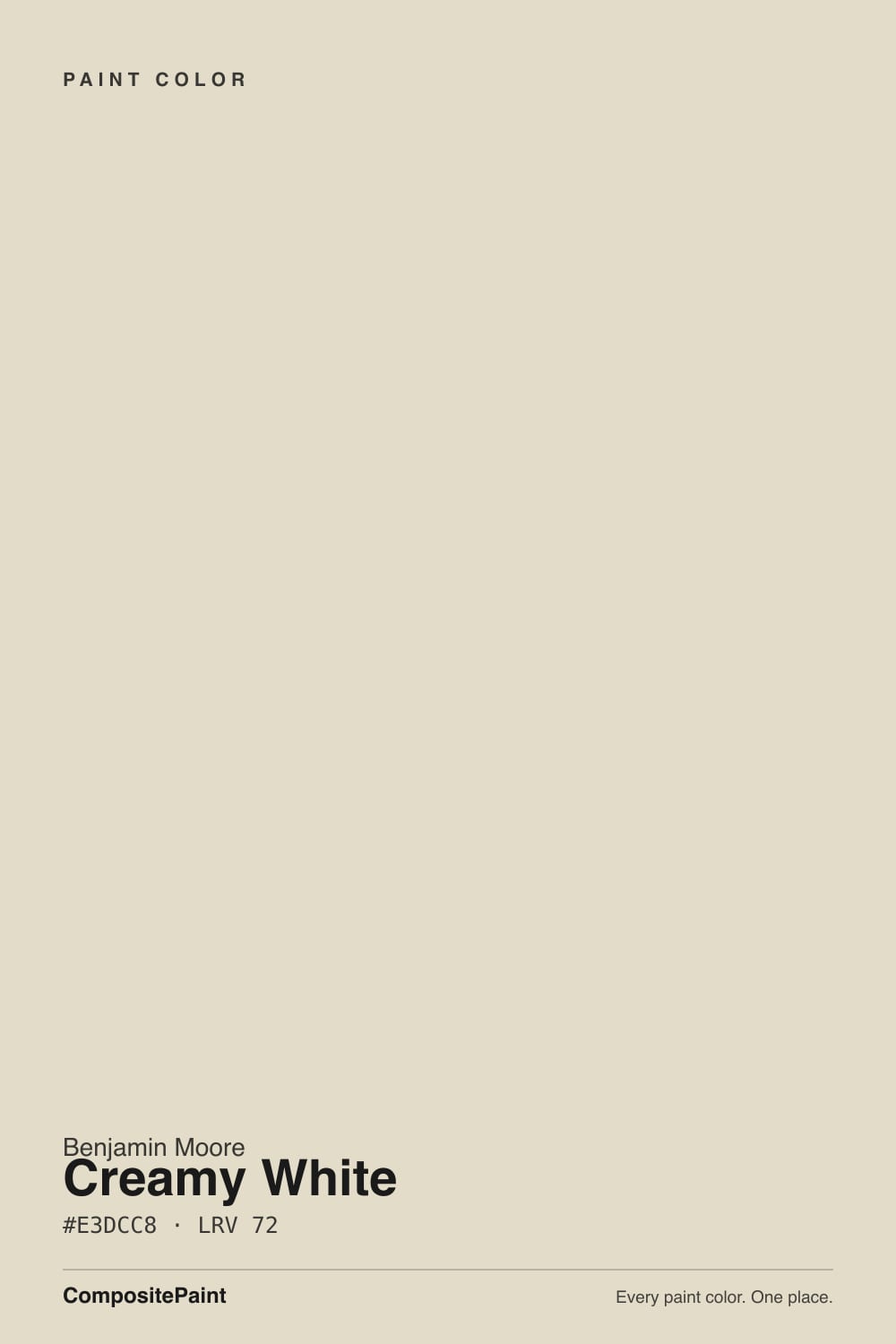
Benjamin Moore's own description is "a warm, gentle bisque hue" — bisque being the useful word here: a soft tan-cream, warmer and more saturated than a typical off-white. It sits in the same Off-White Collection as White Dove and Simply White, but unlike those two it never got the marketing spotlight or the design-blog fame. It has simply been sitting in the deck for decades as a working color — the one a cabinet painter or trim contractor reaches for without a second thought. That obscurity is real, not a knock: search for real-room photos of Creamy White and you will find almost none, and real buyers say so out loud — a Houzz thread asking "has anyone used Benjamin Moore Creamy White?" exists precisely because it is genuinely hard to find pictures of this one online before you commit.
At LRV 72 it sits well below the famous off-whites — White Dove is 85, Swiss Coffee is 84, even Navajo White is 78 — which puts Creamy White in noticeably deeper territory. That depth is the whole point: it carries enough pigment to read as an honest cream rather than a tinted white, which is exactly what gives it presence on trim without disappearing into the wall, and what lets it double as a ceiling color in a warm-toned room instead of looking like an afterthought.
Undertone in one line: warm bisque, a tan-cream with no pink and no green in it. If a sample looks murky or grey, that is the room's light working against it, not the paint changing character.
Where It Shines
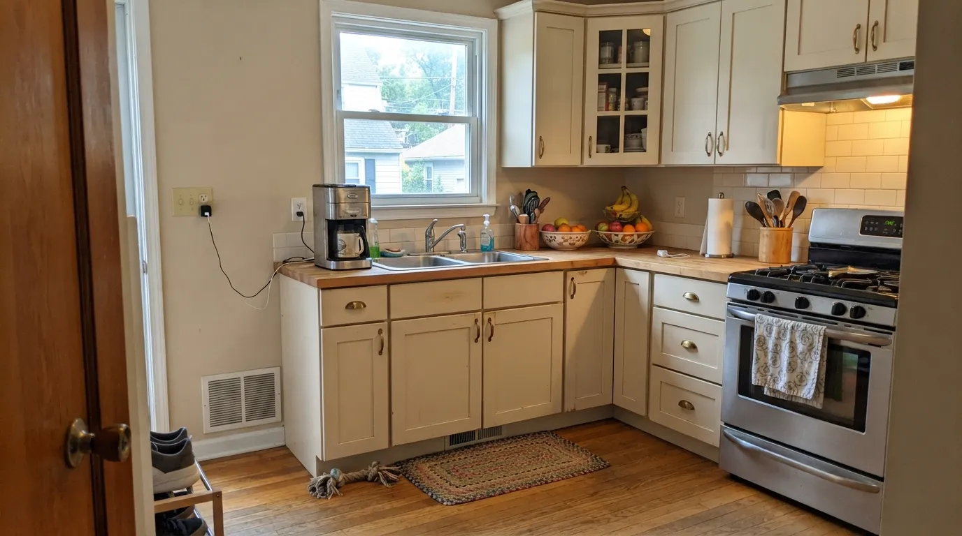
Give it real daylight and warm wood and it does the quiet job it was built for. Trim, cabinets and ceilings are its natural territory — anywhere a color needs enough depth to read as a deliberate choice but not enough saturation to compete with the walls. In a kitchen with oak or maple cabinetry and brass hardware, or on the trim of a traditional room that already leans warm, it behaves the way a good utility color should: it disappears into looking finished.
Where It Fails
Almost every regret story with Creamy White traces back to one of three situations, and all three are predictable before the first coat goes on. None of them are the paint's fault — but if your room or your plan matches one, this is not your color yet.
This is the real, documented complaint: there are almost no real-room photos of Creamy White online, so buyers end up trusting a two-inch chip and hoping. Don't. Order a physical sample (Samplize or an in-store chip) and paint a real board — the online-inspiration shortcut that works for White Dove or Swiss Coffee simply does not exist for this color yet.
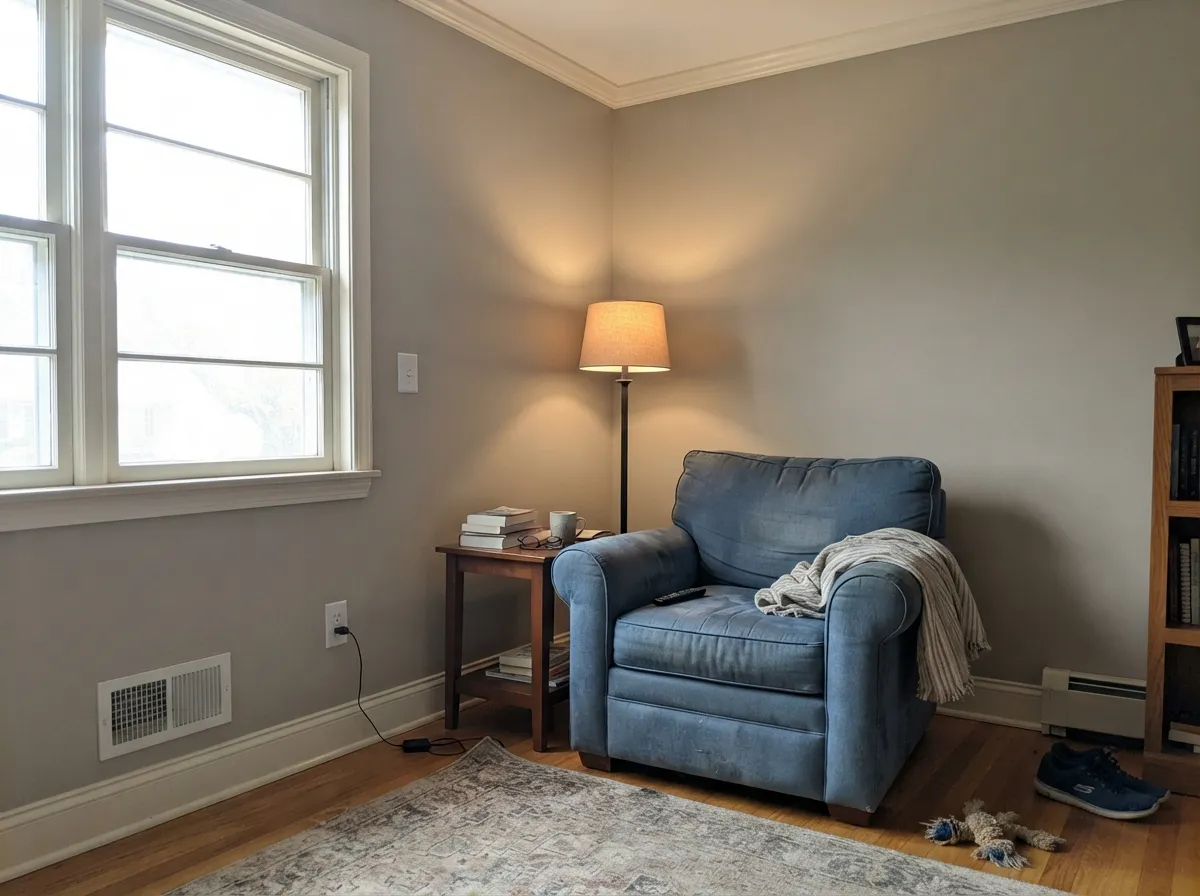
At LRV 72 with a warm bisque undertone, Creamy White needs real light to hold its cream character. In flat, cool daylight the warmth drains out and it reads tired and dingy rather than soft — the same failure mode every warm cream in the deck shares, just with less light to spare because it starts deeper than White Dove or Swiss Coffee.
Because Creamy White sits well below the classic trim whites in LRV, pairing Creamy White walls with a much brighter trim — or the reverse, brighter walls with Creamy White trim done halfheartedly — makes the deeper color look dirty by contrast. The fix is the one-color trick: use Creamy White on both surfaces, separated by sheen, or choose a trim partner closer in value.
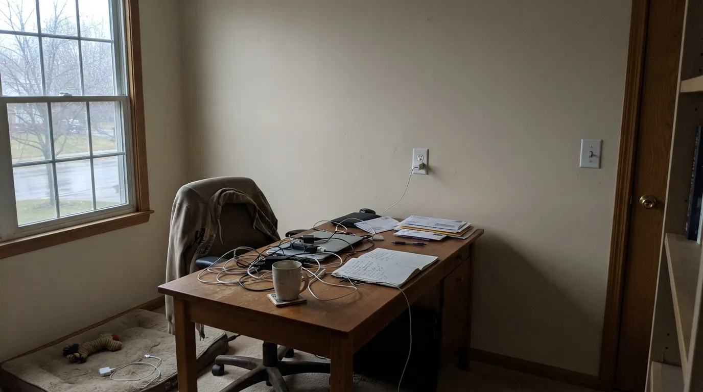
Room by Room
Warm bisque against oak, maple and brass is where this color earns its keep. Satin on cabinets wipes clean and the depth hides fingerprints better than a brighter white would.
Semi-gloss Creamy White trim gives a warm room enough contrast to define the woodwork without the stark cut of a brighter white. This is the job it has quietly done for decades.
Deep enough to feel intentional overhead instead of like an unfinished plane, especially in a room whose walls already run warm. Real owners ask this exact question before painting — pair it with the same color on trim for a soft, enclosed feel, or a lighter cream if you want the ceiling to lift the room.
In south or west light it reads as a calm, finished cream that flatters wood furniture. In a shaded room, test big before committing — this is where the dim-room failure shows up first.
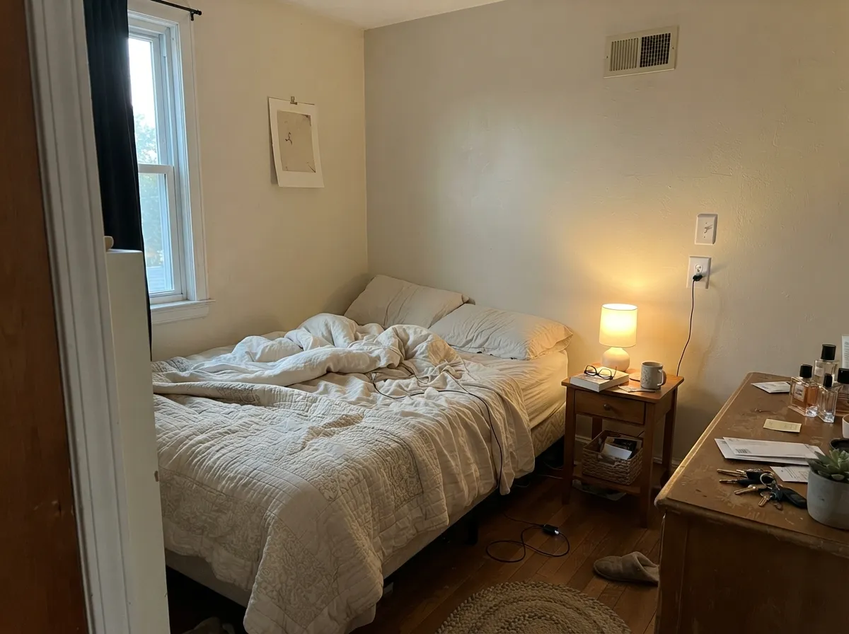
Under 2700K bulbs at night it deepens into a genuinely cozy tan-cream. Pair with warm bedding rather than stark white linens, which will make the walls look dingy by comparison.
With warm wood vanities and brass it is comfortable and traditional. Against cool grey tile or chrome it starts to look muddy — the same cool-versus-warm mismatch that trips up every cream in this family.
Your Light Is the Risk
Full warm daylight is where the bisque tone glows instead of looking dingy — the light condition this color actually needs.
Flat, cool daylight drains the warmth and leaves it reading tired and grey-tan. Sample it in your own room before trusting a chip.
In an east-facing room it starts cool and quiet in the morning and warms visibly by late afternoon. The shift is gentle, not a different color.
2700K lamps deepen it into a cozy tan-cream. Cool white LEDs flatten it toward grey — swap the bulbs before you swap the paint.
Most complaints about Creamy White are a light mismatch. Upload a photo of your actual room and see it on your walls — then ask for the same wall in north light or evening lamps before you buy a single sample.
Need It From Another Brand?
Any paint counter can custom-tint Benjamin Moore OC-7 directly. If you would rather stay in one brand's own deck, these are the closest stock matches, measured as ΔE2000. Under 2 is a difference you will not see on the wall.
| Brand | Closest color | ΔE | LRV | |
|---|---|---|---|---|
| Sherwin-Williams | Neutral GroundSW 7568 · Sherwin-Williams | 1.9 | 70 | Color page → |
| Behr | Ivory PaperMQ3-12 · Behr | 1.2 | 72 | Color page → |
| Valspar | Daybreak6008-3A · Valspar | 1.4 | 71.2 | Color page → |
| PPG / Glidden | Sugar CookiePPG1101-2 · PPG / Glidden | 0.4 | 72 | Color page → |
| Glidden | Sugar CookiePPG1101-2 · Glidden | 0.6 | 73 | Color page → |
| Dutch Boy | Antique White011W · Dutch Boy | 2.2 | 72 | Color page → |
Similar Benjamin Moore Colors
The nearest shades to Creamy White within Benjamin Moore's own range, ranked by perceptual color distance — useful when you want the same look a touch lighter, darker, or warmer.
WCAG 2.1: AA is 4.5 : 1 for normal text, 3 : 1 for large text, AAA is 7 : 1.
Creamy White vs the Colors You're Also Considering
Every Creamy White sample board has the same rivals on it. The numbers show the real lightness gap — then it comes down to which risk you would rather live with.
Pick this for more cream depth and presence, especially on trim or a ceiling in a room that already runs warm.
Benjamin Moore OC-17 · LRV 85White DovePick this for the lighter, more famous default — higher LRV and the safest pick if you are not sure.
Pick this for more depth and a color that reads confidently as cream rather than a tinted white.
Benjamin Moore 947 · LRV 78Navajo WhitePick this for a lighter cream that stays closer to white — but check your light exposure first, it is pickier about which side of the house it sits on.
Spring in Aspen 954 shares the same hex #E3DCC8 at LRV 71, so on a wall it is the same color from a different deck. Elephant Tusk OC-8 at #E4DCC4 and LRV 70 is a shade deeper and slightly more yellow. Ivory Porcelain 239 at #E4DCC4 and LRV 72 matches the lightness with the same small extra warmth. Pebble Rock 945 at #E3DEC7 and LRV 73 is the lightest of the group and reads a touch fresher.
Across brands the matches are exceptionally close. Farrow and Ball Lime White No. 1 at deltaE 0.38, PPG and Glidden Sugar Cookie PPG1101-2 at 0.43, Kompozit White Elephant 0223 at 0.73, and Diamond Vogel Hennepin White H102 at 0.97 are all true matches rather than approximations. Behr Ivory Paper MQ3-12 at deltaE 1.17 and Sherwin-Williams Neutral Ground SW 7568 at 1.85 are visually identical in normal room light. C2 Cherubic C2-850 at deltaE 3.4 is very close but should be sampled first.
Creamy White Coordinating Colors
The rule for coordinating with Creamy White is the same one that governs every warm cream: stay warm, and keep the value gap modest so nothing looks dingy by comparison. It pairs naturally with warm greiges, quieter creams, and one confident dark note for contrast. These are the partners that keep the palette calm instead of competing:
Why This Color Has No Photos Online
Creamy White is not a new or discontinued color — it is a genuine, decades-old member of Benjamin Moore's Off-White Collection, sold and mixed at every counter today. What it never got was the design-blog spotlight that turned White Dove and Simply White into household names. Instead it became the color painters and cabinet shops quietly kept using, because it does its job, without anyone writing it up.
The result shows up directly in reader research: a Houzz thread titled simply "has anyone used Benjamin Moore Creamy White?" exists because a real buyer with a physical sample in hand could not find enough real rooms to compare it against. That is not a red flag about the paint — it is a genuine gap in the online record. If you are considering it, treat the paint chip and a real sample board as your primary evidence, not someone else's Pinterest board, because that board mostly does not exist yet.
Creamy White With Wood Tones and Floors
Like every warm bisque cream in the Benjamin Moore deck, Creamy White is built to sit next to warm wood, and oak, maple and butcher block are its natural company — the warmth on both sides meets in the middle instead of fighting. It is a particularly comfortable match for honey and golden-toned wood, which is exactly the floor tone that gives cooler whites trouble.
Cool grey or grey-washed flooring is the pairing to sample first. The same warm-versus-cool mismatch that affects every color in this family shows up here too: grey floors can pull Creamy White's warmth into relief and make the trim or cabinets read slightly yellow by comparison. It is rarely a dealbreaker with enough natural light and warm accents in the room, but it is worth a large sample above the actual floor before committing a whole kitchen to it.
Three Ready Palettes Built on Creamy White
A color is never alone on the wall. These are complete combinations in the 60-30-10 pattern, with the reason each one holds together. Every one opens in the visualizer.
Agreeable Gray's warm greige base meets Creamy White's bisque halfway, so the wall-to-trim handoff feels deliberate rather than mismatched. Chelsea Gray supplies the single dark anchor note without going stark black.
Try this palette in your roomNatural Cream's quieter warmth keeps the walls from competing with Creamy White cabinets, so the two read as one calm palette. Hale Navy on the island gives the room its single saturated note and loves the same warm wood and brass both creams already flatter.
Try this palette in your roomPale Oak and Creamy White share the same warm-greige-to-bisque family, so the ceiling reads as a soft continuation of the walls instead of a stark cap overhead. Revere Pewter on built-ins adds depth without introducing a new undertone to referee.
Try this palette in your roomCreamy White FAQ
Is Creamy White warm or cool?
Warm — Benjamin Moore's own description calls it a "gentle bisque hue." It is a genuine tan-cream with no pink and no green in it. In cool light it can look muted, but it never turns cold.
Why can't I find real room photos of Creamy White?
Honestly: it has never been a design-blog favorite the way White Dove or Swiss Coffee are, even though it has sat in Benjamin Moore's deck for decades as a working trim and cabinet color. That means fewer inspiration photos to lean on before you commit — order a physical sample and paint a real board rather than searching for someone else's room.
Creamy White vs White Dove — which one?
White Dove is lighter (LRV 85), more famous, and the safer default if you are unsure. Creamy White is deeper (LRV 72) and carries more visible cream, which gives it more presence on trim, cabinets or a ceiling in a room that already runs warm. Neither is a wrong answer — it depends on how much color you want to see.
Can I use it on kitchen cabinets?
Yes — this is one of its best jobs. Against oak, maple, brass hardware and butcher block it reads warm and considered. Use a satin, urethane-fortified cabinet enamel; the depth hides scuffs and fingerprints well.
What wall color goes with Creamy White trim?
Stay warm and stay close in value: a warm greige or a quieter cream keeps the handoff soft, the way Agreeable Gray or Natural Cream do above. A much brighter wall white will make Creamy White trim look dingy by contrast, and a dim room will make the whole pairing feel tired regardless of the wall color — make sure the room has real daylight first.
Does it work as a ceiling color?
Yes, and real owners specifically ask this question because it is deeper than a typical ceiling white. In a room whose walls already run warm, a Creamy White ceiling reads as a soft continuation rather than a stark cap. If you want the ceiling to visually lift the room instead, go lighter — White Dove or a plain white.
Have you painted with Creamy White?
Rate it — one tap helps the next reader decide.
Ask a Question