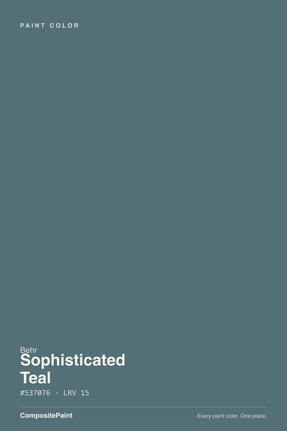
Sophisticated Teal
A deep grayed teal reviewed honestly: the light that pulls the green forward, the light that flattens it to blue-black, and where it actually earns its keep — cabinets, front doors, and small rooms.

Jessica has spec'd whites and neutrals for more than 300 rooms and keeps a sample wall of painted drawdowns in her studio. Every color review is checked against real reader rooms in the comments and re-tested when a formula changes. About the testing process →
- 1Salamander6
- 2Sophisticated Teal15
- 3Adirondack Blue22
- 4Van Courtland Blue31
The Fast Verdict
Sophisticated Teal is a blue-green pulled down to LRV 15 and grayed just enough to stop looking like a swimming pool. In real daylight the green steps forward and it reads like a confident, grown-up teal; under anything dimmer or cooler it sinks into a flat blue-black that could pass for a navy. It is not a bright, saturated color, and it was never trying to be — this is the teal you pick for cabinets and a front door, not the one you pick if you actually wanted turquoise.
Kitchen islands and cabinets · front doors · powder rooms and bath vanities · a moody accent wall in a room with real daylight
Your room runs on cool LEDs with no natural light · you wanted a bright, saturated Caribbean teal · you're doing all four walls in a dim north-facing room · you want a color that reads the same day and night
- A grayed-down teal that reads sophisticated instead of loud
- Genuinely sold as a cabinet/door/trim enamel and as a porch-and-patio floor paint — not just a wall color
- Green comes forward in real daylight, settles into moody blue-gray at night — most owners like the shift
- Deep enough (LRV 15) to hold real color in a bright room
- Pairs cleanly with warm white trim, brass, and black hardware
- Goes flat, near-black blue-gray in dim or cool-lit rooms
- Not a bright, saturated teal — too muted if that's the look you want
- The porch/patio floor enamel version can be slippery when wet without a grit additive
- More light-dependent than a true neutral — sample big before committing
What Color Is Sophisticated Teal, Really?
A blue-green with a soft gray cast pulled deep enough — LRV 15 — that it behaves more like a near-neutral dark than a statement color. Behr sells it under its Home Decorators Collection banner and has featured it as a Color of the Month, which is a fair description of the appeal: it looks expensive and considered rather than trendy. The gray in the mix is doing the real work — take it out and you have a much louder aqua; leave it in and the color can sit next to brass, black hardware, or warm wood without shouting.
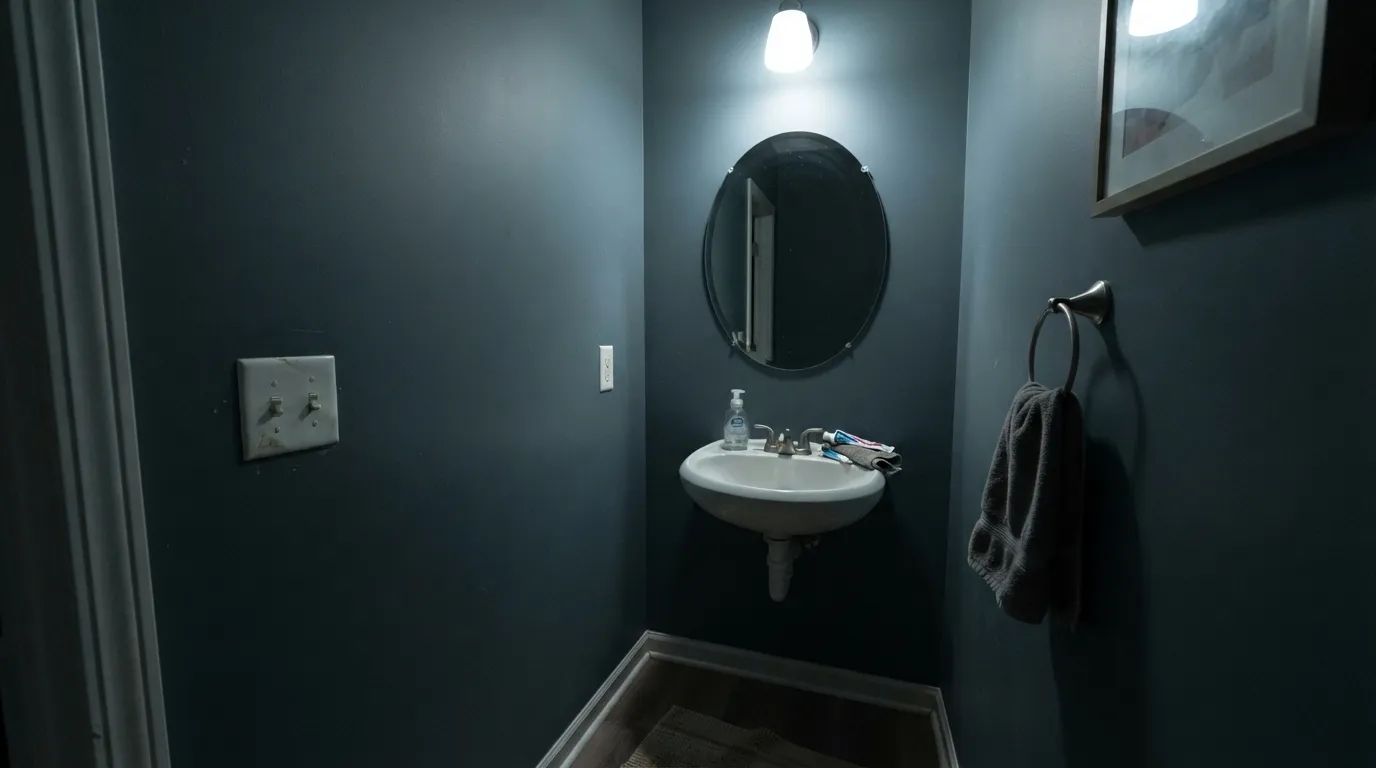
At LRV 15 it is a genuine dark. That depth is why the color needs real light to prove what it is: in strong, direct daylight the green comes forward and the paint reads as a clear, confident blue-green. Pull the light back — an overcast afternoon, a lamp instead of a window, a north-facing wall — and the green retreats, leaving a flat, cool blue-gray that can look almost black in a photo. Plan for the paint to look darker and less colorful than the chip in anything but bright rooms; that gap between chip and wall is the single most common surprise with a color this deep.
Undertone in one line: blue-green with gray holding it down — never a clean, bright teal, never a true navy. If your sample reads mostly gray or near-black, that is the room's light doing exactly what this color does in low light, not a bad can of paint.
Where It Shines
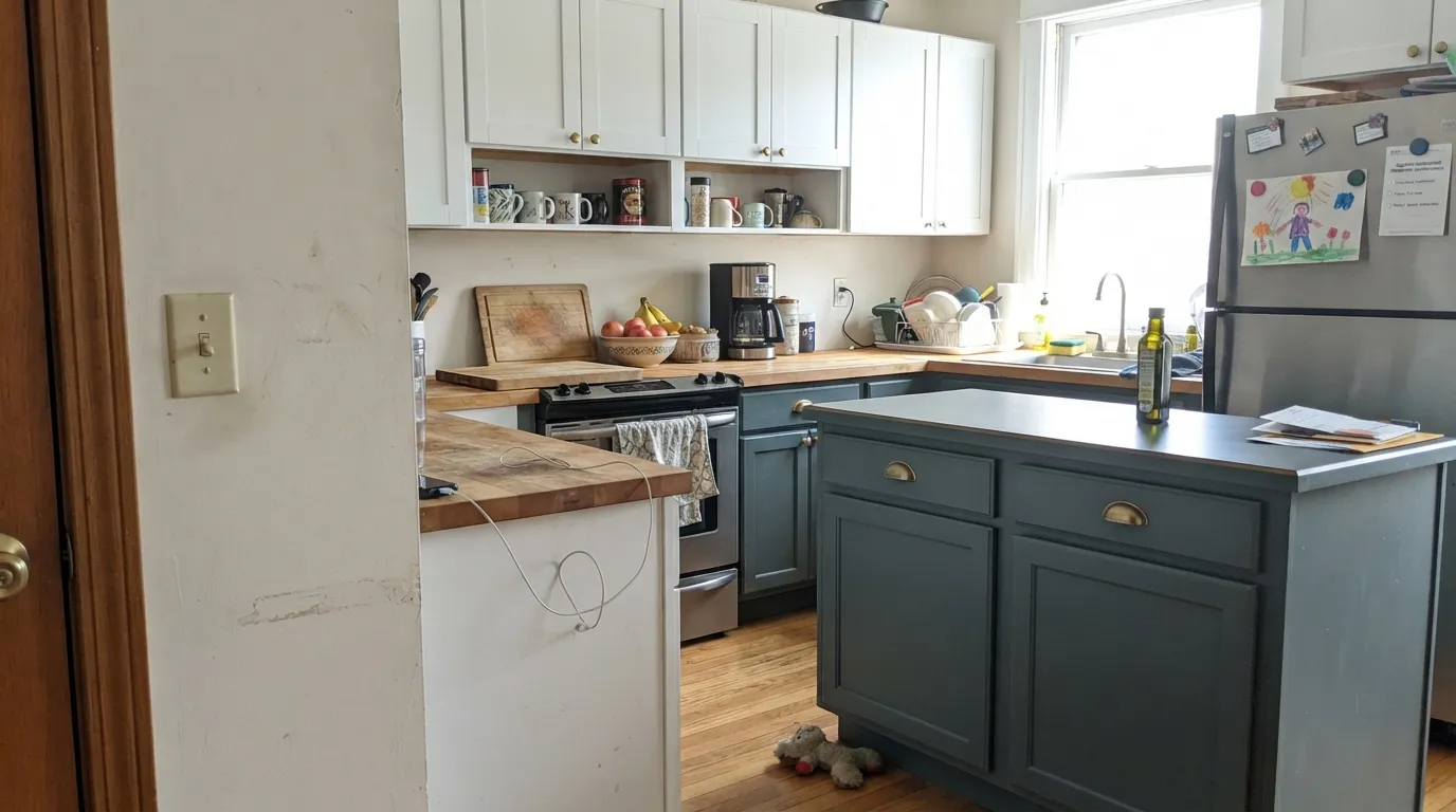
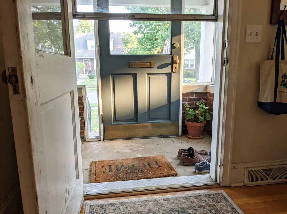
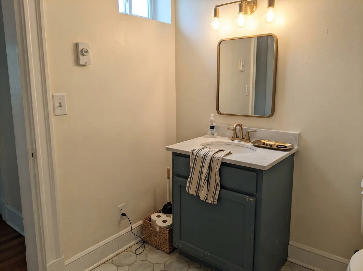
This color does its best work as a decision on one surface, not a whole room, and it does that work well. Cabinets and kitchen islands are its home turf — Behr sells this exact color pre-formulated as a cabinet-and-trim enamel, which tells you where the brand expects it to land. Front doors are the other obvious win: enough color to read as a real choice from the curb, dark enough to hide everyday grime, and it reads calmer than a true navy against most siding colors. Small, well-lit rooms — a powder room, a vanity — take the depth well because there is less wall for the color to go flat across.
Where It Fails
Nearly every disappointed review of a color this deep traces back to one of three things, and none of them are really the paint's fault. If your situation matches one of these, sample big before you commit — a swatch card will not warn you.
The gray in this formula is deliberate — it is what keeps a deep blue-green from turning candy-bright — but it also means Sophisticated Teal will never read as a vivid Caribbean turquoise, on the chip or on the wall. If that vivid, high-chroma teal is the look you pictured, this color will feel muted and disappointing next to it. Look at a lighter, more saturated teal-blue like Aegean Blue instead and let this one stay in the cabinet-and-door lane.
Cool light strips the green out of this color the same way it does with every grayed dark blue-green, leaving a flat, near-black blue-gray that reads more like a shadow than a paint choice. Readers who love this color in a bright kitchen and then use it in a windowless powder room under a cool overhead bulb are describing two different colors. The fix is cheap: swap to 2700K warm bulbs before you decide the paint failed.
Behr sells this exact color as a low-lustre enamel porch-and-patio floor paint as well as a wall paint, and the two products behave differently. A gloss or low-lustre floor enamel shows dust, scuffs, and foot traffic more than a flat interior wall finish does, and enamel floor coatings can get slippery underfoot when wet unless you mix in a grit additive on steps. That is a floor-paint quirk, not a wall-color one — but it is an easy mix-up if you grab the wrong can at the store.
Room by Room
Behr already sells this color pre-mixed as a cabinet-and-trim enamel, and it earns the formulation: on an island or lower cabinets under warm task lighting it reads confident and current without going trendy-bright. Semi-gloss for wipeability; pair with a warm white on the uppers so the kitchen doesn't go fully dark.
A classic use for a color at this depth. It reads as a real color choice from the curb without the commitment of a full navy, and the enamel door-and-trim version Behr sells is built for exactly this job. Works against white, cream, or light gray siding; gets murkier against a house that's already blue-gray.
Small rooms take deep color well, and a Sophisticated Teal vanity under a bright bathroom light with brass or black hardware reads custom, not cautious. Satin cabinet enamel; make sure the room actually has a light source, not just an overhead can light.
One wall in a room that gets genuine daylight can carry this color as a grounded, moody backdrop for warm wood and black metal. In a dim or north-facing room, the same wall reads flat and closes the space in rather than adding depth.
Can work as an accent behind a headboard with warm lamps and daylight during the day, but it is not the automatic moody-bedroom pick some deeper, warmer colors are. If the room has no real daylight, this is not the color to gamble on for four walls.
Full sun tends to gray it out rather than flatter it the way it flatters a true navy or a warm exterior color, so it is a stronger shutters-and-door color than a whole-house siding color. Where it genuinely shines outdoors is the job Behr built a dedicated product for: porch and patio floors, where the low-lustre enamel formula is meant to take foot traffic and weather.
Your Light Is the Risk
The green steps forward and the color reads as a clear, confident blue-green. This is the light the color was chosen for.
The green retreats and the paint flattens into a near-black blue-gray. Test on the actual wall before committing a whole room.
The same wall can look gray-black under clouds and clearly teal an hour later in sun. Expect it to move more than a lighter color would.
2700K warm bulbs keep the blue-green readable after dark. Cool white LEDs push it toward flat charcoal — swap the bulb before you swap the paint.
Most complaints about Sophisticated Teal are a light mismatch. Upload a photo of your actual room and see it on your walls — then ask for the same wall in north light or evening lamps before you buy a single sample.
Need It From Another Brand?
Any paint counter can custom-tint Behr HDC-CL-22 directly. If you would rather stay in one brand's own deck, these are the closest stock matches, measured as ΔE2000. Under 2 is a difference you will not see on the wall.
| Brand | Closest color | ΔE | LRV | |
|---|---|---|---|---|
| Sherwin-Williams | Smoky BlueSW 7604 · Sherwin-Williams | 4.5 | 15 | Color page → |
| Benjamin Moore | Bella Blue720 · Benjamin Moore | 1.7 | 16 | Color page → |
| Valspar | Ol' Blue EyesV105-5 · Valspar | 1.7 | 14.7 | Color page → |
| PPG / Glidden | SuperstitionPPG1035-6 · PPG / Glidden | 3.3 | 15 | Color page → |
| Glidden | SuperstitionPPG1035-6 · Glidden | 3.3 | 15 | Color page → |
| Dutch Boy | Shadowed Blue428-6DB · Dutch Boy | 2.9 | 16 | Color page → |
Similar Behr Colors
The nearest shades to Sophisticated Teal within Behr's own range, ranked by perceptual color distance — useful when you want the same look a touch lighter, darker, or warmer.
WCAG 2.1: AA is 4.5 : 1 for normal text, 3 : 1 for large text, AAA is 7 : 1.
Sophisticated Teal vs the Colors You're Also Considering
Every Sophisticated Teal sample board has the same rivals on it. The numbers show the real lightness gap — then it comes down to which risk you would rather live with.
Pick this for Home Depot availability and the matching cabinet-and-floor enamel options Behr sells alongside it.
Benjamin Moore 720 · LRV 16Bella BluePick this if your painter works in Benjamin Moore — it is nearly the same deep slate-teal at almost the same LRV.
Pick this for the more distinctly blue-green identity — Hidden Gem leans closer to a straight dark green.
Behr N430-6A · LRV 14Hidden GemPick this if you want the greener, less-blue version of the same depth — still Behr, still cabinet-friendly.
Pick this for the deeper, grayed, more grown-up version — Aegean Blue is louder and less forgiving of a dim room.
Behr BXC-36 · LRV 25Aegean BluePick this if you want an actual bright teal-blue that isn't afraid of daylight — the color Sophisticated Teal fans wish it were.
Pick this when the green identity is the point — Sophisticated Teal commits to it in good light; Smoky Blue never does.
Sherwin-Williams SW 7604 · LRV 15Smoky BluePick this if you want the green dialed down further — Smoky Blue reads as a dependable blue-gray, barely teal at all.
Within Behr the closest neighbor is Juniper Berries PPU13-02 (#547075, LRV 15), which is effectively the same color on a wall. Unreal Teal ECC-58-3 (#5C6E70, LRV 15) is grayer and less blue, a good pick if you want the color to behave more like a dark neutral. Myth 740F-5 (#51757A, LRV 16) is slightly brighter and more clearly teal.
Across brands, Valspar Ol' Blue Eyes V105-5 (#556F77, LRV 14.7) at deltaE 1.7 and Benjamin Moore Bella Blue 720 (#54747C, LRV 16) at deltaE 1.74 are both visually identical in normal room light, with Bella Blue reading a hair bluer.
Dunn-Edwards Moody Blues DET590 (#586E75, LRV 15) is deltaE 2.55, very close but worth sampling first. Sherwin-Williams Smoky Blue SW 7604 (#596E79, LRV 15) is deltaE 4.49, close but visibly different side by side, leaning noticeably bluer. Clare Nearly Navy PNT100-DP-65 (#4D6A70, LRV 13) is deltaE 2.26 and a step darker.
Sophisticated Teal Coordinating Colors
The rule for coordinating with Sophisticated Teal: keep whites warm and neutral, and let near-blacks do the contrast work instead of a second bright color. It pairs cleanly with brass and black hardware, and it shares its depth almost exactly with a couple of other decks' quiet teals, which makes cross-brand matching easy if your painter stocks a different brand.
Sophisticated Teal Across Behr's Product Line
This is one of the more genuinely versatile single colors in Behr's deck, in a literal sense: it's sold as a Marquee interior wall paint in matte, satin, and semi-gloss, as a Premium Plus eggshell interior paint, as a Premium cabinet-and-door-and-trim enamel, and as a low-lustre enamel porch-and-patio floor paint — with an interior/exterior alkyd enamel version on top of that. Behr has also run it as a featured Color of the Month, which tracks with how the color reads: designed to be a deliberate, single-surface choice rather than a whole-house default.
The practical takeaway: know which product you're buying. The wall paints are built for coverage and washability on drywall; the cabinet enamel is built for a harder, more durable finish on wood; the porch-and-patio floor version is a different formula entirely, built to take foot traffic and weather, and it will not behave — or wear — like the wall paint if you use it somewhere it wasn't designed for.
Sophisticated Teal With Wood Tones and Metals
Walnut, black stain, and unlacquered brass are this color's best company — the warmth in the wood and metal balances the cool gray in the paint, which is why it turns up so often on kitchen islands with brass pulls. Black and matte-black hardware read clean and modern against it.
Honey oak and orange-toned wood are the pairing to watch. Orange sits close to this color's complement, so a golden oak floor or trim can make the teal look slightly duller and the wood look slightly more orange than it does on its own. It's a mild version of that clash, not a dealbreaker — a walnut or black-stained accent nearby usually settles it — but it's worth a sample next to the actual floor before committing a whole kitchen.
Three Ready Palettes Built on Sophisticated Teal
A color is never alone on the wall. These are complete combinations in the 60-30-10 pattern, with the reason each one holds together. Every one opens in the visualizer.
A warm white on the uppers keeps the kitchen from going dark, the teal island supplies the one confident color decision, and Cast Iron on the hood ties the metals together without adding a second bright color to argue with.
Try this palette in your roomA light, neutral siding lets the door carry all the color; soft near-black shutters add depth without competing with the teal for attention the way a second blue would.
Try this palette in your roomCream walls keep a small room from feeling cave-like, the vanity carries the color, and near-black fixtures give the eye one dark anchor so the scheme reads deliberate instead of accidental.
Try this palette in your roomSophisticated Teal FAQ
Is Sophisticated Teal more blue or more green?
Both, depending on the light. Behr describes it as a blue-green with a gray cast, and that is accurate: bright daylight pulls the green forward, dim or cool light pushes it toward blue-gray. It is not a fixed color so much as a range that moves with the room.
What is the LRV of Sophisticated Teal?
Our deck lists it at 15, which some independent color-matching sites round slightly lower, to around 13. Either way it is a genuine dark — expect it to reflect roughly a seventh of the light hitting it and to behave like a deep color, not a mid-tone.
Does it work on kitchen cabinets?
Yes — Behr sells this exact color pre-formulated as a cabinet-and-trim enamel, which is a strong hint about where it performs best. Semi-gloss, and pair it with a warm white on the rest of the kitchen so the room keeps some light.
Is it a good front door color?
Yes. It reads as a confident, considered color from the curb without the full commitment of a true navy, and Behr's door-and-trim enamel line carries it. It looks best against light siding — white, cream, light gray — and gets muddier against a house that already leans blue-gray.
Can I use it in a small bathroom or powder room?
It's one of its best uses. A vanity or all four walls in a small, well-lit powder room reads custom and intentional. Make sure the room has a real light source — this color needs light to prove it's teal and not just dark.
Can I use it outside, like on a porch floor?
Behr sells this color specifically as a low-lustre enamel porch-and-patio floor paint, so yes, that is a real, intended use — just know it's a different product than the wall paint, built to take foot traffic, and enamel floor finishes can be slippery when wet unless you add a grit additive on steps.
Have you painted with Sophisticated Teal?
Rate it — one tap helps the next reader decide.
Ask a Question