Pale Honey
A soft honey-gold yellow reviewed honestly: the kitchens where it glows, the light that turns it dull, and what to pick instead.

Jessica has spec'd whites and neutrals for more than 300 rooms and keeps a sample wall of painted drawdowns in her studio. Every color review is checked against real reader rooms in the comments and re-tested when a formula changes. About the testing process →
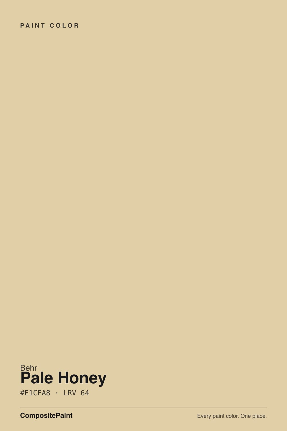
- 1Honey Tea52
- 2Jackfruit62
- 3Pale Honey70
- 4Lemon Chiffon79
- 5Frittata86
The Fast Verdict
Pale Honey is what happens when yellow agrees to behave: a warm gold anchored by a beige note, so it reads sunny and grounded instead of candy-bright or nursery-sweet. At LRV 70 it holds real color — this is not a whisper-of-yellow trim white — while staying light enough for a whole kitchen or dining room. Give it daylight and warm wood and it is genuinely inviting; take the daylight away and the honey turns flat fast.
Kitchens with warm wood, brass, and real daylight · dining rooms that want a cheerful glow · entryways and mudrooms that need a warm welcome · nurseries and kids' rooms that want happy color without going neon
Your room faces north and stays dim · you already have honey-oak floors and gold-flecked counters · you want a true neutral, not a yellow · your trim and fixtures are icy white or cool gray
- A real, visible honey-gold — not a barely-there wash of yellow
- LRV 70 keeps rooms bright without going saturated or loud
- Flatters warm oak, walnut, brass and butcher block
- Sold across Behr's line in every sheen, including cabinet-ready semi-gloss
- Genuinely cheerful in kitchens, entries and kids' spaces without reading childish
- Goes flat and slightly murky in dim, north-facing rooms
- Clashes with icy white trim and cool gray-blue stone
- Reads far more yellow on the wall than the chip suggests
- Fights with honey-oak floors and gold-toned counters — too much of the same warmth
What Color Is Pale Honey, Really?
A warm gold-yellow built on a beige base, not a clear or lemony one — that beige note is the whole trick. Straight yellows can turn saccharine or nursery-bright on a wall, but Pale Honey is mixed with enough brown-beige underneath that it lands closer to honey than to butter. It sits in Behr's PPU6 family alongside deeper cousins like Charismatic and Saffron Strands, and it is sold across Behr's Premium Plus and Marquee lines in every sheen from flat to semi-gloss, which tells you it is meant to do real work — walls, trim, and cabinets, not just an accent.
At LRV 70 it reflects a good amount of light, so a whole room in Pale Honey still feels bright, not cave-like — but it is clearly not a neutral. Put it next to a color like Behr Butter Yellow (LRV 86) and Pale Honey suddenly shows real body and color where Butter Yellow reads almost white. That gap matters: a lot of readers pick a pale yellow off a small fan-deck chip expecting a whisper of warmth and get a wall that unmistakably reads gold. The paint did not change; the sample size did.
Undertone in one line: warm gold, never green, never pink. If your sample looks murky or slightly greenish, that is cool light stripping the warmth out — not the paint failing. If it flashes orange in late-day sun, that is normal for every warm yellow at this depth.
Where It Shines
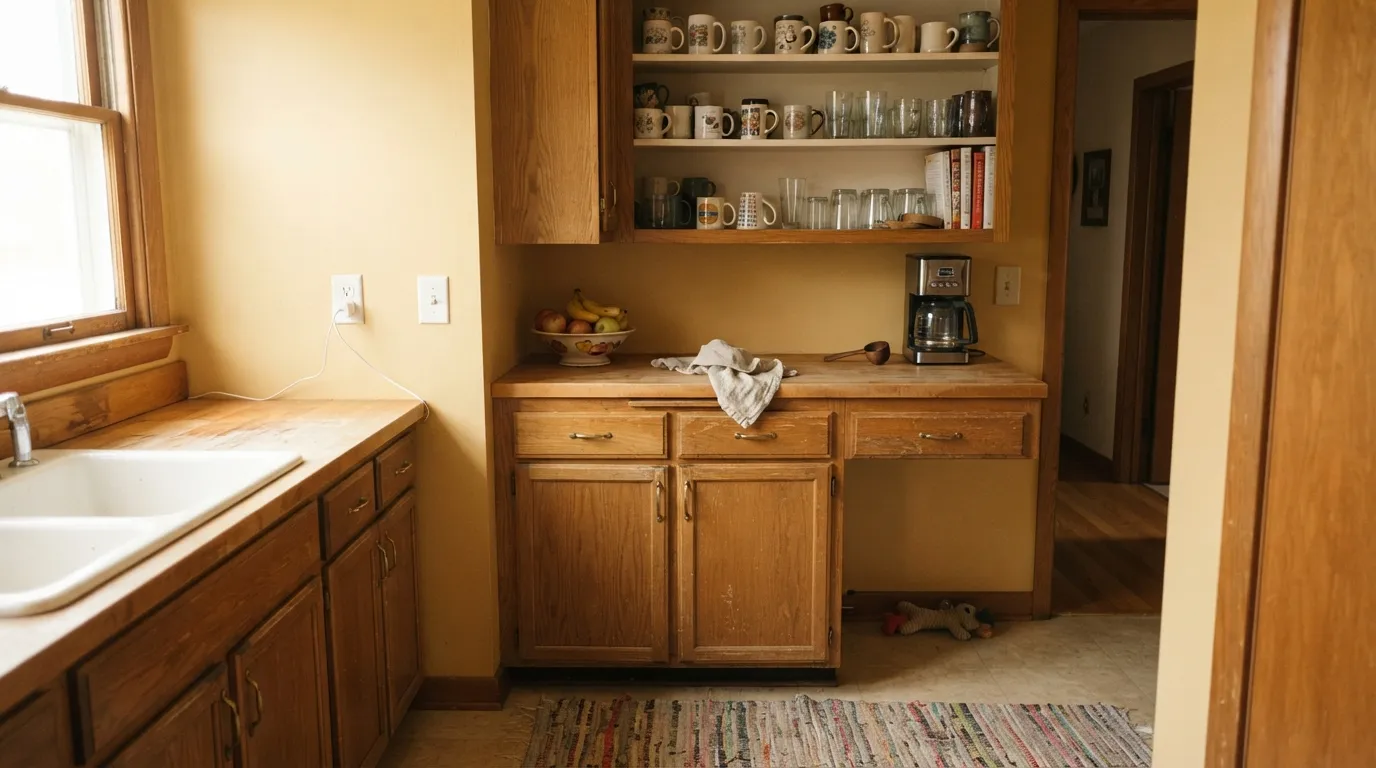
Give it real daylight — south or west — and warm materials, and Pale Honey is one of the easier yellows to live with. Kitchens are its natural home: it plays well with oak and walnut cabinetry, brass hardware, and butcher block without turning precious, and at LRV 70 it hides everyday grease-spatter and handprints better than a bright white would. Dining rooms and breakfast nooks are its second home — a color that makes morning coffee feel like it is happening somewhere warmer than it is.
Where It Fails
Almost every disappointed review of a color like Pale Honey comes from one of three predictable situations. None of them are the paint's fault — but if your room matches one, this is not your yellow, and a bigger sample will only confirm it.
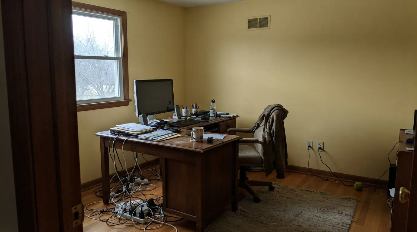
Cool north daylight is exactly the wrong light for a warm yellow: it strips the gold out and leaves a flat, slightly murky beige that some readers describe as "dirty" or "baby-food." The color did not fail; the light did. Add warm 2700K lamps or move Pale Honey to a room with real daylight.
A stark, blue-white trim or a cool gray-and-blue quartz counter sits at the opposite temperature and makes Pale Honey look dingy by comparison — the honey reads like a mistake instead of a choice. Warm the trim (Behr Swiss Coffee, not a bright white) and keep countertops on the warm-white or wood side.
On a 2-inch chip, Pale Honey can look like a quiet warm neutral. On four walls, the yellow is unmistakable — depth and coverage multiply undertone the same way they do for every strong color. If "barely-there warmth" is the goal, this is too much color; look at a paler cousin like Behr Butter Yellow instead.
Room by Room
Warm wood cabinetry, brass pulls, butcher block or warm-toned stone all pull the honey forward and make the room feel sunlit even on a gray day. Satin or semi-gloss on cabinets wipes clean; eggshell on walls.
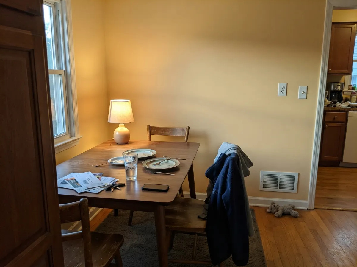
A genuinely cheerful backdrop for a wood table and warm-toned chairs, especially under evening lamplight. Skip it if your dining set is dark, cool-toned walnut with black metal — the contrast reads busy rather than warm.
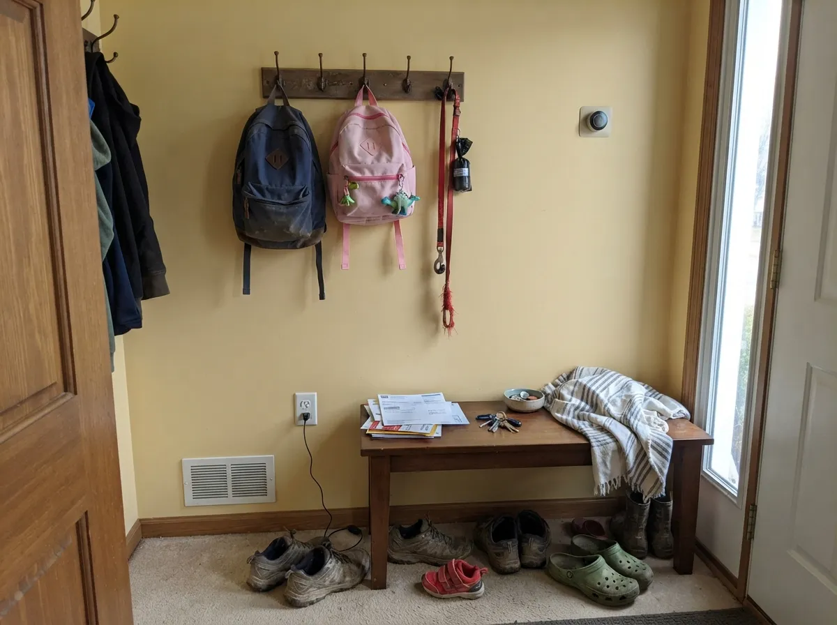
A warm welcome that survives scuffed shoes and school bags better than a pale white would, since LRV 70 hides everyday grime. Pair with a darker bench or hooks in a warm wood or black for contrast.
Cheerful without the neon of a true buttercup yellow — the beige base keeps it from feeling juvenile as the child grows into the room. Test in the room's actual light first; north-facing nurseries will need warm bulbs to keep it honey instead of dull.
Yellow at this saturation reads more energizing than restful for most sleepers. It can work as a guest room or a sunny reading corner, but it is not the calm-retreat color most primary bedrooms are chasing.
In a powder room with brass fixtures and a wood vanity, it is a genuinely happy small dose of color. In a full bath with cool gray or blue-veined tile, it fights the room — pick a true neutral instead.
Your Light Is the Risk
Direct warm daylight is where the honey glows without turning orange or washing out. Whole-room safe here.
Cool, indirect daylight drains the gold and leaves a flat, slightly murky beige. Test a large sample before committing.
Bright and golden at the sun hours, quieter and more neutral the rest of the day — most owners like the movement.
2700K warm bulbs deepen the honey and make it glow. Cool white LEDs flatten it toward a dull, slightly greenish beige — swap the bulbs before you blame the paint.
Most complaints about Pale Honey are a light mismatch. Upload a photo of your actual room and see it on your walls — then ask for the same wall in north light or evening lamps before you buy a single sample.
Need It From Another Brand?
Any paint counter can custom-tint Behr PPU6-08 directly. If you would rather stay in one brand's own deck, these are the closest stock matches, measured as ΔE2000. Under 2 is a difference you will not see on the wall.
| Brand | Closest color | ΔE | LRV | |
|---|---|---|---|---|
| Sherwin-Williams | Enjoyable YellowSW 6666 · Sherwin-Williams | 0.9 | 71 | Color page → |
| Benjamin Moore | Manila2158-50 · Benjamin Moore | 0.6 | 70 | Color page → |
| Valspar | French Pastry3002-6C · Valspar | 0.9 | 68.8 | Color page → |
| PPG / Glidden | Waves Of GrainPPG12-07 · PPG / Glidden | 3.2 | 70 | Color page → |
| Glidden | Waves Of GrainPPG12-07 · Glidden | 2.7 | 70 | Color page → |
| Dutch Boy | Mimosa Brunch211-2DB · Dutch Boy | 0.9 | 71 | Color page → |
Similar Behr Colors
The nearest shades to Pale Honey within Behr's own range, ranked by perceptual color distance — useful when you want the same look a touch lighter, darker, or warmer.
WCAG 2.1: AA is 4.5 : 1 for normal text, 3 : 1 for large text, AAA is 7 : 1.
Pale Honey vs the Colors You're Also Considering
Every Pale Honey sample board has the same rivals on it. The numbers show the real lightness gap — then it comes down to which risk you would rather live with.
Pick this when you want unmistakable honey color, not a barely-there cream.
Benjamin Moore 947 · LRV 78Navajo WhitePick this if you want the warm cream read without the honey-yellow — Navajo White shares the same warm base but reads white-adjacent, not gold.
Pick this for the more overtly golden version — SW Navajo White leans beige, Pale Honey commits to yellow.
Sherwin-Williams SW 6126 · LRV 72Navajo WhitePick this if your painter works in Sherwin-Williams and you want the deepest, most old-school warm white in their deck instead of a true yellow.
Pale Honey Coordinating Colors
The rule for coordinating with Pale Honey is simple: stay warm and avoid anything icy. It pairs best with warm off-whites, warm wood-toned darks, and one muted green or brown accent — and it argues with cool grays, blue-whites, and anything with a blue undertone. These are the partners that keep showing up in rooms that work:
Where Pale Honey Fits the Soft-Yellow Revival
Pale, warm yellows have been having a moment in kitchens and dining rooms in recent years — a reaction against a decade of gray and greige, and softer than the saturated mustard trend that came before it. Pale Honey sits comfortably in that revival without depending on it: it is one of several yellow-family colors in Behr's own PPU6 neighborhood, alongside deeper siblings like Charismatic and Saffron Strands and paler ones like Honey Mist, which means it was built as part of a coordinated warm-yellow range rather than a single trend-chasing shade.
That context matters for repaint risk. A color designed to sit inside a family of related warm neutrals and yellows tends to age more like a dependable warm off-white than like a single loud trend color — the kind of thing you can still live with once the current design-blog cycle moves on.
Pale Honey With Wood Tones and Floors
The floor decides more than the paint chip does. Honey-oak or gold-toned builder floors are the one real clash: two warm yellows in the same room compete instead of complementing, and the effect can feel flat rather than rich. White oak, walnut, and black-stained or dark LVP floors all give Pale Honey the contrast it needs to read as an intentional color choice rather than a matched-set mistake.
Countertops follow the same logic. Butcher block, warm-toned granite, and warm white quartz are easy partners; cool gray or blue-veined stone fights the honey and can make it look slightly off rather than deliberate. Brass and unlacquered metals are the friendliest hardware finishes here — chrome and cool nickel read colder than the wall wants them to.
Three Ready Palettes Built on Pale Honey
A color is never alone on the wall. These are complete combinations in the 60-30-10 pattern, with the reason each one holds together. Every one opens in the visualizer.
A warm off-white trim keeps Pale Honey from arguing with the walls the way a stark white would, while one near-black island note grounds all that gold so the kitchen reads sunny, not sugary.
Try this palette in your roomTwo warm darks — Porpoise on the built-ins, Wenge on the door — turn the honey walls into a proper glow instead of the main event, the way a lamplit den should feel.
Try this palette in your roomNavajo White shares Pale Honey's warm base at a lighter depth, so walking from the honey-gold kitchen into a paler hallway feels like the same house breathing, not a color change. One trim white ties every room together.
Try this palette in your roomPale Honey FAQ
Is Pale Honey a yellow or a beige?
It is a genuine yellow — the beige note keeps it from looking candy-bright, but at LRV 70 across four walls it reads as honey-gold, not neutral. On a small chip it can look like a quiet tan; that changes fast at full scale.
What trim white goes with Pale Honey?
A warm off-white like Behr Swiss Coffee, not a stark bright white. A cool, blue-white trim makes the honey walls look dingy by comparison — the most common pairing mistake with a color this warm.
Will it look dull in a north-facing room?
Likely, yes. Cool north daylight strips the gold out of warm yellows and leaves a flat, slightly murky beige. Test a large sample in the actual room first, or plan on warm 2700K lamps to keep it honey after dark.
Is Pale Honey good for kitchen cabinets?
Yes — Behr sells it across sheens up to semi-gloss, which is what cabinets need. It flatters brass hardware and warm wood counters especially well; it is a tougher sell next to cool gray or blue-veined stone.
What's the difference between Pale Honey and Butter Yellow?
Depth. Butter Yellow sits at LRV 86 and is pale enough to read almost white on the wall. Pale Honey, at LRV 70, is unmistakably yellow — pick Butter Yellow for a whisper of warmth, Pale Honey when you actually want the color.
Does it work with gray or white quartz counters?
Cool gray or blue-veined quartz fights it — the temperatures argue and the honey can look off. Warmer white quartz, butcher block, or warm-toned granite are much easier partners.
Have you painted with Pale Honey?
Rate it — one tap helps the next reader decide.
Ask a Question