Off Broadway
Behr's soft city black, reviewed honestly: the light that shows its warm brown depth, the light that flattens it to nothing, and what to pick instead.

Jessica has spec'd whites and neutrals for more than 300 rooms and keeps a sample wall of painted drawdowns in her studio. Every color review is checked against real reader rooms in the comments and re-tested when a formula changes. About the testing process →

- 1Cordovan Brown0
- 2Off Broadway5
The Fast Verdict
Off Broadway is Behr's answer for buyers who want black without the cold edge — a deep brown-charcoal at LRV 5 that reads soft and warm instead of flat and inky. It skips the blue chill of Sherwin-Williams Iron Ore and the violet flash Behr's own Cracked Pepper throws in strong sun, staying steady and brown-warm in almost any light that reaches it. The trade is real: give it no light and it goes as dark and characterless as any other black.
Kitchen islands and lower cabinets · front doors and exterior trim · powder rooms and small accent walls · interior doors and trim that want drama without going cold
You want a true, ink-flat black · the room gets little to no daylight or lamp light · you're painting four full walls with no real window · you're not ready for a tinted primer and 3+ coats over a light color
- Warm brown-black instead of a cold, blue-leaning near-black
- Excellent on kitchen islands, cabinets, and front doors
- Flatters brass, walnut, and warm stone the way true blacks don't
- Reads sophisticated and deliberate without gallery-black starkness
- Small rooms (powder rooms, nooks) can go all-in without needing much daylight
- Goes flat, characterless black with no real light source nearby
- Needs a tinted primer and 3+ coats over any light existing color
- Shows fingerprints and dust readily in semi-gloss on doors and cabinets
- Too dark for a full room without real windows or reliable lamp light
What Color Is Off Broadway, Really?
A near-black with a distinctly brown, warm base — closer to a very dark espresso-charcoal than to a true black. Behr's true blacks (like Cracked Pepper) sit cooler and flatter; Off Broadway keeps a visible warmth underneath, which is why it photographs as "soft" rather than "stark" even at this depth. That warmth is the reason it shows up so often on kitchen islands and front doors instead of gallery-black trim.
At LRV 5 it reflects almost none of the light that hits it, so the color is only as good as the light you give it. In a room with real daylight or a warm lamp nearby, the brown base comes forward and the color reads rich and deliberate. In a dim room with no supplemental light, that brown base disappears and it reads as ordinary flat black — the same effect every near-black color has, just more noticeable here because the warmth is the whole point.
Undertone in one line: warm brown-black, never a cold blue-black. A few retailers list a faint cool edge at the margins, but the dominant, repeated read — and Behr's own placement of the color next to its true blacks — is warm. If your sample looks flat and characterless, that's a dim room talking, not the undertone.
Where It Shines
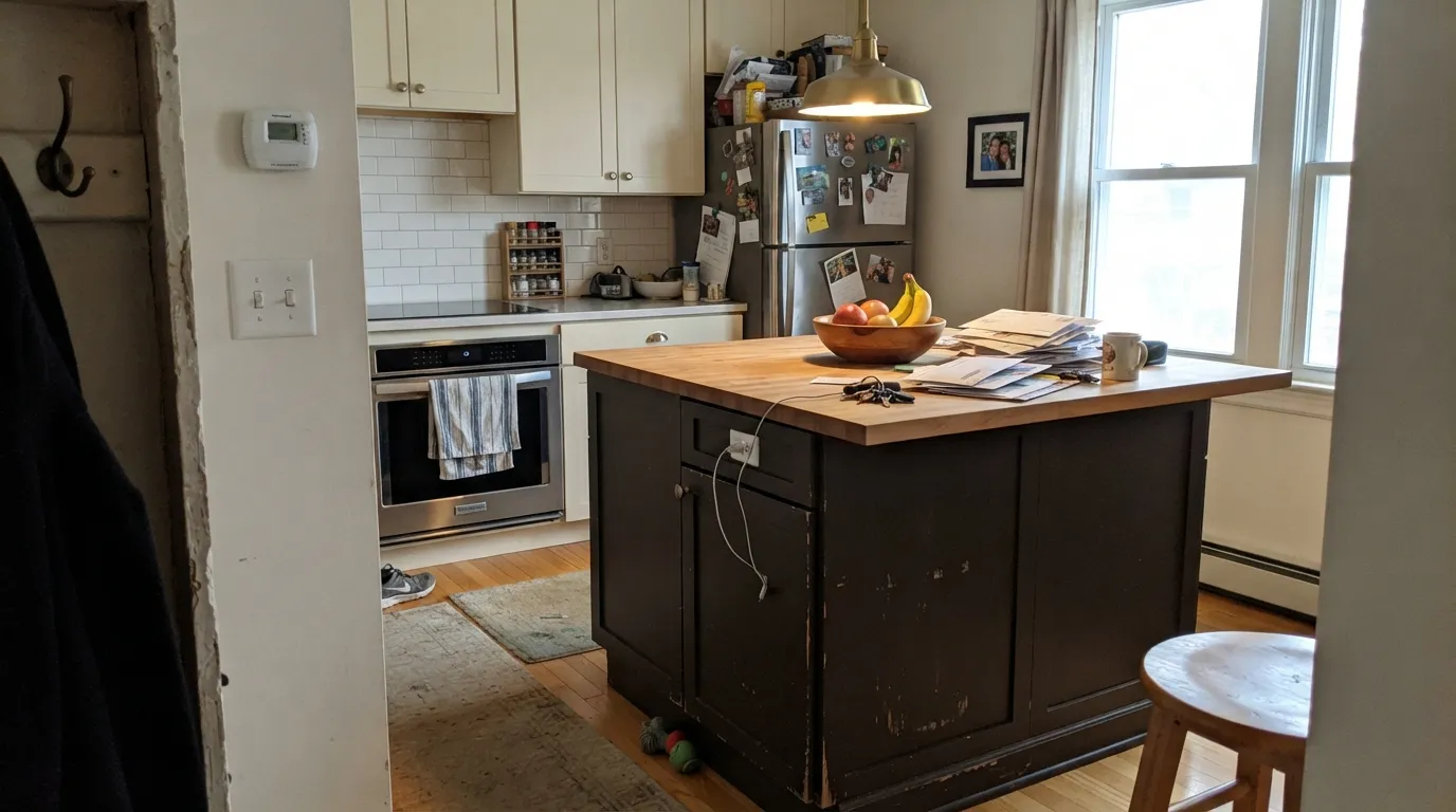
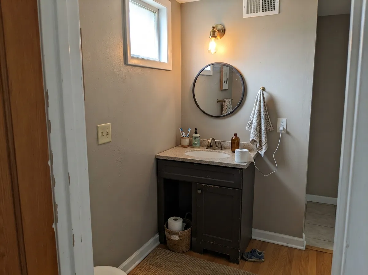
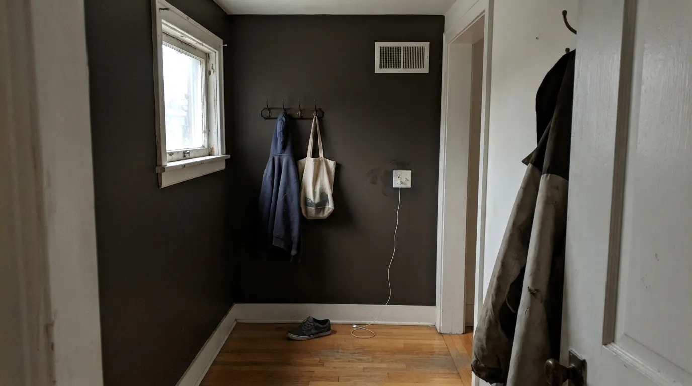
Give it a real light source — daylight, a warm lamp, under-cabinet lighting — and the brown warmth comes forward, which is exactly why it earns its keep on kitchen islands and front doors rather than whole rooms. It pairs naturally with brass, walnut, and warm quartz or marble, the same combination that makes any warm near-black look expensive instead of heavy. In small, contained spaces — a powder room, a mudroom nook, a single accent wall — it can carry the whole room without needing much daylight at all, because the room itself is small enough to stay lit by a fixture.

Where It Fails
Almost every disappointed review of a warm near-black like this follows one of three scripts, and all three are predictable before the first coat goes on. None of them are the paint's fault — but if your project matches one, this is not your color, or at least not for that surface.
Off Broadway is built to read warm and soft, not stark. Next to an actual true black (Tricorn Black, Behr's own Cracked Pepper) it will look visibly brown, and some buyers who wanted gallery-black trim call that "dirty" instead of "warm." If flat black is the goal, this is the wrong pick — go cooler and more neutral instead.
With no daylight and no lamp anywhere near it, the brown base has nothing to bounce off and the color reads as ordinary, characterless black — the exact complaint behind most "it just looks like black to me" reviews. Test it in the room's actual evening lighting, with the lamps you'll actually use, before committing a whole wall.
Near-black colors are not a one-coat job over white or beige. Skip the gray-tinted primer and you get patchy, streaky coverage that needs a third or fourth coat to fix — an expensive way to learn that dark colors need real prep, not just more paint.
Room by Room
On an island or lower cabinets under warm pendant light, it reads rich and custom against brass hardware, walnut floors, and warm quartz. Satin cabinet enamel wipes clean and hides fingerprints better than semi-gloss does.
A common use for this exact color: full daylight reads it warmer and more brown than it does indoors, and it holds up well against white, gray, or brick siding. Semi-gloss for the door itself.
Small, contained rooms take deep color well and stay lit enough by a single fixture to keep the warmth showing. Drenching all four walls in a windowless powder room works better here than it would in any larger space.
A single black interior door or a run of black trim under a light wall color reads as intentional drama without the coldness a true black brings. Semi-gloss, and expect real prep over any light-colored existing trim.
Works as one accent wall behind a sofa or media console with a warm lamp nearby; a full room of it needs real windows or it goes flat and heavy by mid-afternoon.
Four walls in a bedroom with modest daylight will read as a black box once the sun goes down. A headboard nook or a single wall with a warm bedside lamp gets the mood without the risk.
Your Light Is the Risk
The brown base comes forward and it reads as a rich warm charcoal, not a flat black square. This is the light that makes islands and front doors look their best.
Without a light source nearby the warmth disappears and it reads as ordinary flat black. Test it with the room's actual evening lighting before painting four walls.
Strong direct sun brightens it and can expose brush or roller texture more than diffuse light does. Most owners like the extra warmth; it's worth knowing before a full front-door repaint.
2700K warm bulbs deepen the brown and make it feel cozy, almost velvet. Cool white LEDs flatten it toward a colder, blacker black — pick your bulbs on purpose here.
Most complaints about Off Broadway are a light mismatch. Upload a photo of your actual room and see it on your walls — then ask for the same wall in north light or evening lamps before you buy a single sample.
Need It From Another Brand?
Any paint counter can custom-tint Behr MQ1-35 directly. If you would rather stay in one brand's own deck, these are the closest stock matches, measured as ΔE2000. Under 2 is a difference you will not see on the wall.
| Brand | Closest color | ΔE | LRV | |
|---|---|---|---|---|
| Sherwin-Williams | DarkroomSW 7083 · Sherwin-Williams | 2.5 | 5 | Color page → |
| Benjamin Moore | Black Panther2125-10 · Benjamin Moore | 3.7 | 5 | Color page → |
| Valspar | Safari Brown6009-1 · Valspar | 0.6 | 5.2 | Color page → |
| PPG / Glidden | Black MagicPPG1001-7 · PPG / Glidden | 2.4 | 5 | Color page → |
| Glidden | Black MagicPPG1001-7 · Glidden | 1.8 | 5 | Color page → |
| Dutch Boy | Cauldron437-7DB · Dutch Boy | 2.2 | 5 | Color page → |
Similar Behr Colors
The nearest shades to Off Broadway within Behr's own range, ranked by perceptual color distance — useful when you want the same look a touch lighter, darker, or warmer.
WCAG 2.1: AA is 4.5 : 1 for normal text, 3 : 1 for large text, AAA is 7 : 1.
Off Broadway vs the Colors You're Also Considering
Every Off Broadway sample board has the same rivals on it. The numbers show the real lightness gap — then it comes down to which risk you would rather live with.
Pick this for the more visibly brown, more clearly warm version of the same soft-black mood.
Benjamin Moore 2124-10 · LRV 6Wrought IronPick this if you're already working in Benjamin Moore's palette — an equally soft near-black, just a touch cooler and greener.
Pick this for the warmer brown-black that skips Iron Ore's slight blue chill.
Sherwin-Williams SW 7069 · LRV 6Iron OrePick this for the cooler, bluer whole-house black that's become the default choice for kitchens and exteriors.
Off Broadway Coordinating Colors
The rule with a warm near-black like this: pair it with warm whites and creams, never stark cool whites, and let brass or warm wood do the rest of the work. These are the partners that keep it reading rich instead of heavy:
Off Broadway vs. a True Black
Behr's deck has more than one "black," and the difference between them matters more than the names suggest. Cracked Pepper is Behr's flatter, more neutral near-black — closer to the reference point of Sherwin-Williams Tricorn Black — and both of those can flash violet or read stark in strong light. Off Broadway is built differently: the brown stays visible on purpose, which is why it reads as soft and warm rather than dramatic and cold.
That distinction is exactly why the two colors get used differently. Cracked Pepper and Tricorn Black show up on modern front doors and gallery-style trim where flat black is the point. Off Broadway shows up on kitchen islands, cabinets, and front doors where the goal is depth and warmth, not a stark black-and-white contrast.
Off Broadway With Metals and Wood Tones
This is where the warm base pays off. Unlacquered brass, aged bronze, and matte black hardware all sit comfortably against it, and walnut, dark oak, and warm quartz or marble read richer next to it than they would against a true, cool black. Polished chrome and cool white marble are the only pairings that fight it — the cold metal or stone makes the brown warmth look slightly muddy by comparison, so test a sample against your actual counter or hardware before committing a whole island.
Three Ready Palettes Built on Off Broadway
A color is never alone on the wall. These are complete combinations in the 60-30-10 pattern, with the reason each one holds together. Every one opens in the visualizer.
A warm white on the walls and upper cabinets lets the island carry all the drama; both whites lean warm enough that the black reads brown-rich instead of harsh against them.
Try this palette in your roomTwo whites keep the facade calm and let the door do all the talking; in full sun the warm black reads crisp against either white without going cold or harsh.
Try this palette in your roomA small, windowless room stays lit enough by one fixture to keep the warmth in the walls showing; the white vanity and near-black hardware keep the drenched room from feeling like a cave.
Try this palette in your roomOff Broadway FAQ
Is Off Broadway a true black or a dark brown-gray?
It's a near-black with a clearly warm, brown base — not a true, flat black like Behr's own Cracked Pepper or Sherwin-Williams Tricorn Black. In good light it reads as a rich espresso-charcoal; in dim light it can look like ordinary black.
What's the best light for this color?
Bright, indirect daylight or a warm lamp nearby. That's when the brown warmth comes forward. Without any real light source, it goes flat and characterless like most near-blacks do.
How many coats does it take over a white wall?
Plan on a gray-tinted primer plus at least three finish coats over any light existing color. One or two coats over white will look streaky and patchy — near-black colors need real prep, not just more paint.
Is it good for kitchen cabinets or an island?
Yes — it's one of its best uses. On an island or lower cabinets under warm lighting it reads custom against brass and walnut. Use a satin, urethane-fortified cabinet enamel; it wipes clean and hides fingerprints better than semi-gloss.
Does it work on a front door?
Yes, and it's a common use for this exact color. Full daylight reads it warmer and more brown outdoors than it does inside, and it holds up against white, gray, or brick siding. Use a semi-gloss exterior enamel.
What wall or trim color pairs best with it?
A warm white or cream — Blank Canvas, Swiss Coffee, or Whisper White in the Behr deck — keeps the black reading brown-rich instead of harsh. A stark, cool white will make the contrast feel colder and more clinical.
Have you painted with Off Broadway?
Rate it — one tap helps the next reader decide.
Ask a Question