CP

Sunset Color Palette — Pearl Horizon

A warm five-color sunset scheme moving from coral and tangerine through gold into dusky purple and deep sky, with every color matched to real paint you can buy.

By Jessica Williams · Color Stylist & Interior Editor

Tangerine Glow
Dominant
Kompozit Heat of Summer · 1025
#E98D5B
LRV 37
Coral Blush
Secondary
Kompozit Alexandra Peach · 1059
#DB9785
LRV 39
Pearl Gold
Base
Kompozit Shortcake · 0868
#EEDAAC
LRV 71
Dusky Plum
Support
Kompozit Vivid Vision · 1227
#5E4B62
LRV 8
Deep Sky
Accent
Kompozit Star-Studded · 0620
#32425A
LRV 5
View palette in

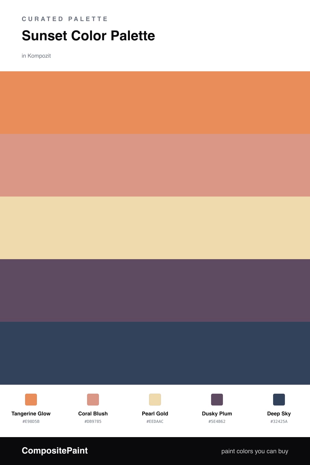
A sunset never holds still, and this palette borrows that movement. Tangerine Glow leads with that last warm flare of light, while Coral Blush softens just beside it like the haze near the horizon. Together they feel lit from within rather than simply bright.

Pearl Gold is the calm in the middle, a soft buttery base that lets the warm tones breathe and reads beautifully in 2026 rooms that lean quiet and tactile. Spread it across walls and large surfaces so the brighter shades have somewhere to settle.

Then the sky drops. Dusky Plum and Deep Sky anchor everything in cooler, dimmer light — perfect for a grounding sofa, a moody built-in, or trim that frames the warmth. Keep the warm shades leading and let these two play the shadow at the edge of the day.

Buy These Colors

Each color matched to the closest real paint in every brand, by ΔE2000. Kompozit first; take any SKU to the store — these mix on demand.

Tangerine Glow
#E08A4B · LRV 35 · Dominant
Kompozit Heat of Summer · 1025 ΔE 4.19
Backdrop Rosita · BD-RO ΔE 16.93
Behr Amiable Orange · M230-6 ΔE 1.59
Benjamin Moore Pumpkin Spice · 126 ΔE 2.14
Clare Good as Gold · PNT100-DP-59 ΔE 13.09
Dunn-Edwards Brushed Clay · DE5243 ΔE 3.91
Farrow & Ball India Yellow · No. 66 ΔE 11.66
Magnolia Home Vintage Crown · JG-152 ΔE 13.48
PPG / Glidden Carrot Cake · 1198-5 ΔE 2.62
Sherwin-Williams Serape · SW 6656 ΔE 1.95
Valspar Autumn Meadow · M232 ΔE 1.78
Coral Blush
#E29A86 · LRV 41 · Secondary
Kompozit Alexandra Peach · 1059 ΔE 1.47
Backdrop Rosita · BD-RO ΔE 6.18
Behr Pecos Spice · 230D-4 ΔE 1.41
Benjamin Moore Custis Salmon · CW-215 ΔE 2.03
Clare Subrosa · PNT100-MD-76 ΔE 5.55
Dunn-Edwards Rose Dusk · DE5150 ΔE 2.58
Farrow & Ball Cinder Rose · No. 246 ΔE 11.63
Magnolia Home Rosy Pink · JG-154 ΔE 11.18
PPG / Glidden Opal Fire · 1192-5 ΔE 0.89
Sherwin-Williams Sockeye · SW 6619 ΔE 1.38
Valspar Venetian Plaster · 8002-12C ΔE 2.81
Pearl Gold
#EFD9AE · LRV 71 · Base
Kompozit Shortcake · 0868 ΔE 1.25
Backdrop Cookies & Cream · BD-CC ΔE 6.5
Behr Champagne Wishes · M280-3 ΔE 1.58
Benjamin Moore Handmade · AF-325 ΔE 1.96
Clare Lemonade · PNT100-MD-22 ΔE 1.66
Dunn-Edwards Fine Sand · DE5324 ΔE 2.92
Farrow & Ball Farrow's Cream · No. 67 ΔE 1
Magnolia Home Lemony · JG-42 ΔE 2.45
PPG / Glidden Waves Of Grain · 12-07 ΔE 0.78
Sherwin-Williams Captivating Cream · SW 6659 ΔE 2.32
Valspar Hazy Yellow · 3004-8B ΔE 2.82
Dusky Plum
#6B4A63 · LRV 9 · Support
Kompozit Vivid Vision · 1227 ΔE 4.56
Backdrop We Three Kings · BD-WK ΔE 22.04
Behr Purplestone · 110F-6 ΔE 1.79
Benjamin Moore Eggplant · 1379 ΔE 1.06
Clare Night Groove · PNT100-DP-77 ΔE 6.4
Dunn-Edwards Old-Fashioned Purple · DE6007 ΔE 3.55
Farrow & Ball Preference Red · No. 297 ΔE 9.37
Magnolia Home Mountain Currant · JG-171 ΔE 14.46
PPG / Glidden Positively Purple · 13-08 ΔE 2.64
Sherwin-Williams Impulsive Purple · SW 6832 ΔE 7.82
Valspar Passionate · T502 ΔE 3.32
Deep Sky
#2E4258 · LRV 5 · Accent
Kompozit Star-Studded · 0620 ΔE 2.2
Backdrop Last Call · BD-LC ΔE 6.24
Behr Soulful · HDC-FL13-7 ΔE 2.77
Benjamin Moore Twilight · 2058-10 ΔE 5.39
Clare Blackish · PNT100-DP-54 ΔE 13.37
Dunn-Edwards Black River Falls · DEA189 ΔE 4.22
Farrow & Ball Hague Blue · No. 30 ΔE 7.66
Magnolia Home Arches · JG-97 ΔE 8.34
PPG / Glidden Victory Blue · 1165-7 ΔE 6.82
Sherwin-Williams Dress Blues · SW 9176 ΔE 2.53
Valspar Time's Current · 8003-45G ΔE 2.99

Questions

How do I keep a sunset palette from feeling loud?

Let the gold do the quiet work and keep the brights small. Tangerine and coral feel rich when most of the room stays soft, so use them on one wall or in fabrics rather than everywhere.

Where should the plum and sky tones go?

Use them low and grounding — think a deep-painted built-in, a sofa, or trim. They cool the warm tones the way the sky cools after the sun drops.

Similar Palettes

Closest schemes by color — not by label.