CP

Sunset Color Palette — Sunset Afterglow

A warm five-color scheme that runs from coral and tangerine through gold into a dusky purple and deep evening blue — every color matched to real paint you can buy.

By David Chen · Formulation Lead & Resident Chemist

Coral Glow
Dominant
Kompozit Sari · 1066
#E47C64
LRV 32
Tangerine Spark
Secondary
Kompozit Japonica · 0983
#E89952
LRV 41
Soft Gold
Base
Kompozit Sweet Angelica · 0806
#E8D08E
LRV 64
Dusky Plum
Support
Kompozit Magenta Red Lips · 1194
#62416D
LRV 7
Deep Sky Blue
Accent
Kompozit Star-Studded · 0620
#32425A
LRV 5
View palette in

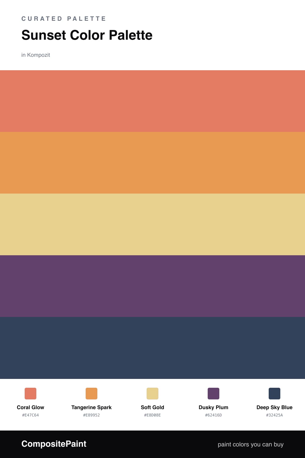
Think of this scheme as a sunset frozen at its best minute. A warm Coral Glow leads the way, the color the sky turns just as the sun touches the horizon, and a brighter Tangerine Spark sits beside it like the light catching the underside of a cloud.

Underneath both of them is a quiet Soft Gold that does most of the work. It is the calm wall color, the wide open sky, and it keeps the two warmer shades from running too hot. A Dusky Plum and a Deep Sky Blue stand in for the cooler half of the sky overhead, the part already sliding toward night.

The trick is the gradient. Let the gold cover the most space, use coral and tangerine in confident but smaller doses, and tuck the plum and blue in as your darkest grounding notes. Done that way the palette feels current and warm without ever tipping into a costume.

Buy These Colors

Each color matched to the closest real paint in every brand, by ΔE2000. Kompozit first; take any SKU to the store — these mix on demand.

Coral Glow
#E8765A · LRV 31 · Dominant
Kompozit Sari · 1066 ΔE 2.01
Backdrop Rosita · BD-RO ΔE 14.8
Behr Cosmic Coral · HDC-SM14-12 ΔE 4.52
Benjamin Moore Fresno · 020 ΔE 1.65
Clare Fire Sign · PNT100-DP-74 ΔE 6.18
Dunn-Edwards Orangeville · DE5138 ΔE 2.04
Farrow & Ball Red Earth · No. 64 ΔE 7.15
Magnolia Home Work Worn Wood · JG-35 ΔE 10.8
PPG / Glidden Clay Pot · 1194-6 ΔE 2.05
Sherwin-Williams Rejuvenate · SW 6620 ΔE 2.44
Valspar Peach Posey · M214 ΔE 4.79
Tangerine Spark
#E89B3C · LRV 41 · Secondary
Kompozit Japonica · 0983 ΔE 4.63
Backdrop Rosita · BD-RO ΔE 21.48
Behr Gilded Leaves · HDC-FL14-5 ΔE 1.54
Benjamin Moore Cedar · ES-40 ΔE 2.18
Clare Good as Gold · PNT100-DP-59 ΔE 10.76
Dunn-Edwards Persimmon · DE5293 ΔE 1.64
Farrow & Ball India Yellow · No. 66 ΔE 7.73
Magnolia Home Cottage Feel · JG-40 ΔE 10.26
PPG / Glidden Cornucopia · 1203-7 ΔE 2.19
Sherwin-Williams Sunflower · SW 6678 ΔE 1.9
Valspar Sunflower Field · V013-3 ΔE 1.36
Soft Gold
#EBCF94 · LRV 64 · Base
Kompozit Sweet Angelica · 0806 ΔE 2.18
Backdrop Eames · BD-EA ΔE 3.19
Behr Filtered Moon · M270-4 ΔE 2.56
Benjamin Moore Moir Gold · CW-280 ΔE 2.61
Clare Lemonade · PNT100-MD-22 ΔE 2.85
Dunn-Edwards Madera · DEC728 ΔE 2.24
Farrow & Ball Yellow Ground · No. 218 ΔE 3.03
Magnolia Home Lemony · JG-42 ΔE 2.64
PPG / Glidden Wayward Wind · 1108-4 ΔE 2.99
Sherwin-Williams Peace Yellow · SW 2857 ΔE 2.9
Valspar Honeysuckle Beige · 3007-6A ΔE 1.93
Dusky Plum
#6B4A6E · LRV 9 · Support
Kompozit Magenta Red Lips · 1194 ΔE 3.8
Backdrop We Three Kings · BD-WK ΔE 20.4
Behr Plum Rich · MQ5-35 ΔE 3.6
Benjamin Moore Passion Plum · 2073-30 ΔE 3.08
Clare Night Groove · PNT100-DP-77 ΔE 9.34
Dunn-Edwards Old-Fashioned Purple · DE6007 ΔE 2.82
Farrow & Ball Preference Red · No. 297 ΔE 12.88
Magnolia Home Coffee Nook · JG-96 ΔE 18.4
PPG / Glidden Perfectly Purple · 1176-7 ΔE 3.66
Sherwin-Williams Impulsive Purple · SW 6832 ΔE 4.47
Valspar Purple Davenport · 1003-3A ΔE 3.92
Deep Sky Blue
#2C3E5C · LRV 5 · Accent
Kompozit Star-Studded · 0620 ΔE 2.56
Backdrop Last Call · BD-LC ΔE 5.7
Behr Night Flight · S520-7 ΔE 1.77
Benjamin Moore Marine Blue · 2059-10 ΔE 5.07
Clare Blackish · PNT100-DP-54 ΔE 15.79
Dunn-Edwards Black River Falls · DEA189 ΔE 3.28
Farrow & Ball Paean Black · No. 294 ΔE 13.45
Magnolia Home Arches · JG-97 ΔE 11.43
PPG / Glidden Victory Blue · 1165-7 ΔE 4.42
Sherwin-Williams Salty Dog · SW 9177 ΔE 5.33
Valspar Time's Current · 8003-45G ΔE 5.22

Questions

How do I keep these warm colors from feeling too hot together?

Lean on the gold as your largest area and let it cool the room down between the brighter coral and tangerine. The dusky plum and deep blue act like the last light of evening, pulling the whole scheme back toward calm so the warm tones read cozy instead of loud.

Which color should I paint the walls?

Use the soft gold as your wall color since it is the lightest and easiest to live with. Save the coral and tangerine for an accent wall or trim, and let the plum and deep blue show up in smaller pieces like a door or built-in shelving.

Similar Palettes

Closest schemes by color — not by label.