CP

Sunset Color Palette — Tidal Glow

A warm five-color sunset scheme that runs from coral and tangerine through gold into dusky purple and deep sky blue — every color matched to real paint you can buy.

By Emily Roberts · DIY Editor & First-Timer's Guide

Coral Tide
Dominant
Kompozit Sari · 1066
#E47C64
LRV 32
Tangerine Wash
Secondary
Kompozit Japonica · 0983
#E89952
LRV 41
Soft Gold
Base
Kompozit Good-Looking · 0918
#EDD2A7
LRV 67
Dusky Plum
Support
Kompozit Grapes of Wrath · 1284
#65627D
LRV 13
Deep Sky
Accent
Kompozit Quiet Peace · 0592
#3A4A64
LRV 7
View palette in

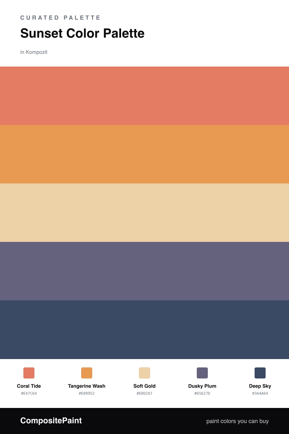
There is a moment right at sunset when the whole sky glows at once, and that is exactly what this palette chases. Coral Tide leads the way — a soft, warm coral that feels current for 2026 without tipping into a loud orange — and Tangerine Wash picks up that warmth like the last band of light near the horizon.

Soft Gold is your steadying middle. Think of it as the calm sand the whole scene sits on, so the brighter colors have somewhere to rest. It keeps the room from feeling overheated while still holding onto that golden-hour warmth.

Then come the cool notes that make a sunset feel real. Dusky Plum is that hazy purple just above the glow, and Deep Sky is the blue settling in at the top. Use these two sparingly — a single accent wall, a door, or trim — and the warm colors will look even richer next to them.

Buy These Colors

Each color matched to the closest real paint in every brand, by ΔE2000. Kompozit first; take any SKU to the store — these mix on demand.

Coral Tide
#E5765B · LRV 30 · Dominant
Kompozit Sari · 1066 ΔE 1.77
Backdrop Rosita · BD-RO ΔE 14.59
Behr Cosmic Coral · HDC-SM14-12 ΔE 4.29
Benjamin Moore Tucker Orange · CW-300 ΔE 1.62
Clare Fire Sign · PNT100-DP-74 ΔE 5.82
Dunn-Edwards Orangeville · DE5138 ΔE 1.8
Farrow & Ball Red Earth · No. 64 ΔE 6.61
Magnolia Home Work Worn Wood · JG-35 ΔE 10.36
PPG / Glidden Clay Pot · 1194-6 ΔE 1.89
Sherwin-Williams Rejuvenate · SW 6620 ΔE 1.89
Valspar Peach Posey · M214 ΔE 4.43
Tangerine Wash
#E89C4A · LRV 41 · Secondary
Kompozit Japonica · 0983 ΔE 2.69
Backdrop Rosita · BD-RO ΔE 19.63
Behr Gilded Leaves · HDC-FL14-5 ΔE 3.02
Benjamin Moore Cedar · ES-40 ΔE 0.32
Clare Good as Gold · PNT100-DP-59 ΔE 10.27
Dunn-Edwards Colorado Peach · DE5236 ΔE 1.34
Farrow & Ball India Yellow · No. 66 ΔE 7.62
Magnolia Home Cottage Feel · JG-40 ΔE 9.72
PPG / Glidden Cornucopia · 1203-7 ΔE 1.24
Sherwin-Williams Adventure Orange · SW 6655 ΔE 3.35
Valspar Sunflower Field · V013-3 ΔE 1.58
Soft Gold
#EAD3A0 · LRV 67 · Base
Kompozit Good-Looking · 0918 ΔE 2.89
Backdrop Cookies & Cream · BD-CC ΔE 8.3
Behr Harmonious Gold · M300-3 ΔE 0.95
Benjamin Moore Vellum · 207 ΔE 0.65
Clare Lemonade · PNT100-MD-22 ΔE 1.03
Dunn-Edwards Crossroads · DE5359 ΔE 1.94
Farrow & Ball Dorset Cream · No. 68 ΔE 1.11
Magnolia Home Lemony · JG-42 ΔE 1.91
PPG / Glidden Spice Is Nice · 1090-2 ΔE 2.66
Sherwin-Williams Sunbeam Yellow · SW 78 ΔE 1.87
Valspar Beignet · V055-2 ΔE 0.95
Dusky Plum
#6E5570 · LRV 11 · Support
Kompozit Grapes of Wrath · 1284 ΔE 8.64
Backdrop Mom Jeans · BD-MJ ΔE 21.68
Behr Plum Shade · 100F-6 ΔE 3.52
Benjamin Moore Ultra Violet · 1372 ΔE 3.32
Clare Prince · PNT100-DP-33 ΔE 7.63
Dunn-Edwards Princely Violet · DE5957 ΔE 3.74
Farrow & Ball Stiffkey Blue · No. 281 ΔE 18.52
Magnolia Home Autumn Gray · JG-143 ΔE 13.39
PPG / Glidden Pageant Pansy · 13-20 ΔE 2.88
Sherwin-Williams Plummy · SW 6558 ΔE 4.22
Valspar Purple Valley · 1001-5A ΔE 5.48
Deep Sky
#2F4A63 · LRV 6 · Accent
Kompozit Quiet Peace · 0592 ΔE 4.08
Backdrop Last Call · BD-LC ΔE 8.05
Behr Rain Boots · HDC-FL14-12 ΔE 1.18
Benjamin Moore Cefalú Beach · 2061-20 ΔE 1.64
Clare Blackish · PNT100-DP-54 ΔE 14.46
Dunn-Edwards Deep Ocean · DEA135 ΔE 3.7
Farrow & Ball Hague Blue · No. 30 ΔE 7.21
Magnolia Home Signature · JG-91 ΔE 3.25
PPG / Glidden Blueberry Pie · 1163-7 ΔE 1.04
Sherwin-Williams Commodore · SW 6524 ΔE 3.26
Valspar Blue Fedora · V111-6 ΔE 1.62

Questions

Why do these warm and cool colors work together?

They follow the real order of a sunset, so your eye already trusts the blend — warm coral and gold up front, cooler plum and deep sky behind. That natural gradient is what keeps five colors from feeling busy.

How do I use five colors without it looking like too much?

Let the coral lead on the big surfaces, keep gold as your calm middle, and save the plum and deep sky for small touches like a door or trim — roughly a 60/25/15 split.

Similar Palettes

Closest schemes by color — not by label.