CP

Sunset Color Palette — Sunset Mirage

A warm five-color sunset scheme that drifts from coral and tangerine through gold into a dusky purple and deep evening blue — every color matched to real paint you can buy.

By Jessica Williams · Color Stylist & Interior Editor

Coral Glow
Dominant
Kompozit Sari · 1066
#E47C64
LRV 32
Tangerine Haze
Secondary
Kompozit Japonica · 0983
#E89952
LRV 41
Soft Gold
Base
Kompozit Perky Yellow · 0926
#F2CA83
LRV 63
Dusky Plum
Support
Kompozit Vivid Vision · 1227
#5E4B62
LRV 8
Evening Blue
Accent
Kompozit Quiet Peace · 0592
#3A4A64
LRV 7
View palette in

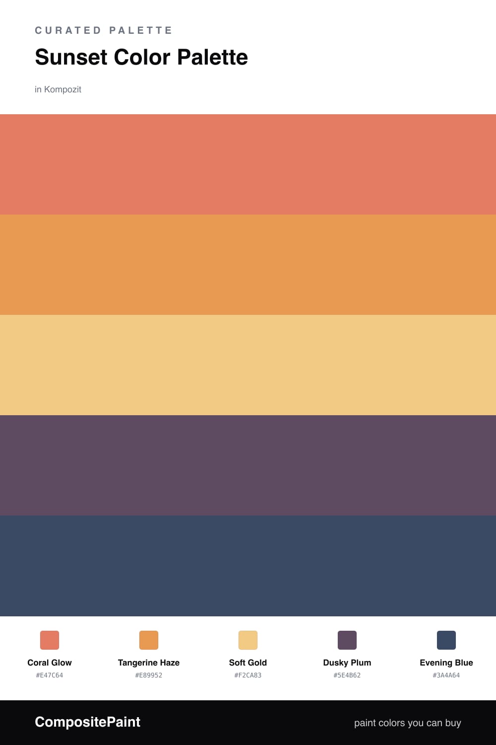
There is a moment a few minutes after the sun drops when the whole sky turns into a gradient you could not paint on purpose. This scheme chases that feeling. Coral Glow leads as the warm, lit-from-within heart of it, with Tangerine Haze carrying that same heat a half-step softer.

Soft Gold is the light itself, the pale wash that ties the warm tones together and keeps the whole thing from getting heavy. Then the sky cools. Dusky Plum brings in that bruised, romantic purple that shows up at the horizon, and Evening Blue is the deep blue creeping in from above as the day lets go.

For 2026 the move is to lean warm and let the cool tones stay scarce, like a sunset where the glow wins. Run the corals and gold across your largest planes, then place the plum and blue with restraint so they read as depth rather than contrast. Done right, it feels less like a color scheme and more like a time of day you get to live in.

Buy These Colors

Each color matched to the closest real paint in every brand, by ΔE2000. Kompozit first; take any SKU to the store — these mix on demand.

Coral Glow
#E8765A · LRV 31 · Dominant
Kompozit Sari · 1066 ΔE 2.01
Backdrop Rosita · BD-RO ΔE 14.8
Behr Cosmic Coral · HDC-SM14-12 ΔE 4.52
Benjamin Moore Fresno · 020 ΔE 1.65
Clare Fire Sign · PNT100-DP-74 ΔE 6.18
Dunn-Edwards Orangeville · DE5138 ΔE 2.04
Farrow & Ball Red Earth · No. 64 ΔE 7.15
Magnolia Home Work Worn Wood · JG-35 ΔE 10.8
PPG / Glidden Clay Pot · 1194-6 ΔE 2.05
Sherwin-Williams Rejuvenate · SW 6620 ΔE 2.44
Valspar Peach Posey · M214 ΔE 4.79
Tangerine Haze
#E89B4C · LRV 41 · Secondary
Kompozit Japonica · 0983 ΔE 1.94
Backdrop Rosita · BD-RO ΔE 19.12
Behr Gilded Leaves · HDC-FL14-5 ΔE 3.75
Benjamin Moore Cedar · ES-40 ΔE 0.56
Clare Good as Gold · PNT100-DP-59 ΔE 10.42
Dunn-Edwards Colorado Peach · DE5236 ΔE 0.68
Farrow & Ball India Yellow · No. 66 ΔE 7.93
Magnolia Home Cottage Feel · JG-40 ΔE 10
PPG / Glidden Cornucopia · 1203-7 ΔE 1.36
Sherwin-Williams Adventure Orange · SW 6655 ΔE 2.86
Valspar Sunflower Field · V013-3 ΔE 1.95
Soft Gold
#EBC97E · LRV 61 · Base
Kompozit Perky Yellow · 0926 ΔE 2.23
Backdrop Eames · BD-EA ΔE 1.51
Behr Garbanzo Paste · M290-4 ΔE 2
Benjamin Moore Beverly Hills · 180 ΔE 1.54
Clare Golden Hour · PNT100-MD-23 ΔE 2.53
Dunn-Edwards Almond Cookie · DE5374 ΔE 1.14
Farrow & Ball Yellow Ground · No. 218 ΔE 1.59
Magnolia Home Amber · JG-39 ΔE 4.31
PPG / Glidden Yukon Gold · 1209-4 ΔE 2.75
Sherwin-Williams Yellow Bird · SW 9022 ΔE 1.56
Valspar Home Brew · 8002-24C ΔE 3.04
Dusky Plum
#6B4F6E · LRV 10 · Support
Kompozit Vivid Vision · 1227 ΔE 4.33
Backdrop We Three Kings · BD-WK ΔE 19.94
Behr Prussian Plum · MQ1-39 ΔE 4.75
Benjamin Moore Ultra Violet · 1372 ΔE 2.63
Clare Night Groove · PNT100-DP-77 ΔE 7.99
Dunn-Edwards Old-Fashioned Purple · DE6007 ΔE 3.98
Farrow & Ball Stiffkey Blue · No. 281 ΔE 19.08
Magnolia Home Autumn Gray · JG-143 ΔE 15
PPG / Glidden Positively Purple · 13-08 ΔE 4.92
Sherwin-Williams Plummy · SW 6558 ΔE 5.6
Valspar Purple Valley · 1001-5A ΔE 5.81
Evening Blue
#3A4E6B · LRV 7 · Accent
Kompozit Quiet Peace · 0592 ΔE 1.82
Backdrop We Three Kings · BD-WK ΔE 3.4
Behr Rain Boots · HDC-FL14-12 ΔE 2.68
Benjamin Moore Stunning · 826 ΔE 3.99
Clare Blackest · PNT100-DP-55 ΔE 12.84
Dunn-Edwards Luna Pier · DE5888 ΔE 3.2
Farrow & Ball Hague Blue · No. 30 ΔE 9.36
Magnolia Home Signature · JG-91 ΔE 5.46
PPG / Glidden Annapolis Blue · 1164-7 ΔE 1.44
Sherwin-Williams Dignified · SW 6538 ΔE 3.81
Valspar Midnight Shadow · 4004-4C ΔE 5.05

Questions

How do I keep five sunset colors from feeling like too much?

Let the warm tones lead and the cool ones whisper. Use Coral Glow and Tangerine Haze across the biggest surfaces, keep Soft Gold as a quiet wash, and save Dusky Plum and Evening Blue for one wall or a few accents so the scheme glows instead of shouts.

Where should the deep blue and plum actually go?

Treat them the way the sky treats night, at the edges. Evening Blue is lovely on a single far wall, a ceiling, or cabinetry, and Dusky Plum reads beautifully on a built-in or trim where it can pool in shadow next to the warmer shades.

Similar Palettes

Closest schemes by color — not by label.