CP

Sunset Color Palette — Dusk Over the Horizon

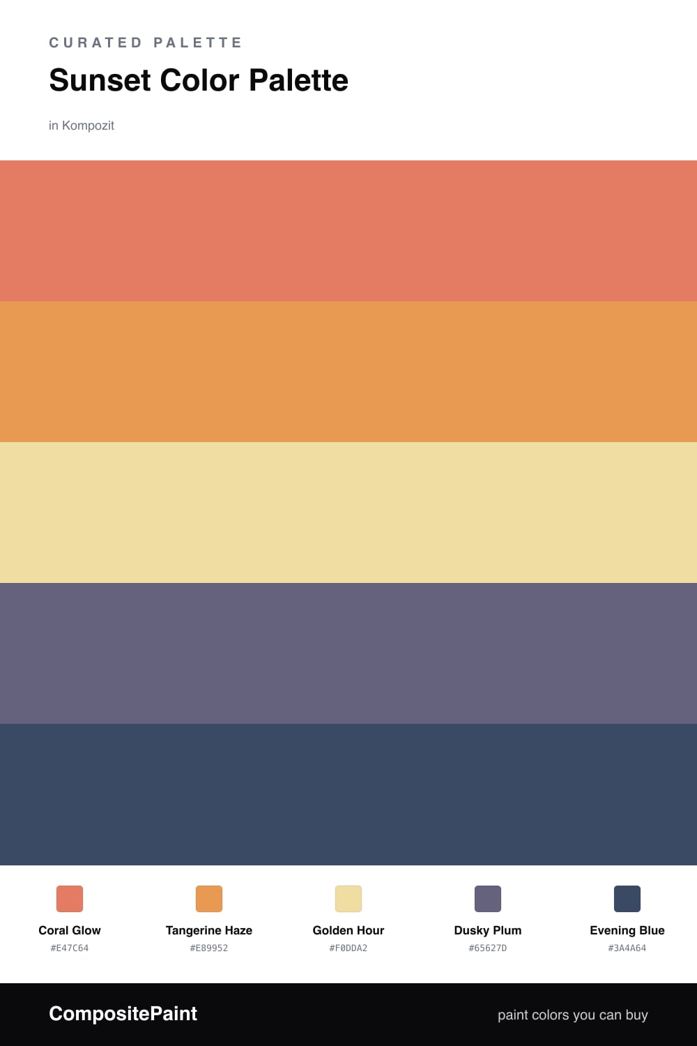
A warm five-color sunset scheme that fades from coral and tangerine through golden glow into dusky purple and deep evening blue — every color matched to real paint you can buy.

By Emily Roberts · DIY Editor & First-Timer's Guide

Coral Glow
Dominant
Kompozit Sari · 1066
#E47C64
LRV 32
Tangerine Haze
Secondary
Kompozit Japonica · 0983
#E89952
LRV 41
Golden Hour
Base
Kompozit Mella Yella · 0805
#F0DDA2
LRV 73
Dusky Plum
Support
Kompozit Grapes of Wrath · 1284
#65627D
LRV 13
Evening Blue
Accent
Kompozit Quiet Peace · 0592
#3A4A64
LRV 7
View palette in

There is a moment right after the sun dips when the whole sky turns into a gradient, and that is exactly what this palette is chasing. It starts with Coral Glow, the warm pinky-orange that leads the scheme, then steps into Tangerine Haze, a riper, sunnier orange that feels like the brightest part of the sky.

Golden Hour is your base here. It is soft and pale, the color of light spilling across everything, so let it carry the biggest areas and keep the bolder shades from feeling like too much. Think of it as the breathing room that makes the warm tones read as glow instead of clutter.

Then the sky cools off. Dusky Plum and Evening Blue are the dusk colors creeping in from the edge, and they do the grounding work that keeps this from feeling sugary. A 2026-leaning move is to use that deep blue in a small but confident way, like a single door or a band of trim, so the warm gradient has a quiet anchor at the bottom.

Buy These Colors

Each color matched to the closest real paint in every brand, by ΔE2000. Kompozit first; take any SKU to the store — these mix on demand.

Coral Glow
#E07856 · LRV 30 · Dominant
Kompozit Sari · 1066 ΔE 3.38
Backdrop Rosita · BD-RO ΔE 14.84
Behr Pumpkin Puree · M220-6 ΔE 3.96
Benjamin Moore Oriole · 2169-30 ΔE 1.12
Clare Fire Sign · PNT100-DP-74 ΔE 4.64
Dunn-Edwards Deep Coral · DE5173 ΔE 2.48
Farrow & Ball Red Earth · No. 64 ΔE 6.46
Magnolia Home Work Worn Wood · JG-35 ΔE 9.15
PPG / Glidden Clay Pot · 1194-6 ΔE 0.65
Sherwin-Williams Rejuvenate · SW 6620 ΔE 3.32
Valspar Marmalade Magic · V043-4 ΔE 4.38
Tangerine Haze
#E89B4C · LRV 41 · Secondary
Kompozit Japonica · 0983 ΔE 1.94
Backdrop Rosita · BD-RO ΔE 19.12
Behr Gilded Leaves · HDC-FL14-5 ΔE 3.75
Benjamin Moore Cedar · ES-40 ΔE 0.56
Clare Good as Gold · PNT100-DP-59 ΔE 10.42
Dunn-Edwards Colorado Peach · DE5236 ΔE 0.68
Farrow & Ball India Yellow · No. 66 ΔE 7.93
Magnolia Home Cottage Feel · JG-40 ΔE 10
PPG / Glidden Cornucopia · 1203-7 ΔE 1.36
Sherwin-Williams Adventure Orange · SW 6655 ΔE 2.86
Valspar Sunflower Field · V013-3 ΔE 1.95
Golden Hour
#F0D89B · LRV 70 · Base
Kompozit Mella Yella · 0805 ΔE 1.81
Backdrop Cookies & Cream · BD-CC ΔE 10.01
Behr Pismo Dunes · 340C-3 ΔE 2.3
Benjamin Moore Governor's Gold · CW-395 ΔE 0.92
Clare Lemonade · PNT100-MD-22 ΔE 2.81
Dunn-Edwards Hazy Moon · DE5443 ΔE 1.44
Farrow & Ball Dorset Cream · No. 68 ΔE 2.37
Magnolia Home Lemony · JG-42 ΔE 3.52
PPG / Glidden Demeter · 11-01 ΔE 1.86
Sherwin-Williams Solaria · SW 6688 ΔE 2.55
Valspar Tomatillo · 8001-26C ΔE 2.19
Dusky Plum
#6B5573 · LRV 11 · Support
Kompozit Grapes of Wrath · 1284 ΔE 7.72
Backdrop We Three Kings · BD-WK ΔE 18.5
Behr Plum Shade · 100F-6 ΔE 3.11
Benjamin Moore Ultra Violet · 1372 ΔE 3.98
Clare Prince · PNT100-DP-33 ΔE 7.88
Dunn-Edwards Princely Violet · DE5957 ΔE 2.78
Farrow & Ball Stiffkey Blue · No. 281 ΔE 17.52
Magnolia Home Autumn Gray · JG-143 ΔE 13.57
PPG / Glidden Pageant Pansy · 13-20 ΔE 2.46
Sherwin-Williams Plummy · SW 6558 ΔE 3.31
Valspar Purple Valley · 1001-5A ΔE 3.98
Evening Blue
#3B4A66 · LRV 7 · Accent
Kompozit Quiet Peace · 0592 ΔE 1.04
Backdrop Last Call · BD-LC ΔE 4.54
Behr Knighthood · S550-7 ΔE 0.86
Benjamin Moore Stunning · 826 ΔE 2.3
Clare Blackest · PNT100-DP-55 ΔE 12.41
Dunn-Edwards Luna Pier · DE5888 ΔE 2.83
Farrow & Ball Hague Blue · No. 30 ΔE 9.97
Magnolia Home Signature · JG-91 ΔE 6.76
PPG / Glidden Annapolis Blue · 1164-7 ΔE 1.13
Sherwin-Williams Dignified · SW 6538 ΔE 2.74
Valspar Skyline · 8003-47G ΔE 4.67

Questions

How do I keep this many warm colors from looking busy?

Let Golden Hour be most of what you see, since it is the lightest and calmest. Use Coral Glow and Tangerine Haze in medium doses, then save Dusky Plum and Evening Blue for small moments like a door or trim. The cool tones at the end give your eye a place to rest.

Can I use this palette in a north-facing space that gets cool light?

Yes, and it actually helps. North light is bluish and can flatten warm tones, but the coral and tangerine here are saturated enough to hold their glow. Just test a large swatch on the wall first, because cool light will pull them slightly more muted than the chip suggests.

Similar Palettes

Closest schemes by color — not by label.