Sunset Color Palette — Golden Hour Glow
A warm five-color sunset scheme that fades from coral and tangerine through soft gold into dusky purple and deep sky blue — every color matched to real paint you can buy.
By Emily Roberts · DIY Editor & First-Timer's Guide
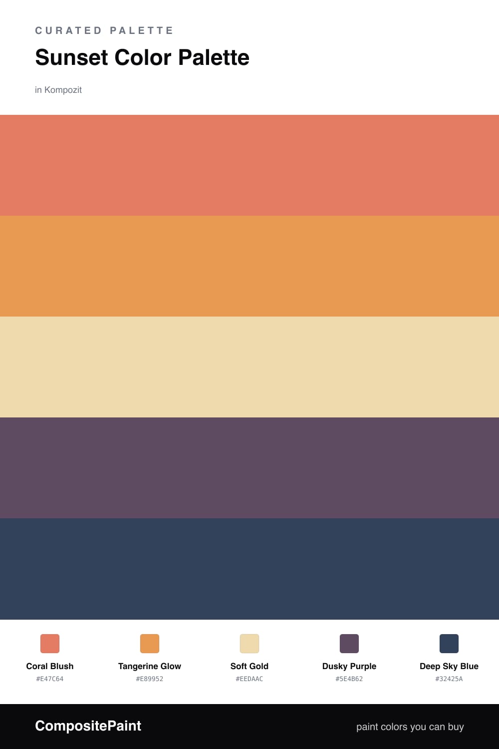
A real sunset never sits on one color, and neither does this scheme. It opens on a warm, dialed-back Coral Blush that feels like the first flush of light, then steps into a glowing Tangerine Glow for the part of the sky that actually catches fire. These two are the heart of the palette, so give them the most room.
Underneath it all sits Soft Gold, a gentle, sandy base that keeps the brights from feeling loud and gives your eye somewhere to rest. It is the color you can live with all day, the quiet hour before the sky turns.
Then the cool side arrives, the way it does at dusk. A smoky Dusky Purple and a deep, twilight Deep Sky Blue ground the whole thing and make the warm tones glow even harder by contrast. Use them sparingly, in trim, a door, or one accent moment, and the gradient reads contemporary and calm rather than themed.
Buy These Colors
Each color matched to the closest real paint in every brand, by ΔE2000. Kompozit first; take any SKU to the store — these mix on demand.
Questions
Let the warm tones lead and the cool tones support. Coral and tangerine should cover the most space, soft gold sits underneath as a quiet base, and the dusky purple and deep blue show up in small doses, like trim or a single accent wall, so the gradient feels like a real sunset instead of a rainbow.
Start with the Coral Blush as your dominant tone, since it carries the warmth of the whole scheme. If that feels too strong on a big wall, drop the Soft Gold there instead and save the coral for a feature wall or the next room over, so the warmth still reads without taking over.
Similar Palettes
Closest schemes by color — not by label.