Sunset Color Palette — Sunset Quartz
A warm five-color sunset scheme moving from coral and tangerine through gold into dusky purple and deep sky, with every color matched to real paint you can buy.
By Jessica Williams · Color Stylist & Interior Editor
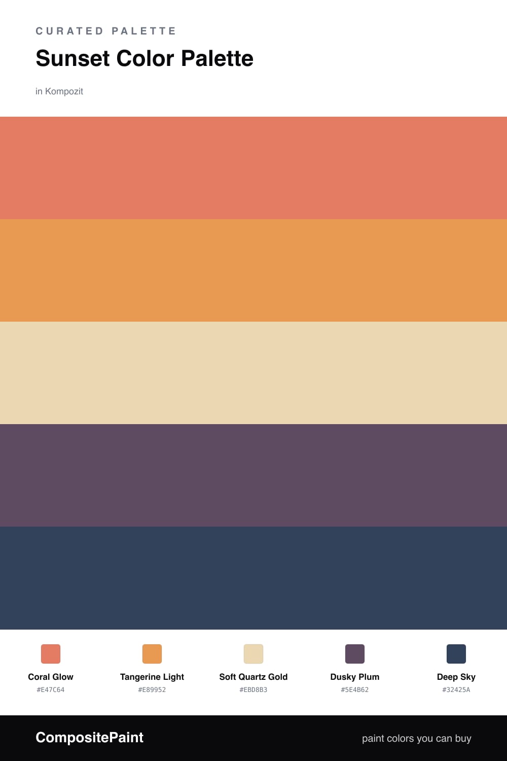
There is a moment just after the sun drops when the whole sky seems lit from inside, and that is exactly what this palette chases. Coral Glow leads as the warm heart of the room, with Tangerine Light layered close behind it like the brighter band low on the horizon.
Soft Quartz Gold is the breath between everything — a pale, sandy warmth that keeps the brights from shouting and lets them glow instead. I love it on the largest walls, where it reads almost like daylight held a little longer.
Then come the shadows. Dusky Plum and a deep, inky Deep Sky cool the edges and give the warm tones something to push against, the way evening violet creeps in as the gold fades. Used sparingly on trim or a single accent wall, they make the whole scheme feel modern and a touch moody — sunset, caught indoors.
Buy These Colors
Each color matched to the closest real paint in every brand, by ΔE2000. Kompozit first; take any SKU to the store — these mix on demand.
Questions
Let the soft gold do most of the quiet work on the largest surfaces, then use coral and tangerine in smaller, glowing doses the way light pools at dusk.
Save them for the edges — trim, a single wall, or soft furnishings — so they read as the cool shadow that makes the warm tones feel even warmer.
Similar Palettes
Closest schemes by color — not by label.