CP

Sunset Color Palette — Sunset Bloom

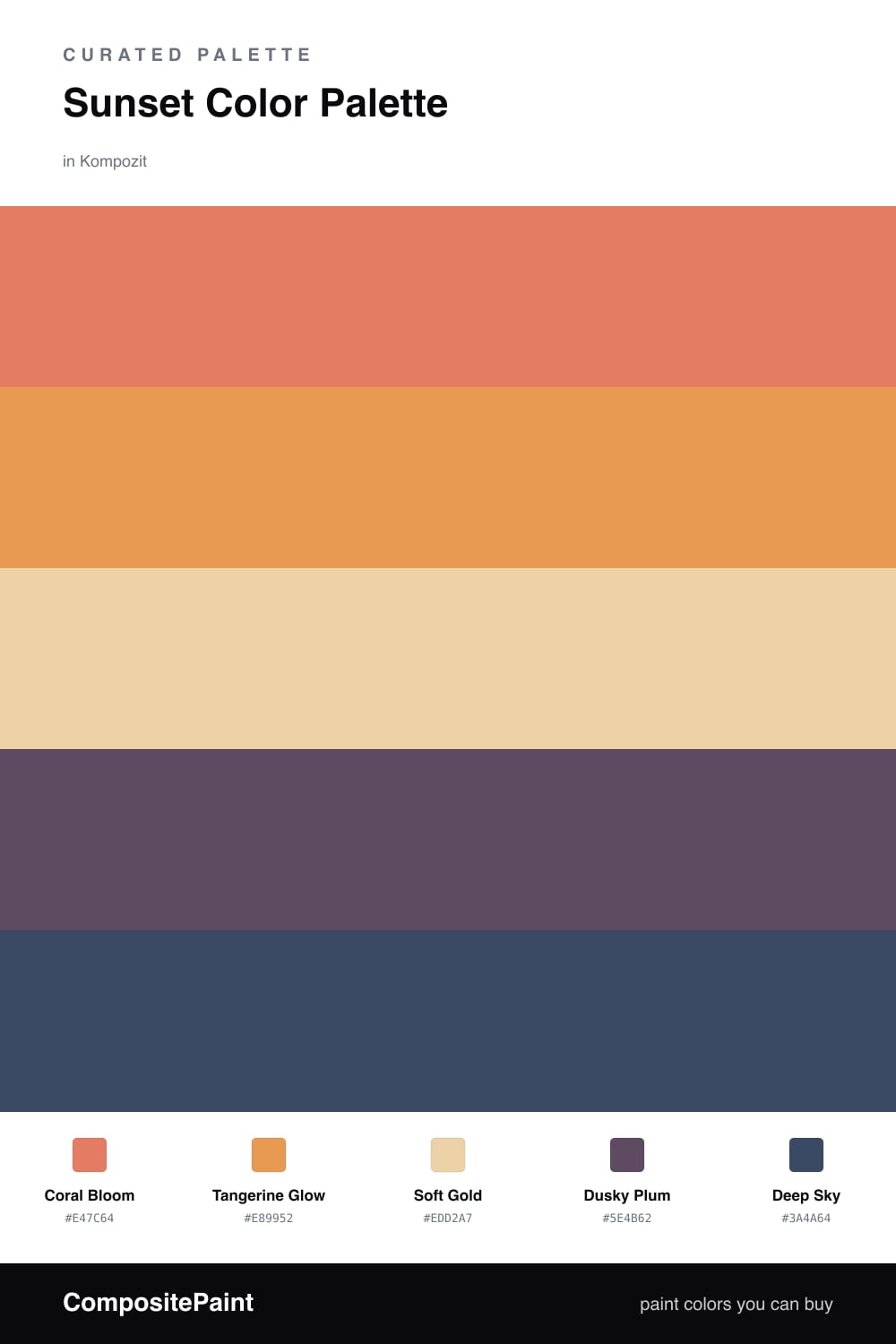
A warm five-color sunset scheme that drifts from coral and tangerine through gold into dusky purple and deep sky, with every color matched to real paint you can buy.

By David Chen · Formulation Lead & Resident Chemist

Coral Bloom
Dominant
Kompozit Sari · 1066
#E47C64
LRV 32
Tangerine Glow
Secondary
Kompozit Japonica · 0983
#E89952
LRV 41
Soft Gold
Base
Kompozit Good-Looking · 0918
#EDD2A7
LRV 67
Dusky Plum
Support
Kompozit Vivid Vision · 1227
#5E4B62
LRV 8
Deep Sky
Accent
Kompozit Quiet Peace · 0592
#3A4A64
LRV 7
View palette in

Think of a real sunset as a slow fade. The light starts warm and close, then cools as it sinks. This palette walks that same line, so it feels natural rather than picked at random. Coral Bloom leads as the dominant glow, with Tangerine Glow right beside it to keep the warmth moving.

Soft Gold is the quiet base here. It is the haze in the middle of the sky that lets the brighter colors breathe, so the room never tips into too much. I lean on a soft gold like this whenever a warm scheme needs somewhere to rest.

Then the sky cools. Dusky Plum and a grounded Deep Sky carry the last light of the day, and a little of each goes a long way. Keep them to one wall, the trim, or a few pieces, and the whole space reads like that calm minute just after the sun drops — a look that feels right at home in 2026.

Buy These Colors

Each color matched to the closest real paint in every brand, by ΔE2000. Kompozit first; take any SKU to the store — these mix on demand.

Coral Bloom
#E07856 · LRV 30 · Dominant
Kompozit Sari · 1066 ΔE 3.38
Backdrop Rosita · BD-RO ΔE 14.84
Behr Pumpkin Puree · M220-6 ΔE 3.96
Benjamin Moore Oriole · 2169-30 ΔE 1.12
Clare Fire Sign · PNT100-DP-74 ΔE 4.64
Dunn-Edwards Deep Coral · DE5173 ΔE 2.48
Farrow & Ball Red Earth · No. 64 ΔE 6.46
Magnolia Home Work Worn Wood · JG-35 ΔE 9.15
PPG / Glidden Clay Pot · 1194-6 ΔE 0.65
Sherwin-Williams Rejuvenate · SW 6620 ΔE 3.32
Valspar Marmalade Magic · V043-4 ΔE 4.38
Tangerine Glow
#E59A4C · LRV 40 · Secondary
Kompozit Japonica · 0983 ΔE 2.07
Backdrop Rosita · BD-RO ΔE 19.03
Behr Solar Fusion · UL150-3 ΔE 4.49
Benjamin Moore Brilliant Amber · 161 ΔE 0.7
Clare Good as Gold · PNT100-DP-59 ΔE 9.98
Dunn-Edwards Colorado Peach · DE5236 ΔE 0.62
Farrow & Ball India Yellow · No. 66 ΔE 7.48
Magnolia Home Cottage Feel · JG-40 ΔE 9.88
PPG / Glidden Cornucopia · 1203-7 ΔE 1.79
Sherwin-Williams Saffron Thread · SW 6663 ΔE 1.22
Valspar Sunflower Field · V013-3 ΔE 1.98
Soft Gold
#EAD2A6 · LRV 66 · Base
Kompozit Good-Looking · 0918 ΔE 1.21
Backdrop Cookies & Cream · BD-CC ΔE 7.33
Behr Amber Moon · HDC-CT-01 ΔE 2.39
Benjamin Moore Safari · AF-335 ΔE 0.56
Clare Lemonade · PNT100-MD-22 ΔE 1.56
Dunn-Edwards Canary Island · DE6164 ΔE 1.08
Farrow & Ball Dorset Cream · No. 68 ΔE 2.05
Magnolia Home Lemony · JG-42 ΔE 1.56
PPG / Glidden Spice Is Nice · 1090-2 ΔE 1.11
Sherwin-Williams Lucent Yellow · SW 6400 ΔE 1.52
Valspar Melted Butter · P017 ΔE 1.2
Dusky Plum
#6B5273 · LRV 10 · Support
Kompozit Vivid Vision · 1227 ΔE 4.85
Backdrop We Three Kings · BD-WK ΔE 18.91
Behr Plum Shade · 100F-6 ΔE 4.47
Benjamin Moore Ultra Violet · 1372 ΔE 3.23
Clare Night Groove · PNT100-DP-77 ΔE 8.82
Dunn-Edwards Concord Jam · DE5964 ΔE 4.79
Farrow & Ball Stiffkey Blue · No. 281 ΔE 18.13
Magnolia Home Autumn Gray · JG-143 ΔE 14.77
PPG / Glidden Pageant Pansy · 13-20 ΔE 3.63
Sherwin-Williams Plummy · SW 6558 ΔE 4.56
Valspar Purple Valley · 1001-5A ΔE 4.46
Deep Sky
#3A4A66 · LRV 7 · Accent
Kompozit Quiet Peace · 0592 ΔE 0.8
Backdrop Last Call · BD-LC ΔE 4.77
Behr Knighthood · S550-7 ΔE 0.75
Benjamin Moore Stunning · 826 ΔE 2.61
Clare Blackest · PNT100-DP-55 ΔE 12.49
Dunn-Edwards Luna Pier · DE5888 ΔE 2.83
Farrow & Ball Hague Blue · No. 30 ΔE 9.78
Magnolia Home Signature · JG-91 ΔE 6.46
PPG / Glidden Annapolis Blue · 1164-7 ΔE 0.74
Sherwin-Williams Dignified · SW 6538 ΔE 2.92
Valspar Skyline · 8003-47G ΔE 5.02

Questions

Why do these sunset colors work together?

They follow the same path light takes at dusk, warm coral and tangerine up front, cooling into plum and deep sky. Because they share that gradual shift, the eye reads them as one mood instead of five separate choices.

How do I balance them in a room?

Let the coral and gold lead across the big surfaces, then use plum and deep sky in small doses on a single wall, trim, or decor — roughly an 80/20 split keeps the warmth in charge.

Similar Palettes

Closest schemes by color — not by label.