Sunset Color Palette — Horizon Dawn
A warm five-color sunset scheme moving from coral and tangerine into gold, dusky purple, and deep sky blue, with every color matched to real paint you can buy.
By Maya Patel · Reviews Editor & Product Tester
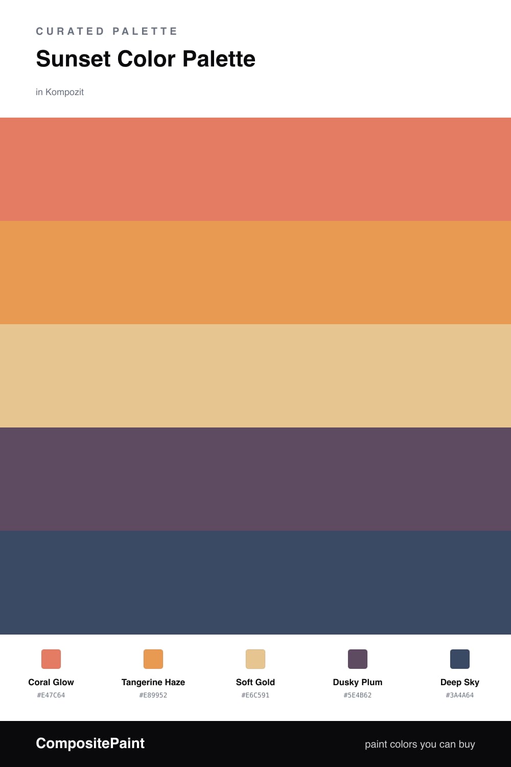
This is a sunset caught mid-fade. Coral Glow leads with that flushed, just-after-golden-hour warmth, and Tangerine Haze sits right beside it as the brighter spark — the part of the sky still holding heat.
Soft Gold is the smart move here. It is the calm base that lets the two oranges breathe instead of competing, so the room feels glowing rather than loud. Use it on your largest, quietest surfaces and let the warmer tones land on the features you want noticed.
Then the sky cools. Dusky Plum brings the violet edge of dusk, and Deep Sky grounds everything with that last band of fading blue. Keep these two in smaller doses — trim, a door, a single accent wall — and the whole palette feels like a real horizon instead of a swatch strip.
Buy These Colors
Each color matched to the closest real paint in every brand, by ΔE2000. Kompozit first; take any SKU to the store — these mix on demand.
Questions
Let the gold do most of the heavy lifting as your quiet base, then use coral and tangerine on the bigger surfaces and save plum and deep sky for trim, accents, or a single moody wall.
It reads modern in a sunroom, a creative studio, or an entryway — anywhere you want warmth up front and a cooler grounding tone to keep it from turning sweet.
Similar Palettes
Closest schemes by color — not by label.