Sunset Color Palette — Sunset Ember
A warm five-color scheme that moves from coral and tangerine through gold into a dusky purple and deep blue sky — every color matched to real paint you can buy.
By Jessica Williams · Color Stylist & Interior Editor
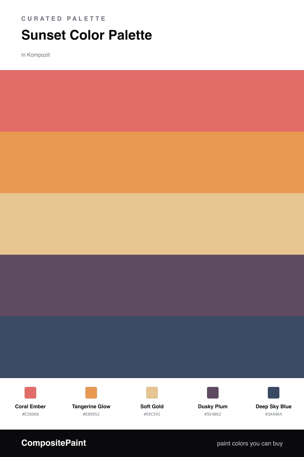
This is the sky in the last ten minutes before dark, caught and held. Coral Ember leads with that flushed, glowing warmth you see right at the horizon, while Tangerine Glow picks up just above it — softer, a little hazier, the color of light bleeding through clouds.
Soft Gold is the quiet center of the whole thing. It carries the room without shouting, the way a sunset spends most of its time as a warm wash rather than a blaze. Against it, Dusky Plum brings in that bruised, beautiful shadow color that creeps up from the bottom of the sky.
And then Deep Sky Blue, the cool note that makes everything else feel warmer by contrast. Use it sparingly — a door, a chair, a single wall — and the gradient suddenly reads as a real sky, not just a row of warm paint chips. For 2026 I love letting the plum and blue do more than usual; they keep the warmth feeling current instead of nostalgic.
Buy These Colors
Each color matched to the closest real paint in every brand, by ΔE2000. Kompozit first; take any SKU to the store — these mix on demand.
Questions
Let the gold do the heavy lifting on the largest surfaces and use the coral and tangerine in smaller, intentional moments. The dusky plum and deep blue act as a cool counterweight, so the warmth reads cozy instead of hot.
Start with Soft Gold. It is the calmest, most livable shade here and gives you a forgiving backdrop, so you can layer the coral, tangerine, and blue in through smaller decor and trim over time.
Similar Palettes
Closest schemes by color — not by label.