CP

Sunset Color Palette — Cocoa Afterglow

A five-color sunset scheme that melts coral and tangerine into gold, dusky purple, and a deep cocoa sky — every color matched to real paint you can buy.

By Jessica Williams · Color Stylist & Interior Editor

Coral Glow
Dominant
Kompozit Sari · 1066
#E47C64
LRV 32
Tangerine Haze
Secondary
Kompozit Japonica · 0983
#E89952
LRV 41
Soft Gold
Base
Kompozit Marzipan · 0882
#E9D4AA
LRV 67
Dusky Plum
Support
Kompozit Vivid Vision · 1227
#5E4B62
LRV 8
Deep Cocoa Sky
Accent
Kompozit Silent Sea · 0515
#2A2B2C
LRV 2
View palette in

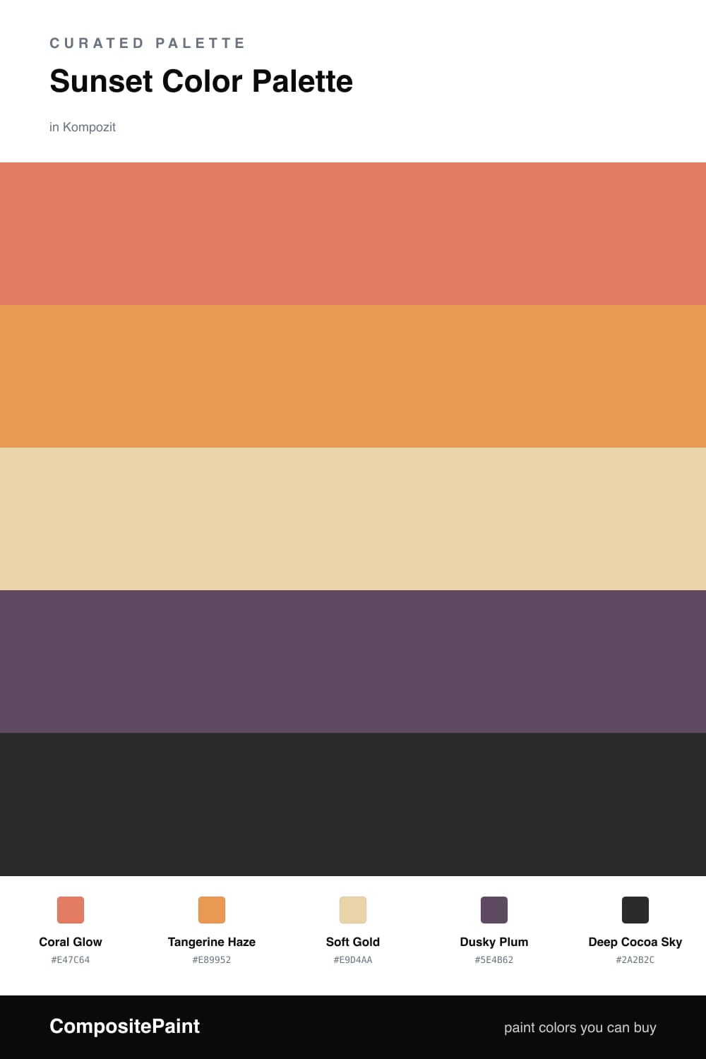
There is a moment right after the sun drops when the whole sky seems to blush, and this palette tries to hold onto it. Coral Glow leads as a soft, lit-from-within warmth, with Tangerine Haze glowing just beneath it like the last band of light on the horizon.

Soft Gold is the quiet middle, a hazy wash that keeps the warmth from feeling saturated, while Dusky Plum brings in that cooler twilight edge. Then Deep Cocoa Sky grounds everything — a rich, almost-brown dusk that makes the corals read warmer by contrast.

For a contemporary 2026 feel, let the coral and gold carry the big surfaces and save the plum and cocoa for the deep corners, a moody cabinet, or a single grounding wall. It is a gradient you can live inside.

Buy These Colors

Each color matched to the closest real paint in every brand, by ΔE2000. Kompozit first; take any SKU to the store — these mix on demand.

Coral Glow
#E8755A · LRV 31 · Dominant
Kompozit Sari · 1066 ΔE 2.06
Backdrop Rosita · BD-RO ΔE 14.9
Behr Cosmic Coral · HDC-SM14-12 ΔE 4.36
Benjamin Moore Tucker Orange · CW-300 ΔE 1.95
Clare Fire Sign · PNT100-DP-74 ΔE 6.22
Dunn-Edwards Orangeville · DE5138 ΔE 1.69
Farrow & Ball Red Earth · No. 64 ΔE 7.16
Magnolia Home Work Worn Wood · JG-35 ΔE 10.84
PPG / Glidden Clay Pot · 1194-6 ΔE 2.29
Sherwin-Williams Rejuvenate · SW 6620 ΔE 2.37
Valspar Peach Posey · M214 ΔE 4.53
Tangerine Haze
#E0954A · LRV 38 · Secondary
Kompozit Japonica · 0983 ΔE 2.09
Backdrop Rosita · BD-RO ΔE 18.65
Behr Stunning Gold · M240-6 ΔE 1.52
Benjamin Moore Brilliant Amber · 161 ΔE 1.37
Clare Good as Gold · PNT100-DP-59 ΔE 9.99
Dunn-Edwards Brushed Clay · DE5243 ΔE 1.83
Farrow & Ball India Yellow · No. 66 ΔE 7.67
Magnolia Home Cottage Feel · JG-40 ΔE 10.79
PPG / Glidden Dynamo · 17-22 ΔE 3.76
Sherwin-Williams Saffron Thread · SW 6663 ΔE 1.08
Valspar Toffee Cream · 3001-3B ΔE 2.04
Soft Gold
#EBD4A6 · LRV 68 · Base
Kompozit Marzipan · 0882 ΔE 1.08
Backdrop Cookies & Cream · BD-CC ΔE 7.36
Behr Quiet Veranda · 350F-4 ΔE 0.88
Benjamin Moore Safari · AF-335 ΔE 1.32
Clare Lemonade · PNT100-MD-22 ΔE 0.86
Dunn-Edwards Canary Island · DE6164 ΔE 0.88
Farrow & Ball Dorset Cream · No. 68 ΔE 1.55
Magnolia Home Lemony · JG-42 ΔE 1.61
PPG / Glidden Caramelized Pears · 1105-3 ΔE 2.02
Sherwin-Williams Sunbeam Yellow · SW 78 ΔE 2.32
Valspar Melted Butter · P017 ΔE 0.73
Dusky Plum
#6B4A66 · LRV 9 · Support
Kompozit Vivid Vision · 1227 ΔE 4.59
Backdrop We Three Kings · BD-WK ΔE 21.66
Behr Purplestone · 110F-6 ΔE 2.8
Benjamin Moore Eggplant · 1379 ΔE 2.02
Clare Night Groove · PNT100-DP-77 ΔE 7.18
Dunn-Edwards Old-Fashioned Purple · DE6007 ΔE 2.89
Farrow & Ball Preference Red · No. 297 ΔE 10.35
Magnolia Home Coffee Nook · JG-96 ΔE 18.44
PPG / Glidden Positively Purple · 13-08 ΔE 3.59
Sherwin-Williams Impulsive Purple · SW 6832 ΔE 6.85
Valspar Passionate · T502 ΔE 4.35
Deep Cocoa Sky
#3A2A2E · LRV 3 · Accent
Kompozit Silent Sea · 0515 ΔE 10.23
Backdrop Hocus Pocus · BD-HP ΔE 10.33
Behr Double Espresso · BNC-21 ΔE 3.82
Benjamin Moore Velvet Cloak · CSP-480 ΔE 1.73
Clare Blackish · PNT100-DP-54 ΔE 12.84
Dunn-Edwards Black · DEA187 ΔE 9.81
Farrow & Ball Pitch Black · No. 256 ΔE 9.51
Magnolia Home Blackboard · JG-05 ΔE 10.79
PPG / Glidden Black Magic · 1001-7 ΔE 10.75
Sherwin-Williams Raisin · SW 7630 ΔE 1.54
Valspar Noblesse Oblige · 8004-2G ΔE 2.49

Questions

Why do these sunset colors work together?

They follow the same path your eye does at dusk — warm coral and tangerine up top, gold in the middle, then a dusky plum sliding into deep cocoa. Because the shift is gradual, nothing clashes; each color feels like the next breath of the same sky.

How do I keep this palette from feeling too warm?

Lean on the dusky plum and the deep cocoa to cool things down. Let the coral lead, keep the gold as a soft wash, and use the plum and cocoa as grounding shadows so the warmth feels glowing rather than heavy.

Similar Palettes

Closest schemes by color — not by label.