CP

Rose Kitchen Palette — Faded Rose & Warm Oat

A soft, grounded 5-color scheme for rose kitchens: faded-rose cabinets, warm oat walls, creamy trim, walnut wood, and a deep clay anchor, with every color matched to real paint you can buy.

By Jessica Williams · Color Stylist & Interior Editor

Faded Rose
Cabinets
Kompozit Angela Canyon · 0119
#C99997
LRV 37
Warm Oat
Walls
Kompozit Onion Skin · 0418
#EBE8DC
LRV 81
Soft Cream
Trim & Ceiling
Kompozit Sugar Dust · 0011
#F8F6ED
LRV 92
Walnut Brown
Wood & Floors
Kompozit Alpha Male · 0193
#715A45
LRV 11
Burnished Clay
Island Accent
Kompozit Dark Marmalade · 1040
#994939
LRV 12
View palette in

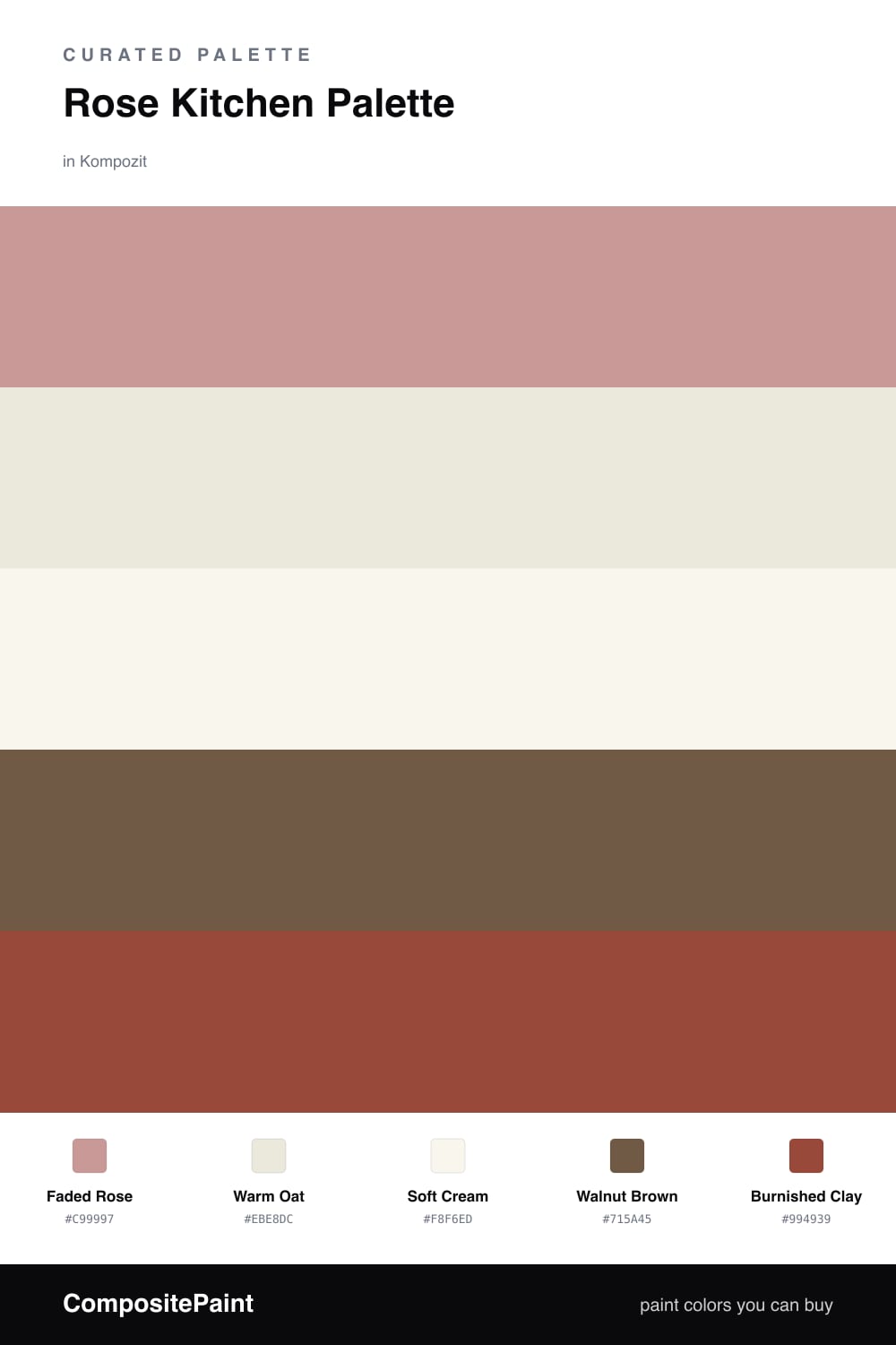
A rose kitchen should feel like late-afternoon light on terracotta, warm, soft, and a little nostalgic. This palette leans on a muted faded rose for the cabinets, the kind of dusty shade that looks almost gray in shadow and blooms into a gentle clay-pink when the sun reaches it.

Around it, warm oat settles onto the walls and a cleaner soft cream lifts the trim and ceiling, so the rose never feels heavy. Walnut brown on the wood and floors keeps everything grounded, the way real wood anchors a room and stops a soft color from floating away.

For the anchor, a single run of burnished clay on the island gives the eye somewhere to rest. It is the deepest note here, so use it sparingly, on one surface and no more, and let the rose stay the star.

Buy These Colors

Each color matched to the closest real paint in every brand, by ΔE2000. Kompozit first; take any SKU to the store — these mix on demand.

Faded Rose
#C99A93 · LRV 38 · Cabinets
Kompozit Angela Canyon · 0119 ΔE 2.13
Backdrop Rosita · BD-RO ΔE 2.48
Behr Artifact · 210F-5 ΔE 2.1
Benjamin Moore Amaryllis · 1256 ΔE 2.16
Clare Subrosa · PNT100-MD-76 ΔE 2.51
Dunn-Edwards Musk · DE6088 ΔE 3.09
Farrow & Ball Cinder Rose · No. 246 ΔE 5.36
Magnolia Home Rustic Oak · JG-110 ΔE 13.87
PPG / Glidden Pepperberry · 1055-4 ΔE 2.46
Sherwin-Williams Cabbage Rose · SW 3 ΔE 4.51
Valspar Naked Clay · 1008-10A ΔE 5.13
Warm Oat
#EDE6D8 · LRV 80 · Walls
Kompozit Onion Skin · 0418 ΔE 1.91
Backdrop Don't Eat the Yellow Snow · BD-DS ΔE 3.81
Behr Exclusive Ivory · HDC-MD-11 ΔE 1.59
Benjamin Moore White Down · 970 ΔE 1.2
Clare Like Buttah · PNT100-LT-62 ΔE 2.01
Dunn-Edwards Antique White · DEW351 ΔE 1.49
Farrow & Ball James White · No. 2010 ΔE 2.24
Magnolia Home Carter Crème · JG-16 ΔE 1.65
PPG / Glidden China White · 1101-1 ΔE 1.4
Sherwin-Williams Ivory Lace · SW 7013 ΔE 0.48
Valspar Cozy White · 3008-10C ΔE 0.88
Soft Cream
#FAF6EE · LRV 92 · Trim & Ceiling
Kompozit Sugar Dust · 0011 ΔE 1.22
Backdrop Tabula Rasa · BD-TR ΔE 2.13
Behr China Cup · W-D-100 ΔE 0.58
Benjamin Moore Simply White · 2143-70 ΔE 2.15
Clare Timeless · PNT100-LT-04 ΔE 1.52
Dunn-Edwards Milk Glass · DEW358 ΔE 0.59
Farrow & Ball All White · No. 2005 ΔE 1.9
Magnolia Home True White · JG-21 ΔE 2.5
PPG / Glidden Delicate White · 1001-1 ΔE 2.86
Sherwin-Williams High Reflective White · SW 7757 ΔE 1.94
Valspar Gauzy White · V152 ΔE 1.57
Walnut Brown
#7A553A · LRV 11 · Wood & Floors
Kompozit Alpha Male · 0193 ΔE 5.22
Backdrop Buenos Aires · BD-BA ΔE 4.14
Behr Leather Work · S240-7 ΔE 1.2
Benjamin Moore Marsh Brown · 2164-20 ΔE 1.21
Clare Vintage · PNT100-DP-67 ΔE 12.49
Dunn-Edwards Roxy Brown · DE6084 ΔE 5.07
Farrow & Ball Salon Drab · No. 290 ΔE 9.99
Magnolia Home Cognac · JG-164 ΔE 3.52
PPG / Glidden Molasses · 1079-7 ΔE 2.42
Sherwin-Williams Über Umber · SW 9107 ΔE 2.35
Valspar Château Mantle · V085-6 ΔE 0.72
Burnished Clay
#9C4B3B · LRV 12 · Island Accent
Kompozit Dark Marmalade · 1040 ΔE 0.84
Backdrop Bahaus · BD-BH ΔE 7.11
Behr Smokin Hot · MQ1-24 ΔE 2.54
Benjamin Moore Vintage Redware · 2172-30 ΔE 0.85
Clare Big Apple · PNT100-DP-30 ΔE 8.81
Dunn-Edwards Arabian Red · DEA155 ΔE 1.57
Farrow & Ball Incarnadine · No. 248 ΔE 5.95
Magnolia Home Home At Last · JG-30 ΔE 3.43
PPG / Glidden Rojo Colonial · 13-15 ΔE 2.04
Sherwin-Williams Spicy Hue · SW 6342 ΔE 2.26
Valspar Toasted Cranberry · 2001-5A ΔE 1.77

Questions

Will rose cabinets make my kitchen look pink and childish?

Not when the rose is muted and slightly gray, like the faded rose here. Paired with walnut wood and warm oat walls, it reads as a soft warm clay rather than a candy pink. Keep your countertops and metals warm-toned to hold that grounded feeling.

How much rose is too much in a kitchen?

Let the faded rose lead on the cabinets and stop there. Keep the walls and trim neutral so the color has room to breathe, and use the deeper burnished clay on just one surface, like the island, so the eye has a single place to land.

Similar Palettes

Closest schemes by color — not by label.