CP

Coral Powder Room Palette — Sunbaked Coral & Soft Plaster

A warm, jewel-box 5-color scheme for a powder room: sunbaked coral walls, a soft plaster neutral, crisp trim, grounding wood, and a deep clay accent, every color matched to real paint you can buy.

By David Chen · Formulation Lead & Resident Chemist

Sunbaked Coral
Walls
Kompozit Summer Memory · 1052
#DF856E
LRV 34
Soft Plaster
Backdrop & Vanity
Kompozit Merlins Beard · 0124
#EFE2D9
LRV 78
Warm Chalk White
Trim & Ceiling
Kompozit Sugar Dust · 0011
#F8F6ED
LRV 92
Burnished Walnut
Wood & Vanity Top
Kompozit Coffee Shop · 0151
#725042
LRV 10
Deep Clay
Accent & Hardware Wall
Kompozit Dark Marmalade · 1040
#994939
LRV 12
View palette in

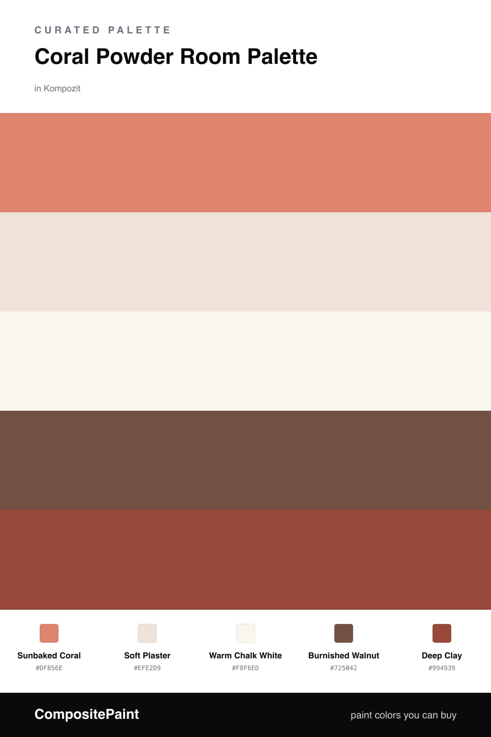
Think of coral as a warm red that someone stirred a spoonful of clay into. That little bit of brown is what makes Sunbaked Coral feel grounded instead of loud, and a powder room is the perfect place to let it run wall to wall. The room is small, you are only in it for a minute, so a saturated color lands as a small pleasure rather than a decision you have to live with all day.

To keep the coral from shouting, I give it quiet company. Soft Plaster is a warm off-white you can carry onto the vanity or a half-wall, and Warm Chalk White sits a touch cleaner on the trim and ceiling so every coral edge looks crisp. Burnished Walnut on the vanity or floor adds the wood note that tells your eye the coral is earthy, not artificial.

For the one deep moment every small room needs, reach for Deep Clay — a burnt brick-red I would keep to a single surface, a console wall behind the basin, or even just the framing around a mirror. Used on more than about one-fifth of the room it stops being an accent and starts competing with the coral. Hold it back, pair it with warm brass fixtures, and the whole room cocoons.

Buy These Colors

Each color matched to the closest real paint in every brand, by ΔE2000. Kompozit first; take any SKU to the store — these mix on demand.

Sunbaked Coral
#E08566 · LRV 34 · Walls
Kompozit Summer Memory · 1052 ΔE 2.56
Backdrop Rosita · BD-RO ΔE 11.84
Behr Candied Yams (m210-5) · M210-5 ΔE 3.16
Benjamin Moore Golden Cherry · 069 ΔE 2.86
Clare Pink Sky · PNT100-MD-28 ΔE 10.07
Dunn-Edwards Bronzed Orange · DE5179 ΔE 2.55
Farrow & Ball Red Earth · No. 64 ΔE 6.25
Magnolia Home Vintage Crown · JG-152 ΔE 16.26
PPG / Glidden Summer Sunset · 1192-6 ΔE 2.18
Sherwin-Williams Rejuvenate · SW 6620 ΔE 4.26
Valspar Longhorn · 2007-5B ΔE 5.95
Soft Plaster
#EDE4D8 · LRV 78 · Backdrop & Vanity
Kompozit Merlins Beard · 0124 ΔE 2.8
Backdrop Don't Eat the Yellow Snow · BD-DS ΔE 5.13
Behr Natural Linen · W-F-120 ΔE 0.79
Benjamin Moore White Down · 970 ΔE 2.74
Clare On Point · PNT100-LT-11 ΔE 3
Dunn-Edwards Siamese Kitten · DE6121 ΔE 1.35
Farrow & Ball Dimity · No. 2008 ΔE 1.64
Magnolia Home Antique Rose · JG-23 ΔE 1.84
PPG / Glidden String Of Pearls · 1079-1 ΔE 0.57
Sherwin-Williams Ivory Lace · SW 7013 ΔE 1.23
Valspar Bubble Bath · V154 ΔE 1.48
Warm Chalk White
#FAF6EF · LRV 92 · Trim & Ceiling
Kompozit Sugar Dust · 0011 ΔE 1.56
Backdrop Tabula Rasa · BD-TR ΔE 2.52
Behr China Cup · W-D-100 ΔE 0.93
Benjamin Moore Snowfall White · 2144-70 ΔE 2.84
Clare Timeless · PNT100-LT-04 ΔE 1.73
Dunn-Edwards Milk Glass · DEW358 ΔE 0.52
Farrow & Ball All White · No. 2005 ΔE 1.46
Magnolia Home True White · JG-21 ΔE 2.41
PPG / Glidden Delicate White · 1001-1 ΔE 2.7
Sherwin-Williams High Reflective White · SW 7757 ΔE 1.91
Valspar New Ream · V148 ΔE 1.95
Burnished Walnut
#7A5236 · LRV 10 · Wood & Vanity Top
Kompozit Coffee Shop · 0151 ΔE 5.6
Backdrop Buenos Aires · BD-BA ΔE 5.38
Behr Leather Work · S240-7 ΔE 1.26
Benjamin Moore Cordwainer · 2164-10 ΔE 1.32
Clare Vintage · PNT100-DP-67 ΔE 12.31
Dunn-Edwards Cellar Door · DEA157 ΔE 4.97
Farrow & Ball Salon Drab · No. 290 ΔE 11.16
Magnolia Home Cognac · JG-164 ΔE 4.45
PPG / Glidden Molasses · 1079-7 ΔE 3.43
Sherwin-Williams Umber Rust · SW 9100 ΔE 1.32
Valspar Château Mantle · V085-6 ΔE 0.67
Deep Clay
#9C4A38 · LRV 12 · Accent & Hardware Wall
Kompozit Dark Marmalade · 1040 ΔE 0.95
Backdrop Bahaus · BD-BH ΔE 7.28
Behr Smokin Hot · MQ1-24 ΔE 3.12
Benjamin Moore Rich Chestnut · 2090-20 ΔE 0.64
Clare Big Apple · PNT100-DP-30 ΔE 9.51
Dunn-Edwards Arabian Red · DEA155 ΔE 2.22
Farrow & Ball Incarnadine · No. 248 ΔE 6.6
Magnolia Home Home At Last · JG-30 ΔE 4.14
PPG / Glidden Rojo Colonial · 13-15 ΔE 2.59
Sherwin-Williams Spicy Hue · SW 6342 ΔE 1.6
Valspar Toasted Cranberry · 2001-5A ΔE 2.16

Questions

Will coral walls feel like too much in a small powder room?

A powder room is exactly where coral works best. The space is small and you pass through it, so a saturated wall reads as a treat rather than a commitment. Keep the trim and ceiling in the warm chalk white so the coral has a clean edge and the room feels finished, not swallowed.

How do I keep coral from looking too pink or too orange?

Sunbaked coral here is muted with a little brown in it, which steadies it between pink and orange. Pair it with the warm wood and the deep clay accent and the eye reads it as earthy coral. Cool metals or stark white trim are what tip coral toward candy pink, so stay with warm brass and the chalk white.

Similar Palettes

Closest schemes by color — not by label.