CP

Mustard Kitchen Palette — Golden Mustard & Warm Oat

A cozy, sun-warmed 5-color scheme for kitchens: golden mustard cabinets, warm oat walls, soft trim, grounding walnut wood, and a deep clay accent, with every color matched to real paint you can buy.

By Emily Roberts · DIY Editor & First-Timer's Guide

Golden Mustard
Cabinets
Kompozit Yellow Shout · 0935
#D19932
LRV 37
Warm Oat
Walls
Kompozit Floating Island · 0320
#ECE5CF
LRV 78
Soft Linen White
Trim & Ceiling
Kompozit Sugar Dust · 0011
#F8F6ED
LRV 92
Walnut Brown
Wood & Floors
Kompozit Alpha Male · 0193
#715A45
LRV 11
Burnt Clay
Island Accent
Kompozit Dark Marmalade · 1040
#994939
LRV 12
View palette in

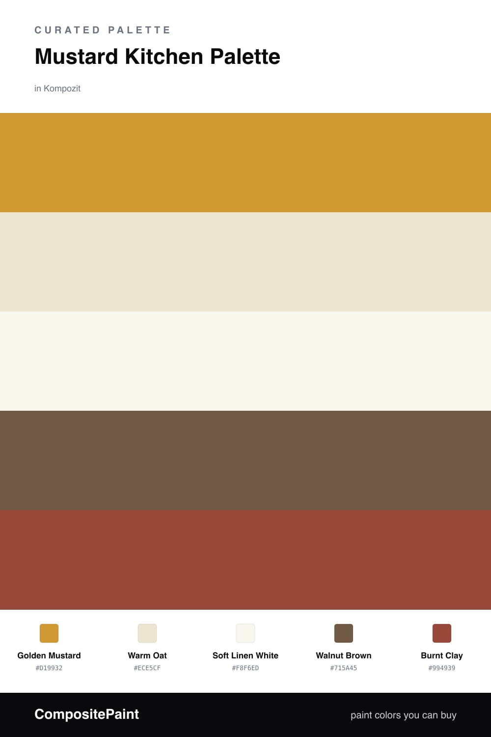
A mustard kitchen feels like late-afternoon sun on a wood table — warm, lived-in, and welcoming. The star here is a golden mustard on the cabinets, a soft ochre-gold that looks rich without tipping into neon. It is the kind of color that makes a kitchen feel like the heart of the house.

To keep it easy to live with, the walls wear a gentle warm oat and the trim a clean soft linen white, so the mustard has room to glow instead of crowding the eye. Walnut brown floors and open shelves ground everything with real warmth, the way wood always does.

For one last bit of depth, a burnt clay accent — on an island front or a single base run — gives the room a spot to land. Keep that deepest color to one surface, no more, and the whole scheme stays cozy instead of heavy.

Buy These Colors

Each color matched to the closest real paint in every brand, by ΔE2000. Kompozit first; take any SKU to the store — these mix on demand.

Golden Mustard
#C99A3B · LRV 36 · Cabinets
Kompozit Yellow Shout · 0935 ΔE 2.37
Backdrop Carry the Two · BD-CT ΔE 17.52
Behr Solid Gold · M280-6 ΔE 2.55
Benjamin Moore Fields of Gold · 203 ΔE 0.87
Clare Good as Gold · PNT100-DP-59 ΔE 7.12
Dunn-Edwards Roman Gold · DE5356 ΔE 2.17
Farrow & Ball India Yellow · No. 66 ΔE 4.45
Magnolia Home Bright Days · JG-45 ΔE 9.07
PPG / Glidden Golden Field · 1107-7 ΔE 2.91
Sherwin-Williams Crispy Gold · SW 6699 ΔE 1.65
Valspar Golden Avocado · 3008-5A ΔE 1.82
Warm Oat
#EDE6D2 · LRV 79 · Walls
Kompozit Floating Island · 0320 ΔE 0.79
Backdrop Don't Eat the Yellow Snow · BD-DS ΔE 1.61
Behr Warm Marshmallow · HDC-NT-11A ΔE 2.27
Benjamin Moore Spanish White · 943 ΔE 0.96
Clare Like Buttah · PNT100-LT-62 ΔE 2.35
Dunn-Edwards Antique White · DEW351 ΔE 1.11
Farrow & Ball Dimity · No. 2008 ΔE 2.98
Magnolia Home Carter Crème · JG-16 ΔE 0.82
PPG / Glidden Instant Relief · 1096-1 ΔE 0.71
Sherwin-Williams Décor White · SW 7559 ΔE 2.66
Valspar Snow on the Pines · 8004-22A ΔE 0.45
Soft Linen White
#FAF7EF · LRV 93 · Trim & Ceiling
Kompozit Sugar Dust · 0011 ΔE 0.81
Backdrop Tabula Rasa · BD-TR ΔE 1.93
Behr Swan Wing · W-F-400 ΔE 1.03
Benjamin Moore Snowfall White · 2144-70 ΔE 2.11
Clare Timeless · PNT100-LT-04 ΔE 1.11
Dunn-Edwards Milk Glass · DEW358 ΔE 0.47
Farrow & Ball All White · No. 2005 ΔE 1.97
Magnolia Home True White · JG-21 ΔE 2.13
PPG / Glidden Delicate White · 1001-1 ΔE 2.62
Sherwin-Williams High Reflective White · SW 7757 ΔE 1.53
Valspar Ultra White · 7006-24 ΔE 1.76
Walnut Brown
#7A5436 · LRV 11 · Wood & Floors
Kompozit Alpha Male · 0193 ΔE 5.68
Backdrop Buenos Aires · BD-BA ΔE 4.68
Behr Leather Work · S240-7 ΔE 0.85
Benjamin Moore Cordwainer · 2164-10 ΔE 2.06
Clare Vintage · PNT100-DP-67 ΔE 13.4
Dunn-Edwards Cellar Door · DEA157 ΔE 6.11
Farrow & Ball Salon Drab · No. 290 ΔE 10.47
Magnolia Home Cognac · JG-164 ΔE 3.56
PPG / Glidden Molasses · 1079-7 ΔE 2.82
Sherwin-Williams Über Umber · SW 9107 ΔE 1.88
Valspar Château Mantle · V085-6 ΔE 1.14
Burnt Clay
#9A4B32 · LRV 12 · Island Accent
Kompozit Dark Marmalade · 1040 ΔE 3.12
Backdrop Bahaus · BD-BH ΔE 9.26
Behr Smokin Hot · MQ1-24 ΔE 5.11
Benjamin Moore Rich Chestnut · 2090-20 ΔE 2.84
Clare Vintage · PNT100-DP-67 ΔE 11.91
Dunn-Edwards Arabian Red · DEA155 ΔE 4.56
Farrow & Ball Incarnadine · No. 248 ΔE 9.09
Magnolia Home Home At Last · JG-30 ΔE 5.95
PPG / Glidden Burled Redwood · 1067-7 ΔE 3.36
Sherwin-Williams Spicy Hue · SW 6342 ΔE 1.01
Valspar Tropical Nut · 2003-5A ΔE 2.62

Questions

Is mustard too bold for kitchen cabinets?

It is bolder than a plain white, but mustard is a warm, friendly color that wears well in a kitchen. Pair it with the oat walls and soft white trim here so it feels cozy rather than loud, and you will not tire of it.

Where should I put the mustard so it does not overwhelm the room?

Lower cabinets are the sweet spot. Keep the uppers and walls light with the warm oat, and let the mustard sit at eye level and below. That way the color grounds the room without closing it in.

Similar Palettes

Closest schemes by color — not by label.