CP

Rose Quartz Bedroom Palette — Soft Pink & Gentle Gray

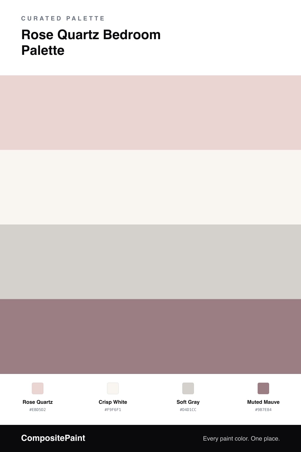
A serene pastel bedroom in rose quartz pink, crisp white, soft gray, and a muted mauve accent — calm, pretty, and easy to rest in. Every color matched to real paint you can buy.

By Jessica Williams · Color Stylist & Interior Editor

Rose quartz is barely-there pink, and that’s exactly why it works so well in a bedroom. It’s pale and soft, giving the walls a gentle blush glow rather than an obvious color. The room feels warm and pretty, but stays calm enough to rest in — never sweet, never loud.

A crisp white on the trim keeps it fresh and clean, and a soft gray through furniture or a rug cools the pink just enough so it reads grown-up. That balance of warm blush and cool gray is what gives the scheme its serenity.

The muted mauve is your accent — bedding, a headboard, or one painted nook. It deepens the pink family and adds a little weight, so the pastels feel intentional instead of flat. Rose quartz leads, white and gray support, and mauve gives it just enough depth to feel finished.

View palette in
Rose Quartz
Walls
PPG / Glidden Shangri La · PPG1053-2
#EBD4D1
LRV 69
Crisp White
Trim
Dunn-Edwards Milk Glass · DEW358
#FAF7F0
LRV 86
Soft Gray
Furniture
Benjamin Moore Lilac Hush · CSP-490
#D6D2CD
LRV 64
Muted Mauve
Accent
Dunn-Edwards Plumville · DE6012
#9E8185
LRV 23

Buy These Colors

Each color matched to the closest real paint in every brand, by ΔE2000. Tap a swatch for its full guide or + to save it — take any SKU to the store, they mix on demand.

Rose Quartz
#EBD5D2 · LRV 70 · Walls
Sherwin-Williams · SW 6309 · ΔE 1.84
Behr · S200-1 · ΔE 1.85
Benjamin Moore · 2094-60 · ΔE 1.73
Valspar · 1006-8C · ΔE 0.94
PPG / Glidden · PPG1053-2 · ΔE 0.4
Glidden · PPG1053-2 · ΔE 0.94
Dutch Boy · 203-1DB · ΔE 1.84
HGTV Home by Sherwin-Williams · HGSW 2047 · ΔE 1.84
Dunn-Edwards · DE6023 · ΔE 3.34
Magnolia Home · JG-34 · ΔE 7.92
Farrow & Ball · NO. 202 · ΔE 5.29
Diamond Vogel · 0146 · ΔE 4.78
Hirshfield's · 0146 · ΔE 3.94
Rodda · CA049 · ΔE 7.93
C2 Paint · C2-850 · ΔE 8.73
Clare · PNT100-LT-20 · ΔE 7.74
Portola Paints · GEM · ΔE 10.45
Annie Sloan · OLD OCHRE · ΔE 13.2
Backdrop · BD-CC · ΔE 13.12
Rust-Oleum · 285142 · ΔE 2.1
Kompozit · 0146 · ΔE 3.94
Crisp White
#F9F6F1 · LRV 92 · Trim
Sherwin-Williams · SW 7757 · ΔE 1.7
Behr · W-F-400 · ΔE 1.97
Benjamin Moore · 2121-70 · ΔE 2.48
Valspar · V148 · ΔE 1.51
PPG / Glidden · PPG1001-1 · ΔE 2.26
Glidden · 61YY 89/040 · ΔE 1.77
Dutch Boy · 001W · ΔE 1.99
HGTV Home by Sherwin-Williams · HGSW 4001 · ΔE 1.7
Dunn-Edwards · DEW358 · ΔE 0.99
Magnolia Home · JG-21 · ΔE 2
Farrow & Ball · NO. 2005 · ΔE 1.45
Diamond Vogel · 0011 · ΔE 2.6
Hirshfield's · 0011 · ΔE 2.1
Rodda · R007 · ΔE 1.28
C2 Paint · C2-756 · ΔE 1.81
Clare · PNT100-LT-04 · ΔE 2
Portola Paints · ONE DROP · ΔE 5.22
Annie Sloan · OLD OCHRE · ΔE 14.54
Backdrop · BD-TR · ΔE 3.13
Rust-Oleum · 285140 · ΔE 3.66
Kompozit · 0011 · ΔE 2.1
Soft Gray
#D4D1CC · LRV 64 · Furniture
Sherwin-Williams · SW 9561 · ΔE 1.28
Behr · N140-1A · ΔE 1.77
Benjamin Moore · CSP-490 · ΔE 0.59
Valspar · 8006-2B · ΔE 1.42
PPG / Glidden · PPG1009-2 · ΔE 1.98
Glidden · 70YY 63/045 · ΔE 1
Dutch Boy · 405-1DB · ΔE 2.45
HGTV Home by Sherwin-Williams · HGSW 3267 · ΔE 2.89
Dunn-Edwards · DEGR06 · ΔE 2.33
Magnolia Home · JG-55 · ΔE 3.97
Farrow & Ball · NO. 277 · ΔE 1.96
Diamond Vogel · 0572 · ΔE 2.62
Hirshfield's · 0538 · ΔE 0.9
Rodda · R025 · ΔE 2.92
C2 Paint · C2-994 · ΔE 1.42
Clare · PNT100-LT-18 · ΔE 1.12
Portola Paints · SAN FERNANDO · ΔE 1.19
Annie Sloan · OLD OCHRE · ΔE 11.08
Backdrop · BD-RR · ΔE 5.17
Rust-Oleum · 285142 · ΔE 8.71
Kompozit · 0538 · ΔE 0.9
Muted Mauve
#9B7E84 · LRV 24 · Accent
Sherwin-Williams · SW 9076 · ΔE 2.88
Behr · T15-19 · ΔE 1.43
Benjamin Moore · 1448 · ΔE 4.37
Valspar · 1004-9C · ΔE 5.88
PPG / Glidden · PPG1049-5 · ΔE 5.55
Glidden · 90RR 22/126 · ΔE 2.7
Dutch Boy · 301-5DB · ΔE 4.22
HGTV Home by Sherwin-Williams · HGSW 3413 · ΔE 6
Dunn-Edwards · DE6012 · ΔE 1.35
Magnolia Home · JG-100 · ΔE 8.12
Farrow & Ball · NO. 271 · ΔE 7.27
Diamond Vogel · 1304 · ΔE 5.27
Hirshfield's · 0099 · ΔE 3.54
Rodda · R116 · ΔE 6.14
C2 Paint · C2-510 · ΔE 4.52
Clare · PNT100-DP-52 · ΔE 14.04
Portola Paints · JOLENE · ΔE 6.93
Annie Sloan · COCO · ΔE 17.27
Backdrop · BD-HF · ΔE 22.87
Rust-Oleum · 391446 · ΔE 13.4
Kompozit · 0099 · ΔE 3.54

Questions

is rose quartz too pale to show up on walls?

It's subtle, and that's the point. Rose quartz gives a soft blush glow rather than an obvious pink, so the room feels warm and pretty without committing to a strong color. In good light you'll see it clearly; it just stays gentle.

what colors go with rose quartz pink?

Cool grays and crisp whites are the easiest match, keeping the pink fresh rather than sweet. A muted mauve accent deepens the scheme, and soft brass or warm metals look lovely against the blush.

KEEP EXPLORING

Similar Palettes

Closest schemes by color — not by label.