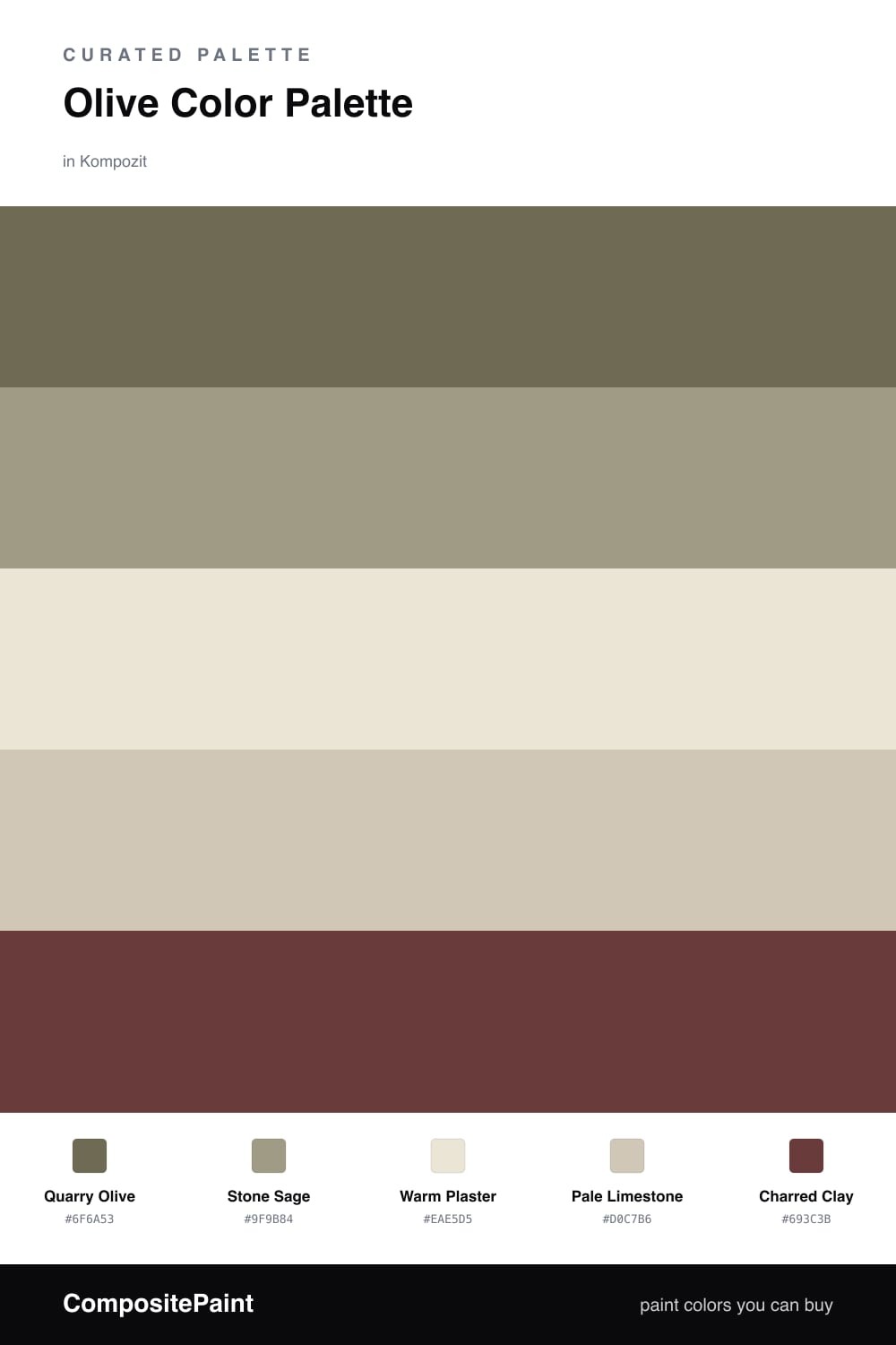
Olive Color Palette — Quarry Olive
A grounded five-color scheme led by soft olive and layered with stone, warm white, and a charred clay accent — every color matched to real paint you can buy.
By Jessica Williams · Color Stylist & Interior Editor
There is something quietly modern about olive right now. Quarry Olive leads this scheme with that soft, dusty green-brown that feels less like a statement and more like a deep breath. It is the kind of color that shifts through the day, cooler in morning light and almost golden by late afternoon.
Around it, Stone Sage and Warm Plaster keep things soft and lived-in, while Pale Limestone adds a little warmth underfoot so the room never tips cold. These three do the quiet work, letting the olive stay the center of attention without ever feeling heavy.
Then there is Charred Clay, a smoky red-brown that I would use sparingly — a chair, a door, a single shelf of pottery. It is the ember in the scheme, just enough heat to make all that earthy green feel grounded and warm instead of flat.
Buy These Colors
Each color matched to the closest real paint in every brand, by ΔE2000. Kompozit first; take any SKU to the store — these mix on demand.
Questions
Olive sits between green and brown, so it reads as a soft natural neutral rather than a true color. That muddiness is what makes it restful — it borrows the steadiness of earth tones while still feeling alive.
Let it lead. Olive works best as the dominant tone on walls or cabinetry, with the stone and plaster shades carrying the lighter weight and the clay accent showing up only in small touches.
Similar Palettes
Closest schemes by color — not by label.