Lavender Color Palette — Lavender Fern
A soft five-color scheme led by gentle lavender, grounded with fern green, warm cream and a slate accent — every color matched to real paint you can buy.
By David Chen · Formulation Lead & Resident Chemist
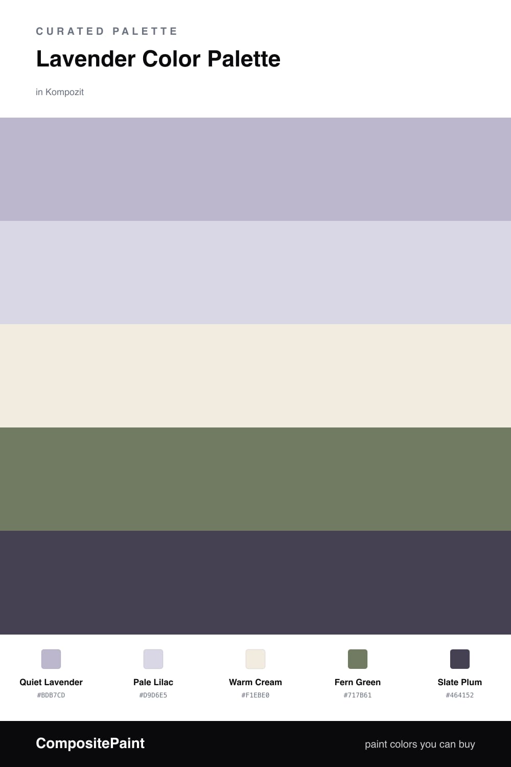
Lavender gets a bad reputation for being precious, but the trick is to keep it grounded. Here Quiet Lavender leads the whole scheme, with Pale Lilac layered just above it so the purple has some depth instead of reading as one flat wash.
Warm Cream is the base that keeps everything from going cool and chilly, and Fern Green is the move that makes this feel current. Green is purple’s natural partner, so a muted, slightly grayed fern reads like a leaf next to a flower rather than a loud contrast.
Save Slate Plum for the smallest gestures. A little of it in a frame, a knob, or a line of trim pulls the soft tones together and gives the eye somewhere firm to land.
Buy These Colors
Each color matched to the closest real paint in every brand, by ΔE2000. Kompozit first; take any SKU to the store — these mix on demand.
Questions
Think of how lavender and greenery look in a real garden bed — the cool purple and the muted green sit a third apart on the color wheel, so they feel related rather than fighting. The green also reads as the natural complement to purple, which is why the pairing looks settled instead of busy.
Let lavender lead at roughly two-thirds of the space, with the lilac and cream softening it. Use the fern green in smaller doses and save the slate plum for the smallest details, like trim or hardware.
Similar Palettes
Closest schemes by color — not by label.