Gold Color Palette — Sage Field at Dusk
A warm five-color scheme led by soft antique gold, settled into sage, oatmeal, and a smoky charcoal accent — every color matched to real paint you can buy.
By Jessica Williams · Color Stylist & Interior Editor
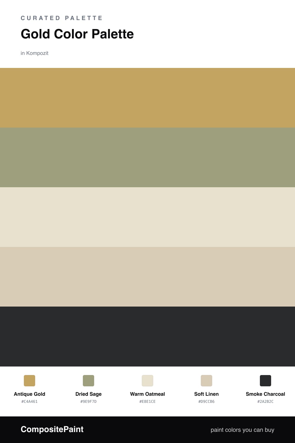
There is something deeply grounding about a soft, aged gold. This scheme is built around Antique Gold, a muted, sunlit tone that feels closer to wheat at dusk than to anything shiny. It carries real warmth without tipping into yellow, which is exactly why it works as the leading color in a calm, contemporary room.
Around it, Dried Sage brings a hushed green that cools the gold and keeps the whole palette feeling fresh and current. Warm Oatmeal and Soft Linen do the quiet work underneath, softening every edge so the gold can glow rather than glare.
To finish, a touch of Smoke Charcoal grounds the scheme — think a single matte fixture, a frame, or a low shadow line. Keep gold as your dominant tone, let sage answer it, and use the charcoal sparingly so the field stays warm and unhurried.
Buy These Colors
Each color matched to the closest real paint in every brand, by ΔE2000. Kompozit first; take any SKU to the store — these mix on demand.
Questions
Gold and sage share a quiet, earthy warmth, so they read as one natural family rather than a contrast. The sage cools the gold just enough to keep it from feeling brassy.
Let gold lead but not shout — aim for roughly two-thirds gold and neutrals, with sage as the steady supporting note and only a whisper of charcoal to anchor it.
Similar Palettes
Closest schemes by color — not by label.