CP

Forest Color Palette — Marsh Hollow

A deep forest-led five-color scheme grounded in mossy greens with warm taupe and a soft clay accent, every color matched to real paint you can buy.

By Emily Roberts · DIY Editor & First-Timer's Guide

Marsh Pine
Dominant
Kompozit Clover Patch · 0431
#464A3B
LRV 7
Reed Sage
Secondary
Kompozit Bowling Green · 0437
#717B61
LRV 19
Misted Linen
Base
Kompozit Elusive White · 0002
#E8E3D6
LRV 77
Driftwood Taupe
Support
Kompozit Macadamia Brown · 0184
#BBA791
LRV 40
Clay Ember
Accent
Kompozit Semolina · 1011
#B6774F
LRV 24
View palette in

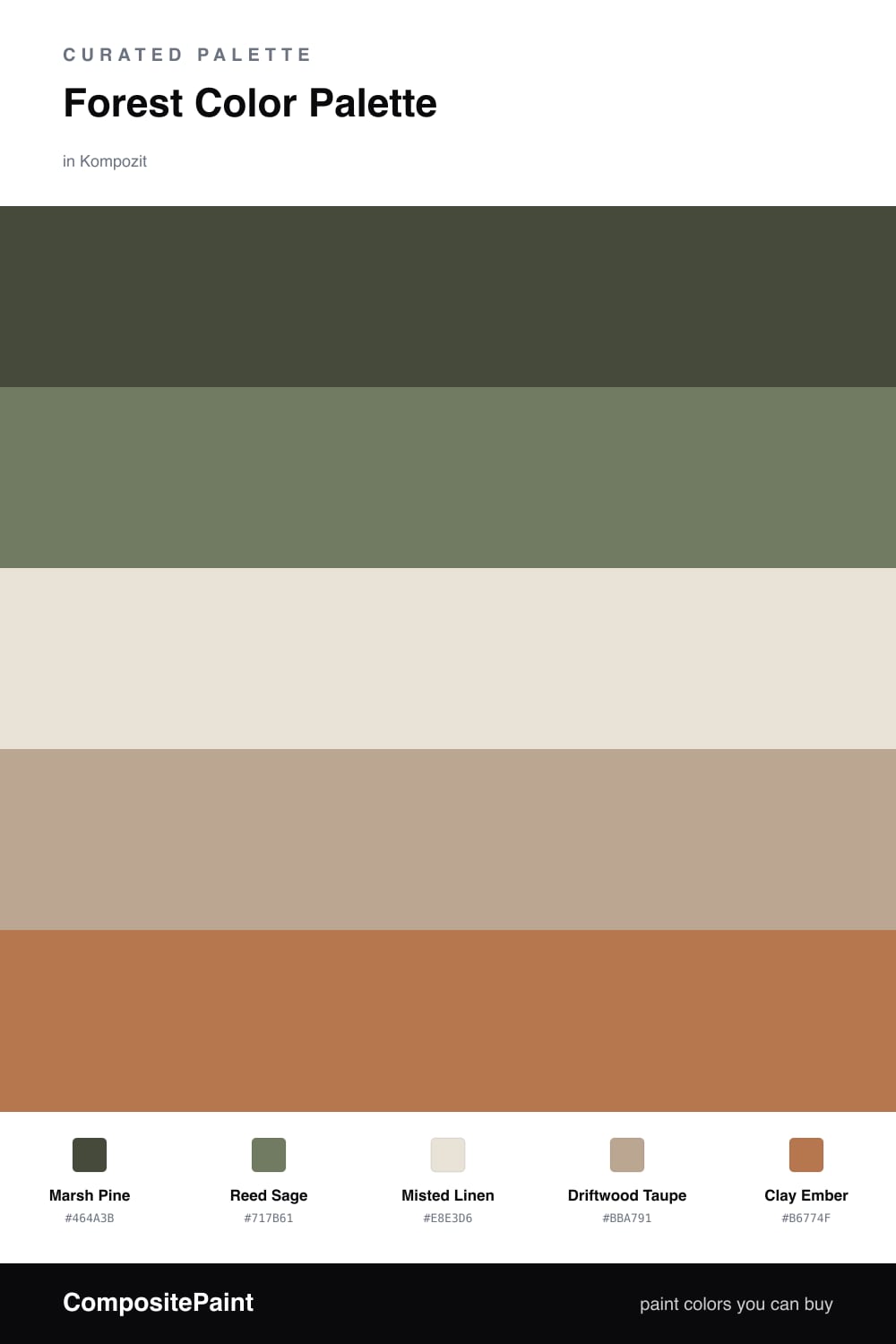
This is forest at its most lived-in. A deep, slightly grayed Marsh Pine leads the whole scheme — think of the color of pine needles after rain — and Reed Sage steps it down a notch so the green feels layered instead of flat.

To keep things light and current, Misted Linen and Driftwood Taupe do the breathing room. They are soft and warm rather than stark white, which is exactly where 2026 rooms are headed — quieter, cozier, a little more natural.

The one spark here is Clay Ember, a warm terracotta-leaning brown that wakes the greens up without fighting them. Use it sparingly and the whole palette reads grounded, calm, and easy to live with.

Buy These Colors

Each color matched to the closest real paint in every brand, by ΔE2000. Kompozit first; take any SKU to the store — these mix on demand.

Marsh Pine
#3A4A3A · LRV 6 · Dominant
Kompozit Clover Patch · 0431 ΔE 5.53
Backdrop North End · BD-NE ΔE 1.4
Behr Black Bean · 790D-7 ΔE 3.58
Benjamin Moore Colonial Verdigris · CW-530 ΔE 4.74
Clare Blackish · PNT100-DP-54 ΔE 11.77
Dunn-Edwards Refined Green · DEA181 ΔE 7.43
Farrow & Ball Studio Green · No. 93 ΔE 8.48
Magnolia Home Arches · JG-97 ΔE 13.4
PPG / Glidden Dark As Night · 14-05 ΔE 8.65
Sherwin-Williams Dard Hunter Green · SW 41 ΔE 2.28
Valspar Deepest River · 5009-3 ΔE 5.61
Reed Sage
#6E7A5E · LRV 18 · Secondary
Kompozit Bowling Green · 0437 ΔE 1.19
Backdrop Old Soul · BD-OS ΔE 6.28
Behr Spanish Galleon · 760D-6 ΔE 3.35
Benjamin Moore In the Garden · CSP-805 ΔE 3.66
Clare Daily Greens · PNT100-DP-61 ΔE 0.9
Dunn-Edwards Greenland · DE6286 ΔE 3.73
Farrow & Ball Green Smoke · No. 47 ΔE 6.49
Magnolia Home Celery Seeds · JG-58 ΔE 3.76
PPG / Glidden Dark Sage · 1124-6 ΔE 1.78
Sherwin-Williams Messenger Bag · SW 7740 ΔE 10.31
Valspar Greenwich Green · P023 ΔE 5.14
Misted Linen
#E8E4D6 · LRV 77 · Base
Kompozit Elusive White · 0002 ΔE 0.76
Backdrop Don't Eat the Yellow Snow · BD-DS ΔE 3.92
Behr White Mocha · OR-W11 ΔE 1.08
Benjamin Moore Soft Chamois · 969 ΔE 0.58
Clare On Point · PNT100-LT-11 ΔE 3.64
Dunn-Edwards Watermist · DE6240 ΔE 1.25
Farrow & Ball Dimity · No. 2008 ΔE 3.23
Magnolia Home Shiplap · JG-22 ΔE 2.27
PPG / Glidden Off White · 1024-1 ΔE 0
Sherwin-Williams Nacre · SW 6154 ΔE 1.05
Valspar Divine Cream · 7006-8 ΔE 1.49
Driftwood Taupe
#B6A78E · LRV 40 · Support
Kompozit Macadamia Brown · 0184 ΔE 3.12
Backdrop Le Freak · BD-LF ΔE 10.25
Behr Harvest Brown · 710D-4 ΔE 2.2
Benjamin Moore Clarksville Gray · HC-102 ΔE 2.95
Clare Subrosa · PNT100-MD-76 ΔE 15.39
Dunn-Edwards Desert Gray · DEC760 ΔE 2.25
Farrow & Ball Light Gray · No. 17 ΔE 2.26
Magnolia Home Juniper Tree · JG-166 ΔE 3.49
PPG / Glidden Antelope · 15-09 ΔE 2.51
Sherwin-Williams Universal Khaki · SW 6150 ΔE 1
Valspar Earthy Beige · M351 ΔE 1.48
Clay Ember
#B5734E · LRV 23 · Accent
Kompozit Semolina · 1011 ΔE 1.75
Backdrop Old Soul · BD-OS ΔE 21.73
Behr Campfire Blaze · HDC-AC-06 ΔE 2.77
Benjamin Moore Firenze · AF-225 ΔE 0.87
Clare Fire Sign · PNT100-DP-74 ΔE 6.25
Dunn-Edwards Cinnabar · DE5209 ΔE 1.28
Farrow & Ball Red Earth · No. 64 ΔE 7.62
Magnolia Home Work Worn Wood · JG-35 ΔE 3.04
PPG / Glidden Fresh Praline · 16-21 ΔE 3.3
Sherwin-Williams Tigereye · SW 6362 ΔE 3.14
Valspar Cattle Drive · 2007-5A ΔE 2.13

Questions

Why does this palette feel so calm?

It stays mostly in one family — deep green softening into sage and warm neutrals — so your eye never has to jump. The clay accent is the only warm pop, and a little of it goes a long way.

Where should I put the green and where should I put the accent?

Let the deep Marsh Pine lead on the biggest surface, use the lighter neutrals to open the space up, and save the clay tone for small moments — a chair, a frame, a door.

Similar Palettes

Closest schemes by color — not by label.