Charcoal Color Palette — Charcoal Haze
A moody five-color scheme led by deep charcoal, softened with warm greige and dove gray and lifted by a single brass accent — every color matched to real paint you can buy.
By Jessica Williams · Color Stylist & Interior Editor
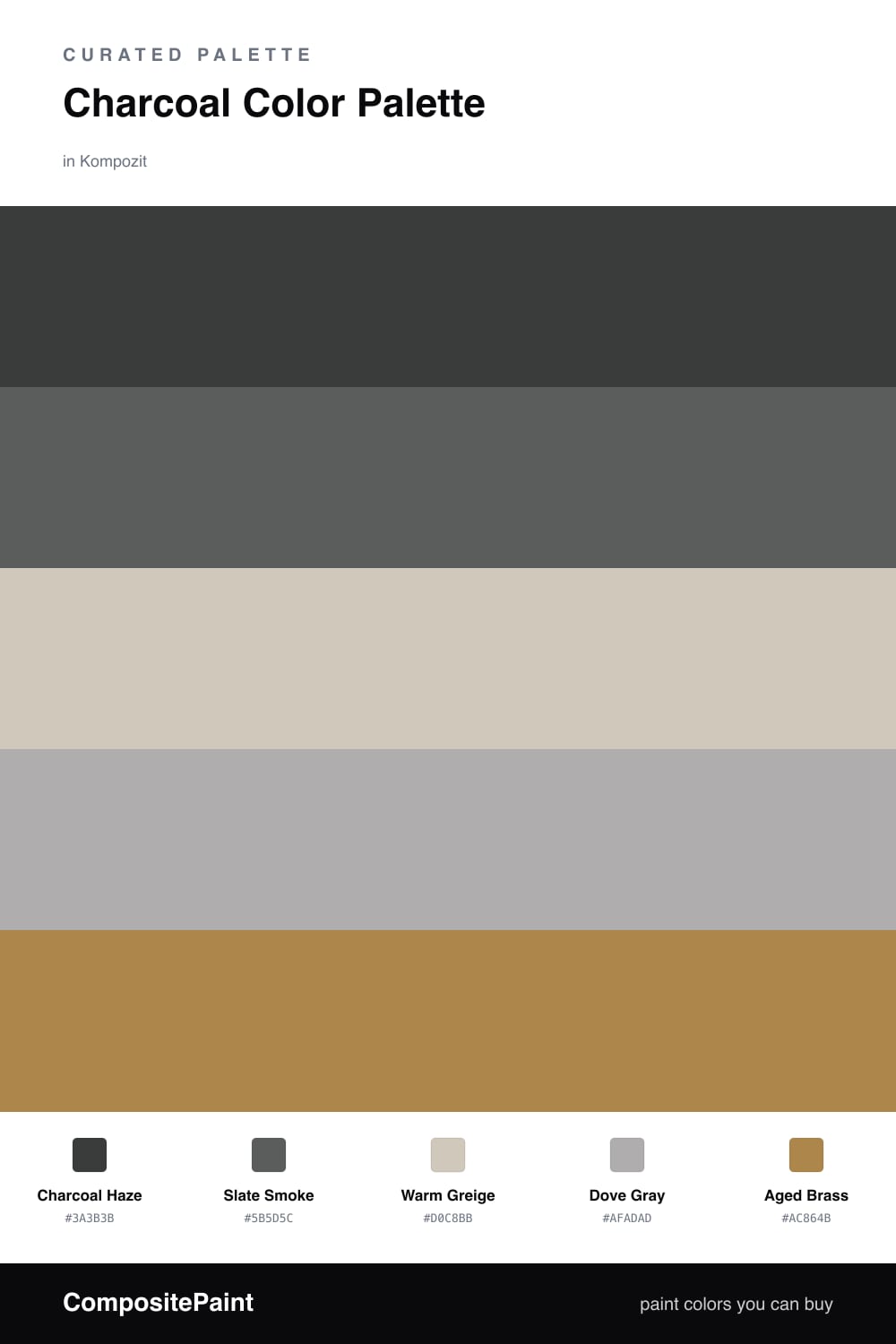
Charcoal is having a real moment right now, and it is easy to see why. Charcoal Haze is that deep, soft-edged gray that feels grounded and a little cocooning, the kind of shade that makes a room feel considered the moment you walk in. I built this scheme to let it lead without turning the space cave-like.
To keep it breathing, Slate Smoke steps up a touch lighter and carries the charcoal into trim or a second wall, while Warm Greige and Dove Gray do the quiet work — warming the cool tones and giving your eye somewhere soft to land. That warmth matters; without it charcoal can tip cold and flat.
Then there is Aged Brass, used sparingly. A lamp base, a drawer pull, a thin picture frame — that is all it takes. Against all that gray it glows, and it is the small move that makes the whole palette feel current rather than just dark. Lead with the charcoal, lean on the neutrals, and let the brass be the one thing that catches the light.
Buy These Colors
Each color matched to the closest real paint in every brand, by ΔE2000. Kompozit first; take any SKU to the store — these mix on demand.
Questions
Charcoal reads almost like a soft black but holds enough gray to feel calm instead of heavy. It gives walls real depth, and because it is a quiet neutral it lets your lighter tones and that one warm accent stand out without any fight.
Let charcoal carry the big surfaces, then pull back. A good feel is roughly two-thirds charcoal and slate, one-third the warm greige and dove gray, with the brass kept to a tenth or less so it stays a spark, not a stripe.
Similar Palettes
Closest schemes by color — not by label.