Niebla Azul
A balanced blue-green from Sherwin-Williams' biggest color drop in years, reviewed honestly: where it earns its keep, why almost nobody talks about it, and what to pick instead.

Jessica has spec'd whites and neutrals for more than 300 rooms and keeps a sample wall of painted drawdowns in her studio. Every color review is checked against real reader rooms in the comments and re-tested when a formula changes. About the testing process →
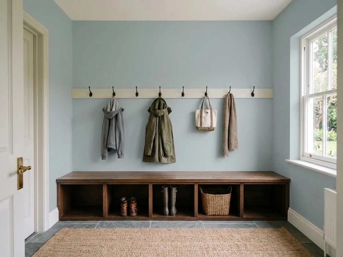
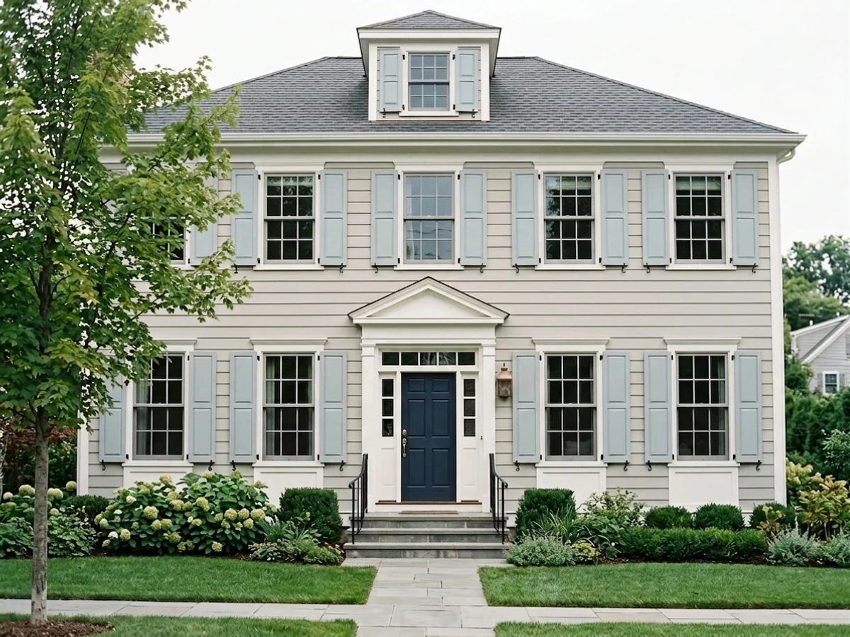
- 1Stardew43
- 2Quietude48
- 3Niebla Azul53
- 4Sea Salt63
- 5Wickham Gray68
The Fast Verdict
Niebla Azul splits the difference between blue and green almost exactly down the middle, which is the whole reason it works and the whole reason it never became famous — it doesn't commit hard enough in either direction to headline a launch. At LRV 53 it's a genuine mid-tone color, not a near-white or a whisper of gray. Put it on cabinets, a vanity, or a front door with real daylight on it and it looks deliberate and unusual. Spread it across four ordinary walls and it can read as pleasant but forgettable — which is honestly the story of this whole color.
Kitchen and bath cabinets in real daylight · exterior doors and shutters on a white or light-gray house · calm home offices and dens · anyone who wants a genuine blue-green without a name everyone else already used
You want a clean, undeniable blue rather than blue-green · your room is dim and north-facing · you want a color with an established online track record before you buy · your floors are heavy honey-gold oak
- A genuinely balanced blue-green — not a blue pretending to be interesting or a green pretending to be safe
- LRV 53 gives real, visible color without going dark or precious
- Works with both brass and nickel hardware, where most blues force a choice
- Exterior doors and shutters read coastal-craftsman without a full navy commitment
- Underused enough that your kitchen won't look like everyone else's
- Almost no real-room track record online — you're deciding mostly from the chip, not from other people's results
- The green pull disappoints anyone who wanted an actual, undeniable blue
- Flattens to a dull gray-green in dim, cool-lit rooms
- Too muted to read as a statement color across full walls
What Color Is Niebla Azul, Really?
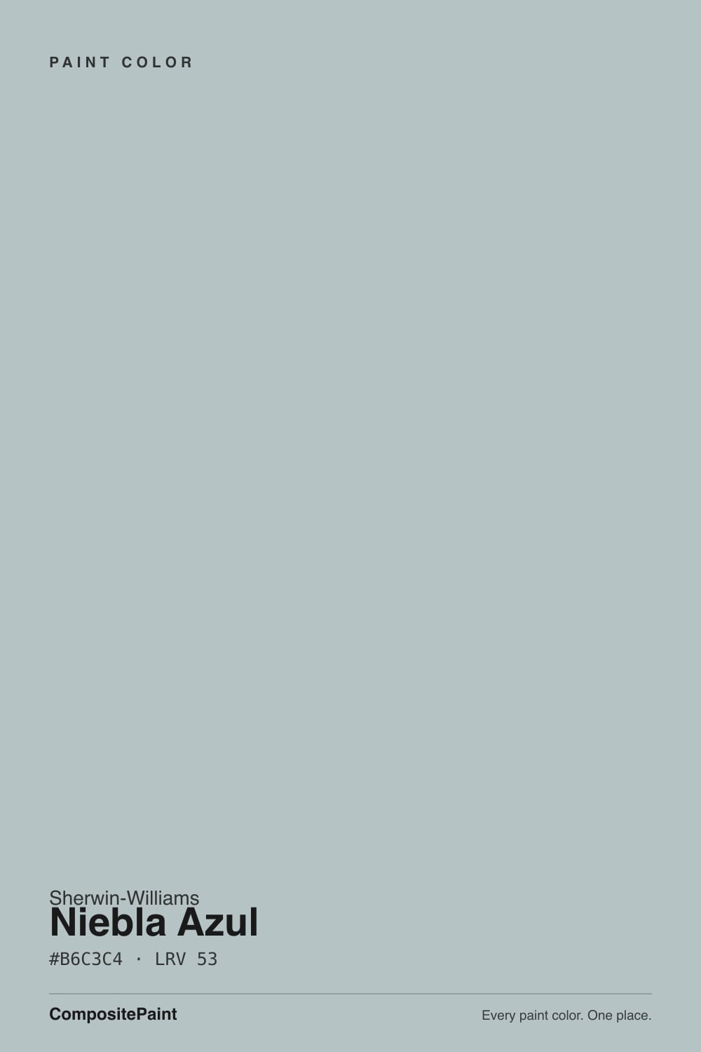
Niebla Azul is Spanish for "blue mist," and the name is more accurate than most paint names get: the RGB build sits at roughly 182 red, 195 green, 196 blue — green and blue essentially tied, with red pulled well back. That is a genuine blue-green, not a blue with a green whisper or a green with a blue whisper. Sherwin-Williams' own site files it under "Blue," but on the wall it reads just as often as a cool gray-green. SW 9137 landed in the middle of Sherwin-Williams' January 2021 color expansion, a huge batch of new names released together in the SW9130–SW9150 numbering block that also included Evergreen Fog (SW 9130), Jasper Stone (SW 9133), Stardew (SW 9138) and Debonair (SW 9139).
At LRV 53 it sits squarely in the mid-tone range — the same LRV, coincidentally, as Benjamin Moore's Palladian Blue, a color that leans noticeably greener. That LRV matters: this is a color you will clearly see as color, not a shadow-gray that only shows up in certain light. It has enough depth to read on cabinetry from across a room, and enough lightness to avoid feeling heavy in a small bathroom.
Undertone in one line: blue and green in roughly equal measure, never a clean single-note blue. In bright, cool daylight the blue edges forward and it reads closer to a soft slate-blue; in warm afternoon light or under yellow bulbs the green comes up and it drifts toward sage-teal. Both are the same paint being honest about the light in the room, not a defect.
Where It Shines
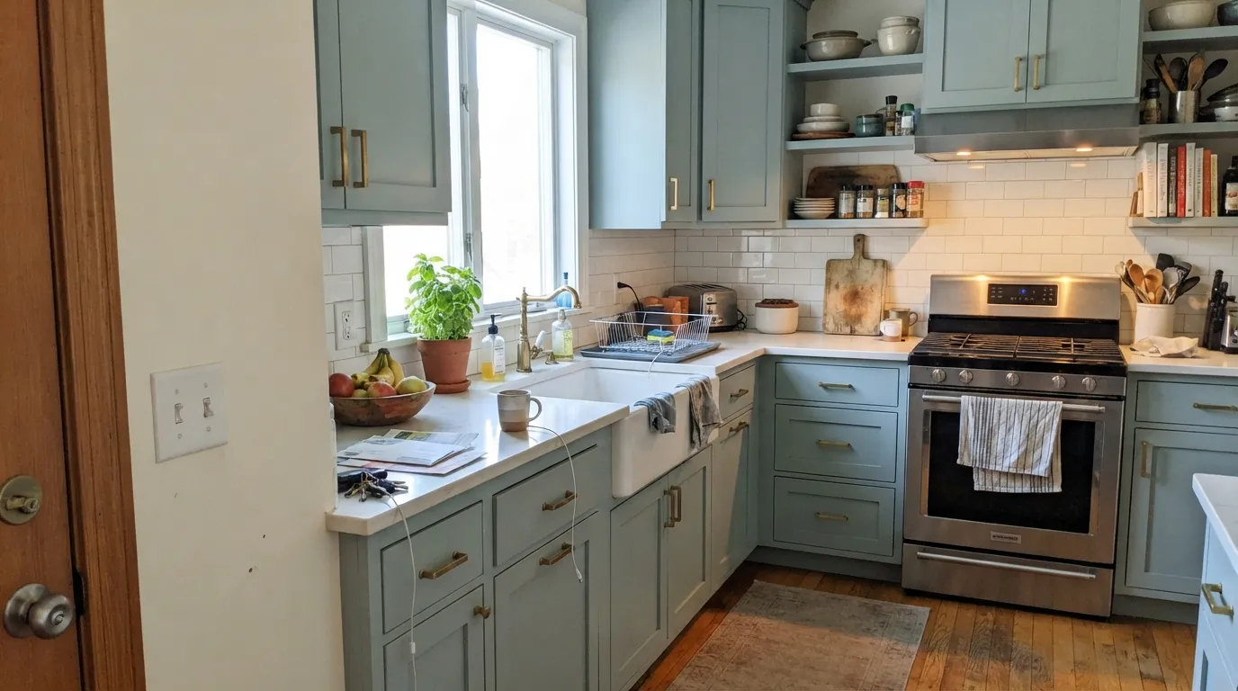
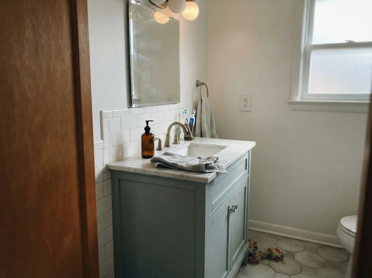
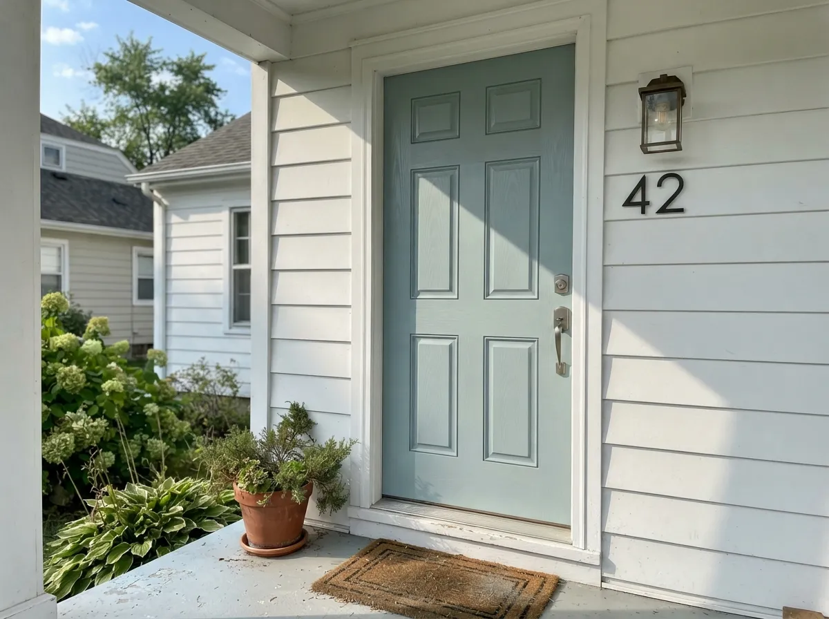
The real-world evidence for this color is thin but consistent: it shows up almost exclusively on cabinetry, vanities, and exterior doors rather than full rooms of walls. Houzz project photos tag it on kitchen islands and inset cabinet fronts — one designer's project is literally captioned an "inset baby blue kitchen" — and on front-entry shutters and trim accents. It flatters white or light-stone counters, takes either brass or nickel hardware without a fight (most blues force you to pick one), and on an exterior door it reads coastal-craftsman without the full commitment of a navy.
Where It Fails
Almost every disappointing outcome with Niebla Azul comes from one of three mismatches, and all three are predictable before the first coat. None of them are the paint's fault — but if your room or your expectations match one of these, sample big before you commit.
The green half of this color is not a rounding error — in warm light it pulls visibly toward seafoam and teal, which disappoints anyone shopping for a true blue like Naval or Van Deusen Blue. If blue is the point, not blue-green, pick one of those instead.
Cold, flat light strips the color's warmth the same way it does to every blue-green in this family (Stardew and Smoke share the exact same trap). The result is a dull, slightly muddy pond-water gray-green instead of the sophisticated color the chip promised. Warm 2700K bulbs fix more of this than repainting will.
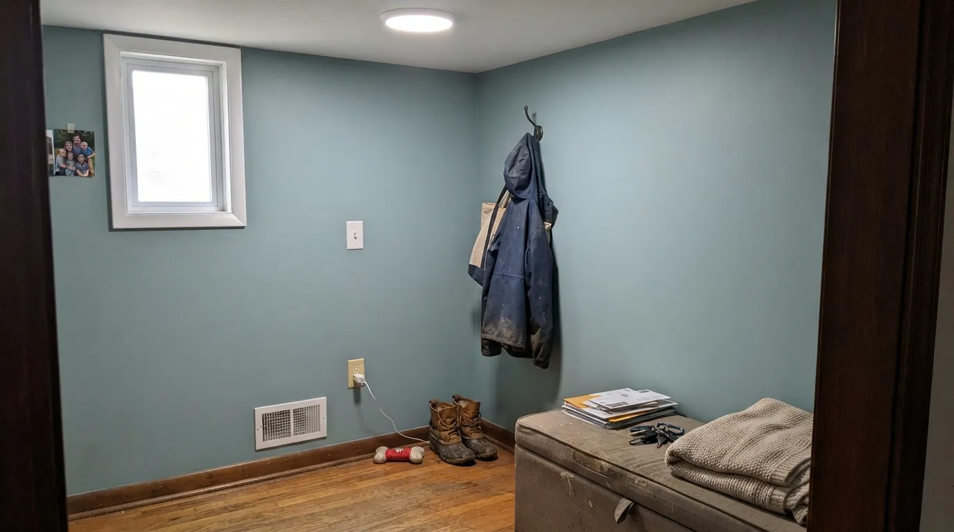
LRV 53 is real color, but the saturation is muted — on four walls in ordinary daylight it can read as "pleasant, not much of anything" to someone expecting the punch of a photo. It also has almost no community track record to check against: very few people have posted full-room Niebla Azul photos, so you're deciding mostly from the chip. Use it in a contained dose — cabinets, a door, a vanity — where the color has to do less convincing.
Room by Room
This is where the real-world evidence actually points. Satin, urethane-fortified cabinet enamel, white or light-stone counters, and either brass or nickel hardware — it takes both metals without arguing.
Same logic as a powder room accent: enough color to feel considered, small enough to repaint in a weekend if you change your mind. Pairs cleanly with a white or Sea Salt-toned wall and a marble or quartz top.
On a white or light-gray house body it reads intentional and a little unusual, without betting the whole facade on navy. Full outdoor sun pulls out more blue than it shows indoors; shade brings the green up.
In good daylight it is restful without being the same blue-gray everyone already has. A north-facing office with no natural light will expose its weakness fast — test here before committing.
It is genuine color at LRV 53, not a near-white, but it's too muted to carry a big room the way a saturated blue would. Sample a large board on the actual wall; in ordinary daylight the room-scale result can undersell the color you saw on the chip.
Small, secondary rooms are the low-stakes place to try a color with this little history. Cabinets or a Dutch door in Niebla Azul, walls in a warm white, done.
Your Light Is the Risk
The blue and green stay balanced and the color reads sophisticated, not muddy. This is the light every cabinet or door photo of it was taken in.
The color drops toward flat pond-water gray-green and loses its identity. Test a sample here before trusting the chip.
East light gives it a cooler, more clearly blue read in the morning; by afternoon it warms and the green comes forward. It moves through the day more than a plain gray would.
Warm 2700K bulbs push it further green-gray and cozier. Cool white LEDs keep it closer to blue but flatten it — pick your bulb based on which side you want to win.
Most complaints about Niebla Azul are a light mismatch. Upload a photo of your actual room and see it on your walls — then ask for the same wall in north light or evening lamps before you buy a single sample.
Need It From Another Brand?
Any paint counter can custom-tint Sherwin-Williams SW 9137 directly. If you would rather stay in one brand's own deck, these are the closest stock matches, measured as ΔE2000. Under 2 is a difference you will not see on the wall.
| Brand | Closest color | ΔE | LRV | |
|---|---|---|---|---|
| Behr | Polished RockPPF-26 · Behr | 2.5 | 54 | Color page → |
| Benjamin Moore | Wales Gray1585 · Benjamin Moore | 1.6 | 54 | Color page → |
| Valspar | Moroccan ModerneT664 · Valspar | 0.8 | 53.2 | Color page → |
| PPG / Glidden | QuestPPG10-15 · PPG / Glidden | 3.4 | 53 | Color page → |
| Glidden | Maiden MistPPG1039-2 · Glidden | 2.5 | 52 | Color page → |
| Dutch Boy | Chromed434-2DB · Dutch Boy | 2.7 | 52 | Color page → |
Similar Sherwin-Williams Colors
The nearest shades to Niebla Azul within Sherwin-Williams's own range, ranked by perceptual color distance — useful when you want the same look a touch lighter, darker, or warmer.
WCAG 2.1: AA is 4.5 : 1 for normal text, 3 : 1 for large text, AAA is 7 : 1.
Niebla Azul vs the Colors You're Also Considering
Every Niebla Azul sample board has the same rivals on it. The numbers show the real lightness gap — then it comes down to which risk you would rather live with.
Pick this for the lighter, more clearly blue-green version at the top of the same family.
Sherwin-Williams SW 9138 · LRV 43StardewPick this if you want it a touch darker and grayer — Stardew is the beautiful blue-gray people keep buying and complimenting as "just a good gray."
Pick this when you want the pale, mid-tone version that still reads light and airy on cabinets.
Sherwin-Williams SW 9139 · LRV 34DebonairPick this for real depth — Debonair is a genuinely good blue-gray almost nobody talks about, the moodiest sibling in this launch batch.
Pick this for the marginally bluer, more evenly split version at the identical LRV.
Benjamin Moore HC-144 · LRV 53Palladian BluePick this if you want the Benjamin Moore version of this same idea — the best-behaved spa color in the BM deck, with a stronger, more committed green lean.
Inside the brand, Silver Lake SW 9633 shares the identical hex #B6C3C4 and the same LRV of 53, so on a wall the two are the same color under any light. Krypton SW 6247 (#B8C0C3, LRV 52) is a shade cooler and bluer, Lazy Gray SW 6254 (#BEC1C3, LRV 53) is flatter and closer to a plain gray, and Samovar Silver SW 6233 (#B8BEBE, LRV 51) is a touch darker and grayer. Billowy Breeze SW 9055 (#AFC7CD, LRV 55) is the clearest blue of the group.
Across brands, HGTV Home by Sherwin-Williams Fresh Idea HGSW 3326 matches the hex exactly at deltaE 0, and Valspar Moroccan Moderne T664 (#B7C3C5, LRV 53.2) at deltaE 0.76 is effectively the same color. Rodda Winter Air R079 at deltaE 1.07 and Benjamin Moore Wales Gray 1585 (#B9C5C3, LRV 54) at deltaE 1.59 are visually identical in normal room light. Behr Polished Rock PPF-26 (#BCC3C2, LRV 54) at deltaE 2.49 and Farrow and Ball Hazy No. CC6 (#AFC2C9, LRV 52) at deltaE 3.14 are very close, so sample first.
Niebla Azul Coordinating Colors
The pairing rule is simple: warm, soft whites for walls or trim, a near-black for the one dark note a room needs, and either brass or nickel hardware — this color doesn't force the choice most blues do. These are the partners that keep showing up in the few real projects that use it:
The Quiet Sibling of SW's 2021 Color Expansion
Sherwin-Williams' January 2021 color expansion was, at the time, one of the largest simultaneous color launches the industry had seen — dozens of new names arriving together in the SW9100–SW9200 numbering block. Niebla Azul (SW 9137) landed in the middle of that batch, a handful of slots from Evergreen Fog (SW 9130), Jasper Stone (SW 9133), Stardew (SW 9138) and Debonair (SW 9139).
Evergreen Fog went on to become one of the most talked-about colors of the decade. Niebla Azul did not. There's no Color of the Year mention, no viral kitchen reveal, barely a Reddit thread — the closest thing to a real-world track record is a scatter of Houzz project photos on cabinetry and one front door. That isn't a flaw in the paint; the undertone is genuinely well-built and the LRV is a useful, usable mid-tone. It's simply the sibling that launched next to a phenomenon and never got asked to the party.
Niebla Azul With Wood Tones and Metals
White oak and other pale, cool-leaning woods are the easiest pairing — nothing in this undertone fights a light floor. Walnut and espresso work too, adding contrast rather than competition, since neither carries the orange cast that would argue with the green in this color.
Honey and golden oak are the pairing to sample carefully first. It isn't the flat clash a true purple would cause, but the warm orange in the wood and the cool green-blue in the paint pull in different directions, and a room with a lot of both can feel unsettled. Hardware is the forgiving part: because Niebla Azul splits the difference between blue and green, it doesn't force a metal finish the way a committed blue (nickel) or committed green (brass) would — both read fine here.
Three Ready Palettes Built on Niebla Azul
A color is never alone on the wall. These are complete combinations in the 60-30-10 pattern, with the reason each one holds together. Every one opens in the visualizer.
Alabaster keeps the room bright enough for the cabinet color to read as a deliberate accent rather than the whole story, and Iron Ore on the island supplies the one near-black note the palette needs so the blue-green doesn't have to carry all the contrast itself.
Try this palette in your roomA crisp white body lets the door read as the one colored note on the facade instead of competing with a busier palette, and charcoal shutters ground the scheme with a dark neutral that doesn't fight either the blue or the green in the door.
Try this palette in your roomSea Salt and Niebla Azul share the same blue-green family, so the wall-to-vanity handoff feels tonal rather than mismatched, and White Dove trim keeps the small room from feeling closed in.
Try this palette in your roomNiebla Azul FAQ
Is Niebla Azul more blue or more green?
Almost exactly split — the RGB build has green and blue essentially tied, with red pulled back. Sherwin-Williams files it under "Blue" on their own site, but on the wall it reads as a genuine blue-green: bright cool daylight pushes the blue forward, warm afternoon light or yellow bulbs bring the green up.
What does the name Niebla Azul mean?
Spanish for "blue mist" or "blue fog." It's simply the name Sherwin-Williams gave this color when it launched; it isn't part of a themed collection beyond the large batch of new colors it released alongside.
Is Niebla Azul a popular color?
Honestly, no. It launched in Sherwin-Williams' January 2021 color expansion next to Evergreen Fog, Jasper Stone, Stardew and Debonair — and only Evergreen Fog became a design-world phenomenon. Niebla Azul has almost no organic online discussion; a handful of Houzz cabinet and exterior-door photos is most of the real-world evidence available. That isn't a knock on the paint itself, which is a competently built blue-green — it simply never got its moment.
What's the best use for Niebla Azul?
Cabinets, a bathroom vanity, or an exterior door — a contained dose rather than a full room of walls. The undertone and LRV are more convincing when the color doesn't have to carry an entire room in ordinary daylight.
What trim or wall white goes with Niebla Azul?
Alabaster or White Dove keep the pairing warm and soft. Extra White is the crisper, cooler option for a more modern exterior. Avoid a strongly yellow cream trim — it fights the color's cool lean.
Niebla Azul vs. Stardew vs. Debonair — what's the difference?
Same 2021 launch family, same blue-green undertone direction, different depth. Niebla Azul (LRV 53) is the lightest and most cabinet-friendly of the three; Stardew (LRV 43) sits mid-depth and gets complimented as "just a good gray"; Debonair (LRV 34) is the deepest and moodiest.
Have you painted with Niebla Azul?
Rate it — one tap helps the next reader decide.
Ask a Question