New Colonial Yellow
The deep golden ochre from Sherwin-Williams' historic collection, reviewed honestly: where it glows on a colonial exterior, the light that turns it muddy indoors, and what to pick instead.

Jessica has spec'd whites and neutrals for more than 300 rooms and keeps a sample wall of painted drawdowns in her studio. Every color review is checked against real reader rooms in the comments and re-tested when a formula changes. About the testing process →
- 1Determined Orange22
- 2Caramelized35
- 3New Colonial Yellow46
- 4Beehive51
- 5Colonial Yellow59
The Fast Verdict
New Colonial Yellow is not a soft butter yellow — it is a deep, earthy ochre with real orange-brown weight, the kind of gold that used to come standard on New England farmhouses and colonial revivals. In full sun on a house it glows without going candy-bright. Indoors it is a different animal: gorgeous in an entry or a porch ceiling, heavy and dated fast if you commit a whole dim room to it.
Colonial and farmhouse exteriors · front doors and porch ceilings · entryways and hallways with wood floors · a kitchen island or cabinet run with brass hardware
You pictured a pale, delicate butter yellow · your room is small and north-facing · you plan to run it across all four walls of a main living space · your fixed finishes are cool white and chrome
- An authentic deep colonial gold, not a generic pastel yellow
- Holds its color in full sun instead of washing out (LRV 46)
- Classic with white trim and black or dark shutters on an exterior
- Flatters wood floors, brass hardware, and leather
- Reads custom and historic in small interior doses
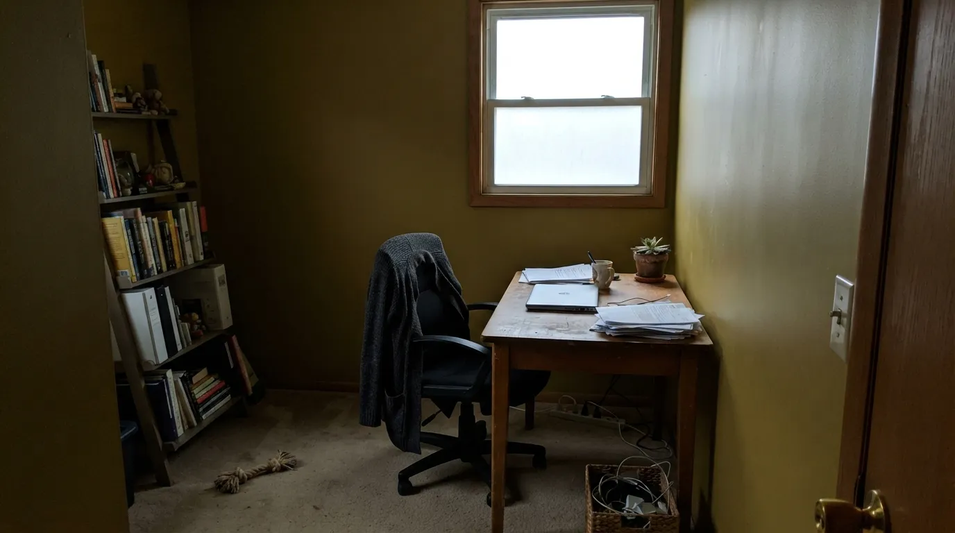
- Goes muddy and slightly green in dim, north-facing interior light
- A full room of it can read dated rather than historic
- Too deep and saturated for anyone who wanted a soft pastel yellow
- Less forgiving of cool white or chrome finishes nearby
What Color Is New Colonial Yellow, Really?
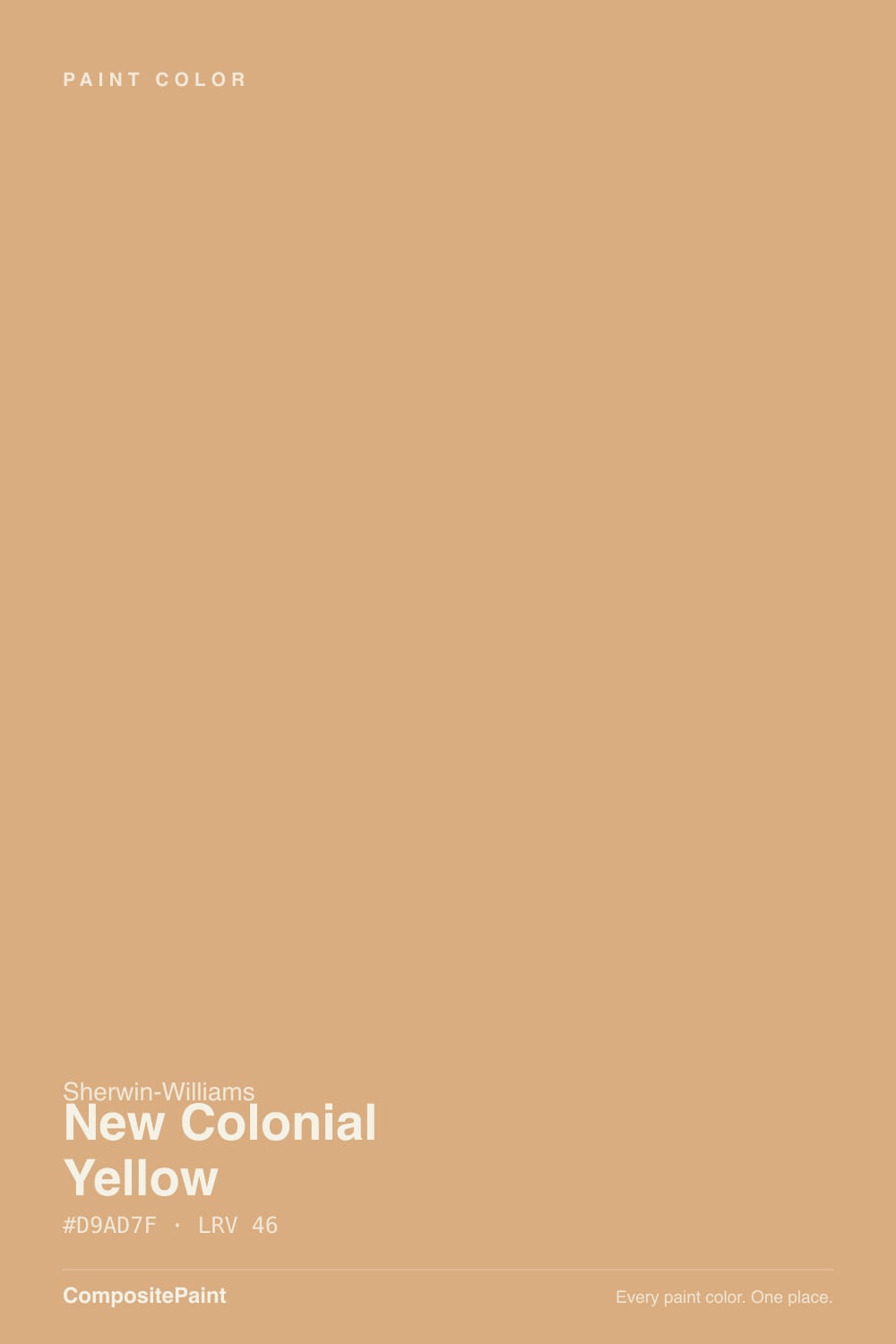
New Colonial Yellow is a golden ochre with an orange-brown backbone — closer to aged mustard or antique gold than to a bright lemon yellow. It lives in Sherwin-Williams' Historic Colors collection (interior and exterior), and the name says exactly what it is for: the deep, saturated gold that shows up on 18th- and 19th-century colonial and farmhouse exteriors, long before pastel "Colonial Yellow" siding became the safer default.
At LRV 46 it sits almost exactly at the midpoint of the reflectance scale, and it reads that way — a true medium-depth color, not a pale wash. That depth is the whole personality: it holds its gold in bright light instead of washing out, but it also means the color has real body on a wall, closer in weight to a warm tan than to a typical "yellow paint colors" swatch.
Undertone in one line: gold-orange first, brown second, never pink. Sherwin-Williams' own color notes flag one real risk — in cool, crisp north daylight the warmth can pull back and expose a faint greenish cast, which is the most common surprise reported when this color is tested indoors rather than on a sunlit exterior wall.
Where It Shines
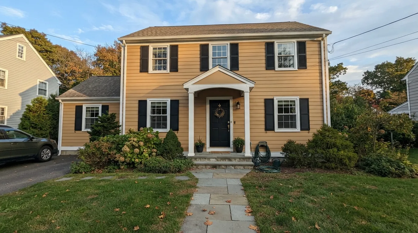
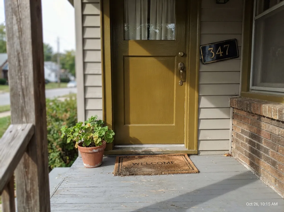
This is an exterior-first color, and full sun is where it earns its keep: a colonial or farmhouse facade in New Colonial Yellow, with white trim and dark shutters, reads like a house that has always looked that way. Its second home is a small, bright interior dose — a front door seen from the porch, a porch ceiling, an entry hall with wood floors and brass hardware — where the depth reads custom instead of overwhelming.
Where It Fails
Almost every regret story about New Colonial Yellow comes from treating it like a pale interior yellow instead of the deep historic gold it actually is. All three situations below are predictable before the first coat.
Cool north daylight pulls the warmth back and can expose a faint green undertone, leaving the gold looking muddy and olive instead of golden. This color needs real sun, indoors or out — if the room stays dim, it will disappoint.
At this depth and saturation, a full room of New Colonial Yellow reads closer to a 1990s honey-oak-era kitchen than a deliberate historic choice. Use it as a door, an entry, an accent wall, or the whole exterior — not the whole interior.
New Colonial Yellow is deep and earthy, not soft and pastel. If the goal was a gentle, barely-there yellow for a nursery or a sunroom, this is the wrong color entirely — look at a much higher-LRV yellow instead.
Room by Room
This is what the color was built for. Full sun brings out the gold without tipping neon; white trim keeps the edges crisp, and black or dark shutters give it the classic colonial contrast. Satin on siding, semi-gloss on trim and shutters.
A single small, bright surface is the easiest way to use this color's depth without committing a whole facade or room. Gloss on the door for a polished look; a slightly flatter finish overhead on the porch ceiling.
A front hall with a window or sidelight and warm wood floors is the classic interior use — it is why the color is remembered as the "porch-and-hallway" gold. Skip it in a windowless interior hall.
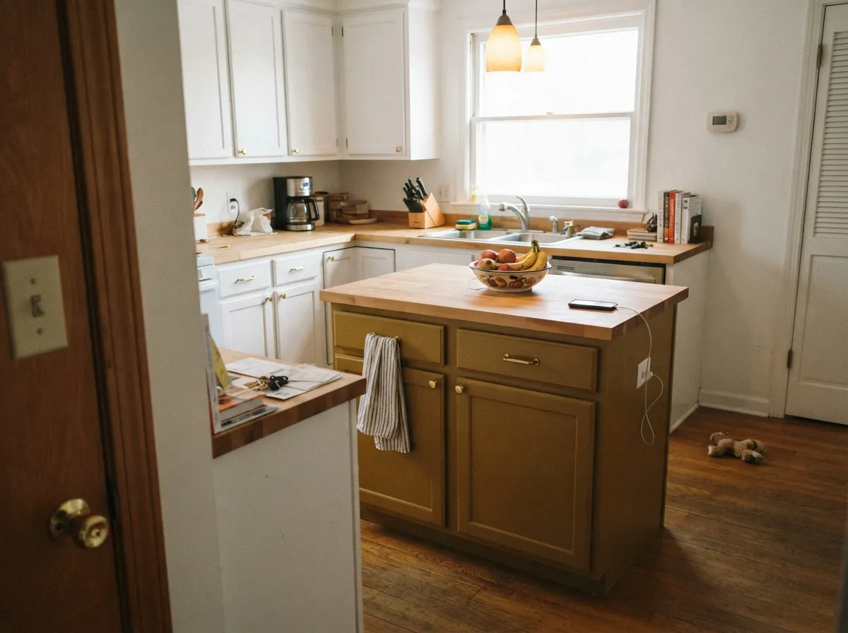
On an island or a run of cabinets with brass pulls and butcher block, it is warm and custom-looking. Painted on all four kitchen walls next to white cabinets and stainless steel, it tips toward dated rather than historic.
Beautiful as a single accent wall or a den with leather and dark wood; risky as the color for an entire open-plan main floor, where its weight has nowhere to rest.
The saturation and orange-gold weight fight the calm most bedrooms are going for. If you love the gold, take it to the front door instead and keep the bedroom quieter.
Your Light Is the Risk
Direct sunlight is where this color is meant to live — the gold reads rich and warm without going neon. The color's home turf.
Cool, crisp north light pulls the warmth back and can expose a faint greenish cast, leaving it looking muddy instead of golden.
Glows richest at the sun hours near the window, settles into a quieter earthy gold the rest of the day.
2700K warm bulbs deepen it toward amber and make it cozier at night. Cool white LEDs flatten the gold and push it toward dull olive — keep bulbs warm.
Most complaints about New Colonial Yellow are a light mismatch. Upload a photo of your actual room and see it on your walls — then ask for the same wall in north light or evening lamps before you buy a single sample.
Need It From Another Brand?
Any paint counter can custom-tint Sherwin-Williams SW 2853 directly. If you would rather stay in one brand's own deck, these are the closest stock matches, measured as ΔE2000. Under 2 is a difference you will not see on the wall.
| Brand | Closest color | ΔE | LRV | |
|---|---|---|---|---|
| Behr | CorkPPU6-05 · Behr | 0.8 | 46 | Color page → |
| Benjamin Moore | Creamy Custard1145 · Benjamin Moore | 1.4 | 45 | Color page → |
| Valspar | Young at Heart3003-8A · Valspar | 2.2 | 46.7 | Color page → |
| PPG / Glidden | Drops Of HoneyPPG1090-4 · PPG / Glidden | 3.1 | 45 | Color page → |
| Glidden | Cheddar BiscuitPPG1083-5 · Glidden | 2.4 | 45 | Color page → |
| Dutch Boy | Honey Hive213-4DB · Dutch Boy | 2.0 | 47 | Color page → |
Similar Sherwin-Williams Colors
The nearest shades to New Colonial Yellow within Sherwin-Williams's own range, ranked by perceptual color distance — useful when you want the same look a touch lighter, darker, or warmer.
WCAG 2.1: AA is 4.5 : 1 for normal text, 3 : 1 for large text, AAA is 7 : 1.
New Colonial Yellow vs the Colors You're Also Considering
Every New Colonial Yellow sample board has the same rivals on it. The numbers show the real lightness gap — then it comes down to which risk you would rather live with.
Pick this when you want the deeper, more saturated, more historic-exterior gold instead of the lighter interior version.
Sherwin-Williams SW 30 · LRV 59Colonial YellowPick this for the paler, more classic Colonial Williamsburg-style yellow that works across a whole wall, not just a doorway dose.
Pick this when you want real, unmistakable gold depth rather than a soft wash of it.
Benjamin Moore 2152-50 · LRV 70Golden StrawPick this for a much paler, creamier wheat-gold that can safely run across a whole sunny kitchen.
Pick this for the brighter, more clearly golden version — Caramelized reads brown-first, this reads gold-first.
Sherwin-Williams SW 9186 · LRV 35CaramelizedPick this for a deeper, browner caramel with less yellow in it — a safer, more neutral-reading exterior or accent color.
New Colonial Yellow Coordinating Colors
The coordinating rule is the historic-exterior playbook: crisp or warm whites for trim, true black or deep charcoal for shutters and doors, and muted greens as the one complementary accent. Stay away from cool blue-grays, which make the gold look dingy rather than warm.
New Colonial Yellow On Exteriors
This is genuinely an exterior color first — it lives in Sherwin-Williams' Historic Colors collection for exactly this use, styled after the deep, earthy golds that showed up on real 18th- and 19th-century colonial and farmhouse siding before pastel yellows became the safer modern default.
Full sun is what makes it work: the gold reads rich and grounded rather than candy-bright, and it holds that color through the day better than a paler yellow would. The formula that keeps showing up on real houses is white or off-white trim with black or deep charcoal shutters and a matching front door — the dark frame keeps the saturated body color from feeling like too much.
New Colonial Yellow Vs Its Paler Sibling
The name invites the obvious question: what makes it "new," and how is it different from Sherwin-Williams' own Colonial Yellow (SW 30)? The answer is depth. Colonial Yellow sits at LRV 59 — pale enough to run across a full interior wall, closer to the buttery yellow most people picture when they hear "colonial yellow." New Colonial Yellow sits at LRV 46, noticeably deeper and more saturated, with more of that earthy, orange-brown backbone.
In practice, that makes them different tools. Reach for the paler Colonial Yellow when the goal is a whole, livable room. Reach for New Colonial Yellow when the goal is an authentic, deep-gold exterior or a single striking interior surface — a door, a porch ceiling, an entry — that can carry the extra weight.
Three Ready Palettes Built on New Colonial Yellow
A color is never alone on the wall. These are complete combinations in the 60-30-10 pattern, with the reason each one holds together. Every one opens in the visualizer.
The classic colonial-house formula: a saturated body color, crisp white trim to keep every edge readable, and true black shutters and door to anchor the gold instead of letting it float.
Try this palette in your roomWhite Dove's warm softness keeps the gold from overwhelming a small entry, and Kendall Charcoal on the door grounds the space without the starkness of true black — a gentler version of the exterior formula, sized for one room.
Try this palette in your roomAlabaster keeps the perimeter calm so the island can carry all the color; Evergreen Fog on a shelf or end panel gives the gold a muted, complementary green note instead of leaving it to fight with stainless steel.
Try this palette in your roomNew Colonial Yellow FAQ
Is New Colonial Yellow more yellow or more orange?
Both — it is a golden ochre with real orange-brown weight, filed under yellow by name but sitting closer to a deep antique gold. It is not a bright lemon yellow and not a soft pastel one.
Is this the same as Sherwin-Williams' Colonial Yellow (SW 30)?
No — they are siblings, not the same color. Colonial Yellow (SW 30, LRV 59) is the paler, more classic version that works across a whole wall. New Colonial Yellow (SW 2853, LRV 46) is deeper and more saturated, built more for exteriors and accents than a full interior room.
Will it look green in my room?
It can, if the room is dim and north-facing. Cool daylight pulls the warmth back and can expose a faint green undertone, which is the most common surprise people report testing it indoors rather than on a sunlit exterior wall.
What trim goes with it?
Warm or true whites — Sherwin-Williams Extra White or Alabaster both work — keep the edges crisp against the saturated gold. Black or dark charcoal on shutters and doors gives the classic colonial contrast; avoid cool, blue-leaning whites, which can make the gold look dingy by comparison.
Is it good for kitchen cabinets?
Yes, in doses — an island or a single run of cabinets with brass hardware and butcher block looks intentional and warm. Painted on every kitchen surface next to white cabinets and stainless steel, it tends to read more 1990s than historic.
Does it work as a whole-house exterior color?
Yes — this is its strongest use. It is part of Sherwin-Williams' Historic Colors collection specifically for colonial and farmhouse exteriors, and full sun is exactly the light that makes it work. Pair it with white trim and dark shutters for the classic look.
Have you painted with New Colonial Yellow?
Rate it — one tap helps the next reader decide.
Ask a Question