Dutch Tile Blue
The Delft-tile blue from Sherwin-Williams' Historic Color Collection, reviewed honestly: the light where it turns green, the light where it goes flat gray, and where it actually earns its keep.

Jessica has spec'd whites and neutrals for more than 300 rooms and keeps a sample wall of painted drawdowns in her studio. Every color review is checked against real reader rooms in the comments and re-tested when a formula changes. About the testing process →
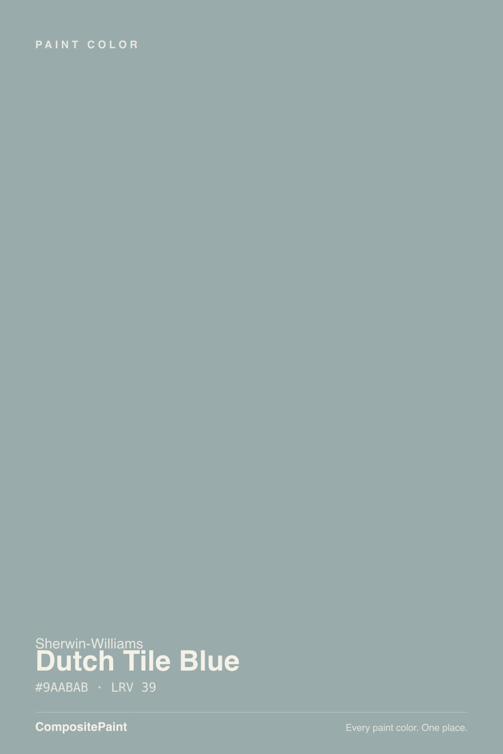
- 1Pewter Green12
- 2Retreat21
- 3Dutch Tile Blue39
- 4Upward57
- 5Sea Salt63
The Fast Verdict
Dutch Tile Blue is what a blue looks like after two centuries of sitting on ceramic tile instead of a paint chip: soft, dusty, and grayed down until it reads as much green as blue. It is not a color that shouts — it is the one a designer reaches for when a client wants "a little blue" without buying a coastal or nautical statement. Give it real daylight and it settles into a genuinely handsome slate-blue-green; take the daylight away and it flattens toward plain gray faster than most colors its depth.
Bathrooms and laundry rooms · kitchen cabinets and islands with real daylight · historic and cottage-style homes · anyone who wants blue in the room without a loud blue on the wall
You want a saturated, unmistakable blue · your room runs on lamp-only light with little daylight backup · your kitchen leans honey oak and heavy brass · you're chasing a trendy teal rather than a quiet historic one
- Genuinely historic, not a trend color — a Delft-tile blue-green that isn't chasing this year's teal
- Settles into a real, dusty blue-gray-green in daylight without ever going loud
- Bathrooms and tile-adjacent rooms live up to the literal name
- Documented real-room proof: a full Country Living farmhouse kitchen in cabinets, walls and ceiling
- SW's own recommended pairings (Greek Villa, Natural Choice) remove the trim guesswork
- Warm, lamp-only evening light flattens it toward plain gray instead of cozying it up
- Not a true saturated blue — disappoints anyone picturing a bold Delft ceramic glaze
- The green undertone can read murky against honey oak floors and heavy warm brass
- Quiet, under-the-radar reputation means fewer real-room photos to sample against before buying
What Color Is Dutch Tile Blue, Really?
Dutch Tile Blue lives in Sherwin-Williams' Historic Color Collection, and the name is literal, not marketing: it is pulled from the blue-and-white Delft ceramic tile tradition, the centuries-old glaze color that shows up on hearths, stair risers and kitchen backsplashes in old Dutch and colonial houses. It was never built to be a trend color, which is exactly why it has aged fine while louder blue-greens came and went. It shows up most often as a considered choice — a bathroom, a laundry room, a run of cabinets — rather than a whole-house gamble.
At LRV 39 it sits at a genuine mid-depth: light enough to hold color without disappearing, dark enough to read as a real hue rather than a tint. The undertone behaves in a way worth knowing before you buy: in real daylight it leans green, reading as a quiet blue-gray with a distinct green cast; under warm 2700K lamp light it does the opposite of most historic colors and goes grayer, not warmer, losing some of its blue-green character exactly when the lights come on. That inversion is the single most useful fact about this paint.
Undertone in one line: blue-gray with green stepping forward in daylight and receding under warm bulbs — never a true navy, never a true teal. If your sample looks nearly gray at night, that is the paint being honest about artificial light, not a bad batch.
Where It Shines
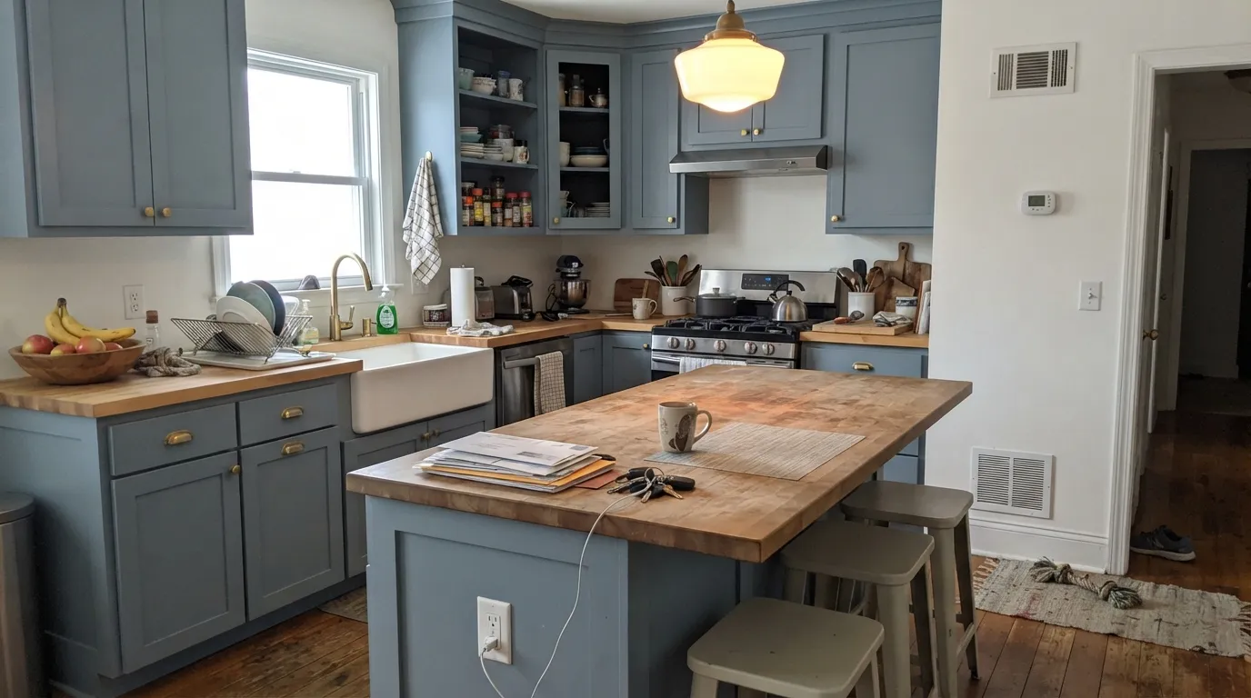
Give it daylight and a room that wants quiet color instead of a statement, and it is genuinely good. Country Living editor-in-chief Rachel Hardage Barrett painted her own Mississippi Delta farmhouse kitchen — cabinets, walls and ceiling — entirely in Dutch Tile Blue, and it is the kind of documented, lived-in use that says more than a marketing photo: a whole room in one soft blue-green, with the gray keeping it from ever feeling like a nursery or a beach house. Bathrooms are its other natural home, for the obvious reason built into the name — a color literally named for tile behaves like it belongs on tile-adjacent walls.
Where It Fails
Almost every regret story with Dutch Tile Blue comes down to one of three mismatches, and all three are visible before the first coat if you know to look for them. None of them are the paint failing — they are a buyer picturing a different color than the one in the can.
The name says "blue," and buyers pull swatches expecting something closer to a saturated Delft ceramic glaze or a coastal navy. What lands on the wall is a grayed, greened-down blue that reads calm rather than bold. If you want an unmistakable blue, this is the wrong can — look at SW Upward instead, which holds the same LRV without the green pulling it toward gray.
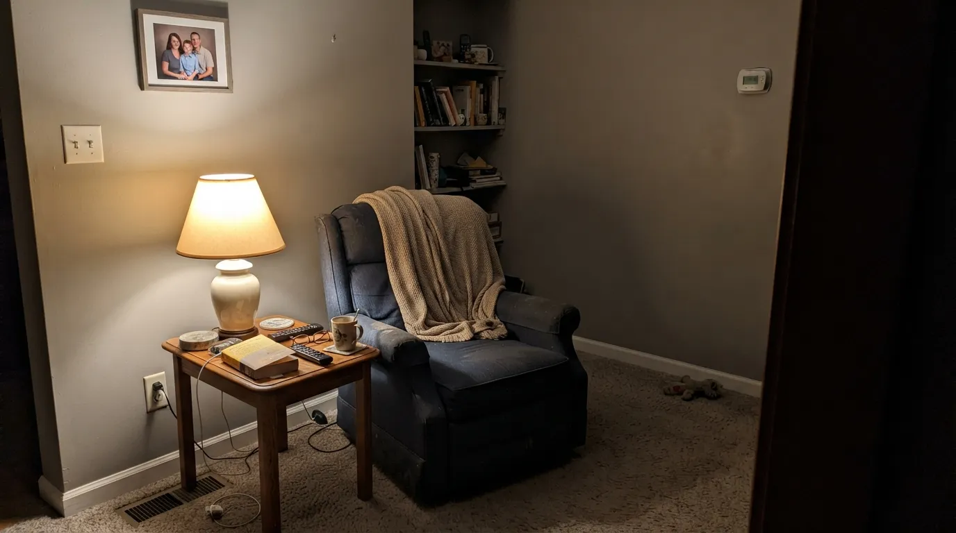
Most muted colors get cozier under warm bulbs. This one does the opposite: 2700K lamp light strips out the blue-green and leaves something closer to plain gray, which disappoints anyone who fell for the color at a bright daylight sample and painted a room that only gets used after dark. Daylight bulbs or genuinely bright fixtures keep more of the character; a lamp-lit den at night will not look like the paint chip.
The green in the undertone is the trap here — next to golden, orange-leaning oak floors or trim, the wall can read slightly murky instead of calm, and warm brass hardware can fight the gray rather than complement it. Pale or white oak, walnut, and unlacquered or matte black metals give it a cleaner partner than builder-grade honey wood.
Room by Room
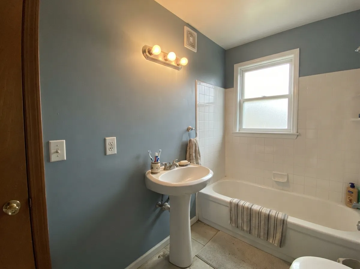
A color named for ceramic tile earns the name here: with white or marble-look tile and a bright vanity light, it reads like an actual glazed tile wall. Satin or semi-gloss for the moisture, and keep the lighting daylight-leaning rather than warm-only.
Small, hardworking rooms are where a quiet, slightly unusual color earns its keep without a big commitment. It hides scuffs and hose-water splashes better than a bright white and pairs easily with open shelving in any wood tone lighter than honey oak.
The Country Living farmhouse kitchen is the proof of concept: cabinets, walls and ceiling all in Dutch Tile Blue, with daylight doing the work. Pair with Greek Villa walls or Natural Choice for the warm-white counterpoint SW itself recommends, and keep the room's main light source natural or daylight-temperature bulbs.
Calm and grounding with morning daylight; go easy on warm 2700K-only lamp setups if you want the blue-green to survive after sunset. Cooler 3000K bulbs keep more of the color than a classic warm-glow bedside lamp.
Handsome in a closed room with good daylight; riskier in an open-plan space where it has to negotiate with a kitchen's warm wood and an adjoining room's undertone. Give it a defined wall or a den rather than an entire open floor plan.
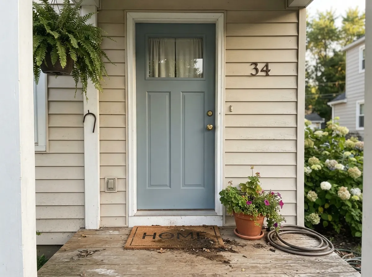
As a front door on a light-neutral or white house, the historic pedigree reads intentional and a little unexpected in a good way. Full siding coverage asks a lot of a color this light-dependent — sample it on the actual exposure of the house before committing the whole facade.
Your Light Is the Risk
The full Delft character shows here: a genuine blue-gray with the green stepping forward, calm and clearly intentional rather than accidental gray.
Warm 2700K bulbs strip the blue-green out instead of warming it up, and the color reads close to plain gray. The opposite of what most muted colors do after dark.
Cooler and more blue in morning light, truest blue-green at midday, and a slight gold-hour warmth in late afternoon that never fully erases the gray.
Warm 2700K bulbs gray it out; cooler LEDs hold more of the blue-green but can push the room toward a colder, more nautical feel. Daylight-temperature bulbs are the safest middle ground.
Most complaints about Dutch Tile Blue are a light mismatch. Upload a photo of your actual room and see it on your walls — then ask for the same wall in north light or evening lamps before you buy a single sample.
Need It From Another Brand?
Any paint counter can custom-tint Sherwin-Williams SW 31 directly. If you would rather stay in one brand's own deck, these are the closest stock matches, measured as ΔE2000. Under 2 is a difference you will not see on the wall.
| Brand | Closest color | ΔE | LRV | |
|---|---|---|---|---|
| Behr | NorwesterN470-4 · Behr | 2.3 | 38 | Color page → |
| Benjamin Moore | Adagio1593 · Benjamin Moore | 3.7 | 39 | Color page → |
| Valspar | Blue Arrow5001-3C · Valspar | 0.3 | 39.4 | Color page → |
| PPG / Glidden | PolarisPPG10-04 · PPG / Glidden | 1.8 | 40 | Color page → |
| Glidden | PolarisPPG10-04 · Glidden | 1.5 | 41 | Color page → |
| Dutch Boy | Explore The Shore426-5DB · Dutch Boy | 2.8 | 39 | Color page → |
Similar Sherwin-Williams Colors
The nearest shades to Dutch Tile Blue within Sherwin-Williams's own range, ranked by perceptual color distance — useful when you want the same look a touch lighter, darker, or warmer.
WCAG 2.1: AA is 4.5 : 1 for normal text, 3 : 1 for large text, AAA is 7 : 1.
Dutch Tile Blue vs the Colors You're Also Considering
Every Dutch Tile Blue sample board has the same rivals on it. The numbers show the real lightness gap — then it comes down to which risk you would rather live with.
Pick this if you're already committed to Sherwin-Williams, or you want the Historic Collection provenance Boothbay Gray doesn't carry.
Benjamin Moore HC-165 · LRV 36Boothbay GrayPick this if you want the near-identical color in Benjamin Moore's deck — the two hexes sit close enough that painters treat them as interchangeable.
Pick this for the quieter, more historic read Upward doesn't have — Dutch Tile Blue is greener and less overtly "blue paint."
Sherwin-Williams SW 6239 · LRV 39UpwardPick this for a clearer, more confidently blue color at the same LRV — Upward skips the green and the go-gray-at-night risk.
Pick this for more depth and a genuinely blue presence next to the green — Rainwashed can drift closer to plain sea-glass.
Sherwin-Williams SW 6211 · LRV 47RainwashedPick this for a lighter, more clearly watery green — Rainwashed leans coastal rather than historic.
Pick this for a deeper, moodier version of the same blue-green-gray family with a genuine historic pedigree instead of a trend one.
Benjamin Moore HC-144 · LRV 53Palladian BluePick this for the famous, more popular spa blue-green — lighter, and far better documented in real rooms.
Within the Sherwin-Williams deck, Meditative (SW 6227), hex #96AAB0 at LRV 38, is the bluer neighbor and loses most of the green. Halcyon Green (SW 6213), hex #9BAAA2 at LRV 39, goes the other way and reads as a soft sage. Gris (SW 7659), hex #A5A9A8 at LRV 39, is the most neutral of the group, and Breezy (SW 7616), hex #A0AEAF at LRV 41, is lighter and slightly more aqua.
Across brands, Valspar Blue Arrow (5001-3C), hex #9BACAC at LRV 39.4, sits at a color difference of 0.29, which makes it the same color for practical purposes. Glidden Polaris (PPG10-04) at 1.53 and Dunn-Edwards Mission Bay Blue (DET563) at 1.8 look identical in normal room light.
Behr Cosmic Quest (N460-4), hex #97AEAB at LRV 40, is at 2.85, so it is very close but worth sampling first. Farrow and Ball Dix Blue (No. 82) at 3.42 and Benjamin Moore Adagio (1593) at 3.66 are close but visibly different side by side, with Adagio the grayer of the two.
Dutch Tile Blue Coordinating Colors
The rule for coordinating with Dutch Tile Blue: warm whites for the trim, pale or dark neutrals for contrast, and nothing with a strong yellow-orange pull nearby. It takes Sherwin-Williams' own suggested warm-white partners well, and it layers cleanly with its own tonal cousins in the blue-gray-green family. These are the partners that keep showing up in rooms that work:
The Delft Tile Story: Where the Name Comes From
Dutch Tile Blue is part of Sherwin-Williams' Historic Color Collection, the archive of colors pulled from real period buildings rather than invented for a current trend cycle. The name points directly at Delft tile — the blue-and-white glazed ceramic that has covered Dutch hearths, stair risers and kitchen walls since the 1600s. Real Delft glaze is more saturated than this paint; the color in the can is the softened, weathered version, as if the tile had spent a century absorbing light through a farmhouse window.
That heritage is also why the color has stayed under the radar rather than going viral: it was never positioned as a statement color, and there is no Color-of-the-Year moment attached to it. The best evidence of real-world use is quieter and more credible than a marketing push — Country Living's editor-in-chief Rachel Hardage Barrett chose it for her own Mississippi Delta farmhouse kitchen, painting cabinets, walls and ceiling in it as one color. That is closer to how this paint actually gets used: a considered choice in an old or old-feeling house, not a trend buy.
Dutch Tile Blue With Wood Tones and Metals
White oak, pale ash and walnut all sit comfortably against Dutch Tile Blue — cool and neutral enough not to fight the green in the undertone. Honey oak and other orange-leaning golden wood are the one real mismatch: the green pulls toward murky next to that warmth, and the floor can start to look more orange by contrast. If the golden floor is staying, keep the color to a smaller surface — an island, a vanity, a door — rather than the full room.
Metals split the same way. Unlacquered brass, aged bronze and matte black all read well against it, echoing the historic, tile-and-hearth mood the color comes from. Polished chrome and bright, yellow-toned brass are the two finishes most likely to feel like they're arguing with the wall instead of finishing it.
Three Ready Palettes Built on Dutch Tile Blue
A color is never alone on the wall. These are complete combinations in the 60-30-10 pattern, with the reason each one holds together. Every one opens in the visualizer.
This is Sherwin-Williams' own suggested pairing, and it is the same combination behind the Country Living farmhouse kitchen: Greek Villa's warmth keeps the cabinets from reading cold, and Extra White sharpens the trim line without competing with the blue-green.
Try this palette in your roomThe literal tile-blue pairing for the room it was named for: Pure White keeps the trim crisp against a tiled shower, and a dark Peppercorn vanity supplies the contrast so the wall color isn't doing all the work by itself.
Try this palette in your roomNatural Choice is Sherwin-Williams' own suggested beige partner, softened here into a whole-exterior neutral. The door carries the historic blue-green without betting the entire facade on a color this dependent on daylight.
Try this palette in your roomDutch Tile Blue FAQ
Is Dutch Tile Blue more blue or more gray?
Both, depending on the light — and that's the honest answer. In real daylight the green-blue steps forward and it reads as a genuine dusty blue-gray-green. Under warm lamp light at night it grays out more than most colors this depth, so a room that only gets evening light will look noticeably less blue than the sample looked in the store.
Where does the name come from?
It's part of Sherwin-Williams' Historic Color Collection, named for the blue-and-white Delft ceramic tile tradition — the glaze color used on hearths, stair risers and kitchen tile in old Dutch and colonial houses. It isn't a trend color; it's a heritage one, which is why it hasn't dated the way louder blue-greens have.
Does it work in a bathroom?
It's arguably the room the color was built for. Pair it with white or marble-look tile and a genuinely bright vanity light, and it reads like a real glazed tile wall. Keep the lighting daylight-leaning rather than warm-only lamps if you want it to hold its blue-green after dark.
What trim white goes with Dutch Tile Blue?
Sherwin-Williams' own recommendation is Greek Villa for a warm pairing, with Natural Choice as a slightly more beige alternative. For a crisper, brighter trim line — especially on cabinets or a front door — Extra White or Pure White both work without fighting the green undertone.
Is it good for kitchen cabinets?
Yes, with real daylight: Country Living's editor-in-chief painted her own farmhouse kitchen — cabinets, walls and ceiling — entirely in this color, and it holds up as a documented real-room case. Avoid it over honey oak floors or heavy warm brass, which fight the green in the undertone; pale oak, walnut and matte black hardware are better company.
Can I use it outside, like on a front door?
Yes — it's rated for interior and exterior use, and a front door is the lower-risk way to use it outside. Full siding coverage is a bigger bet, since the color is genuinely light-dependent; walk the exposure with a large sample before committing the whole house to it.
Have you painted with Dutch Tile Blue?
Rate it — one tap helps the next reader decide.
Ask a Question