Cool December
Dunn-Edwards' barely-there cool white, reviewed honestly: where it reads crisp, the rooms where it goes gray, and what to pick when you wanted cream.

Jessica has spec'd whites and neutrals for more than 300 rooms and keeps a sample wall of painted drawdowns in her studio. Every color review is checked against real reader rooms in the comments and re-tested when a formula changes. About the testing process →
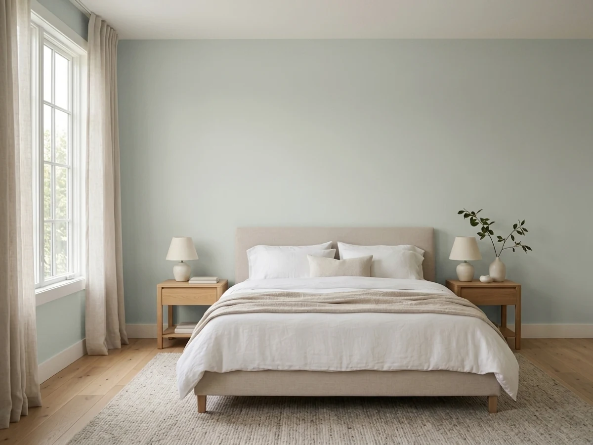

- 1Classic Gray74
- 2Alabaster82
- 3Cool December88
- 4Ultra Pure White97
The Fast Verdict
Cool December is the white you pick when you want the room rinsed, not painted. Barely-there, slightly cool, almost no chroma — crisp without going gallery-stark. In real daylight it glows; in a dim north room it flashes gray. If you wanted White Dove warmth or a true optical white, this is the wrong chip.
Bright living rooms and kitchens · cabinets and trim in a cool modern house · indoor-outdoor walls on Western houses · anyone who wants crisp without gallery-stark
You wanted cream or White Dove warmth · the room faces north and stays dim · honey oak floors and golden wood · you want a true bright optical white
- Crisp white that stays white — cool without going blue
- LRV 88 opens a room without looking like primer
- One-color walls + trim + ceiling works cleanly
- Cabinets stay fresh against chrome, pale wood, and white stone
- Same chip works indoor and outdoor on Western houses
- Goes gray and a little dingy in dim north light
- Too cool if you actually wanted cream or White Dove
- Fights honey oak, golden wood, and unlacquered brass
- Looks faintly gray next to a true optical white
What Color Is Cool December, Really?
A pristine, barely-there white with the slightest cool lean — and the cool is almost all comparison. Next to Whisper or Milk Glass it reads iced and clean; on its own it just reads white. Dunn-Edwards files it in the Whites collection of the Perfect Palette, which is the right shelf: this is not a gray wearing a winter name, and it is not a cream. Designers on the West Coast keep reaching for it when a client says modern, open, and not yellow — Sarah Rosenhaus ran it inside and outside a Santa Monica family house; Amber Interiors has used it on interiors that photograph as simply white.
At LRV 88 it is a genuine bright white, a step above White Dove (LRV 85) and Whisper (LRV 87), a step below Warm White (LRV 93) and Chantilly Lace (LRV 90). That slot is the useful part. It bounces enough light to open a room and still has a hair of body, so it does not look like primer or a builder flat. On a wall it holds as white; the 'cool' only announces itself when a cream neighbor, a golden floor, or a dim north window gives it something to react to.
Undertone in one line: a whisper of gray, never cream, never yellow. The official chip is nearly achromatic — there is almost no hue to argue with. If your sample looks blue, that is north light or a warm neighbor, not a hidden blue in the can. If it looks creamy, that is 2700K bulbs or late sun doing it. Both versions are the same paint being honest about the room.
Where It Shines
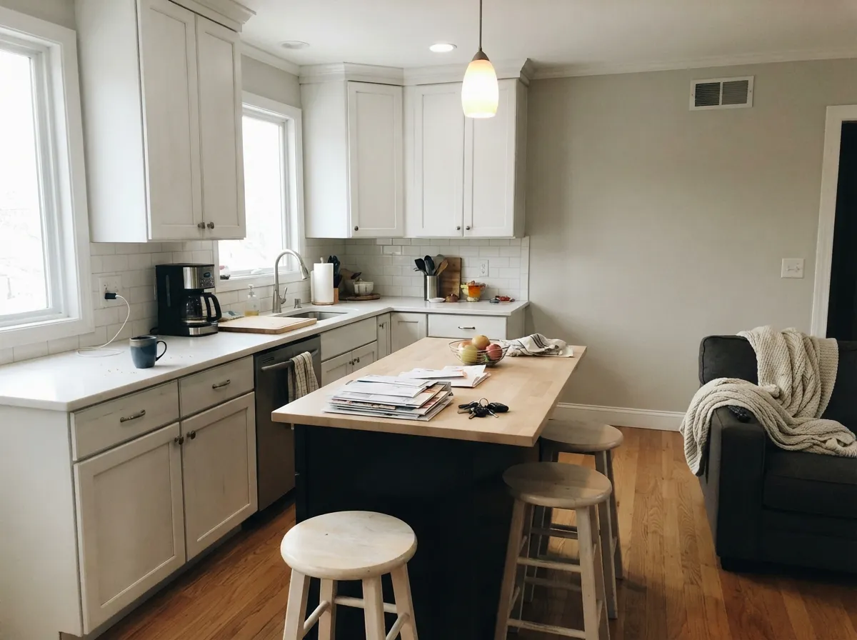
Give it real daylight, pale wood, and silver or chrome and it is one of the cleanest whites in the Dunn-Edwards deck. The one-color room — walls, trim, and ceiling all Cool December, sheen changes only — is the move that keeps it from looking dingy next to a brighter white. Kitchens are its indoor home: on cabinets it stays crisp against white stone and stainless, and at LRV 88 it still hides the scuffs a true optical white would broadcast. Its outdoor home is the indoor-outdoor Western house, the same color in velvet inside and a flat exterior finish outside.
Where It Fails
Almost every regret story about Cool December follows one of three scripts, and all three are predictable before the first coat. None of them are the paint's fault — but if your room matches one, this is not your white, and sampling bigger will only confirm it.
On the chip it passes for a simple bright white. On four walls next to oak, brass, and beige it reads cool — sometimes cold. If your goal was a finished, creamy white, Cool December will feel rinsed and a little sterile. Whisper is the Dunn-Edwards answer; White Dove is the national one.
North light is cool and gray, and it pulls the faint gray out of this white until readers call it dingy. The color did not fail; the light did. Go to Whisper or Milk Glass, or commit to warm lamps and a bigger window. Do not buy Cool December hoping a north room will still feel crisp.
LRV 88 is bright, not the brightest. Put it next to Warm White (LRV 93) or Chantilly Lace (LRV 90) and Cool December suddenly shows its body — and can look faintly gray by comparison. If you want the white that still reads as paper-white in a gallery kitchen, Warm White is the Dunn-Edwards chip; this one is for people who found that too stark.
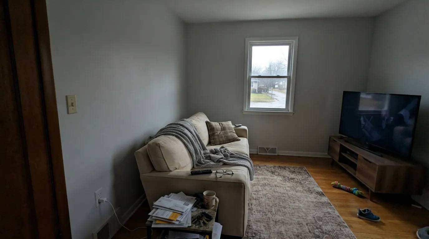
Room by Room
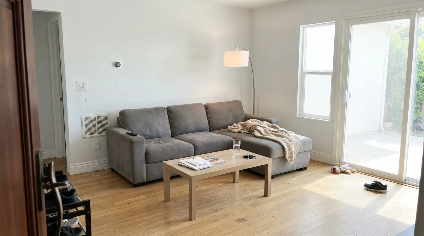
South or west light keeps it a clean white with a crisp edge, the backdrop that makes pale oak and black metal look deliberate. Eggshell or velvet on the walls; same color on trim in semi-gloss. In a closed, dim living room it goes gray — skip it there.
Satin Cool December cabinets against white quartz, chrome, and pale wood are the cool-modern kitchen this color was built for. On walls it stays fresh without the scuff-broadcast of a true optical white. Honey-oak cabinets and orange-stained floors are the one no; they push it icy.
A south-facing bedroom in this white feels hotel-crisp and calm. A north bedroom feels cold. If the room stays dim, Whisper will still look like a white at night; Cool December will look like an unlit gray. Warm 2700K lamps are not optional in a bedroom of this color.
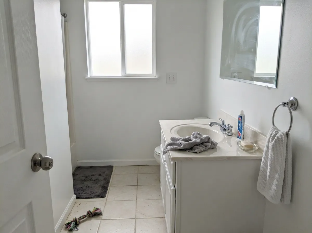
Carrara, chrome, white tile, pale grout — all of it loves Cool December. Warm cream stone and unlacquered brass argue with the cool lean. Satin or eggshell; keep the bulbs at 3000K if you want the white to stay white after dark.
The one-color rule is the safe whole-house path: walls, trim, ceiling, doors, all Cool December, sheen only. A brighter trim white (Warm White, a leftover builder white) makes the walls look unwashed. Semi-gloss on trim and doors, eggshell on walls, flat on the ceiling.
Full sun reads it brighter and crisper than indoors, which is what you want on a Western facade. Sarah Rosenhaus used it inside and out on a Santa Monica house so the rooms and the patio wore the same white. Pair it with charcoal or near-black trim; skip cream trim, which makes the body color look chilly from the street.
Your Light Is the Risk
Bright daylight is where it earns the name: a glowing, barely-there white with a crisp edge and no cream. Whole-house safe in this light.
Cool gray daylight pulls the faint gray forward until the walls look dingy rather than crisp. Test a big sample here before you commit.
Cooler and flatter in morning shade; a hair creamier when low sun hits the wall. The shift is small — most people never notice it unless they are hunting undertones.
2700K lamps hide the cool and it drifts toward Whisper. Cool white LEDs keep it icy. If you bought it for crisp, stay near 3000K; if the cool bothers you at night, swap bulbs, not paint.
Most complaints about Cool December are a light mismatch. Upload a photo of your actual room and see it on your walls — then ask for the same wall in north light or evening lamps before you buy a single sample.
Need It From Another Brand?
Any paint counter can custom-tint Dunn-Edwards DEW383 directly. If you would rather stay in one brand's own deck, these are the closest stock matches, measured as ΔE2000. Under 2 is a difference you will not see on the wall.
| Brand | Closest color | ΔE | LRV | |
|---|---|---|---|---|
| Sherwin-Williams | High Reflective WhiteSW 7757 · Sherwin-Williams | 2.2 | 93 | Color page → |
| Behr | Ultra Pure White 18501850 · Behr | 3.1 | 97 | Color page → |
| Benjamin Moore | Snowfall White2144-70 · Benjamin Moore | 3.7 | 90 | Color page → |
| Valspar | Ultra White7006-24 · Valspar | 1.8 | 93.6 | Color page → |
| PPG / Glidden | Delicate WhitePPG1001-1 · PPG / Glidden | 2.8 | 88 | Color page → |
| Glidden | Delicate WhitePPG1001-1 · Glidden | 2.6 | 88 | Color page → |
Similar Dunn-Edwards Colors
The nearest shades to Cool December within Dunn-Edwards's own range, ranked by perceptual color distance — useful when you want the same look a touch lighter, darker, or warmer.
WCAG 2.1: AA is 4.5 : 1 for normal text, 3 : 1 for large text, AAA is 7 : 1.
Cool December vs the Colors You're Also Considering
Every Cool December sample board has the same rivals on it. The numbers show the real lightness gap — then it comes down to which risk you would rather live with.
Pick this when Whisper still reads creamy and you want the cleaner, cooler white in the same LRV neighborhood.
Dunn-Edwards DEW340 · LRV 87WhisperPick this if you want Dunn-Edwards' White Dove analog — a hair warmer, softer, and safer in mixed light.
Pick this when Warm White feels stark and you want a barely-there white with a little more body.
Dunn-Edwards DEW380 · LRV 93Warm WhitePick this for a true bright optical white — it is a true white wearing a warm name, and it still reads paper-white on a wall.
Against So Chic! (DET614), which shares nearly the same LRV at 61, the two are close, but So Chic! reads a hair warmer and flatter while Cool December keeps its faint cool green lean. Choose Cool December when you want that touch of coolness, and So Chic! when you want a more neutral greige.
Silhouette (DE6276) is a bit deeper at LRV 56. On walls that extra depth is noticeable in lower light, so Silhouette can feel slightly heavier and more shadowed. Pick it if Cool December washes out in your bright room, and stay with Cool December if you want to hold onto lightness.
Dolphin Tales (DET600) at LRV 57 is a cooler, more purely gray version with less of the green cast. In a north-facing room Dolphin Tales can lean colder, while Cool December keeps a slightly softer, more coastal feel.
Cool December Coordinating Colors
The rule for coordinating with Cool December: stay on the cool-to-neutral side. It loves pale woods, chrome, silvered metals, white stone, and near-blacks — and it argues with cream, honey oak, and unlacquered brass. Dunn-Edwards lists Warm White as trim and Trail Dust as an accent; treat the Warm White pairing as a sample, not a default, because the LRV gap can make these walls look dingy. These are the partners that keep showing up in rooms that work:
The Indoor-Outdoor White: Cool December on Exteriors
Cool December is one of the few whites in the Dunn-Edwards deck with a documented indoor-outdoor job. Sarah Rosenhaus of Sarah Rosenhaus Interior Design put it on a rebuilt Santa Monica family house — Suprema velvet inside, Spartashield flat outside — so the living rooms and the patio wore the same white and the house read bigger. The client wanted crisp, open, and durable enough for four teenagers; the white was the through-line, not a facade color with a different interior.
Outside, full sun washes every white brighter, and Cool December keeps just enough body to avoid the blue glare cheap bright whites give stucco. Charcoal or near-black trim — Charcoal Smudge, Black Tie — is the pairing that makes it read crisp from the street. Cream trim and gold hardware make the same white look chilly. Walk the shaded north side with a sample: that elevation will read a step grayer than the sunny south, the same way a north room does indoors.
Cool December With Wood Tones and Floors
Pale woods are the natural company: white oak, ash, bleached walnut, pale maple. They share the cool-clean temperature, so the white stays white instead of picking a fight. Gray-washed floors and cool LVP are fine. Chrome, brushed nickel, and matte black hardware all sit comfortably against it; unlacquered brass is the metal that makes the cool look chilly.
The honest no is golden. Honey oak floors, orange-stained cabinets, yellow builder trim — they sit on the warm side of the wheel, so the floor goes more orange and the walls go more gray-cool. No extra coat fixes that geometry. If the golden floor is staying, put a large gray or ivory rug between it and this paint, or pick Whisper and let the white meet the wood halfway.
White and gray stone — Carrara, honed marble, pale quartz — is the easy counter pairing. Creamy beige stone and terracotta pull the same warm fight as honey oak. Sample a board above the actual floor and the actual counter; this white is so close to nothing that neighbors do more of the talking than the paint does.
Three Ready Palettes Built on Cool December
A color is never alone on the wall. These are complete combinations in the 60-30-10 pattern, with the reason each one holds together. Every one opens in the visualizer.
One white at two sheens keeps the house from growing a dingy line where a brighter trim white would win. Black Tie is the cool near-black Dunn-Edwards already sells for doors and fascia, so the single dark note matches the temperature of the walls.
Try this palette in your roomSilver Spoon is an honest silvery gray, not a greige, so the cabinet white stays crisp instead of picking up beige. Black Tie on the island is the same cool near-black Dunn-Edwards aims at high-contrast kitchens; chrome and pale counters finish the temperature.
Try this palette in your roomThe Santa Monica move: one white inside and out so the patio and the living room wear the same color. Charcoal Smudge and Black Tie are contrast, not four walls — they frame the white so it reads crisp from the street instead of chalky.
Try this palette in your roomCool December FAQ
Is Cool December warm or cool?
Cool — barely. It is a pristine white with a whisper of gray, not a blue-gray and not a cream. In bright south light it just reads white; in north light the cool shows. If you want warm, pick Whisper. If you want colder still, pick Droplets.
What trim white goes with Cool December walls?
Cool December itself, in semi-gloss. Dunn-Edwards lists Warm White as a trim partner, but Warm White sits at LRV 93 against this wall's 88 — the brighter white wins and the walls can look faintly dingy. Same-color trim is the fix. If you insist on contrast, go darker (Black Tie, Charcoal Smudge), never brighter.
Is it good for kitchen cabinets?
One of the better cool whites in the Dunn-Edwards deck for cabinets. It stays crisp against chrome and white stone, and at LRV 88 it hides knuckle marks better than a true optical white. Use a satin cabinet enamel. Skip it over honey-oak floors or orange-stained existing cabinets.
Does Cool December work on exteriors?
Yes — it is a documented indoor-outdoor white. Sarah Rosenhaus used it in Suprema velvet inside and Spartashield flat outside on a Santa Monica house so the rooms and the patio matched. Expect it to read brighter in full sun; pair it with charcoal or near-black trim, not cream.
Will it look gray in a north-facing room?
That is the main risk. North light pulls the faint gray forward and the walls can look dingy rather than crisp. A big sample on the actual north wall, viewed morning and evening, is not optional. If it already looks gray on the sample, Whisper or Milk Glass will treat you better.
Cool December vs Whisper — which white should I buy?
Whisper if you want Dunn-Edwards' White Dove analog: a hair warmer, softer, safer in mixed light. Cool December if Whisper still reads creamy on your wall and you want the cleaner, cooler white in the same brightness range. Sample both on the same wall; the winner is obvious in a day.
Have you painted with Cool December?
Rate it — one tap helps the next reader decide.
Ask a Question