Peaceful Blue
Behr's quiet spa blue-green, reviewed honestly: where it glows, the exact light that flattens it, and what to pick instead.

Jessica has spec'd whites and neutrals for more than 300 rooms and keeps a sample wall of painted drawdowns in her studio. Every color review is checked against real reader rooms in the comments and re-tested when a formula changes. About the testing process →
- 1Hidden Gem14
- 2Van Courtland Blue31
- 3Peaceful Blue44
- 4Wedgewood Gray50
- 5Refresh59
The Fast Verdict
Peaceful Blue is not a color Behr ever built a marketing campaign around — no Color of the Year moment, no celebrity room, just a soft, grayed teal-blue sold across nearly every finish Behr makes, from cabinet enamel to exterior wood stain. That quiet versatility is the whole appeal: it reads as a genuine blue-green in good light, settles into a calm gray-green under lamps, and never asks the room to make a statement. If you want a saturated, confident blue, this isn't it — Peaceful Blue is the version for people who want color without commitment.
Bathrooms and powder rooms · nurseries and kids' rooms · coastal or cottage-style bedrooms · anyone easing into blue without going bold
You want a saturated, unmistakable blue · your room is dim and north-facing with no warm light · your trim and hardware run heavy honey-oak and brass · you're chasing a trending color with a design-magazine story
- Genuinely versatile — sold across nearly every Behr finish and line, interior and exterior
- Real presence of blue-green without going bold or demanding
- A dependable bathroom and nursery color at LRV 44
- Reads clean spa-blue in daylight, calm gray-green under lamps — both looks are usable
- Pairs easily with white trim, light wood, and matte black or brass hardware
- Flattens to murky gray-green in dim, north-facing rooms
- Too quiet for buyers who actually want a bold, saturated blue
- Fights heavy honey-oak and brass-everything rooms
- No trend or Color of the Year story behind it if you want design-magazine backup
What Color Is Peaceful Blue, Really?
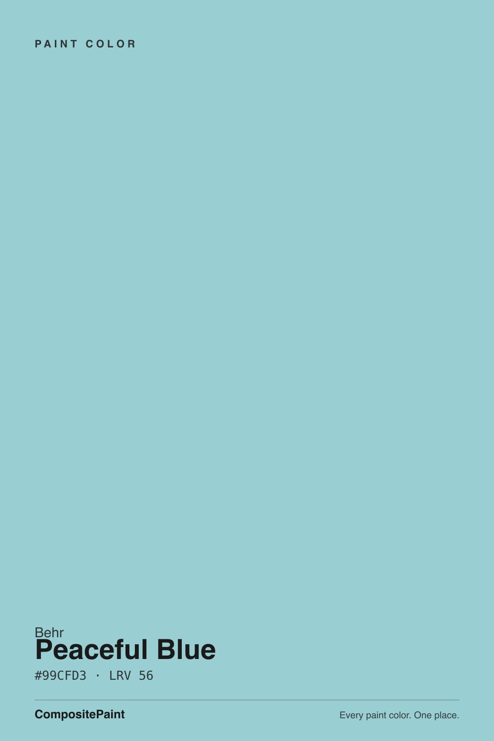
A soft, grayed-down teal-blue — closer to a pale spa turquoise than a navy-adjacent blue. Behr doesn't push a designer story on this one: it simply appears, quietly, across nearly the entire catalog — Marquee, Premium, Ultra, even the Pro contractor line, in flat, matte, satin, semi-gloss and eggshell, plus a solid-color exterior wood stain for siding and fences. That kind of cross-line availability usually means one thing: a formula the brand trusts to behave consistently, not a trend color riding a single collection.
At LRV 44 it sits solidly in the light-to-medium range — brighter than the deeper spa blues (Benjamin Moore Palladian Blue is LRV 53, close in family but visibly paler and grayer), and with more real color in it than a near-neutral like Sherwin-Williams Sea Salt (LRV 63). Peaceful Blue holds more visible blue-green than either of those cousins; it reads as a color choice, not a compromise.
Undertone in one line: blue-green with a gray base, no yellow anywhere in it. In strong daylight the blue comes forward and it reads genuinely aqua; under warm lamps or flat overcast light, the green and gray step forward and it settles into a quieter, mistier version of itself. Neither read is wrong — it is the same paint responding honestly to the room.
Where It Shines
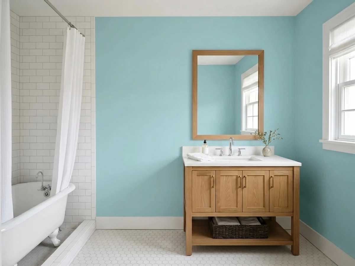
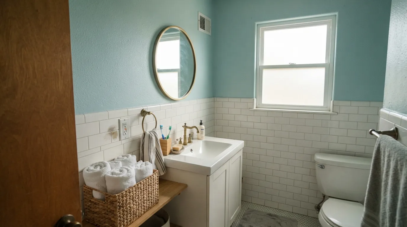
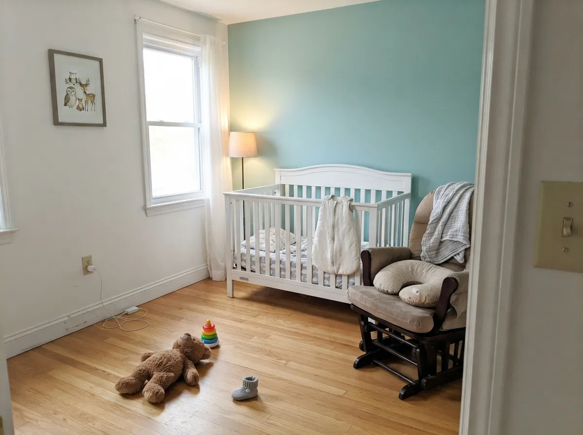
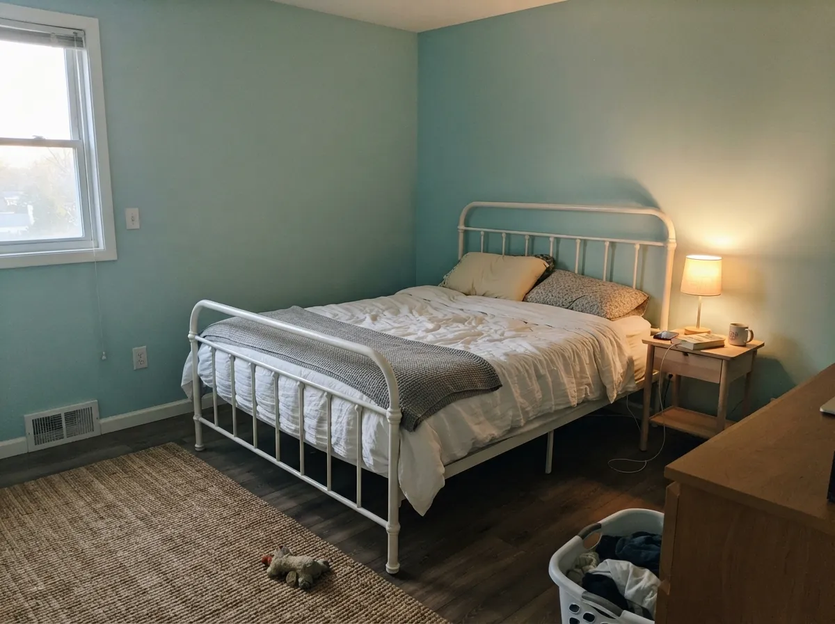
Give it real daylight — south or bright east exposure — and it holds a clean, confident spa blue-green all day. Its best rooms are the ones built to feel calm on purpose: a bathroom with white subway tile and brass fixtures, a nursery that needs color without stimulation, a coastal bedroom with white trim and light wood. In all three it does the job most people actually want from 'a little blue' — presence without drama.
Where It Fails
The complaints that show up around Peaceful Blue follow the same three scripts as every muted color at this depth, and all three are predictable before the first coat goes on.
North light is already cool and gray; it strips the blue out of Peaceful Blue and leaves a flat, slightly murky green-gray with none of the spa calm the color promises in a sample chip. The paint didn't change — the light did. Add warm 2700K lamps or move it to a wall with real daylight.
This is a whisper, not a statement. Buyers picturing something closer to a coastal navy or a saturated turquoise are often surprised at how quiet it reads on four walls — that's the muted, low-chroma formula doing exactly what it's built to do. If you want more presence, step up to a deeper teal instead.
Peaceful Blue is cool-leaning; heavy warm-orange wood tones and warm brass in volume make the wall look slightly disconnected from the rest of the room, each side pulling the other the wrong way. Light oak, whitewashed wood, or matte black hardware are easier partners.
Room by Room
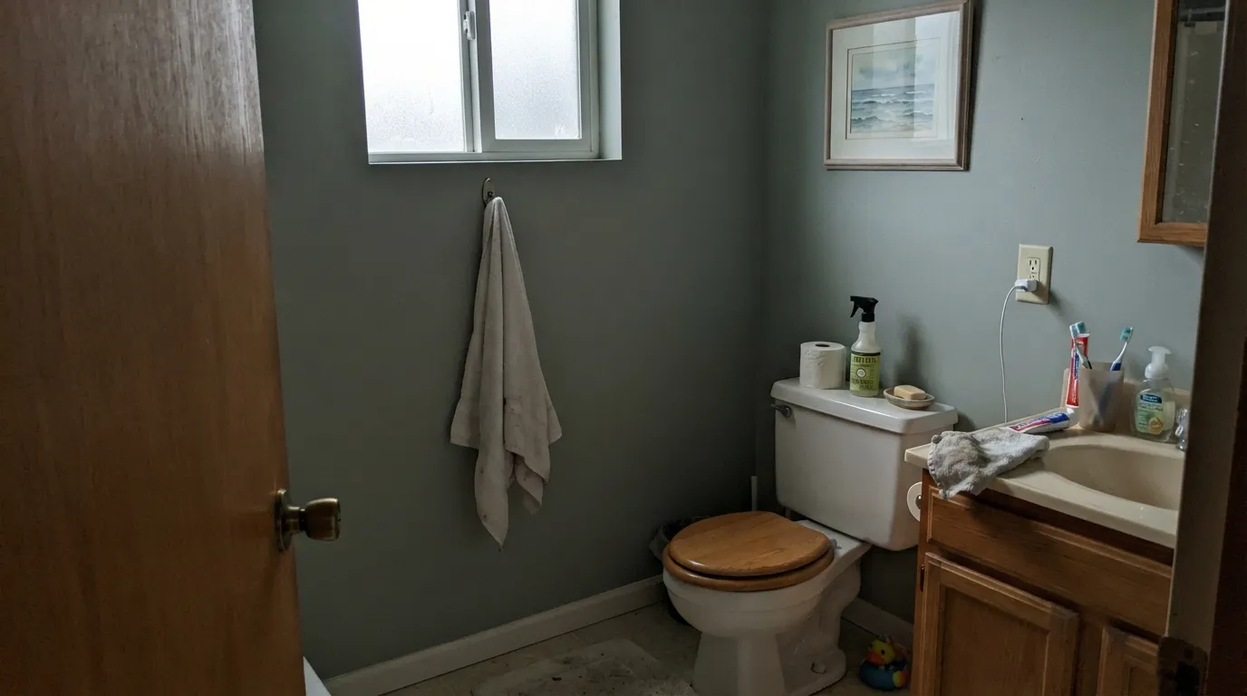
White subway tile, brass or matte-black fixtures, real daylight: this is the color's natural habitat, the spa calm it's built for. Satin or semi-gloss for moisture; add a warm sconce if the room has no window.
Soft enough to be restful, present enough to not read as 'just another white.' Works in a gender-neutral palette without leaning obviously masculine or feminine. Eggshell holds up to handprints better than flat.
Calm and easy under a warm lamp at night; in a north-facing bedroom with no supplemental warmth it can read flat by evening. Pair with warm bedding, not cool gray linens, to keep the room from tipping cold.
On an island under white perimeter cabinets it's a genuinely pretty, unexpected choice. A full kitchen of walls in this color needs strong daylight to avoid feeling washed out. Semi-gloss cabinet enamel for durability.
Works best in a room already committed to a light, airy, wood-and-white palette. In a heavier, formal room with dark wood furniture it can look like an accident rather than a decision.
Behr sells this exact color as a solid exterior wood stain, which tells you it's formulated for siding and fences, not just interior walls. Full sun reads it brighter and more saturated than any indoor room will; pair with white or warm-gray trim for a classic cottage look.
Your Light Is the Risk
The blue steps forward and the color reads as a genuine, confident spa blue-green — the best case, and the light to sample it in.
Cool, low daylight strips the blue out and leaves a flat, slightly murky gray-green. Test on the actual wall before committing.
Cooler and bluer in morning light, softer and greener as the light warms toward evening. The shift is gentle, not a different color.
2700K warm bulbs pull it toward a calm, cozy gray-green. Cool white LEDs flatten it and can make it look slightly clinical — swap the bulb before you swap the paint.
Most complaints about Peaceful Blue are a light mismatch. Upload a photo of your actual room and see it on your walls — then ask for the same wall in north light or evening lamps before you buy a single sample.
Need It From Another Brand?
Any paint counter can custom-tint Behr S470-3 directly. If you would rather stay in one brand's own deck, these are the closest stock matches, measured as ΔE2000. Under 2 is a difference you will not see on the wall.
| Brand | Closest color | ΔE | LRV | |
|---|---|---|---|---|
| Sherwin-Williams | Faded FlaxflowerSW 9146 · Sherwin-Williams | 2.5 | 44 | Color page → |
| Benjamin Moore | ExhaleAF-515 · Benjamin Moore | 1.1 | 46 | Color page → |
| Valspar | Déjà BlueV106-3 · Valspar | 1.1 | 45 | Color page → |
| PPG / Glidden | Blue By YouPPG1035-3 · PPG / Glidden | 3.2 | 44 | Color page → |
| Glidden | Soft Rococo Blue70BG 44/129 · Glidden | 3.0 | 44 | Color page → |
| Dutch Boy | Stonewash Blue432-3DB · Dutch Boy | 2.1 | 44 | Color page → |
Similar Behr Colors
The nearest shades to Peaceful Blue within Behr's own range, ranked by perceptual color distance — useful when you want the same look a touch lighter, darker, or warmer.
WCAG 2.1: AA is 4.5 : 1 for normal text, 3 : 1 for large text, AAA is 7 : 1.
Peaceful Blue vs the Colors You're Also Considering
Every Peaceful Blue sample board has the same rivals on it. The numbers show the real lightness gap — then it comes down to which risk you would rather live with.
Pick this for more visible blue and less green — Peaceful Blue holds its color more clearly.
Benjamin Moore HC-144 · LRV 53Palladian BluePick this if you want it paler and greener — Palladian Blue is the softer, more pastel cousin in the same family.
Pick this for the lighter, more classically 'blue' version of the same calm.
Sherwin-Williams SW 6211 · LRV 47RainwashedPick this for a deeper, more watery green-blue with real weight to it.
Hopeful Blue BIC-23 at LRV 58 is slightly lighter and leans a touch further green, so it feels a little softer on a full wall. Sky Watch HDC-MD-14 at LRV 55 goes the other way: its hex #89CFD8 is more saturated and bluer, which makes it the bolder choice. Shadow Blue N480-3 at LRV 55 and Prelude 740E-3 at LRV 56 are both grayer, calmer versions of the same idea.
Across brands, Benjamin Moore Spectra Blue 2049-50 at LRV 55 has a deltaE of 0.89 and is effectively the same color. Glidden Soft Aqua Stone 90GG 58/171 at LRV 58 and Dunn-Edwards Aqua Bloom DE5737 at LRV 54 come in at 1.3 and 1.43, close enough to look identical in normal room light.
Sherwin-Williams Bora Bora Shore SW 9045 at LRV 56 is 2.49, very close but worth sampling first. Farrow and Ball Blue Ground No. 210 at LRV 52 is 4.36, close but visibly different side by side, and noticeably deeper.
Peaceful Blue Coordinating Colors
The rule for coordinating with Peaceful Blue is simple: keep the trim clean and cool-neutral, keep the wood light, and save warmth for accents rather than the whole room. These are the partners that keep it looking deliberate rather than accidental:
A Color With No Marketing Campaign
Peaceful Blue has never had a Color of the Year moment and no designer has built a viral room around it — and that is worth saying plainly rather than pretending otherwise. What it does have is real, quiet distribution: it's offered across Behr's Marquee, Premium, Ultra and Pro lines in nearly every sheen, and it's one of the colors Behr sells as a solid exterior wood stain for fences and siding. That is not the résumé of a hyped color; it's the résumé of a formula the brand trusts to work, over and over, in ordinary rooms nobody photographs for a magazine.
For a shopper, that honest obscurity is actually useful information. You're not buying into a trend that will look dated in five years, and you're not paying a premium for a name with a story. You're buying a genuinely well-behaved blue-green that has quietly earned its spot in the deck by doing the job, not by being famous.
Peaceful Blue With Wood Tones and Floors
Light oak, whitewashed and pale gray-washed floors are the easiest partners — they keep the room airy and let the blue-green read clearly without a fight. Walnut and other cooler-toned darker woods work too, especially in a bathroom vanity or a bedroom nightstand, where the contrast reads intentional rather than clashing.
Honey oak and any strongly orange-toned wood is the one real risk. Warm, saturated wood pulls against the cool undertone in Peaceful Blue, and both sides end up looking slightly off rather than coordinated. If the golden floor isn't changing, a large light-colored rug between the wood and the wall helps more than any amount of paint sampling will.
Three Ready Palettes Built on Peaceful Blue
A color is never alone on the wall. These are complete combinations in the 60-30-10 pattern, with the reason each one holds together. Every one opens in the visualizer.
White keeps the small room bright while Peaceful Blue does the spa work; one near-black accent on the mirror and hardware stops the palette from feeling too soft or too sweet.
Try this palette in your roomPolar Bear keeps most of the room quiet and neutral so one Peaceful Blue wall reads as a deliberate calm, not a theme; a blush First Light detail softens the palette without forcing pink-or-blue gender cues.
Try this palette in your roomSea Salt is the paler, grayer cousin of the same blue-green family, so a Peaceful Blue den or powder room hands off cleanly into a Sea Salt living room without a jarring color change; one warm trim white ties both rooms together.
Try this palette in your roomPeaceful Blue FAQ
Is Peaceful Blue more blue or more gray?
Both, depending on the light — that's the honest answer. In bright daylight it reads as a genuine soft blue-green; under lamps or on an overcast day the gray steps forward and it reads closer to a muted green-gray. It never goes fully neutral the way a true gray does.
Is it a good bathroom color?
One of its best uses. At LRV 44 it's light enough to keep a small bathroom from feeling closed in, with enough color to give the room a spa feel. Satin or semi-gloss handles moisture better than flat or matte.
Does it work in a nursery?
Yes — it's soft enough to be restful and calm without reading as a themed 'boy blue.' Works well as one accent wall against a neutral white rather than covering all four walls, especially in a room with average daylight.
What trim white goes with Peaceful Blue walls?
A clean, fairly bright white — Behr Ultra Pure White or Whisper White both work. A warm cream trim can make the cool blue-green look slightly off; keep the trim on the neutral-to-cool side.
Will it work on kitchen cabinets?
Yes, especially as an island or lower-cabinet color under white perimeter cabinets. A full kitchen in this color needs strong, consistent daylight — in a dim kitchen it can read flatter than the sample suggested. Use a semi-gloss cabinet enamel for durability.
Can I use Peaceful Blue outside?
Yes — Behr sells this exact color as a solid-color exterior wood stain for siding and fences, not just as an interior wall paint. Full sun makes it read brighter and more saturated than it does indoors, so sample it on the actual exterior wall before committing to the whole house.
Have you painted with Peaceful Blue?
Rate it — one tap helps the next reader decide.
Ask a Question