Iron Mountain
Behr's deep slate gray, reviewed honestly: the cabinets where it looks expensive, the dim rooms where it goes cave, and why it is not the Iron Mountain most blogs mean.

Jessica has spec'd whites and neutrals for more than 300 rooms and keeps a sample wall of painted drawdowns in her studio. Every color review is checked against real reader rooms in the comments and re-tested when a formula changes. About the testing process →
- 1Black Fox7
- 2Pewter Green12
- 3Iron Mountain18
- 4Stardew43
- 5Quietude48
The Fast Verdict
Iron Mountain is Behr's deep, near-neutral slate — a charcoal-gray with a faint green-gray ghost, not a teal and not the warm brown-black Benjamin Moore sells under the same name. At LRV 18 it is dark enough for moody cabinets and built-ins, light enough that you can still see it is gray in daylight. Low light flattens it to charcoal; strong sun can tease out the cool slate. Buy it for cabinets, a fireplace wall, a lamped office, or shutters. Do not buy it because a blog said Iron Mountain and meant the other one.
Moody cabinets, built-ins, and vanities · fireplace and accent walls with real daylight · lamplit offices · shutters, front doors, and exterior details · anyone who wants slate gray, not brown-black
You wanted Benjamin Moore's warmer, browner Iron Mountain · you are drenching four dim interior walls · you came for teal or true black · your trim is staying a yellowed builder cream
- Deep slate that still reads gray in daylight — not another black
- Ideal depth for cabinets, built-ins, vanities, and fireplace walls
- Near-neutral, so it pairs with most whites and woods without a fight
- Easy to sample and buy — a Home Depot staple, including cabinet enamel
- Lighter and more usable as millwork than BM's same-name near-black
- Same name as Benjamin Moore's warmer, darker Iron Mountain — easy to buy the wrong one
- At LRV 18, four interior walls go cave without strong light and lamps
- A faint green-slate can show in daylight and under cool LEDs
- Not teal, not black, and not famous — no Color of the Year, no viral room
What Color Is Iron Mountain, Really?
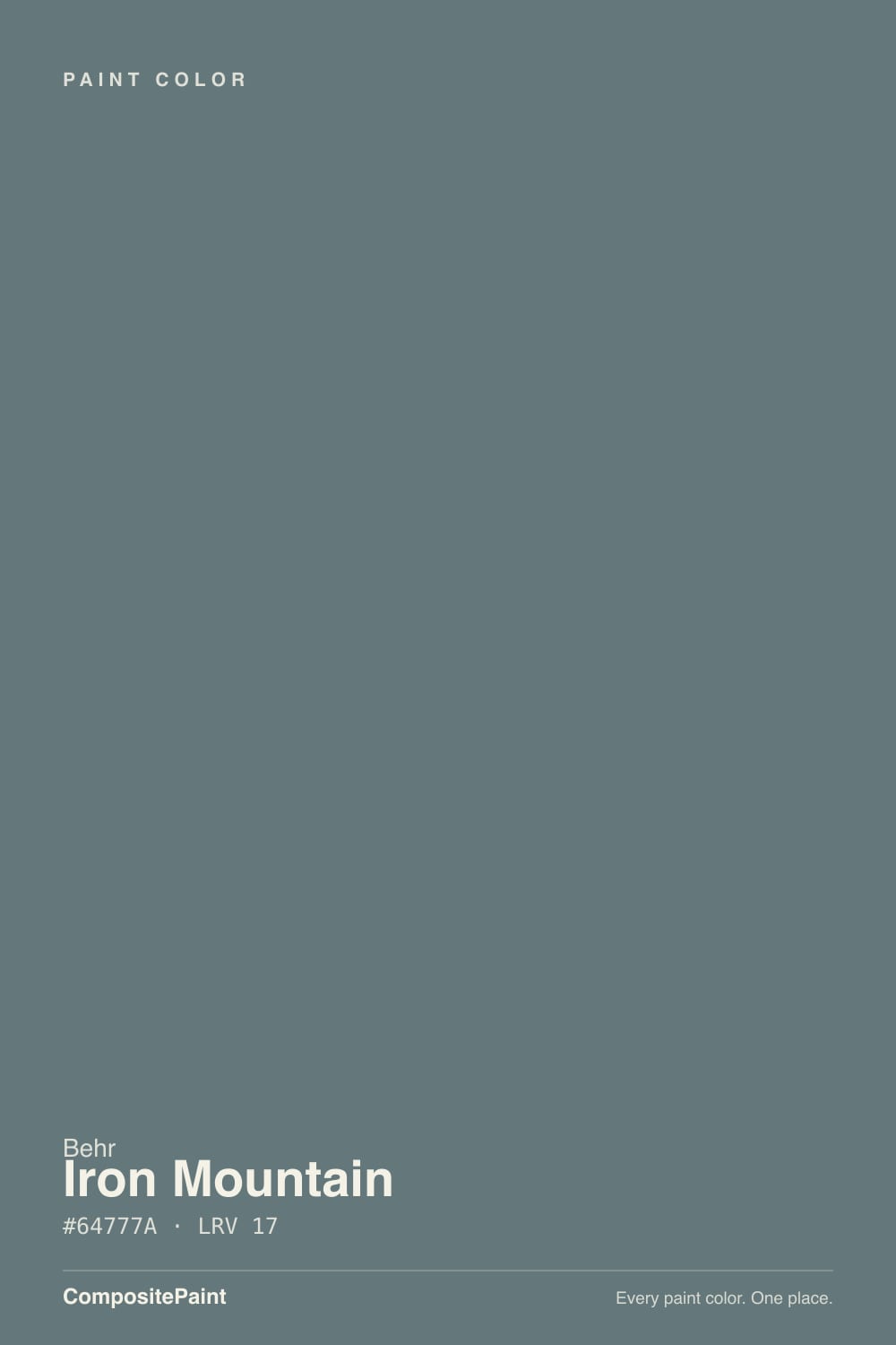
The first thing to settle is the name. Search Iron Mountain and you will land on Benjamin Moore 2134-30, a warm near-black with a bronze-brown lean at LRV 11. Behr N520-5 is a different paint. The hex is #757574 — red and green at 117, blue at 116 — which is a near-even gray with almost no chroma, not a brown-black and not the slate-teal some old listings still show. Behr files it in the Gray family. On the wall it is a dark charcoal-gray that can go cooler depending on the light. That is the color in the can.
At LRV 18 it sits in a useful middle-dark: a step lighter than Kendall Charcoal (LRV 15), a step deeper than Chelsea Gray (LRV 23), and a full band lighter than Benjamin Moore's Iron Mountain. That number is why it works on cabinets. Kendall and Peppercorn (LRV 11) can go black on a door front; this one still reads as a color when the under-cabinet lights are on. On four walls it is a real commitment — not a cave at noon, but a room that will need lamps after 4pm. Plan for any large surface to read a step deeper than the chip. Depth always does that.
Undertone in one line: near-neutral gray first, a faint green-slate second — never brown, never teal. It lives further down the N520 strip from Silver Bullet (N520-2, LRV 56), where the family still flashes cool; by Iron Mountain the chroma has collapsed and what is left is a green-gray ghost. If the sample looks blue-green, that is daylight or a cool LED teasing the ghost. If it looks beige, that is warm lamps or oak bounce. If it looks black, the room is too dim. All three are the same gallon being honest about where you put it.
Where It Shines
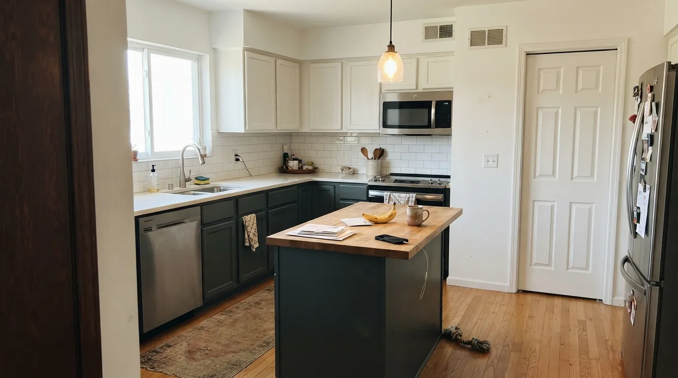
This color is built for surfaces that should look designed, not decorated: kitchen cabinets, a run of built-ins, a fireplace wall, a vanity, a shutter. LRV 18 is the useful trick — dark enough to photograph as moody, light enough that hardware, wood, and grain still show. Behr sells it in cabinet enamel for a reason, and Behr's own color desk has pointed people to it for vanities and fireplace walls. Give it a clean white — Polar Bear or Ultra Pure White — and it looks like a custom millwork color you got at Home Depot. Keep the bulbs warm and the room lit, and the slate stays gray instead of going cave.
Where It Fails
Almost every regret story about Behr Iron Mountain follows one of three scripts, and all three are visible before the first coat. None of them are a bad batch — but if your room or your Pinterest save matches one, this is not your gray, and a third coat will not fix it.
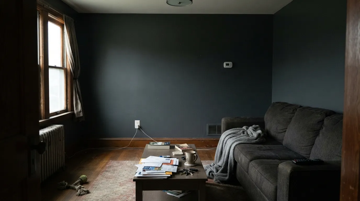
On cabinets or one fireplace wall it is slate. On four walls of a north living room with the lamps off it is a flat, slightly dusty charcoal that swallows the corners. LRV 18 reflects little, so overcast days and rooms that run on a TV instead of a lamp all turn the gray into a parking-garage den. Readers who wanted moody get a cave. The fix is not more paint: keep it to millwork or one wall, add 2700K lamps, or pick Chelsea Gray (LRV 23) and give the room some air.
Same name, different paint. BM 2134-30 is a warm near-black that needs light to stay brown. Behr N520-5 is lighter, cooler, and near-neutral. If the photo you saved had a bronze, chocolate, or wool-coat read, you sampled the wrong deck. If you wanted a clean Home Depot charcoal that does not go brown, you are in the right aisle — just do not expect the BM color to come out of this can.
Old chips and some aggregator pages still show this as a blue-green slate. The live formula is a near-even gray. What is real is a faint green-slate that daylight and cool LEDs can tease out, enough to bother anyone who wanted a dead charcoal or BM's brown-black. If teal is the brief, this is the wrong strip. If a true-neutral charcoal is the brief, Shadow Mountain (LRV 10) has even less of a lean — and is a step darker.
Room by Room
This is the use the color was waiting for. Satin cabinet enamel on lowers, an island, a built-in, or a bath vanity reads custom at LRV 18: dark, not black, and still a gray when the lights are on. Polar Bear or Alabaster on the perimeter keeps the contrast clean. Brass, matte black, and unlacquered bronze all sit well. A whole kitchen of it is a bigger bet — sample a door in place first.
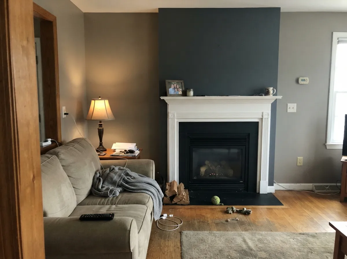
One wall, real daylight, white trim. Behind a sofa or wrapping a fireplace it gives the room a hard slate edge without asking the other three walls to live in a cave. Matte or eggshell; Polar Bear on the millwork. Keep the adjacent walls in a greige (Agreeable Gray, Revere Pewter) so the dark is a decision, not a drench.
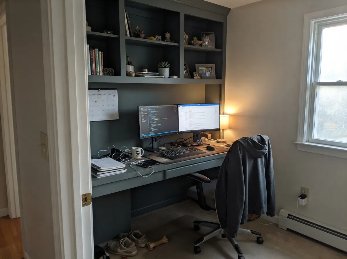
At LRV 18 the room goes quiet and a little cinematic once the desk lamp is on, and a screen wall in this gray does not compete with the picture. Eggshell for wipeability, 2700K bulbs as part of the paint job. A single north window and no lamps is the version that feels like a basement. Sample that wall at 4pm with the overheads off before committing.
Small rooms take deep color. All four powder-room walls, a white vanity, and one warm sconce is a weekend project that reads custom. Satin on any millwork. Skip it in a windowless hall bath you actually shower in — steam plus LRV 18 plus a builder-white vanity light is how slate turns dingy.
A fireplace wall or the wall the sofa faces can look expensive. All four walls in an average living room, especially a north one, tip from cozy to cave by dinner. Open-plan kitchens have the extra problem of the slate having to negotiate with wood tones and whatever greige the rest of the floor wears. If you love the look, put it on the cabinets or one wall and keep the field light.
Full sun does what a dim interior cannot: it lifts the gray so shutters and a front door read as slate from the curb, not black paint. Pair it with a clean white — Ultra Pure White or Polar Bear — on a light or greige body. A whole exterior body at LRV 18 is possible on wood, fiber cement, or stucco; skip vinyl and many steel garage doors unless the manufacturer allows a color this dark. The shaded north wall will read a step deeper than the south — walk a large sample around the house at noon.
Your Light Is the Risk
Strong daylight is the honest read: you can see it is slate, not black, and the gray looks even and finished. This is the light the cabinet and shutter photos were taken in — the reason to buy it.
Cool, weak daylight plus LRV 18 is a charcoal wall. The slate drops out, corners go dead, and a room that looked moody on the chip looks unfinished. Fine on a shutter; disappointing on four walls.
Morning and midday are the cleaner, slightly cooler-slate read. Late-day west sun warms the room around it — oak, brick, grass — and the paint itself can soften toward gray-beige for an hour. After dusk it simply goes dark. Sample at noon and at 6pm.
2700K bulbs keep it a soft charcoal-slate after dark, which is the only indoor version that still feels like a color. Cool 4000K LEDs — including a lot of office tubes and under-cabinet strips — tease the green-gray and leave an institutional cast. Swap bulbs before you swap paint.
Most complaints about Iron Mountain are a light mismatch. Upload a photo of your actual room and see it on your walls — then ask for the same wall in north light or evening lamps before you buy a single sample.
Need It From Another Brand?
Any paint counter can custom-tint Behr N520-5 directly. If you would rather stay in one brand's own deck, these are the closest stock matches, measured as ΔE2000. Under 2 is a difference you will not see on the wall.
| Brand | Closest color | ΔE | LRV | |
|---|---|---|---|---|
| Sherwin-Williams | Before the StormSW 9564 · Sherwin-Williams | 2.6 | 18 | Color page → |
| Benjamin Moore | Amherst GrayHC-167 · Benjamin Moore | 3.0 | 19 | Color page → |
| Valspar | Ground Truth8006-11E · Valspar | 1.3 | 18 | Color page → |
| PPG / Glidden | PencilpointPPG0994-7 · PPG / Glidden | 2.2 | 17 | Color page → |
| Glidden | PencilpointPPG0994-7 · Glidden | 2.9 | 17 | Color page → |
| Dutch Boy | Cliffside Gray437-5DB · Dutch Boy | 1.0 | 17 | Color page → |
Similar Behr Colors
The nearest shades to Iron Mountain within Behr's own range, ranked by perceptual color distance — useful when you want the same look a touch lighter, darker, or warmer.
WCAG 2.1: AA is 4.5 : 1 for normal text, 3 : 1 for large text, AAA is 7 : 1.
Iron Mountain vs the Colors You're Also Considering
Every Iron Mountain sample board has the same rivals on it. The numbers show the real lightness gap — then it comes down to which risk you would rather live with.
Pick this when you want a lighter, cooler Home Depot slate that stays gray instead of going brown-black.
Benjamin Moore 2134-30 · LRV 11Iron MountainPick this if you want the famous warm near-black — bronze-brown in the light, the one most blogs mean by this name.
Pick this when you want a step lighter, a can you can grab at Home Depot, and a gray that is happier on cabinets than on every wall.
Benjamin Moore HC-166 · LRV 15Kendall CharcoalPick this if you want the famous, slightly darker BM charcoal — more track record, still the better-behaved four-wall gray.
Pick this when you want a cooler, deeper slate and you are putting it on millwork or one wall, not a whole dim room.
Benjamin Moore HC-168 · LRV 23Chelsea GrayPick this if you want the go-to charcoal-greige for islands and exteriors — warmer, a little more air, less cave risk.
Its Behr neighbors split by hue rather than by depth. Rain Shadow ECC-22-3 at #677276 and LRV 16 is grayer with less green. Amazon Stone 790F-5 at #6D7874 and LRV 18 pulls clearly green. Silver Hill 750F-5 at #5B7883 and Hypnotic MQ5-19 at #677582, both LRV 17, lean blue and read closer to a slate blue than a teal.
Across brands, several sit very close. Diamond Vogel Bowman Blue 0500 at LRV 17 has a deltaE of 1.16 and Magnolia Home Demo Day JG-79 at LRV 17 is 1.43, both visually identical in normal room light. Benjamin Moore Providence Blue 1636 at LRV 19 with deltaE 1.87, Glidden Night Rendezvous PPG1037-5 at LRV 18 with deltaE 1.91 and Sherwin-Williams Mediterranean SW 7617 at LRV 18 with deltaE 1.97 are all in the same band.
Farther out, Dutch Boy Aged Denim 431-4DB at LRV 19 and deltaE 2.89 is very close but worth sampling first, and Farrow and Ball Sloe Blue No. 87 at LRV 18 and deltaE 4.21 is close but visibly different side by side, clearly bluer.
Iron Mountain Coordinating Colors
The rule for coordinating with Behr Iron Mountain is contrast, not temperature matching. Because the color is nearly neutral, it will sit next to warm greige, cool white, oak, and brass without picking a loud fight — the job is to give it a lighter neighbor so it still reads as slate. Stay off yellowed builder creams, which pull the green-gray forward. These are the partners that keep showing up in rooms that work:
Three Cans Named Iron Mountain
The name is the trap. Benjamin Moore Iron Mountain (2134-30, LRV 11) is the one designers write about: a warm near-black that needs light to stay brown, used on doors, islands, and shutters. Behr Iron Mountain (N520-5, LRV 18) is this review — a lighter, near-neutral slate you buy at Home Depot, happier on cabinets than as a four-wall drench. Dunn-Edwards has used the name on a different charcoal as well. Three brands, three formulas, one Google query.
If a saved photo, a Houzz thread, or a painter's text just says Iron Mountain, assume they mean Benjamin Moore until the SKU says otherwise. Behr's version is the one in the N520 gray strip, next to Silver Bullet and Flannel Gray, sold in interior, exterior, and cabinet enamel. Sample the brand on the can. Mixing them in one house is how a warm brown-black door ends up next to a cool slate cabinet and both look like mistakes.
Iron Mountain With Wood Tones and Floors
Near-neutral means fewer floor fights than a violet-gray or a true teal, but contrast still does work. Walnut, espresso, pale white oak, and gray-washed floors all sit comfortably against it because the wall is not pushing them warmer or cooler. Honey oak is the pairing to sample in place: a cool slate can make orange oak look more orange, and the oak can bounce a little warmth back into the gray. A large rug splits the difference if the oak is staying.
On cabinets the wood question is the counter and the floor, not the door. Butcher block, soapstone, and warm-flecked quartz all work; a cool blue-gray marble can make the green-slate ghost more visible, so test a door next to the slab. Metals are easy: matte black, antique bronze, unlacquered brass, and chrome all sit on this gray. The decision that actually matters is still the light — a beautiful walnut island will not save four dim walls.
Three Ready Palettes Built on Iron Mountain
A color is never alone on the wall. These are complete combinations in the 60-30-10 pattern, with the reason each one holds together. Every one opens in the visualizer.
Polar Bear keeps the room airy so the slate cabinets read as millwork, not a dark box. Alabaster on a perimeter run or the island reverse is the warm cabinet white that will not make Iron Mountain look dusty; brass or matte-black pulls finish the argument.
Try this palette in your roomOne slate wall against a safe greige is how this color earns its keep indoors. Revere Pewter keeps the rest of the room light without going icy; Polar Bear trim cuts a clean edge so the fireplace reads intentional instead of like a leftover dark wall.
Try this palette in your roomA pale gray body, slate on the shutters and door, and the sharpest Behr trim white so the dark reads as architecture from the curb. Ultra Pure White belongs on the trim here, not on the walls. Full sun is what keeps the door gray instead of near-black.
Try this palette in your roomIron Mountain FAQ
Is Behr Iron Mountain the same as Benjamin Moore Iron Mountain?
No. Same name, different paint. Benjamin Moore 2134-30 is a warm near-black at LRV 11 with a bronze-brown lean. Behr N520-5 is a near-neutral slate at LRV 18 — lighter, cooler, and a Home Depot color. If a blog, a door photo, or a designer rec said Iron Mountain without a brand, they almost always meant Benjamin Moore. Check the SKU on the can.
Is it gray or green?
Gray — a deep, near-neutral slate. A faint green-gray can show in daylight and under cool LEDs, leftover from the N520 strip, but nobody will walk in and call it green. It is not a teal. If the sample looks blue-green, check the light and the neighbors before you blame the paint.
Is it good for kitchen cabinets?
That is its best indoor job. LRV 18 is dark enough to look custom and light enough that hardware and grain still show, which is why Behr sells the SKU in cabinet enamel. Satin urethane-fortified enamel, a clean white on the walls or the perimeter, and 2700K under-cabinet lighting are the rest of the recipe. Sample a door in place; a whole kitchen of it is a stronger commitment than an island.
What trim white goes with Iron Mountain?
A clean white — Polar Bear, Ultra Pure White, or Extra White — so the slate has a hard edge. White Dove or Alabaster if you want a slightly softer, warmer cut. A yellowed builder cream will make the gray look a little green and dingy. Semi-gloss on the trim, satin on the cabinets, matte or eggshell on any wall.
Can I paint a whole room this color?
Only if the room has real daylight and you will keep lamps on. LRV 18 on four walls of an average north room is a cave by late afternoon. Use it as the cabinets, the built-in, the fireplace wall, the office, or the powder room — not as the whole-house interior. Chelsea Gray (LRV 23) is the airier four-wall version of a similar idea.
Iron Mountain or Kendall Charcoal?
Kendall Charcoal (LRV 15) is slightly darker, more famous, and the better-behaved four-wall gray if you shop Benjamin Moore. Behr Iron Mountain (LRV 18) is a step lighter, cooler, and the better cabinet and Home Depot pick. If the room is dim, Kendall still needs light — neither is a dim-room gray. If the job is millwork at Home Depot, stay here.
Have you painted with Iron Mountain?
Rate it — one tap helps the next reader decide.
Ask a Question