Iced Copper
The blush-tan neutral Behr sells as a copper, reviewed honestly: the light that flatters it, the light that flattens it, and what to pick instead.

Jessica has spec'd whites and neutrals for more than 300 rooms and keeps a sample wall of painted drawdowns in her studio. Every color review is checked against real reader rooms in the comments and re-tested when a formula changes. About the testing process →
- 1Razzle Dazzle20
- 2Retro Pink38
- 3Iced Copper46
- 4Pale Cherry Blossom61
- 5First Light76
The Fast Verdict
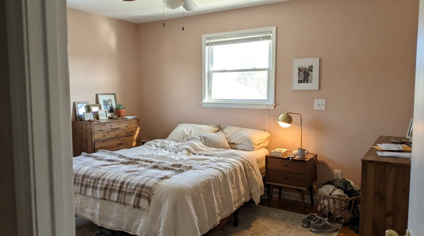
Iced Copper is what you get when a paint company tries to name a color that is neither beige nor pink: a dusty, pink-leaning tan with just enough brown underneath to keep it from reading candy-colored. In good daylight it glows soft and peachy; in a dim room it settles into an ordinary coppery beige. It is a genuinely good answer for anyone who finds beige flat and gray cold, as long as the room has the light to earn the blush.
Bedrooms and bathrooms that want warmth without going full beige · south and west rooms with real daylight · pairing with brass, walnut and warm marble · anyone who wants a hint of pink without committing to a pink room
Your room faces north and stays dim most of the day · you want a true gray or an actual pink, not a blend of both · your fixtures are polished chrome and cool white quartz · you're picturing a bold, saturated copper statement color
- A genuine pink-tan blend — warmer and more interesting than plain beige
- Brown undertone keeps it wearable, not candy-colored
- Flatters brass, walnut and warm marble
- One of the more distinctive exterior stucco colors Behr sells
- Reads as a soft blush at night under warm lamps without feeling like a pink room
- Goes flat and muddy in dim, north-facing rooms
- Fights cool chrome fixtures and stark white quartz
- Not decisive enough for buyers who want a true pink or a true gray
- Depends more on room orientation than most neutrals at this LRV
What Color Is Iced Copper, Really?
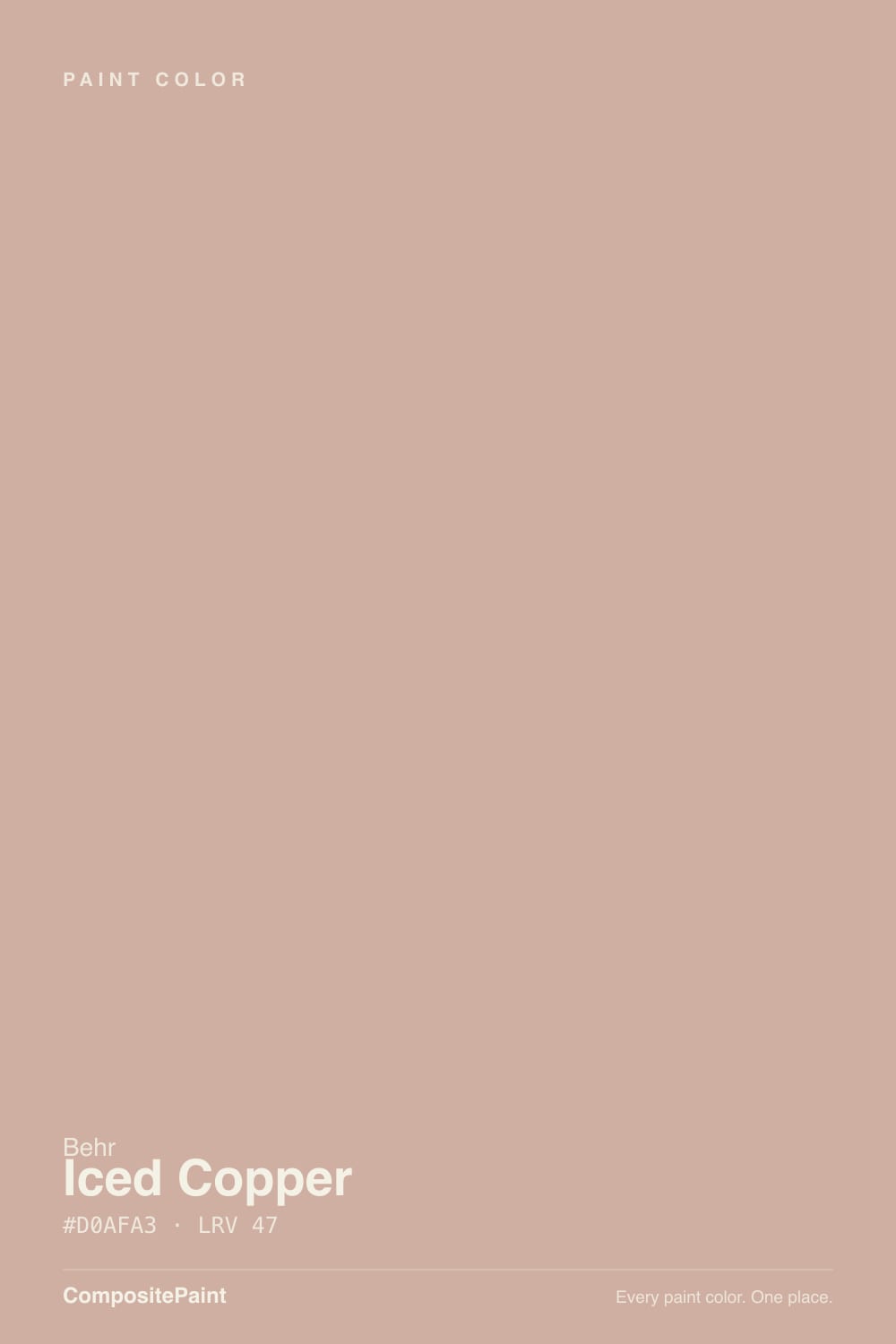
A pink-tan neutral built on a copper base — the name is more literal than most Behr names get. Pull the saturation off a true copper and grey it down with brown, and you land on Iced Copper: a dusty blush-beige that reads warm and a little rosy without ever tipping into an obvious pink. The brown underneath is doing the real work here. It is what keeps the color grounded and wearable on four walls instead of looking like a diluted paint-chip pink.
At LRV 46 it sits squarely in the mid-range: dense enough to hold real color on a wall, light enough not to need a whole design plan built around it. Behr's own guidance on this one is unusually direct about how much the room controls the outcome — a bright, south- or west-facing room pushes the color toward its peachy-pink side, while a north-facing or shaded room pulls it toward a flatter, more coppery brown. Expect the wall to read noticeably different from the chip depending on which windows the room has, more than most neutrals in this LRV range.
Undertone in one line: pink-tan first, copper-brown second — never a clean gray, never a true blush pink. If your sample looks plainly beige, that is a dim room draining the pink out of it; if it looks close to bubblegum, that is strong late-afternoon sun exaggerating the warm side. Both are the same paint, reacting honestly to different light.
Where It Shines
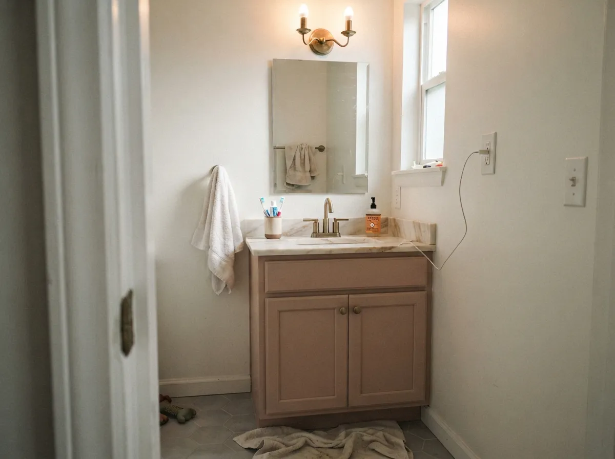
Give it real daylight and warm materials and it earns its name. Bedrooms and bathrooms are its natural home — the blush undertone reads soft and flattering rather than trendy-pink, and it pairs easily with brass fixtures, walnut furniture and warm marble that would look stark against a plain gray or a straight beige. It is also one of the more interesting choices for a Southwest or Mediterranean-style exterior, where Behr itself markets it for stucco: the texture of a stuccoed wall catches the color's warmth and shifts it subtly through the day instead of showing one flat tone.

Where It Fails
Almost every disappointed review of Iced Copper comes down to one of three mismatches, and all three are predictable before the first coat goes on. None of them are the paint failing — they are the paint being exactly what it is in the wrong room.
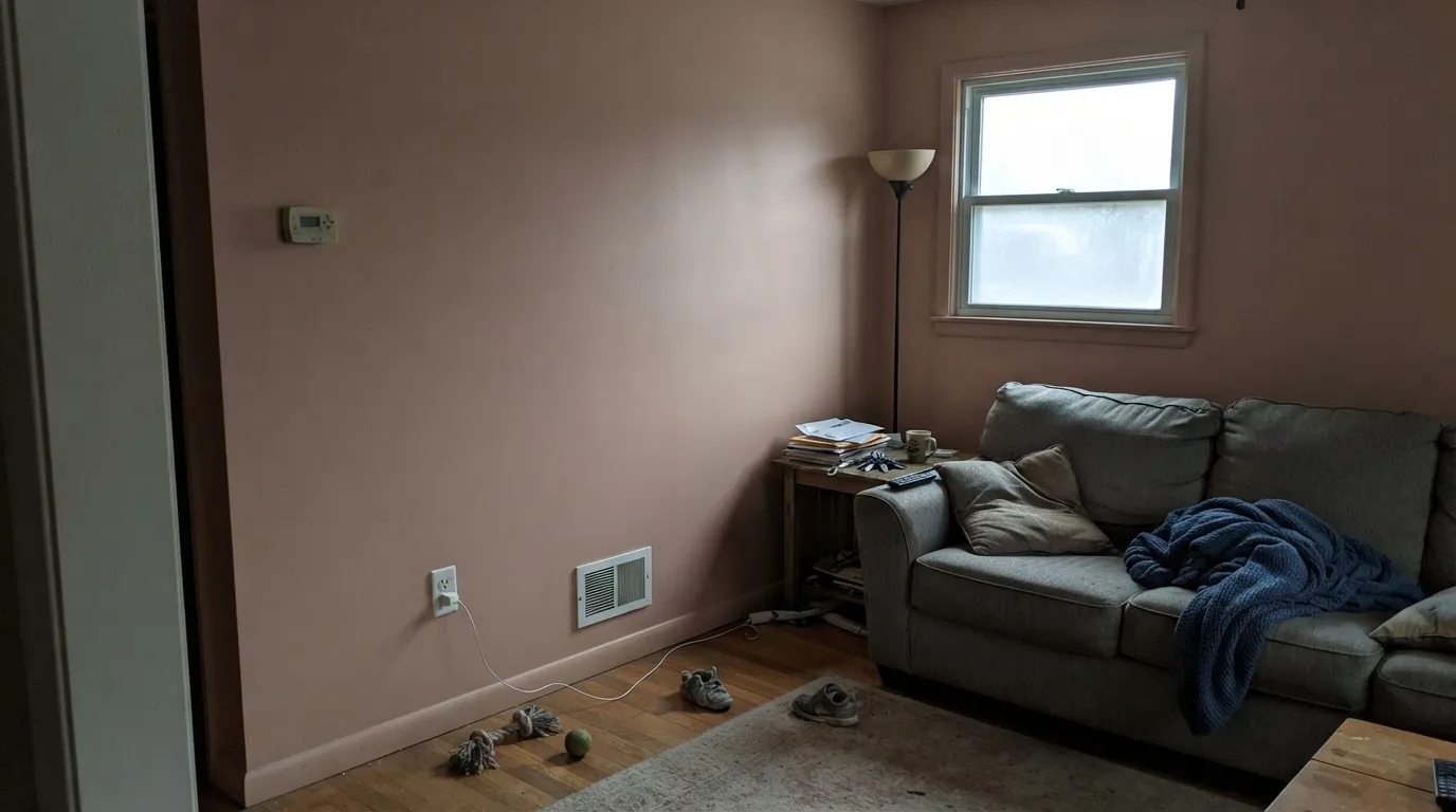
Without direct sun to carry the pink, Iced Copper settles into a flat, slightly muddy coppery-beige — readers describe it as "just beige" or "kind of drab." The color did not change; the light that makes it interesting simply isn't there. Either add warm lamps and accept the quieter version, or move to a color with less riding on daylight, like BM Pashmina.
Polished chrome fixtures and stark cool-white countertops sit at the opposite temperature from this color, and the mismatch reads as the wall looking slightly dirty rather than intentionally warm. Iced Copper wants brass, bronze, or matte black hardware and a warmer stone or butcher block nearby.
This is a genuine blend, not a light pink and not a gray-beige — it is both at once. Buyers hunting for an obvious blush-pink nursery wall end up thinking it's too brown; buyers hunting for a quiet gray-taupe end up thinking it's too pink. If either extreme is the goal, a more decisive color in either direction will make you happier than this compromise.
Room by Room
Warm and calm without being a "pink bedroom." With brass sconces and warm 2700K lamps at night it turns genuinely cozy. Eggshell on the walls, White Dove or SW Alabaster on the trim.
One of its strongest rooms: on a vanity or full bath walls with brass hardware and warm-veined marble or wood-look tile, it reads custom instead of dated. Skip it with polished chrome and cool-gray tile.
In a bright south- or west-facing room, walnut furniture and cream textiles make it feel expensive and unusual. In a north-facing or heavily shaded living room it goes flat fast — check the light before committing to a whole room.
As an island or a breakfast-nook accent under a white or cream wall, it is a genuinely fresh alternative to the usual navy or sage island. A full kitchen of it is a bigger bet, and it needs warm wood or butcher block nearby to avoid looking chalky.
Behr markets this one for exteriors, and stucco especially suits it — the texture catches the color and shifts it through the day instead of showing one flat plane. Works best on Spanish, Mediterranean and Southwest-style homes with white or cream trim; skip it on a shaded north elevation, where it can read dull.
Gentle enough for a nursery without reading as a committed "pink room," but confirm the light first — this is not a color to pick from the chip alone for a room you rarely visit in daylight.
Your Light Is the Risk
The blush comes forward and the color reads peachy-pink and alive without looking artificial. This is the light Iced Copper needs to earn its name.
Cool, flat daylight drains the pink and leaves a dull coppery-brown beige. Sample it on the actual wall before trusting the chip.
Warmer and pinker at the sun hours, quieter and more neutral the rest of the day — a gentle, likable shift most owners enjoy rather than mind.
2700K warm bulbs push it toward a cozy rose-beige at night. Cool white LEDs flatten it back toward plain beige — swap the bulbs, not the paint, if that happens.
Most complaints about Iced Copper are a light mismatch. Upload a photo of your actual room and see it on your walls — then ask for the same wall in north light or evening lamps before you buy a single sample.
Need It From Another Brand?
Any paint counter can custom-tint Behr S200-3 directly. If you would rather stay in one brand's own deck, these are the closest stock matches, measured as ΔE2000. Under 2 is a difference you will not see on the wall.
| Brand | Closest color | ΔE | LRV | |
|---|---|---|---|---|
| Sherwin-Williams | Trek TanSW 7597 · Sherwin-Williams | 0.3 | 46 | Color page → |
| Benjamin Moore | Vintage1174 · Benjamin Moore | 2.2 | 46 | Color page → |
| Valspar | Maple Leaf2008-8B · Valspar | 3.9 | 46.1 | Color page → |
| PPG / Glidden | Sombrero TanPPG16-01 · PPG / Glidden | 1.3 | 45 | Color page → |
| Glidden | Sombrero TanPPG16-01 · Glidden | 1.3 | 45 | Color page → |
| Dutch Boy | Ole Washboard409-3DB · Dutch Boy | 2.8 | 46 | Color page → |
Similar Behr Colors
The nearest shades to Iced Copper within Behr's own range, ranked by perceptual color distance — useful when you want the same look a touch lighter, darker, or warmer.
WCAG 2.1: AA is 4.5 : 1 for normal text, 3 : 1 for large text, AAA is 7 : 1.
Iced Copper vs the Colors You're Also Considering
Every Iced Copper sample board has the same rivals on it. The numbers show the real lightness gap — then it comes down to which risk you would rather live with.
Pick this when you want the pink undertone to actually show, not just hint at itself.
Behr PPU5-13 · LRV 52Creamy MushroomPick this if you want the same warm-pink-in-a-neutral idea but lighter and slightly less committed to the blush.
Pick this for the extra character the blush undertone brings that a straight greige can't.
Benjamin Moore AF-100 · LRV 44PashminaPick this for the same mid-depth warmth with none of the pink risk — a safer whole-house neutral.
Within Behr, Vintage Tea Rose HDC-CT-07A shares the LRV of 47 but its hex, #CBB0A9, holds a little more gray, so it reads calmer. Sweet Tea S210-3 at LRV 49, hex #D4B3A1, is lighter and clearly more tan. Sanderling S220-3 at LRV 45 is the muted, drier option.
Across brands, Benjamin Moore Soul Mate 1179 at LRV 45 is a deltaE of 0.96 from Iced Copper, which is the same color for practical purposes. Valspar Damask Dunes 1006-10B at LRV 45.1, Glidden Velveteen Crush PPG1060-4 at LRV 46, and Dutch Boy Ole Washboard 409-3DB at LRV 46 sit between 1.2 and 1.54 and will look identical in normal room light.
Sherwin-Williams Trek Tan SW 7597 at LRV 46 is a deltaE of 3.34, so it is very close but sample it first; it leans tanner. Farrow and Ball Templeton Pink No. 303 at LRV 47 is 4.67 away and reads visibly different side by side.
Iced Copper Coordinating Colors
The rule for coordinating with Iced Copper is to stay warm: warm whites for trim, warm woods and metals for furniture and hardware, and either a deeper earth tone or a confident dark for contrast. It fights cool grays, chrome, and stark white marble more than most neutrals its depth. These are the partners that keep showing up in rooms that work:
Why Behr Calls a Pink-Tan Neutral "Copper"
Iced Copper's name is a little more honest than most paint names once you see the logic: take a true metallic copper, strip out the shine and most of the orange, and grey it down with brown until it settles into a wearable wall color. What's left is a color that never looks like literal copper metal, but keeps just enough of that warm reddish cast to earn the name instead of just being called another beige.
It has not had a Color of the Year moment and probably won't — it is a quiet, useful neutral rather than a trend color, which is exactly why it holds up well as a long-term choice for a bedroom, a bath, or a stucco exterior rather than something you'll want to repaint in five years.
Iced Copper With Wood Tones and Floors
Warm wood is this color's best friend. Walnut, honey oak, and reclaimed or reddish-brown wood tones all pick up on the copper undertone and make the pairing feel deliberate rather than accidental. Brass and warm bronze hardware do the same job in metal.
The floors that need a sample first are cool gray LVP, gray-washed hardwood, and blue-gray tile. Against those, Iced Copper's pink comes forward more than it does against warm wood, and the combination can start to look mismatched rather than intentional. A warm area rug helps bridge the gap if the floor is staying and can't be changed.
Three Ready Palettes Built on Iced Copper
A color is never alone on the wall. These are complete combinations in the 60-30-10 pattern, with the reason each one holds together. Every one opens in the visualizer.
A warm white trim keeps the blush from feeling too sweet, and Chelsea Gray's charcoal-greige gives the room one grounded dark note so the pink reads sophisticated instead of soft-focus.
Try this palette in your roomKeeping the vanity as the only saturated surface lets the blush read intentional against a warm off-white wall. Maple Glaze's caramel-brown ties the wood tones in the room back to the vanity without adding a second competing color.
Try this palette in your roomCrisp white trim keeps the stucco's warmth from looking dated, and a near-black door supplies the one dark accent that reads modern-Southwest instead of purely traditional adobe.
Try this palette in your roomIced Copper FAQ
Is Iced Copper pink or beige?
Both, deliberately. It is a pink-tan neutral: enough brown underneath to keep it from reading as an obvious pink, enough pink to keep it from reading as plain beige. In bright rooms the pink shows more; in dim rooms it settles toward ordinary beige.
What is the LRV of Iced Copper?
46 — a genuine mid-tone. It holds its color in a bright room without needing extra depth, but it is not light enough to bounce much brightness into a dim one.
Does Iced Copper work on an exterior?
Yes — Behr markets it specifically for exteriors, and it looks especially good on stucco, where the texture catches the color's warmth. It suits Southwest and Mediterranean-style homes best; a shaded north wall will read duller than the chip suggests.
What trim color goes with Iced Copper walls?
A warm white — SW Alabaster, Behr Swiss Coffee, or BM White Dove all work. A stark, cool white trim fights the blush instead of framing it.
Will it look too pink in a bedroom?
Not in most rooms. The brown undertone keeps it from tipping into an obvious pink even in strong daylight. If your room is very bright and south-facing and you're nervous about pink, sample a large board first and check it at midday.
Does it work with gray or cool-toned floors?
It is safer with warm floors — walnut, honey oak, warm-veined marble. Cool gray LVP or blue-gray tile will pull the color's pink into sharper relief and can look mismatched; test a large sample against the actual floor before committing a whole room.
Have you painted with Iced Copper?
Rate it — one tap helps the next reader decide.
Ask a Question