Fast As The Wind
A quiet cool gray Behr mostly sells for siding, reviewed honestly: the real undertone behind the "blue sky" name, where it earns 4.8-star exterior reviews, and where it goes flat indoors.

Jessica has spec'd whites and neutrals for more than 300 rooms and keeps a sample wall of painted drawdowns in her studio. Every color review is checked against real reader rooms in the comments and re-tested when a formula changes. About the testing process →
- 1Stardew43
- 2Quietude48
- 3Fast As The Wind59
- 4Gray Owl65
- 5Glass Slipper70
The Fast Verdict
Fast As The Wind is a cool, quiet light gray with almost no undertone drama — not the blue the name promises, just a genuinely near-neutral gray with the faintest green whisper. It never got a Color of the Year moment or a design-blog write-up; what it got instead is a spot in nearly every Behr exterior line — Ultra, Marquee, Premium Plus, in flat, satin and semi-gloss — and a 4.8-out-of-5 rating from hundreds of people who actually painted their house with it. That is the honest pitch: a dependable siding gray, not a hero color.
Exterior siding and trim on modern-farmhouse or craftsman houses · quiet interior accents and powder rooms · pairing with true white trim and black windows · buyers who want a cool gray with zero drama and no viral backstory
You picked it hoping for the "blue sky" the name advertises · your exterior is warm brick or honey stone · you're chasing a famous, Pinterest-viral color · your interior room is dim, north-facing and lamp-free
- A genuine near-neutral cool gray with almost no undertone drama
- Proven exterior performer across every Behr paint line, with a real 4.8-star rating behind it
- Pairs cleanly with true white trim and black windows or doors
- Reads clean and modern without tipping icy-blue or muddy-flat
- Works as a quiet interior accent without demanding a whole-house commitment
- The "blue sky" marketing oversells it — the real color is a near-neutral gray, not blue
- No Color of the Year status, no design-press coverage, almost nothing written about it as an interior wall color
- Goes flat and slightly institutional in a dim, lamp-free north room
- Clashes with warm brick, honey stone, and golden trim
What Color Is Fast As The Wind, Really?
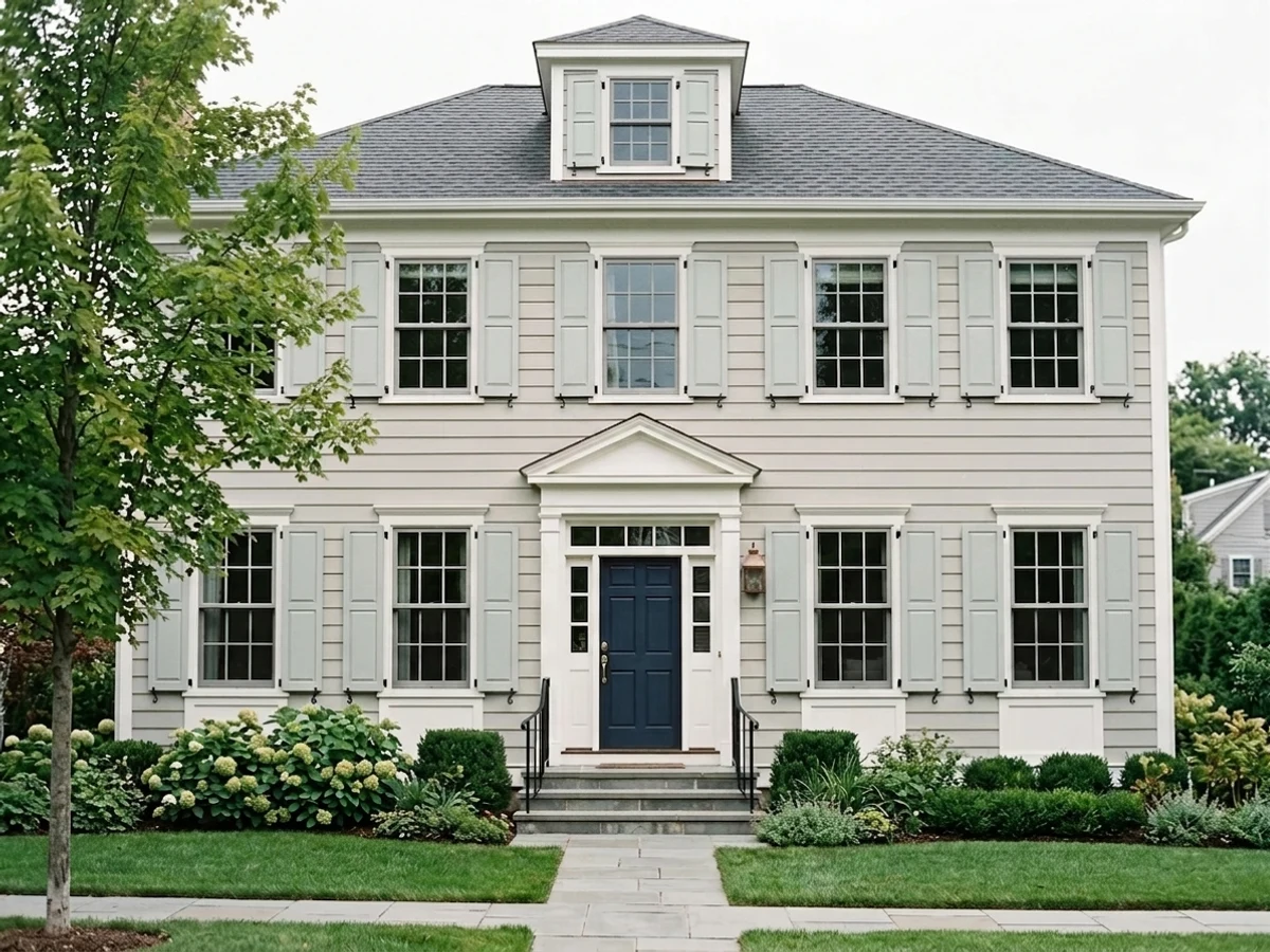
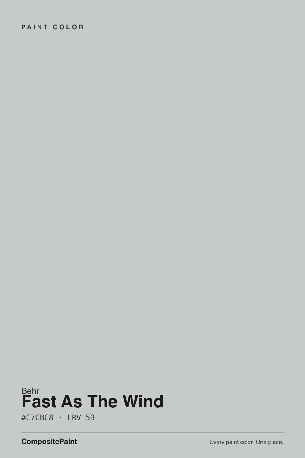
A cool, light, near-neutral gray with almost no undertone bias — not warm, not distinctly blue, not distinctly green, just quiet. At LRV 59 it sits in the same mid-light band as Benjamin Moore Stonington Gray and Sherwin-Williams Repose Gray, and it behaves the same way those two do: clean and gray in bright light, and ready to pick up a faint cast from whatever surrounds it in dimmer light. Behr's own listings lean into the name and describe it as carrying "a touch of blue sky," but independent color tools that log its raw values call it out as a pure neutral with, if anything, the barest green whisper rather than blue — the marketing oversells the sky reference more than the paint delivers it.
The more telling fact isn't the undertone, it's where this color actually gets used. Search the SKU and you don't find a wall-color feature or a designer roundup — you find it stocked across nearly every Behr exterior product: Ultra flat exterior, Marquee flat exterior, Premium Plus Ultra satin enamel exterior, Premium Plus semi-gloss enamel exterior. It's a working siding gray, the color a painter reaches for on a modern-farmhouse repaint, not a color a magazine photographs. The one exterior listing with hundreds of reviews sits at 4.8 out of 5 — genuinely well-liked, just never marketed as anything more than reliable.
Undertone in one line: cool and close to true neutral, with the faintest green-gray whisper — never the blue the name implies. If your sample reads flat gray-on-gray, that's dim light doing what dim light does to every quiet neutral; it is not a defect in the paint.
Where It Shines
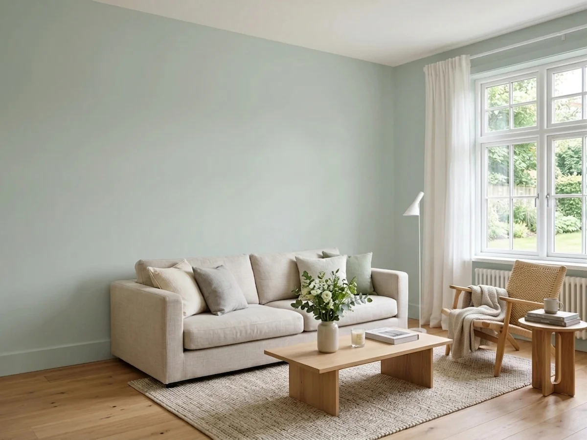
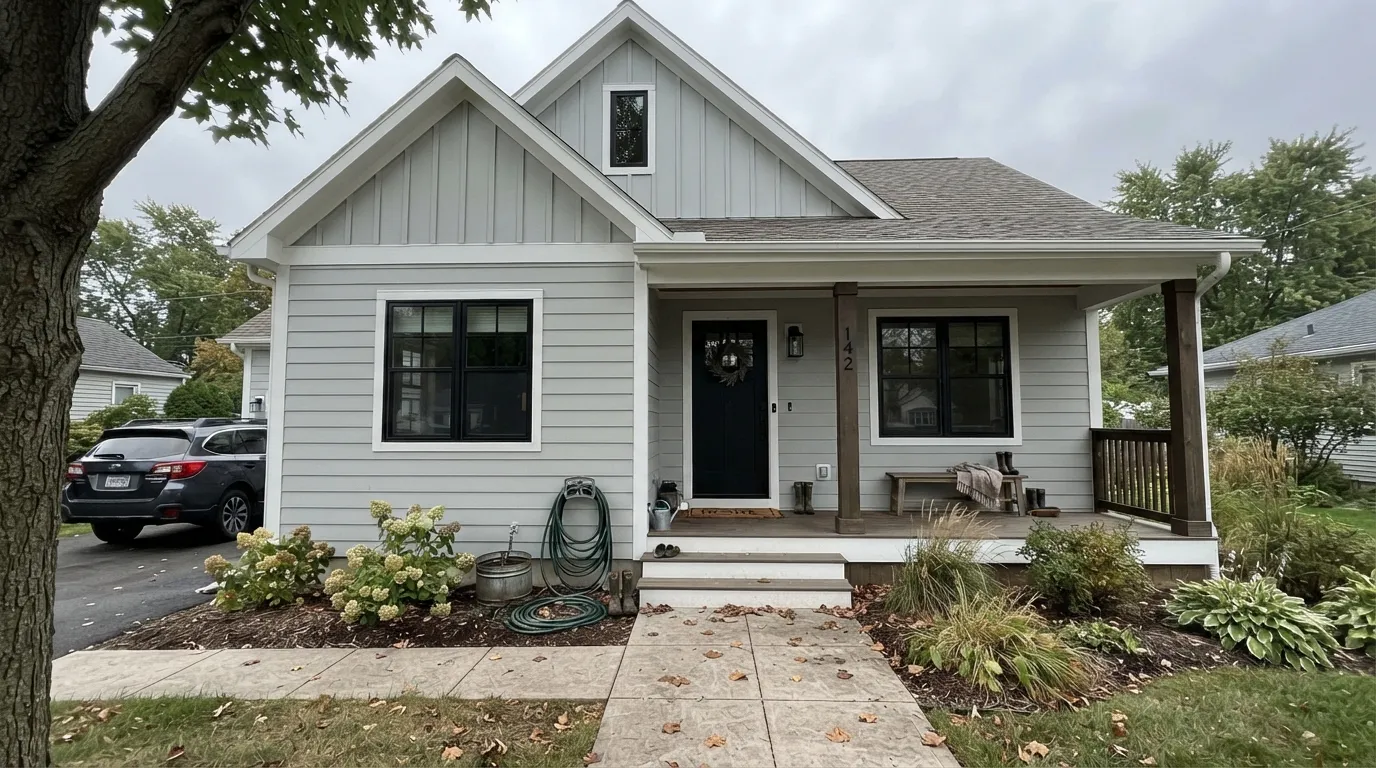
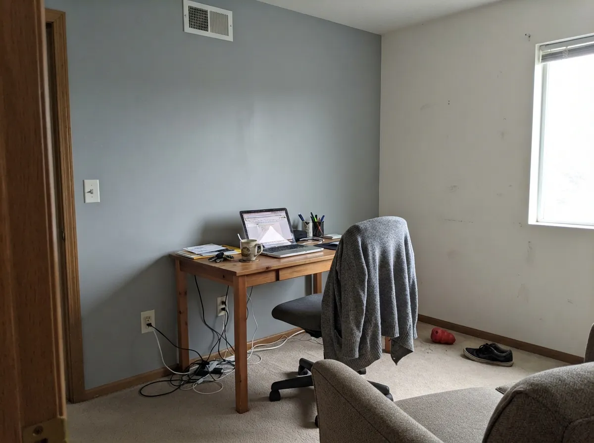
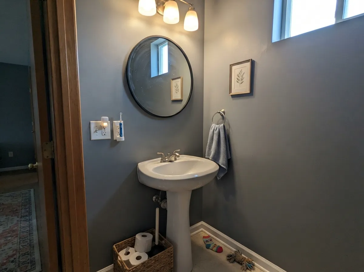
Give it an exterior wall and honest daylight and this is where the color earns its rating. Overcast and bright-diffuse light are its best friends — no harsh glare, no washed-out highlights, just a clean, modern gray that reads intentional next to white trim and black windows. Indoors it plays a smaller, quieter role: a powder room, an accent wall, a room that already has warm lamps doing the emotional work, where its job is to stay out of the way rather than make a statement.
Where It Fails
Most of the disappointment with Fast As The Wind traces back to one of three mismatches, and every one of them is avoidable before you buy the gallon.
"A touch of blue sky" is Behr's own line, and it sets buyers up to expect a blue-gray. On the wall it reads as a cool, close-to-neutral gray with barely a green whisper — not blue. If you actually want a gray that shows real blue, look at SW Cadet or SW Stardew instead; both wear the blue Fast As The Wind's name only implies.
This is a cool color choosing a cool lane, and warm masonry doesn't meet it halfway. Against honey-toned brick or golden stone the siding reads flatter and slightly institutional while the brick pushes orange — both sides lose the argument. White or black trim reads far better against warm masonry than this gray does.
Like every near-neutral gray with a low undertone bias, it has nothing warm to fall back on when the light goes cool and dim. Readers who like it as siding in full sun should expect a flatter, slightly institutional gray if they repeat it on an interior wall that never sees direct daylight. Warm 2700K lamps fix this cheaply; repainting is the expensive fix.
Room by Room
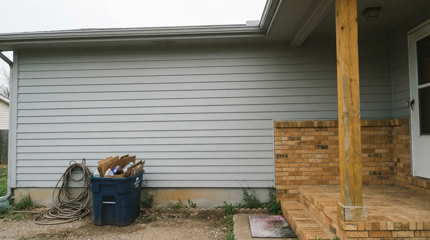
The reason this color exists in the deck at all. Across Behr's Ultra, Marquee and Premium Plus exterior lines it holds a clean, modern gray in daylight and pairs cleanly with true white trim, black windows, or a black front door. Satin or semi-gloss for the body coat; expect the rating (4.8 out of 5 on the flagship exterior listing) to be earned, not hyped.
Works as the lighter half of an exterior scheme too — trim and shutters over a deeper charcoal or navy body color, where its job is to stay crisp and neutral rather than compete.
In a bright room it reads as a clean, modern gray that doesn't fight furniture colors. Pair with a true white trim, not a warm cream one, or the trim will look chalky against it.
Quietly restful in daylight; needs warm 2700K bulbs at night so it doesn't slide into flat institutional gray once the sun is down.
Cool white or gray tile: excellent, no fighting. Warm cream or beige tile: the gray reads colder and slightly at odds — sample against the actual tile before committing.
Not a color with a documented cabinet following the way Sea Salt or Silver Drop have. Works fine as an island or a single wall against white perimeter cabinets, but there's little real-world evidence for a full kitchen of it — sample first.
Your Light Is the Risk
Bright, diffuse cloud light is where this color is most itself: clean cool gray, no glare, no harsh shift. Exactly the light most siding gets most days.
Without warmth to borrow, it drops toward flat, slightly institutional gray. Fine outdoors where nobody stares at it up close; disappointing on an interior wall.
The faint green whisper strengthens a little at midday and softens toward true gray morning and evening — a gentle shift, not a new color.
2700K lamps pull a faint gray-taupe warmth into it at night. Cool LEDs sharpen the green-gray edge and can read sterile — warm bulbs are worth the swap indoors.
Most complaints about Fast As The Wind are a light mismatch. Upload a photo of your actual room and see it on your walls — then ask for the same wall in north light or evening lamps before you buy a single sample.
Need It From Another Brand?
Any paint counter can custom-tint Behr PPU26-17 directly. If you would rather stay in one brand's own deck, these are the closest stock matches, measured as ΔE2000. Under 2 is a difference you will not see on the wall.
| Brand | Closest color | ΔE | LRV | |
|---|---|---|---|---|
| Sherwin-Williams | Gray ScreenSW 7071 · Sherwin-Williams | 1.6 | 59 | Color page → |
| Benjamin Moore | Metro Gray1459 · Benjamin Moore | 2.2 | 58 | Color page → |
| Valspar | Gray Morn8006-11B · Valspar | 2.9 | 59 | Color page → |
| PPG / Glidden | Pittsburgh GrayPPG0994-2 · PPG / Glidden | 0.5 | 59 | Color page → |
| Glidden | Pittsburgh GrayPPG0994-2 · Glidden | 0.5 | 59 | Color page → |
| Dutch Boy | Silvery Gray436-2DB · Dutch Boy | 2.2 | 59 | Color page → |
Similar Behr Colors
The nearest shades to Fast As The Wind within Behr's own range, ranked by perceptual color distance — useful when you want the same look a touch lighter, darker, or warmer.
WCAG 2.1: AA is 4.5 : 1 for normal text, 3 : 1 for large text, AAA is 7 : 1.
Fast As The Wind vs the Colors You're Also Considering
Every Fast As The Wind sample board has the same rivals on it. The numbers show the real lightness gap — then it comes down to which risk you would rather live with.
Pick this when you want the quieter, more neutral version with less color to manage.
Sherwin-Williams SW 6204 · LRV 63Sea SaltPick this if you want the same cool-gray-green family with more personality — Sea Salt leans greener and warmer under good light.
Pick this for the cooler, more consistent gray that changes less room to room.
Behr PPU18-19 · LRV 60Silver DropPick this for the warmer Behr sibling — Silver Drop leans greige and shifts more with the room around it.
Inside the Behr deck, Burnished Metal (UL260-17) at hex #C7CAC9 and LRV 59 is almost the same paint. Graycloth (PPU26-09) at #CCC9C5 and LRV 59 and Dolphin Fin (790C-3) at #CCCAC4 lean slightly warmer, while Chicago Fog (N140-2) at #CACCCD and LRV 60 leans slightly cooler and bluer.
Across brands, PPG Pittsburgh Gray (PPG0994-2) at #C8CBC8 and LRV 59 has a deltaE of 0.48, which is a genuine match. Farrow & Ball Skylight (No. 205) at LRV 61 is 1.31 and Sherwin-Williams Gray Screen (SW 7071) at LRV 59 is 1.62, both visually identical in normal room light.
Benjamin Moore Metro Gray (1459) at 2.17 and Valspar Gray Morn (8006-11B) at 2.86 are very close but worth sampling first, since small hue shifts show up on a big wall. Portola Paints Lumiere at 4.18 is close but visibly different side by side, reading warmer and creamier.
Fast As The Wind Coordinating Colors
The rule for coordinating with this color is simple: stay cool. It pairs cleanly with true whites, black or charcoal accents, and its own close cousins from other brands — and it visibly loses ground against warm creams, honey wood, and golden masonry. These are the partners that actually work with it:
An Honest Workhorse, Not a Trend Color
Every famous paint color has a story: a Color of the Year announcement, a viral renovation, a design-blog feature. Fast As The Wind has none of that, and that absence is itself the honest story. Search the SKU and the results are almost entirely product listings — Behr Ultra, Marquee and Premium Plus, sold as an exterior flat, satin or semi-gloss — not a single roundup of "best gray paint colors" or a designer testimonial.
What it does have is a genuine track record where people actually vote with a purchase: the flagship exterior listing holds a 4.8-out-of-5 rating across hundreds of reviews. That's a color doing its job quietly on real houses, not a color chasing attention. If you want the safety of a widely-praised bestseller with press coverage to match, this isn't quite that; if you want a dependable, honestly-unhyped cool gray for a repaint, the reviews back it up.
Fast As The Wind on Exteriors
This is the color's real home. Across every Behr exterior product line it holds a clean, cool gray in ordinary daylight — not the glare-prone brightness of a near-white, not the maintenance headache of a dark body color, just a dependable modern-neutral siding gray. It reads best against true white trim and black or charcoal windows and doors; the contrast does the visual work the gray itself doesn't try to.
What to avoid outside: warm brick, honey-toned stone, and golden-stained wood trim. All three sit on the opposite temperature and the pairing reads flatter and slightly off rather than intentional — if your house has any of those elements, sample a large board against them in full sun before committing to gallons.
Three Ready Palettes Built on Fast As The Wind
A color is never alone on the wall. These are complete combinations in the 60-30-10 pattern, with the reason each one holds together. Every one opens in the visualizer.
The classic modern-farmhouse split: a cool quiet gray body, true white trim for crisp edges, and a near-black door for the one dark note the eye needs. All three stay cool together, so nothing fights.
Try this palette in your roomA warm trim white keeps a single cool-gray wall from reading cold, and a soft near-black door supplies the depth this quiet color doesn't try to provide on its own.
Try this palette in your roomThree near-identical LRV, cool-neutral grays from three different brands can share a house without a seam — each one nudges a shade warmer or greener, close enough that the handoff between rooms feels deliberate, not mismatched.
Try this palette in your roomFast As The Wind FAQ
Is Fast As The Wind blue or gray?
Gray, mostly. Behr's own description mentions "a touch of blue sky," but on the wall it reads as a cool, near-neutral gray with at most a faint green whisper — not a visible blue. If you want a color that actually reads blue, look at SW Cadet or SW Stardew instead.
Is it good for exterior siding?
Yes — this is genuinely where it's most used and most reviewed. It's stocked across Behr's Ultra, Marquee and Premium Plus exterior lines in flat, satin and semi-gloss, and the flagship exterior listing carries a real 4.8-out-of-5 rating from hundreds of buyers.
What trim color goes with it?
A true white — Behr Ultra Pure White or a similarly crisp white — keeps the edges clean on an exterior. A warm cream trim will look slightly chalky against this cool a gray; black or charcoal windows and doors add the contrast the body color doesn't provide on its own.
Is it a good interior wall color?
It can be, in the right room — bright, with real daylight or warm lamps. It has almost no track record as an interior color compared to its exterior use, so treat it as an accent-wall or powder-room candidate rather than a proven whole-house interior default.
How does it compare to Sea Salt or Silver Drop?
All three are cool, near-neutral grays in the same LRV neighborhood. Sea Salt (SW 6204) leans greener and more colorful; Silver Drop (Behr's own sibling) leans warmer and shifts more from room to room; Fast As The Wind sits in between as the quietest, most consistent of the three.
Why isn't there much written about this color?
It never had a Color of the Year moment or a design-press feature — it's a working exterior gray, bought by people repainting a house, not a color magazines photograph. The customer data that exists (hundreds of exterior reviews at 4.8 stars) says it performs; it just never got marketed as more than that.
Have you painted with Fast As The Wind?
Rate it — one tap helps the next reader decide.
Ask a Question