Deep Breath
The dark teal-navy Behr sells across three paint lines and never turns into a marketing moment, reviewed honestly: where it reads like ink, where it reads black, and what to pick instead.

Jessica has spec'd whites and neutrals for more than 300 rooms and keeps a sample wall of painted drawdowns in her studio. Every color review is checked against real reader rooms in the comments and re-tested when a formula changes. About the testing process →
- 1Dark Night4
- 2Deep Breath9
- 3Hidden Gem14
- 4Van Courtland Blue31
The Fast Verdict
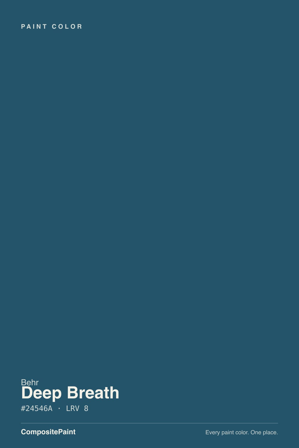
Deep Breath is a genuine dark blue with just enough green in it to read teal in some light and pure navy in others — a gray base keeps it from ever going candy-bright. At LRV 9 it sits at the near-black end of the deck, so it needs real light or a warm bulb to prove it is blue at all; without either, it is simply a dark, quiet wall. Behr sells it across Marquee, Dynasty and Premium Plus rather than pushing it as a hero color, which tells you what it actually is: a dependable dark-blue workhorse for cabinets, doors and one committed wall, not a color built for a marketing campaign.
Kitchen cabinets and islands · bathroom vanities · a front door · a dining room or study with real daylight or lamps · one committed accent wall
The room has one small window and no lamps · you want it to read the same blue all day · you are chasing a specific viral shade (this is not that) · your hardware and trim are cool steel-gray
- A real blue-green, not another near-black brown or charcoal
- Sold across Marquee, Dynasty and Premium Plus — genuinely built for cabinets, trim and doors
- Holds its color well in full daylight and warm lamp light
- Small doses (vanity, door, island) look deliberate and current
- Stain-blocking Dynasty formula available for exterior doors and trim
- At LRV 9, needs real light or it reads as a flat dark neutral, not blue
- Visibly picks up cool gray or chrome neighbors and can read muddy
- Streak- and lap-mark-prone on a first coat over light colors without careful technique
- No design-blog or Color of the Year fame — you are on your own for inspiration photos
What Color Is Deep Breath, Really?
A deep blue-green built on more blue than green — Behr's own color-family listing files it under Blue, not Green, and the numbers back that up. The gray folded into the mix is what keeps it from reading like a bright, cartoonish teal; instead it lands closer to ink, or a very dark denim. It carries none of the branding a Hale Navy or a Naval gets — no Color of the Year campaign, no design-blog origin story — just a standard-deck code (S460-7) that Behr distributes across its Marquee one-coat line, its Dynasty stain-blocking interior/exterior line, and Premium Plus. That spread is the real signal: it is positioned as a flexible, everyday dark color for cabinets, trim and doors, not a statement color with a name people search for on its own.
At LRV 9, Deep Breath sits at the near-black end of any deck — for comparison, most "safe" navies land in the 8-15 range and this is at the bottom of it. That depth means direct light or warm lamps is doing real work here: cut off the light and the color reads as a flat, dark neutral with no visible undertone at all. Give it a south or west window, or a warm 2700K bulb at night, and the blue-green comes forward and the paint looks intentional rather than simply dark.
Undertone in one line: blue first, a touch of green second, softened by gray — never purple, never true black. If your sample looks plain black, that is a light problem, not a paint problem; if it looks greener than you expected, check what is sitting next to it — Behr's own guidance flags that this color visibly borrows color from whatever trim, counter or floor surrounds it.
Where It Shines
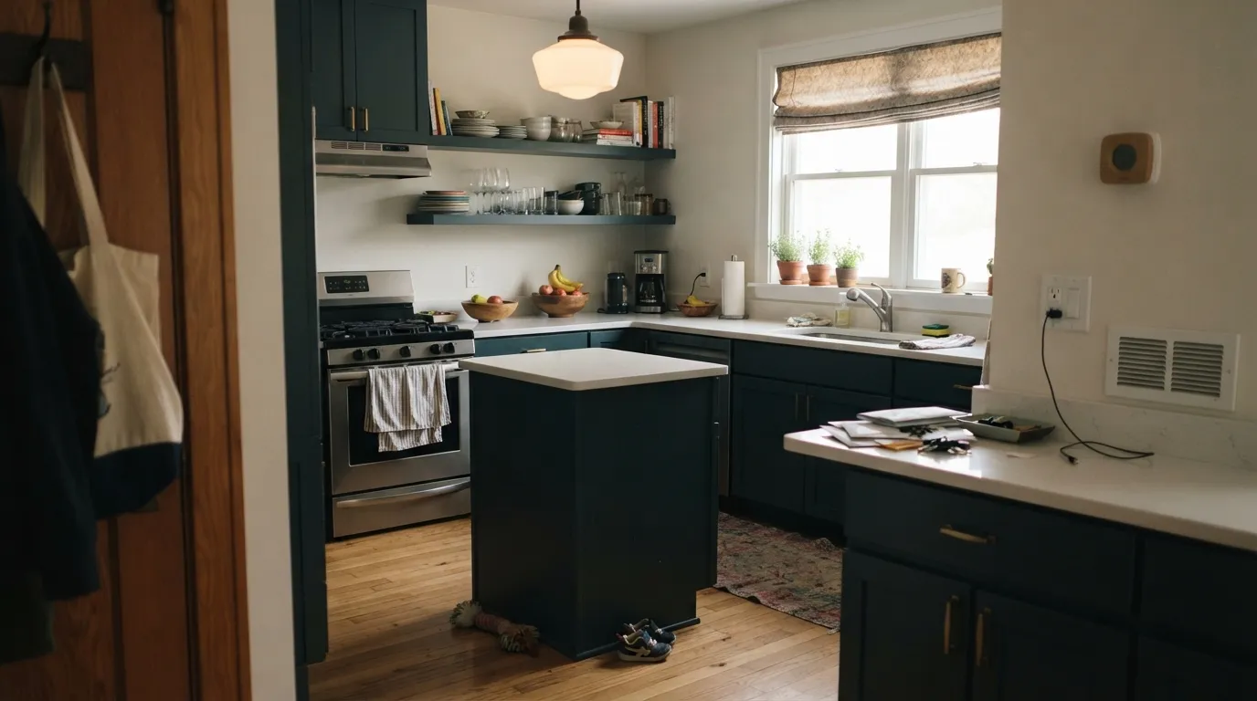
This is a color built for surfaces, not entire rooms in weak light. On lower cabinets or a kitchen island under real daylight it reads as a sophisticated ink-navy against white counters and brass hardware — exactly the look the Marquee and Dynasty one-coat formulas are marketed for. On a front door or bathroom vanity it does the same job in miniature: enough color to feel deliberate, small enough that the near-black depth is a feature, not a liability. Give it warm wood, aged brass and a cream or white partner, and it looks like a considered choice rather than a placeholder for black.
Where It Fails
Almost every disappointing outcome with Deep Breath comes down to one of three predictable mismatches, and none of them are a defect in the paint itself.
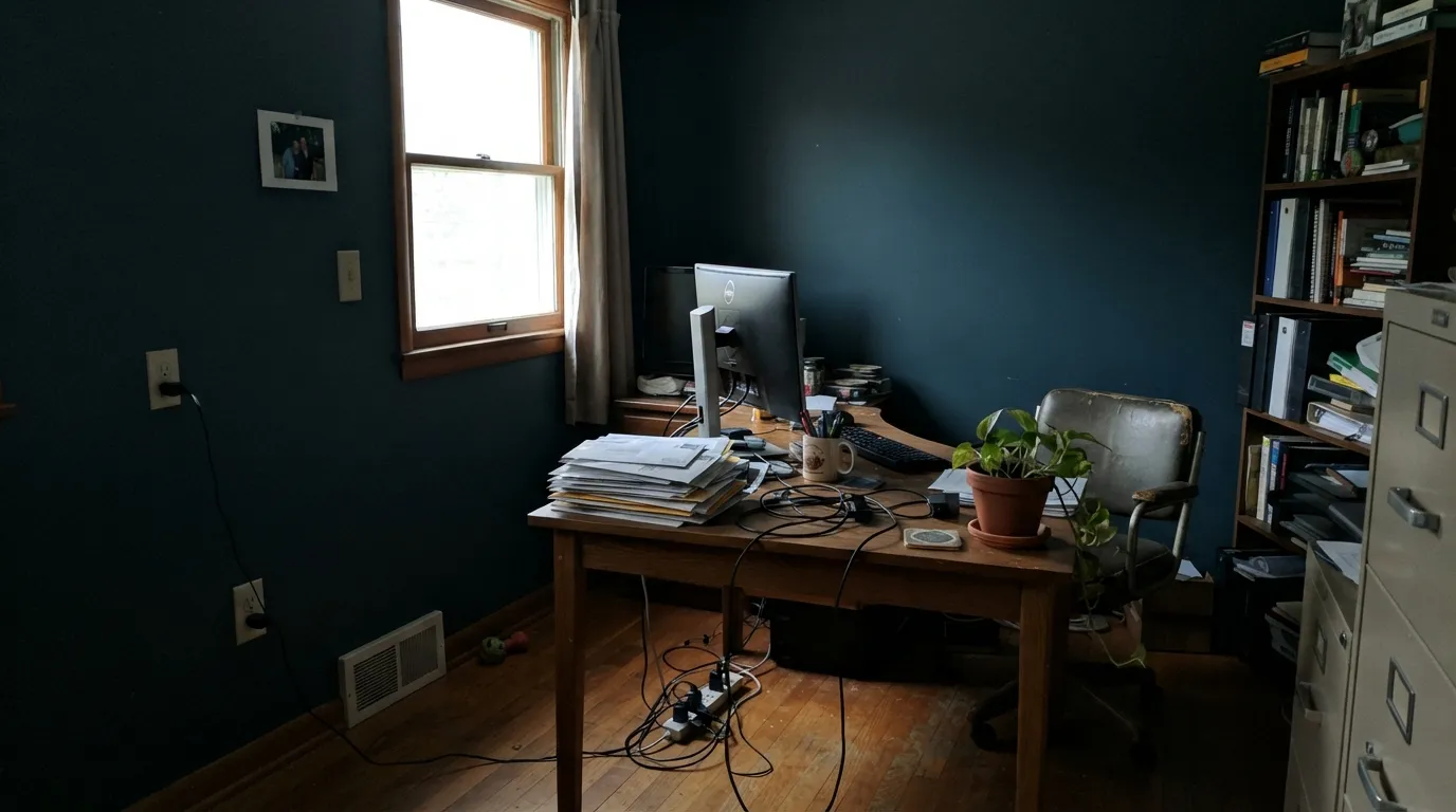
At LRV 9 this color has almost nothing to reflect. In a small room with one north window and no lamps, it does not read as "moody blue" — it reads as a plain dark wall, and most of its character disappears. If the room cannot offer daylight or warm bulbs, this is the wrong color for four walls; use it on a single surface instead.
Behr's own note on this color is specific: it visibly picks up whatever sits next to it. Cool gray countertops, chrome hardware or a stainless range can push the undertone toward flat, slightly muddy gray-teal instead of the crisp ink-blue it shows next to brass and warm wood. Test your actual sample against your actual counters and hardware, not just the paint chip on white paper.
This is a genuinely dark, saturated color going over a much lighter surface, and even the one-coat Marquee and Dynasty formulas need a careful, consistent roller technique to avoid visible lap marks at this depth. Cheaper Premium Plus or chalk-paint applications without back-rolling are the most common source of streaky, uneven-looking cabinets and doors in this color — budget for two full coats and a light second coat regardless of what the can promises.
Room by Room
This is the use Behr actually built the color for, spanning three of its product lines. Satin Deep Breath lower cabinets against white or pale stone counters and brass pulls is a classic, dependable look. Full-height upper cabinets in this color need real kitchen light or they go flat.
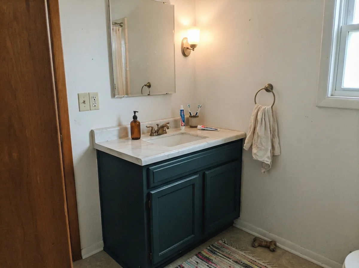
A small vanity is the ideal scale: enough color to feel custom, small enough that the near-black depth reads as intentional. Satin or semi-gloss for durability near water; pair with a warm-white wall rather than cool gray tile.
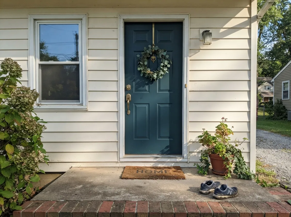
The Dynasty line's interior/exterior stain-blocking formula is built for exactly this. Semi-gloss Deep Breath against a white or warm-neutral house body reads as classic and current at once, and full outdoor sun gives it more light than most interior walls ever will.
In a room with daylight or evening lamps, this is a genuinely good moody-dark choice for people who want blue rather than the more common near-black green or brown. Skip it in a windowless dining room with only overhead cans.
One wall behind a bed under warm lamp light is a safe, striking use. Four walls in a bedroom that only gets morning light or overhead LEDs will read as a plain dark room rather than a blue one.
It holds its color well in full sun and reads as a confident dark blue against white or light-greige siding. It will not read as green outdoors the way it occasionally can indoors next to cool surfaces — direct sunlight settles the undertone.
Your Light Is the Risk
South or west sun, or a 2700K bulb at close range, is what makes the blue-green actually visible. This is the light the color needs to do its job at all.
With almost no light to reflect at LRV 9, it drops most of its color and reads as a plain dark wall. Test with the room's actual evening light, not just daytime.
Morning light can leave it looking closer to charcoal; midday and afternoon sun pull the blue-green forward. Expect real movement, not a static color.
Warm bulbs deepen it toward a rich ink-navy at night. Cool white LEDs flatten it and can make it look closer to plain black — swap the bulb before you swap the paint.
Most complaints about Deep Breath are a light mismatch. Upload a photo of your actual room and see it on your walls — then ask for the same wall in north light or evening lamps before you buy a single sample.
Need It From Another Brand?
Any paint counter can custom-tint Behr S460-7 directly. If you would rather stay in one brand's own deck, these are the closest stock matches, measured as ΔE2000. Under 2 is a difference you will not see on the wall.
| Brand | Closest color | ΔE | LRV | |
|---|---|---|---|---|
| Sherwin-Williams | Endless SeaSW 9150 · Sherwin-Williams | 3.8 | 9 | Color page → |
| Benjamin Moore | In the Midnight Hour1666 · Benjamin Moore | 3.1 | 10 | Color page → |
| Valspar | Deep Twilight Blue4007-6C · Valspar | 2.6 | 8.6 | Color page → |
| PPG / Glidden | OceaniaPPG10-01 · PPG / Glidden | 2.1 | 10 | Color page → |
| Glidden | OceaniaPPG10-01 · Glidden | 2.1 | 9 | Color page → |
| Dutch Boy | Alaskan Night337-6DB · Dutch Boy | 3.4 | 9 | Color page → |
Similar Behr Colors
The nearest shades to Deep Breath within Behr's own range, ranked by perceptual color distance — useful when you want the same look a touch lighter, darker, or warmer.
WCAG 2.1: AA is 4.5 : 1 for normal text, 3 : 1 for large text, AAA is 7 : 1.
Deep Breath vs the Colors You're Also Considering
Every Deep Breath sample board has the same rivals on it. The numbers show the real lightness gap — then it comes down to which risk you would rather live with.
Pick this when you specifically want blue to read as blue, not teal, once the light hits it.
Behr MQ6-01 · LRV 8Ocean AbyssPick this if you want the same near-black depth pulled further toward green — Ocean Abyss reads teal-forward, Deep Breath reads blue-forward.
Pick this if you want a color with a hint of green depth rather than a flat, uncomplicated navy.
Sherwin-Williams SW 6244 · LRV 4NavalPick this for a true navy with the green stripped out entirely — Naval reads navy in almost any light, no undertone debate.
Pick this for more depth and more green character at a nearly identical near-black LRV.
Benjamin Moore HC-155 · LRV 7Newburyport BluePick this for a slightly lighter, more slate-leaning dark blue with a longer design pedigree.
Pick this when you want the deepest, most dramatic version of this blue-green, not a softened one.
Benjamin Moore HC-156 · LRV 11Van Deusen BluePick this if LRV 9 feels like too much commitment — Van Deusen Blue is the same family a full step lighter and easier to live with in average light.
Midnight In The Tropics S480-7 shares the same LRV of 8 but its hex of #2C5469 is slightly grayer, so it looks a touch quieter on a wall. Blue Spell 550F-7 at LRV 8 with hex #245673 is the bluer option, better if the green in Deep Breath reads too teal for you. Undersea S470-7 at #335261 is noticeably duller and reads closer to a slate.
Across brands the closest matches are tight. Glidden Plymouth Blue PPG13-27 at LRV 7 measures a deltaE of 1.16, and Dunn-Edwards Navy Teal DE5832 at LRV 8 measures 1.26. Benjamin Moore Slate Teal 2058-20 at LRV 9 comes in at 1.64 and Dutch Boy Seawater Blue 235-7DB at 1.77. All four are visually identical in normal room light.
Sherwin-Williams Marea Baja SW 9185 at LRV 8 sits at deltaE 2.36 and reads a bit grayer, so it is very close but worth sampling first. Kompozit Queen of the Night 0655 at LRV 9 measures 4.25 and is lighter and bluer, close but visibly different side by side.
Deep Breath Coordinating Colors
The rule for coordinating with Deep Breath: warm whites and warm neutrals bring out its blue, cool grays pull it toward murky. It pairs best with brass, warm wood and a soft off-white, and works as a near-black contrast partner when you want two dark notes instead of one.
One Code, Three Paint Lines: A Workhorse, Not a Hero Color
Deep Breath's clearest signal about what kind of color it is comes from where Behr sells it. It is available in Marquee (the one-coat-hide line marketed for kitchens, bathrooms, cabinets and trim), Dynasty (the stain-blocking interior/exterior formula built for doors and trim that need to survive weather and grease alike), Premium Plus, and even Behr's chalk decorative paint. That is not the distribution pattern of a color built for a design-blog moment — no Color of the Year campaign, no viral room. It is the distribution pattern of a genuinely useful dark blue that Behr expects contractors and DIYers alike to reach for on cabinets, doors and trim, over and over, without any marketing push behind it.
The practical upside of that is real: because it lives across so many product formulas, you can match this exact color in whichever finish and durability level the surface actually needs — a stain-blocking exterior door coat, a wipeable satin cabinet enamel, or a straightforward interior wall paint — without switching colors between rooms or surfaces.
Deep Breath With Wood Tones and Metals
Warm wood is this color's best partner. Oak, walnut and butcher block all sit at the opposite temperature from a blue-green, and the contrast reads as intentional and current rather than clashing — this is part of why it works so well on kitchen islands and cabinets specifically. Cool gray-washed or white-washed wood is the pairing to sample first; it can leave the color looking flatter and grayer than it does next to warm tones.
For hardware, unlacquered brass and aged bronze are the classic match and bring out the color's warmth-adjacent depth. Polished chrome and stainless steel are the metals most likely to push the undertone toward the murkier, cooler side the fails section warns about — not a dealbreaker, but worth testing a real sample against your actual hardware before committing to a full kitchen's worth of cabinets.
Three Ready Palettes Built on Deep Breath
A color is never alone on the wall. These are complete combinations in the 60-30-10 pattern, with the reason each one holds together. Every one opens in the visualizer.
A near-white wall lets Deep Breath cabinets and island carry all the color, and Carbon on hardware-adjacent trim (range hood, open shelving brackets) gives the kitchen one confident dark note instead of two competing ones.
Try this palette in your roomA crisp white trim keeps the dark walls from swallowing the room's edges, and a warm taupe-brown on built-ins bridges the gap between the cool blue-green and any leather or walnut furniture in the room.
Try this palette in your roomA warm off-white body lets the door carry the color, and matching the shutters to a neutral near-black rather than the door itself keeps the facade from reading as two different blues.
Try this palette in your roomDeep Breath FAQ
Is Deep Breath blue or green?
Blue, officially — Behr files it in its Blue color family, and the underlying numbers have more blue than green in them. In some light, especially next to cool gray surfaces, it can flash teal; in daylight or warm lamp light it settles back to a dark, grayed-out blue.
Is it too dark for a whole room?
At LRV 9 it is genuinely near-black, so a room that only gets weak overhead light will read as plain dark, not blue. It works best as a full-room color in spaces with real daylight or reliable lamps, and as an accent (one wall, cabinets, a door) everywhere else.
What sheen should I use on cabinets?
Satin is the standard choice — enough sheen to wipe clean, not so much that it shows every fingerprint. Behr sells this exact color in both the Marquee and Dynasty one-coat lines specifically for cabinets and trim.
What white goes with Deep Breath?
A warm, soft white rather than a stark bright one — the color's gray-green base looks better against a wall that has some warmth to it. A cold, blue-white trim can make the walls read colder and slightly greener than intended.
Can I use it on an exterior front door?
Yes — Behr Dynasty offers this color as a stain-blocking interior/exterior formula built for exactly this use. Full outdoor sun gives the color more consistent light than most interior rooms, so it reads as a confident dark blue rather than near-black.
Does it work with warm oak or honey wood floors?
Yes, and it is one of the more forgiving dark colors for that pairing — the blue and the warm wood sit at opposite temperatures without directly clashing the way a true green can with orange-leaning wood. Cool gray-washed floors are the pairing to sample carefully; they can push the color toward flat and gray.
Have you painted with Deep Breath?
Rate it — one tap helps the next reader decide.
Ask a Question